Mobile Website Design Inspiration to Kickstart Your Creativity

Posted on April 25, 2022 | Updated on July 13, 2023
A decade or two ago, no one could imagine a world where the majority of site visitors arrived via smartphones. The advances in connectivity and screen resolutions makes today’s phones more like mini computers. If you want to compete with other brands, you must up your website design to be as responsive as possible. The best way to learn how to reach customers is by studying some mobile website design inspiration.
A recent report by Statista indicates around 90% of those with internet use a mobile device to go online at least some of the time. If your site isn’t mobile friendly, you risk losing out on a lot of potential customers. How much traffic depends on your particular target audience, but any lead lost is a pain point for your business.
We checked out dozens of sites to find the ones giving us the best mobile website design
inspiration. We looked for varying elements to show how to create good design. The examples we found may not have all the features of a great mobile design, but they have at least some of them to showcase.
Good Examples of Mobile Website Design Inspiration
While many websites have functioning mobile designs, they don’t stand out as anything special. We narrowed down the choices and came up with ones that have a few features we feel any good responsive site should include. We also tried to find examples that aren’t pointed to as often as a way to show that any brand can stand out with a little attention to detail.
- Big buttons for easy navigation
- Images that resize
- Fast load times
- Readable text
- Scannable layout
- Visually appealing on a smaller screen
- Search features
- Forms that work for mobile
While these are just a few of the things that make for great mobile website design inspiration, many of the examples below have additional features that make them stand out. The average person spends around four hours a day on their phone, so consider ease of use and viewing.
1. Nike PLAYlab
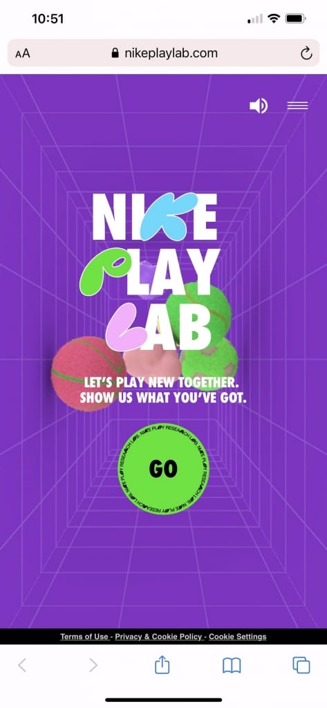
Nike PLAYlab offers an opportunity for kids to share what they’re creating, from music to business ideas and other creative pursuits. The website is built on a fairly simple concept. What we like about the mobile version is that it looks exactly like the desktop version, but adapts perfectly to a smaller screen. Navigation is simple and intuitive.
2. Vista Homes
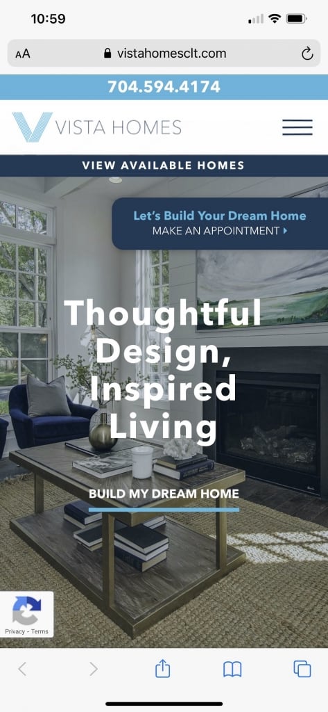
Vista Homes offers some parallax scrolling on mobile devices. As you move down the page, the menu and hero image remain in place. Other elements shift and change, giving the entire site a highly professional and trendy feel.
Probably the best feature for mobile website design inspiration is how adaptable the form is. Click on it and a limited form field popup appears. A few simple clicks and you can request an appointment.
3. Farmers Insurance
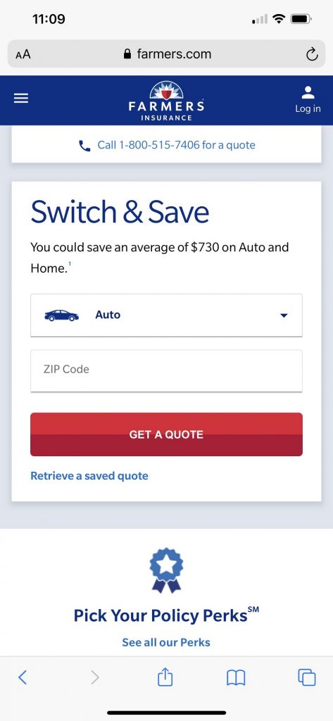
Farmers Insurance goes with a mobile-first, simpler design. By sticking to the basics and including plenty of white space, it is much easier to navigate and find the elements the user needs. If you’re looking for mobile website design inspiration, the simple layout of this website is a good starting point.
4. The Home Depot
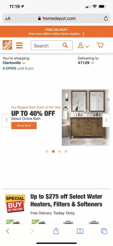
The Home Depot is one of our favorite examples of mobile website design inspiration. For brick-and-mortar businesses, most searches start locally. Utilizing geotargeting ensures your website and advertising gets in front of the right people at the right time.
Notice how the mobile site offers a suggestion of a nearby store. This will vary, depending up where your cell phone pings from when searching for any of the keywords pulling up for The Home Depot or for the store itself.
At the same time, the user can choose to change the store location and pick from any of their many places to shop. The mobile version of the site is quite well thought out and functions on a user friendly level.
5. Zappos
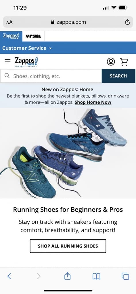
We chose Zappos as an excellent mobile website design inspiration example due to its easy search features on smaller screens. The first thing users see when they land on the mobile site is the search box with a prompt to look for shoes, clothes and so on.
Additionally, once you begin your search, Zappos offers a number of filters to narrow your options down to only the products that apply to you. For example, search by women’s, men’s sizes or kids’ sizes.
6. Puffin Packaging
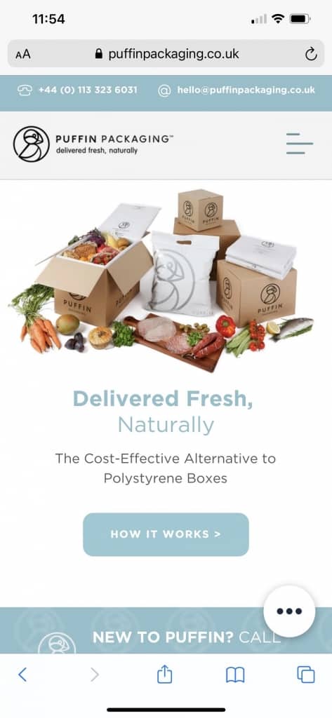
We love the way Puffin Packaging chooses bright colors to grab user attention. While a minimalist white and black web design is classy, using a brand palette can make your site stand out from the crowd.
The layout is minimalist so the brighter colors don’t detract. We also appreciate the layout of steps to show the benefits of their packaging.

Note how the image is set off in a circle but the background remains bright and identifiable as Puffin Packaging. The user scrolls down and sees different benefits of the products at a quick glance, making the site highly readable for busy mobile users.
Find More Mobile Website Design Inspiration
The six sites listed above offer plenty of inspiration for designing a mobile site. Keep in mind that the speed of the site and how intuitive it is impacts user experience. At the end of the day, it’s more important to have a highly functioning site than simply an aesthetically pleasing one.