Every month, we choose a site to receive our coveted Designerly design award. We’ve looked at e-commerce stores, government websites and hotels. This month, we narrowed our options to the financial industry and finally chose to look at banks, which led us to the vivid colors and intuitive design of Old National.
The color blue isn’t a new feature of bank websites. Forbes Advisor reports nearly eight in 10 people in the U.S. are concerned about whether their bank is sustainable. Since blue is a traditional bank color and promotes feelings of trust, it makes sense for physical and digital banks to include the hue in their designs.
It took us a while to choose the winner for this particular category. As you might imagine, there are thousands of banking websites and the majority of them have some shade of blue in the design. However, we finally landed on Old National because of the navigation, simplicity and user flow.
Winner: Old National

Banking is changing fairly rapidly, with more and more fully digital banks entering the scene. Younger generations are more open to a bank without a single physical branch. Even though, Old National offers both online and in-person banking options, they seem to be on the cutting edge of intuitive design.
We chose them as the winner of this month’s award due to their business to many (B2M) approach that covers categories such as personal, business and digital banking.
What Does Old National Bank Do That’s Special?

As you dig through the “About Us” section of the website, you’ll see that Old National lays out a number of things they care about, such as embracing ESG considerations to try to be inclusive and environmentally conscious.
They share that they are the sixth largest bank with headquarters in the Midwest. They have around $48 billion in assets. They pride themselves on the relationships they form with their clients.
The company dates back to 1834, making it one of the oldest institutions in the country. The bank offers a statement about helping local communities by working on community development projects and offering grants.
Their branches offer personal banking options, including:
- Checking
- Savings
- Home Loans
- Personal Loans
They also provide business banking and offer:
- Small Business Banking
- Commercial Banking
- Treasury Management
Their digital banking features
- Zelle
- Mobile Check Deposit
- Bill Pay
The bank likely has something to suit just about any potential client, so it makes sense they’d represent all these features on their website. What makes their site stand apart, however, is the ability to easily navigate between areas.
Sadly, one of the Louisville branches was hit with a tragedy in 2023, when an armed shooter went on attack.
We want to make it clear that while our hearts go out to the bank staff, our decision to choose Old National for site of the month was based solely on the user friendliness of their website.
Why We Chose Old National As Our Site of the Month
Narrowing the choices down from a long list of possible banks took some time. We decided we wanted to focus on a website that offered areas for each buyer persona and would include personal and business banking at a minimum.
Since digital banking is so popular, we also wanted to select a bank offering digital options for its customers and an app they could download for their on-the-go banking needs. ]
Navigation
The navigation at some banking websites gets bulky. With Old National, they break selections into three main categories and then further subcategories under each.
Color Palette
When you look at what the color blue evokes, you find it elicits trust. It makes sense for a company that takes control of your money to use a color that makes users feel they are capable and reliable.
They also add a pop of yellow to grab attention and give the site a unique look that’s different than their competitors.
Trust Indicators
It’s crucial that the audience trusts a banking website. Old National includes some trust factors that pull the user in. In the footer, they include that they’re a member of the FDIC and an Equal Housing Lender. This shows potential customers their money is guaranteed.
Fresh Content
One thing that drives traffic to a site and keeps users coming back is adding fresh content frequently. Old National features a number of articles on topics of interest to the audience. For example, they talk about money myths, debt consolidation and low down payments to get into your first home.
Calls to Action (CTAs)
The CTA buttons on the website guide the user through the buyer’s journey. By using the pop of yellow to draw attention, the designer makes it clear what next steps people should take.
In addition to sharing the opportunity to get details on a high savings interest rate, they also have CTAs that read, “Open a Checking Account,” “View Savings Rates” and “Ask” to interact a database of frequently asked questions and answers.
Mobile Responsiveness
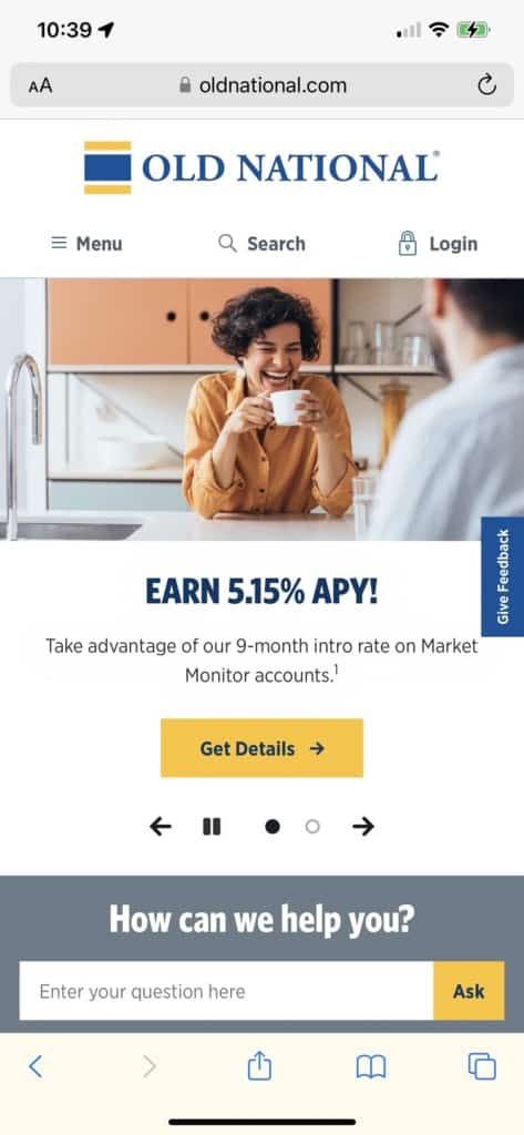
Old National edged out the competition because of the streamlined look of their mobile site and their app. The site narrows down to the function at hand, making it extremely user friendly for small screen users.
The mobile version focuses a bit more on the image carousel but the buyer has no doubt what their next move might be.
What We Would Do Different
Old National is a study in traditional design and modern conveniences. While users will appreciate the layout of the desktop site, the mobile site scales everything down and serves a different role.
If we were going to change one thing about the website, we would make it easier to find the resources the site offers. There are numerous tools, calculators and articles on crucial investment topics. We’d probably put an area right on the front page to showcase the latest articles. It might be a bit different than some banks, but it highlights the knowledge this one has.
Overall, Old National created a user-friendly design with rich colors that pull the customer in. Study the site to learn how to serve multiple audiences at once and still give them all what they need.