
With how much buzz is going around the internet about the company OpenAI with the release of ChatGPT, we thought this was an excellent time to look at the website behind the chatbot technology. After all, people who are so adept at creating AI-driven software must surely have excellent web design.
OpenAI doesn’t disappoint. Anyone who’s ever designed an app, coded a website or worked on a digital project knows how difficult it is to hit all the high points for user experience (UX) on every element of the project and across your assets.
To be certain we were taking a fair view of the overall design of the website and not letting the trending popularity of the software sway our views, we also accepted an invite to try out Google’s Bard and see how their overall design compared. We also tested the software itself, of course! Who wouldn’t?
Winner: OpenAI
Why does this particular technology development site stack up so favorably against even big names such as Google? Experts predict the chatbot market will reach $1.3 trillion by 2025. As more companies and even lay people utilize the benefits of artificial intelligence (AI), the industry will hit even higher numbers and the use of AI will become commonplace.
It would be easy for a software development company to keep their design overly simplified and focus mainly on the UX of the program. However, we chose OpenAI as our winner because their design is truly stellar and intuitive.
What Is OpenAI?
OpenAI’s mission statement is to make sure AI benefits all of humanity. That’s a pretty tall order, and we aren’t sure how much it changes humanity, but it certainly is a useful tool that we see improving and increasing in popularity in coming years.
A group of tech-savvy investors and AI experts founded the company in Silicon Valley in 2015. Notable founding members included Elon Musk and Sam Altman. Microsoft also sent an infusion of cash to help the brand develop their programs.
The company started as a not-for-profit but shifted to a capped for-profit around 2019. The idea was to give employees a stake in the company and attract more investors who want to make a profit.
Since the shift, they’ve partnered with Microsoft and partnered with many investors to pour funds into AI projects. The ultimate goal is to create a human-like machine that can outthink and outperform humans. The fear of such a future has been voiced by geniuses such as Stephen Hawking and Stuart Russell. Musk himself has called AI a threat to humanity.
OpenAI sets some product standards to tie into their mission to make AI benefit humans rather than harm. With that in mind, they have some usage policies that ensure deployment and development of their models are responsible and safe.
Anyone who has seen the movie “I-Robot” or read the book that inspired the film knows just what might happen when robots suddenly start thinking better than humans can and are capable of changing the face of the planet. Still, that type of concern is many decades away, if ever, so we feel fairly safe in handing out an award to OpenAI for their beautiful website design.
Why We Chose OpenAI as the Winner in the Chatbot Industry
The real star of the company, however, is ChatGPT, which was released in November 2022. You may have also heard of Dall-e, a similar program that can generate artwork in a variety of styles based on other images on the internet.
The reason we chose this website for this month’s awards has nothing to do with their programs, although we also admire the design and simplicity of how they function on the site. Instead, we looked at these factors when selecting them as the recipient.
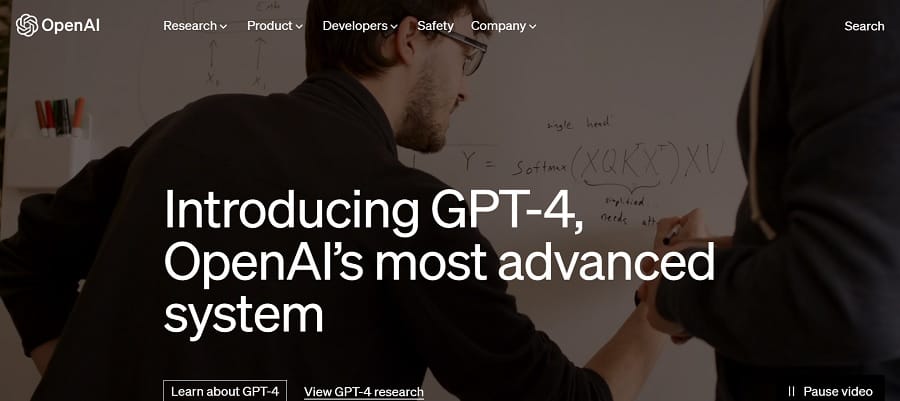
Video Hero Image
Using videos can boost brand awareness and increase engagement. We love the way users see a video the minute they land on the OpenAI home page. The images are relevant to the headline about GPT-4. We see software engineers creating code and coming up with equations to bring the bot to life.
Minimalistic Design
It’s probably no secret that we adore simple designs that get right to the point. Note how the selections on the home page are limited and drive the user to the next phase of the buyer’s journey. The call to action (CTA) button reads “Learn About GPT-4.” If the user scrolls down slightly, there is also an option to “Try ChatGPT.”
Mobile Friendliness
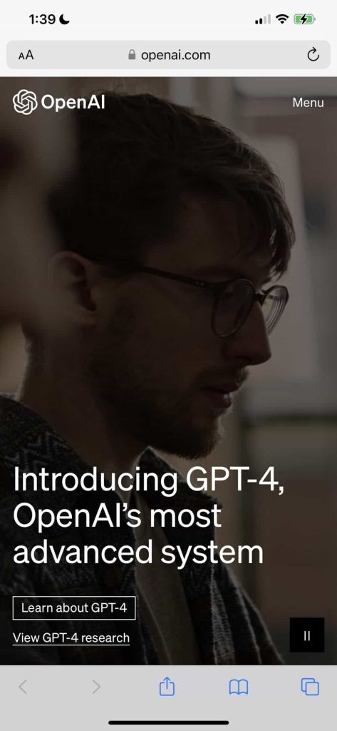
The mobile version of the website is very responsive and while we prefer the desktop for typing in questions and queries to the actual software, you can at least get a sense of what the site is about by loading it on a smartphone.
One particular thing we noted was that the video background streams perfectly on a mobile device. Many sites move to a static image or cut the hero background altogether, but OpenAI keeps the same video on different screen sizes.
Easy to Start
The UX of the site stands out from Google’s attempt to compete. While Bard functions in a similar way and offers valuable advice, it is a bit bulky to start using. As the developers continue to work on it, this may change but as with many of Google’s products, one must go through a series of steps to try to sign up.
First, Designerly staff received an invite to try Bard. We signed up and had to wait on a “waiting list” until we received an email about 12 hours or so later saying we could try it out with a link. The design of that page was under impressive and the reason OpenAI won out on all counts.
Dark Mode
Another thing we noticed is the option on the left side to go into dark mode. When you first log on to use ChatGPT, the screen is white with a contrasting text. However, if you click on the dark mode button it turns to a deep gray with white text.
The ability to go from dark to light mode helps those who work with words all day avoid eye strain and even shift focus a bit when needed to jog the brain into thinking in different ways.
What We Would Do Different
There’s a lot to love about the design of this website and we think our readers can learn a lot about creating an engaging landing page by studying it. The one thing we’d change is the navigation across the top of the header.
While the placement is good and the navigation bar isn’t intrusive, we don’t like the way you have to click to get the drop down menus for each category to appear. Some might prefer this but we like the mouse over dropdown option to save time and make navigation more intuitive.
We also don’t care for the way the search feature in the menu works. You have to click it and have it pop up before searching. You must also manually X out of it to close it down. It’s bulky and doesn’t match the rest of the design.
Overall, this is a design most users will enjoy and likely return to try out a useful program and because they can easily move through different functions of the site. The company did an excellent job of focusing not only on developing an amazing product but delivering it in an aesthetically pleasing manner.

Leave a Comment