Choosing a winner for our Designerly award isn’t always an easy process. We start with all the beautifully designed sites we can find, narrow down the options and ultimately choose one that stands out above the rest.
The staff takes into consideration elements such as balance between content and white space, how intuitive the navigation is and whether the personality reflects the mood of the brand. We also compare each site with others of a similar nature.
If we’ve narrowed the choices down to three sites and one is an e-commerce site, we look at e-commerce sites selling the same products and compare them all. The process takes time, a bit of insight and a lot of nail biting to choose the right example to share with our readers.
Sometimes it’s hard to narrow the elements down, but this month one clear winner “outshone” the others.
Winner: Outshine Labels
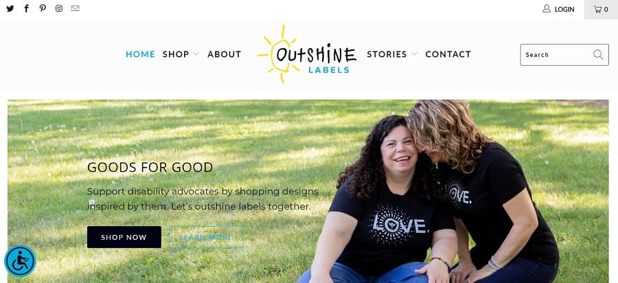
Insider Intelligence recently reported global e-commerce global sales will cross the $1 trillion threshold for the first time ever this year. At the same time, the pandemic shifted people’s priorities to more lasting things and social impact.
Expect more and more retail stores to embrace causes they care about. Outshine Labels takes this concept to a new level, selling products tied to specific people with a need/cause and donating a portion of the profits to these individuals.
What Is Outshine Labels?
Jessica and Blayne Conner founded Outshine Labels. Their youngest daughter, Ava, has Williams Syndrome. They decided to share their journey and met many other special needs families.
They wanted to do something to help with medical costs and special treatments insurance doesn’t always cover, so the idea for Outshine Labels was born. While they don’t always release exact numbers, they do state that a majority of their profits go to the individuals they sponsor.
Outshine Labels is an online marketplace to help people earn extra money for the care of their special needs children. They also partner with some nonprofits to help sell their merchandise and raise awareness for their needs.
They share the stories of those they help raise funds for on their blog. Supporters get information on how the family uses funds, updates on the kids’ progress and more. They sponsor kids of all types of abilities and for various reasons.
Some of the people they sponsor were hurt in an accident and dealing with physical or mental issues. Others were born with different things that make life a bit more difficult for them in some areas.
Why We Chose Them for the Award
Even though the mission behind what they do is impressive, that isn’t why we chose them for this month’s award. It was their stellar design and mobile-friendly website. Some of the things we considered in our choice included:
Excellent Content
They have a blog with stories and detailed information about where their money goes and the causes they hold near to their hearts. Post feature images of those the funds help. However, they also have strong headlines explaining about the causes you’re supporting.
Clean, Intuitive Navigation
They limit their navigation categories to four: Shop, About, Stories and Contact. The user can quickly hop to the needed section without having a difficult time going back. The focus is on stories and shopping. The singular focus pushes the buyer through the sales funnel.
Engaging Shopping Page
h
https://outshinelabels.com/collections/shop-to-support-families-and-individuals
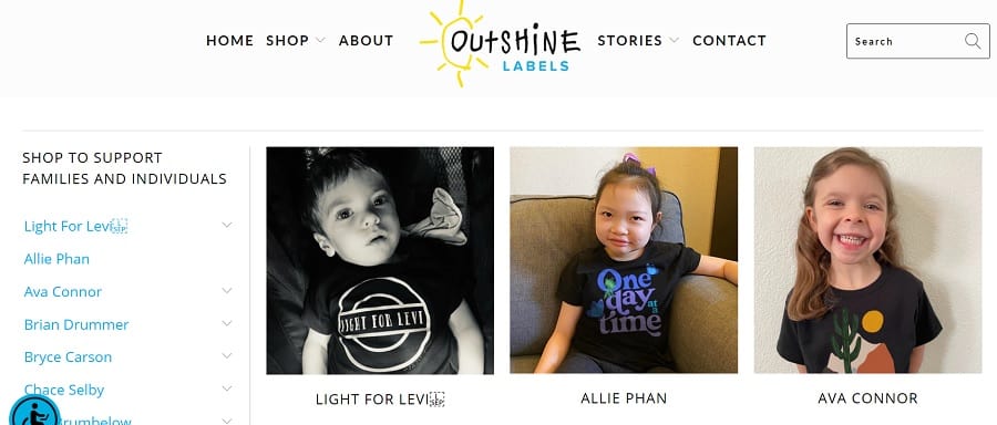
Outshine Label’s shopping page stands out from other e-commerce stores. They use photos of individuals–mostly children–and the name of the cause you’re supporting by shopping via those links. Although you can filter down by Adult, Kids, Baby and Accessories, the focus is on the children you’re helping. You can also search if there is a specific product you want to purchase, such as a candle.
Mobile Responsive Design
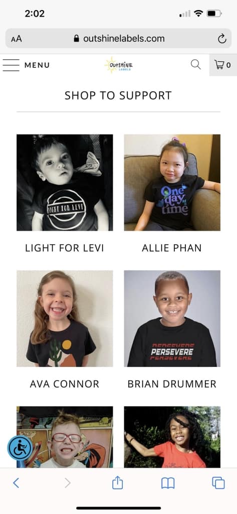
We tested the site on an iPhone and found it to be extremely responsive on a smaller screen. The images on the shopping page adapt perfectly and present in a beautiful grid pattern. Everything retains a sharp edge. We love how everything functions the same and the mobile appearance is consistent with the desktop one.
Balance of Negative Space and Content
We like the light, airy feel to the entire design. There is ample white space to draw the eye toward the content. There is a consistent and beautiful F-Pattern design to the page that allows the user to go through different elements in an orderly fashion.
Intuitive Shopping Cart
It’s easy to add items to the shopping cart and checking out is as easy as clicking on the PayPal button. As the user pulls up each item, the site reminds them what cause they are raising money for and how much of each purchase goes to the individual.
There are more things to love about the simple but effective design of this site. Outshine Labels proves you don’t have to add a bunch of video, animation or special effects to create a highly usable site users will love. Instead, focus on what your audience needs most and add the features that make sense for your brand.
What We Would Do Different
One thing we did notice is that they need to complete the FAQ page. There is a note at the top of the page currently stating they are making changes, so it’s possible this is a new page they are adding. The link to the FAQ page isn’t in the main navigation but is in the footer. We’d advise leaving the section out of the footer until the page is ready for public consumption.
No site is perfect, but this one comes pretty close. Our favorite is the super simple shopping system with multiple ways to pay. It works perfectly for an e-commerce store.
