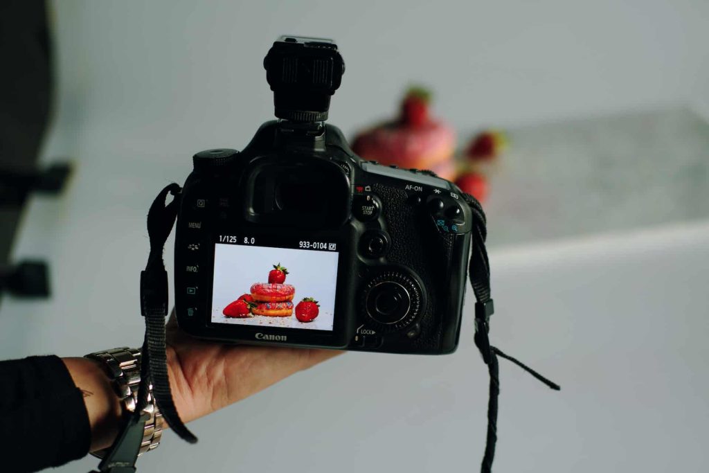
Just as a good website needs excellent design to entice users to explore the page, fantastic photography design can make or break the layout. The way models or products are positioned in the image either creates a dynamic and interesting photo or an odd and cheesy one. It’s vital to know the elements of photography design to craft compelling images that make a webpage visitor want to continue browsing.
There are also plenty of reasons to combine photos and graphic designs to create interesting art. If a designer receives a poor picture, they can save it by making an exciting graphic that helps insert photography design into the otherwise unusable image. Here are a few ways to capture wonderful images and save bad ones with graphic design.
The Seven Principles of Design
Whether you’re a home-grown graphic designer or hold a bachelor’s degree in the subject, you may have heard of the seven principles of design. These standards help artists of any kind make their work attractive to the human eye. They can help guide people through the information they need to know or catch them on a focal point they need to know.
Seven may seem like a lot, but they are relatively intuitive ideas. Here is a look at the seven principles of design.
1. White Space
Starting with the basics always feels appropriate. While the rest of these photography design elements are about what designers can add to a project, white space is about leaving some resting places for the eye. Packing a ton of colors and text into a design may end up being eye-catching for the wrong reasons — mainly because it is so overwhelming that people don’t know where to look.
It’s essential for creating a hierarchy within the design. White space helps group parts of the photo or graphic together so the brain knows how to process what it’s looking at comprehensibly.
2. Balance
Proper balance goes hand in hand with white space. A photographer or designer needs to achieve the right amount of occupied and unoccupied areas to keep a photo from feeling too chaotic or plain. That’s not to say there are no merits to going in one direction or the other. Perhaps the client wants an image that feels claustrophobic or simple.
In such instances, the artist will need to know how to create something that feels unbalanced. However — for clients who want a straightforward design — a designer should balance active and white space through symmetry.
3. Repetition
There will naturally be some repetition within a graphic design. However, it can be a very interesting tool within photography design. It can help an image feel more structured, so finding a repetitive background for a dynamic subject can help lift the focal point off the screen. Subjects with repetition — like flowers or bricks — are eye-catching on their own since human brains love to find patterns.
If a designer wants to create a photo with structure and stability, finding instances of repetition can be very helpful. They could also look to avoid repetitive images to develop a sense of uncertainty.
4. Emphasis
Every photo or graphic design should have a focal point — this is where emphasis comes into play. What does the client want onlookers to stop and look at? Should the image itself be the focal point or would they rather it be a backdrop to any text? When designing a photo, addressing these ideas is vital. Otherwise, it could lead to an image that does not match the client’s needs.
Keeping emphasis in mind during the photography design can do a lot of work to streamline what the graphic designer needs to do. If they don’t have to cut the photo multiple times to create a new image, it can speed up the time they take to do their work.

5. Movement
Movement within the photo or project is crucial as well. How does the eye feel like it should move around the page? Is there a central point in the image a person should pay attention to or should it remain in the background? Crafting an eye-catching picture is great, but it becomes less valuable when the goal is to feature the text that will go on top of it.
This design element can also consist of the camera’s shutter speed. Slow shutters create a blurrier effect on objects in motion, allowing them to convey movement within a still photo.
Inversely, a fast shutter speed allows the photographer to capture action in precise detail.
6. Contrast
As most people might expect, contrast means combining two opposites in one image to create a piece that pops. For example, it could be interesting to pose an object with many features over a plain background or vice versa. There are also plenty of ways to use light and dark or cool and warm colors. Implementing these contrasts make a photo stick out in people’s minds, leading them to the image.
Contrast is essential when adding text, as well. If the image is highly dynamic, it should contrast with lighter fonts to avoid feeling busy. Taking this principle into account during the photography stage helps out the end product.
7. Proportion
Proportioning everything in a way that makes sense helps a photo appear clean and precise as opposed to messy. It helps distinguish what parts of the image are most important, just like emphasis. However, proportion takes every element of the picture into consideration. If the goal is to use the image to promote a handbag, the model and their clothes shouldn’t be as striking to the viewer.
Like contrast, the proportion of the image also matters when it comes to graphic design. There needs to be enough space for the designer to place text or art over the photo to create an excellent flow. Otherwise, the eye can’t tell what it should take away from what it’s observing.
Saving Poor Photography Design With Graphics
Sometimes, a business or designer will get a photo they’re not sure how to work with. There might not be enough time to reshoot the image or the person left up to the task of fixing it doesn’t have the authority to request such a thing. However, they can still save the shot by implementing these photography design principles through graphics.
Say the image is far too cluttered to put text over. The designer could then cut out parts of the image they want to include — like the model or product — and feature it over a less-busy background. This tip could also be successful if they would like to have more contrast instead with artful accents.
If the image has too much contrast, convert it to black and white and see if whatever else needs adding avoids getting lost. Use cutting to add repetition or adjust any askew proportions for a clean design. Perhaps most importantly of all, editing allows the designer to establish emphasis on what truly needs emphasizing.
Use Photography Design for Enticing Images Every Time
While there are absolutely ways to fix an erroneous picture, capturing the perfect shot is always the best way to go. It saves businesses and designers time on adjusting an image to what they want. For eye-catching photos and superior graphics, utilize these elements of photography design for enticing images every time.


Leave a Comment