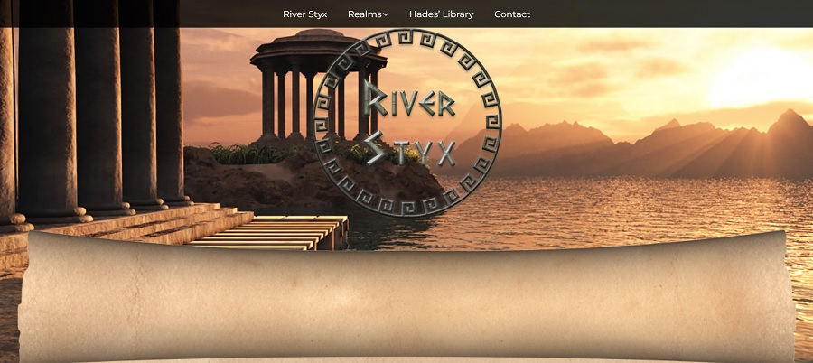
Sometimes you need to unwind and have a little fun. The River Styx website is a rendering of the mythological place related to Hades. Created by GoPilot, the site seems to be just for entertainment value without any way to make a purchase or any advertising or other monetization.
You can click on the link and see that the creator is a web developer named Gabe Marihugh, who specialized in Shopify and WordPress websites. He’s based in California and specializes in SEO for local businesses, too.
The River Styx is an interesting theme for a website. You likely recognize the story from Greek Mythology and the concept that the soul must cross over the river in the underworld to join other dead souls on the other side.
The concept first appeared in Homer’s Iliad and Odyssey. There are a lot of little details surrounding the River Styx, such as needing coins for passage and that the water is poisonous and will destroy most vessels.
We thought it was about time to choose a site that just uses plain old fashioned fun to come up with entertainment for people. While the link at the bottom does render it a form of marketing, it is quite subtle.
Winner: River Styx

We chose River Styx as the winner of the monthly Designerly award for a number of reasons. The design is rather timeless, with strong visuals and relevant text. The pages tell a story, moving the reader from one section to the next.
The images are within a frame and show as PNG, allowing for some slight movement to grab user attention. There is a call to action (CTA) that reads “Listen.” Each page tells a story. On the home page, the visitor is welcomed and asked if they want to “go for a little boat ride.” The sound effect of water gently flowing sets an ambiance.
The graphics are quite advanced, putting one in mind of a game design rather than a website. The look pulls you into the world and keeps you there as you journey through the story.
What is the History of River Styx?
A page defining your business adds trust for users. Around 81% of people say they need to trust a business before buying from them. Contact information and the history of a company are typically quite important when creating web designs.
Interestingly, the site we chose for this month’s award is missing an About Page and the contact page circles back to the library. We wanted to feature it anyway because of the stellar design. Since it is a site for entertainment and they are not selling anything or even earning from ads, we felt we could overlook the lack of information.
Still, we wanted to dig a bit further. A search of the site and a look at the site map turned up little. The clue to the site’s origins is in the foot in tiny letters and says, “site by Glopilot” with a link.
The site has a copyright date of 2005 to 2023 for Rangeland Productions, but a Google search failed to turn up a website for the company. We love a good mystery here at Designerly, so we put on our research hats, checking WhoIs and ICANN to try to determine the owner of the site.
The only clue we found was the GloPilot link to a man named Gabe Marihugh, so we reached out to him about the history of the site and were so excited to get some exclusive information.
Exclusive Insight Into the Site
RiverStyx.com was created in 2008. Gabe is the designer of the site and owner prefers to remain anonymous but will be referred to as Charon.
Gabe shared, “RiverStyx.com began over 15 years ago as an immersive, fully animated (Flash) gamified philosophy website that sought to entice the wandering and otherwise wayward Internet surfer to take a ride with Charon through the Underworld.”
While the visitor goes on the journey, Charon uses mythological realms from ancient Greece to share “ancient anecdotes.” It is through these that he reveals a lot about the modern world and points out the timelessness of the human condition.
Ever-Changing Internet
The inspiration for the site came from a book Charon was working on. As the Internet changed and became more vibrant, Charon realized the format of an interactive site better served the story. He wanted to build a Disneyland of the Underworld online with different worlds to explore. All through the site, they’ve sprinkled strange characters, hidden passages and easter eggs.
Over time, the Internet turned away from Flash technology. In order to keep the site functioning and the legacy alive, the creators took snapshots of each realm and turned them into animations. They then moved the writings and created a web-friendly format for current day visitors.
As time passes and more people access high speed internet, it will be interesting to see what the site morphs into in the future.
“Charon’s hope is to expose his passengers to his vast and ageless trove of life’s wisdom, which he has gleaned from those who have passed over into the afterlife, so that the living might use such wisdom to better their understanding of life while they still have it!”
Why We Chose River Styx As Our Site of the Month
River Styx is a unique selection for one of our awards. It isn’t a commercial site, retail site or manufacturing site. It doesn’t highlight a government entity or educational institution. Rather, it is just for fun and entertainment.
We chose River Styx because it is unique. Everyone in the web design industry once started because they loved to create something from nothing. The early days of learning design are fun. Taking a concept and bringing it to life for a client can be rewarding. When a customer states they are thrilled with the finished product, you’ll feel joy. We thought we’d use this opportunity to remind you why you fell in love with web design and just how much happiness it can bring.
Outside of the fun factor, we also appreciate these things about the overall design:
Simple Navigation
The navigation bar is at the top, so it’s where users expect to see it and easy to find. Four categories make it easy to move from place to place easily. However, there are also buttons throughout the pages labeled “Next.” The user can either scroll to the top of the page and navigate to the location or can click the button.
At the bottom of each page is a link to the site map. You can see the entire layout at one time and open pages in new tabs to keep from hopping back and forth. A site map is also a great way for search engines to index your site.
Interactive Design
The design is well thought out and interactive. As one moves the cursor over the navigation, drop-down menus appear. The color of the text changes to highlight where the user is at any given moment.
When you can keep users engaged, they’re much more likely to stay on the page rather than bouncing away to another page, social media or any of a million other distractions. The longer they stay on your page, the more likely they’ll bookmark it and return.
For businesses, keeping people on the site often converts to sales. For a site like River Styx, there isn’t really an overarching goal outside of entertainment.
Sound With On/Off Button
We like that you can “Listen” via a CTA button on any page, but you can also mute it or “Silence” the talk. Adding sound is a unique feature that tells a story. However, people could be accessing the site at work or in a busy waiting room where they don’t want everyone else hearing what they’re doing.
Anytime you use sound with a web design, ensure the site visitor can turn it off with a simple click of a button.
Animations
Each of the images on pages features some type of animation. The clip isn’t long but it sets the tone. For example,the welcome page features a man in a boat with water moving. It loops repeatedly. On the page titled “The Falls,” the water is in motion but the other elements are static. The furies move around with flapping wings. Each page has something different but not all are animated.
When choosing what to put into motion on your site, select only what will have maximum impact. Even though the majority of people today have faster internet speeds, too much animation can slow a site down or turn away those with slower connections.
Storytelling
The site has a theme and the stories all tie into it. Storytelling pulls users into a website and keeps them there. You know that every story on the River Styx site ties into the tale of Hades and the mythological creatures from Homer’s stories.
Even if your site is commercial, you can add a storytelling element. Think about the messages you want to convey to users. Tell a story through the eyes of a customer and how you helped them. Share details about the lives of the founders or employees. Look for ways to personalize the site and experience so the company becomes real to potential leads.
Mobile Responsiveness

We always pull up our award sites on a smaller screen to see how they might look for the user. Approximately 96% of people access the internet via their mobile phones at least some of the time. If a site creator doesn’t focus on a positive mobile experience, they may miss out on a lot of potential traffic.
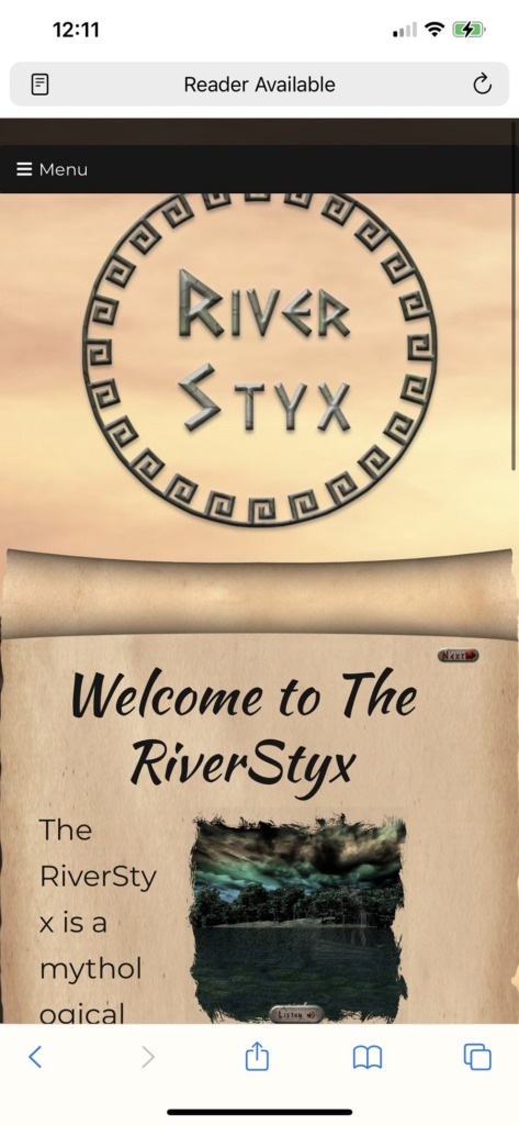
The River Styx website pulled right up on our mobile and had a similar effect to the desktop version. Elements were more stacked upon one another but everything was present and worked the same. We like the way the logo bumps up to the top of the page and grabs attention.
Many mobile sites lose animation but this one kept it and also the ability to turn sound on and off, which worked nicely.
Logo
Let’s talk about the logo for this site for a moment. It is round but has a hieroglyphic quality that grabs user attention. The letters are raised and the font has a definite ancient Greece feel to it. The thing we like most about the logo is the white space being transparent to pull in the background color, which looks like an ancient scroll.
What We Would Do Different
Clearly, we would do a couple of things differently. First, we’d fix the contact page so when the user clicks on it they are given a form, email or some type of defining information to add trust to the site. While we can overlook it for this entertainment-only site, we can’t stress enough how crucial a contact page that works is for business owners.
We would also add an about page to better define who created the site. A website such as this takes a lot of work. The person behind it deserves some credit for the effort. It could also bring additional business as people learn more about the web designer.
Overall, we really loved the site and how entertaining it is. It has some unique images that remind one of another period in history while still showcasing modern elements such as the animations.
This was a different type of site for our awards but we hope you enjoy poking around the River Styx as much as we did. Just make sure you keep coins for your passage back to the real world and don’t touch the water in the river.


