
It all started with skeuomorphic design. In time, neumorphism and glassmorphism also reached surprising levels of popularity. These user interface (UI) trends shaped the early 2000s and continued influencing designers in the 2020s. What made them so popular?
Shining Light on the 2020s’ Most Popular UI Trends
While skeuomorphism, neumorphism and glassmorphism have distinct aspects and styles, they overlap in many places. Highlighting these similarities and differences is necessary.
What Is Skeuomorphism?
Skeuomorphic design mimics the characteristics of real-world objects, leveraging the user’s past experiences to create unconscious connections. For example, a note-taking app may have a notepad icon. Drawing on their previous knowledge lets designers convey what their app is and how it works without explicitly instructing them.
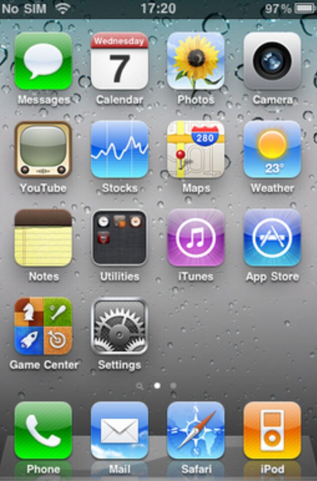
This was one of the original UI trends. For the first time, UI designers prioritized aesthetics over functionality. They replicated the visual characteristics of materials like metal, glass, leather, paper, and fabric to communicate an object’s weight, look, and feel. The goal was realism to make home screens and app stores as accessible as possible to technology novices.
What Is Neumorphism?
Neumorphism — the name for new skeuomorphism — came about because people grew bored with skeuomorphic design and frustrated with flat design. It is sometimes described as “layers of flat” because it has a paper-cutting effect. It strategically uses minimal silhouettes, shadows, and gradients to make elements look slightly three-dimensional.
What Is Glassmorphism?
Glassmorphism is exactly what it sounds like — it leverages blur, opacity, shadows, and gradients to make objects take on a glossy or glass-like appearance. It intends to create the feeling of looking through a window. The background should be somewhat visible through the opaque or translucent design elements.
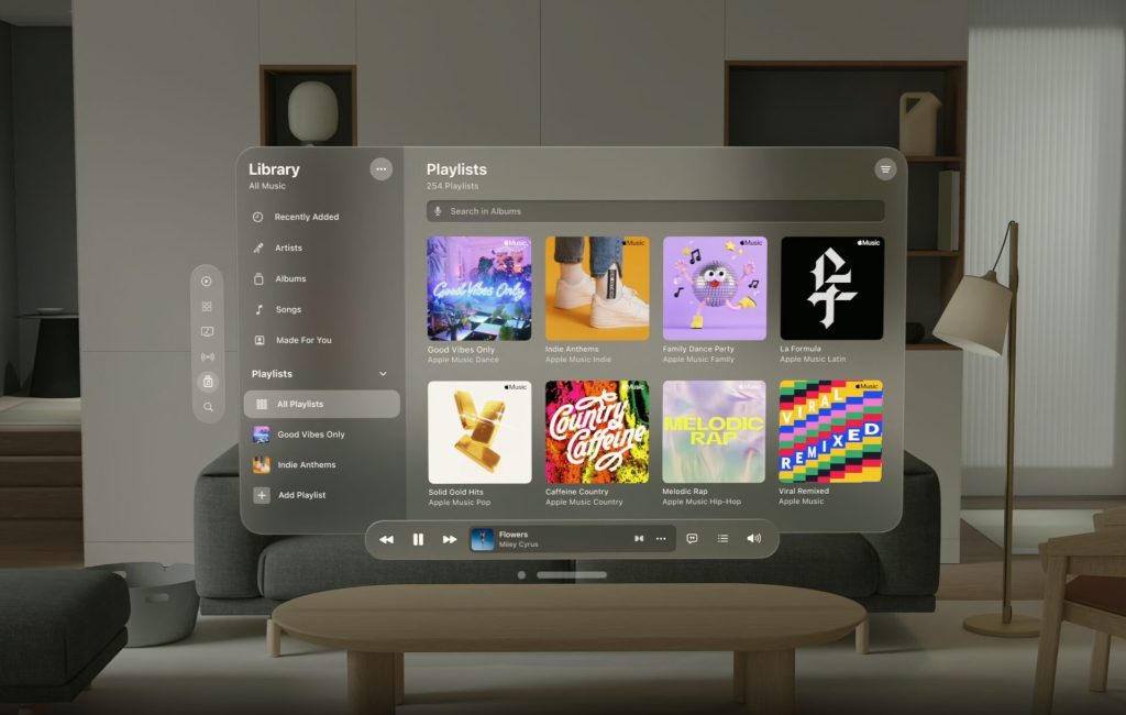
This UI trend doesn’t often appear in web design but is slowly catching on. Since it is a modern design style, it is more commonly used for mobile or mixed reality use cases. Apple is one of the few major companies pioneering it — glassmorphic design influences are visible when opening a folder, viewing notifications, or navigating the Apple Vision Pro menus.
The Fascinating Evolution of UI Design Trends
Neumorphic and skeuomorphic design didn’t emerge in the 2020s — they were some of the original UI trends. In the early 2000s, many people were navigating touchscreens and websites for the first time. Realistic references helped. Like most things, these styles eventually became popular again. They even followed the 20-year rule — that trends recycle every two decades.
Skeuomorphic design became popular with the original Apple touchscreens as a way to subconsciously tell users that their single device could replace all of the other objects they use every day. The change happened fast. Flat design immediately replaced skeuomorphism and remained the top trend for years. While the sudden shift may seem like it happened for the sake of novelty, it went deeper than that.
Skeuomorphism is supposed to call on past experiences so users intuitively know how to use an app or navigate a website they’ve never visited. In reality, many who wanted to be part of the trend made loose, surface-level connections that didn’t convey the right message. At the time, the case against this UI style was solid — those forced connections were confusing.
Of course, aesthetics were also an issue. In an age of rapidly advancing hardware and software, the steadfast attachment to a UI design style that clung to old experiences felt out of place. Consumers wanted exciting change and innovation, so app icons and web design elements that were reminiscent of the past began to seem stale.
Elements of glassmorphism — namely reflections and opacity — have been around since skeuomorphism. On iOS, a gloss effect used to be automatically applied to third-party app icons at the system level, meaning, for the longest time, the only way to remove it was to adjust a specific configuration setting.
Examples of the Drift from Skeuomorphic Design
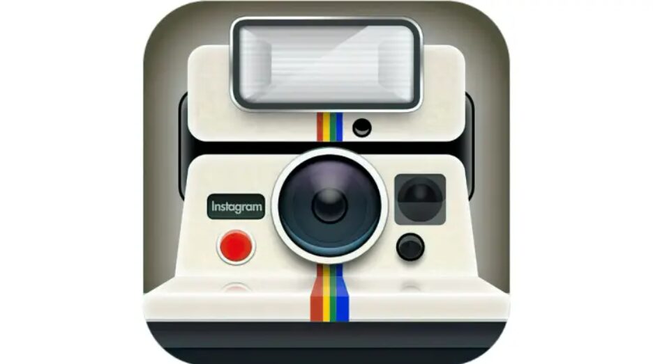
The Instagram logo is one of the best examples of skeuomorphic design because it underwent multiple infamous changes. Its original app icon was meant to mimic the look of a vintage Polaroid OneStep SX-70. Users immediately recognized it as a vintage camera, helping them immediately understand the app’s purpose and feel.
The next — and most popular — design phase involved a vintage beige shutter camera. Instagram kept the rainbow detailing from the first iteration but drastically simplified the overall look. While it seems the lens and viewfinder leveraged glassmorphism, the reflections and opacity were borrowed design elements. Technically, they were remnants of skeuomorphism.
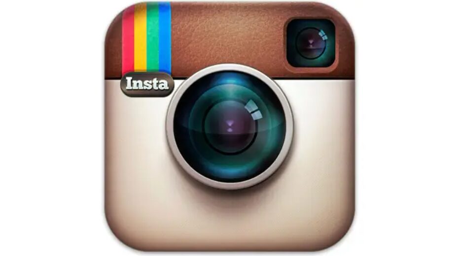
Simplification was key. As phones became slimmer, screen sizes grew, storage space expanded and users felt grew more familiar with interfaces, UI designers felt they needed to tone down the realism. The result was one of Instagram’s most popular app icons to date.
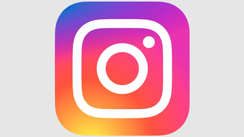
Surprisingly, one of the most recent Instagram changes was widely disliked at first. According to a 2016 poll, 67% of people preferred the old logo. The jump from skeuomorphism to flat design was jarring. While the app retained the outline of the camera, lens, and viewfinder — remnants of skeuomorphic design — it immediately lost its depth.
What Made These UI Trends Popular in the 2020s?
Skeuomorphic design initially went out of style because it was getting confusing, cluttered, and stale. As people adapted to navigated mobile and web interfaces, they had less need for visual reminders of what interactive elements did. Old news articles say as much, describing how out of place it looked on what was then considered futuristic, minimalist screens.
So, how did skeuomorphism become popular again in the 2020s? They blended into other UI design styles. The Windows recycle bin is a good example. It began as a realistic-looking bin and then evolved into a flat, gloss-less design before circling back. As of Windows 10 and 11, it is a glass container filled with crumpled paper.
The UI trends that came before neumorphism paved the way for its eventual success. Since users intuitively understood what design changes meant and how minimalist shapes were meant to convey meaning, subtle gradients, shadows, and forms were enough — people could recognize what an app was supposed to do even if it didn’t mimic a real-world object.
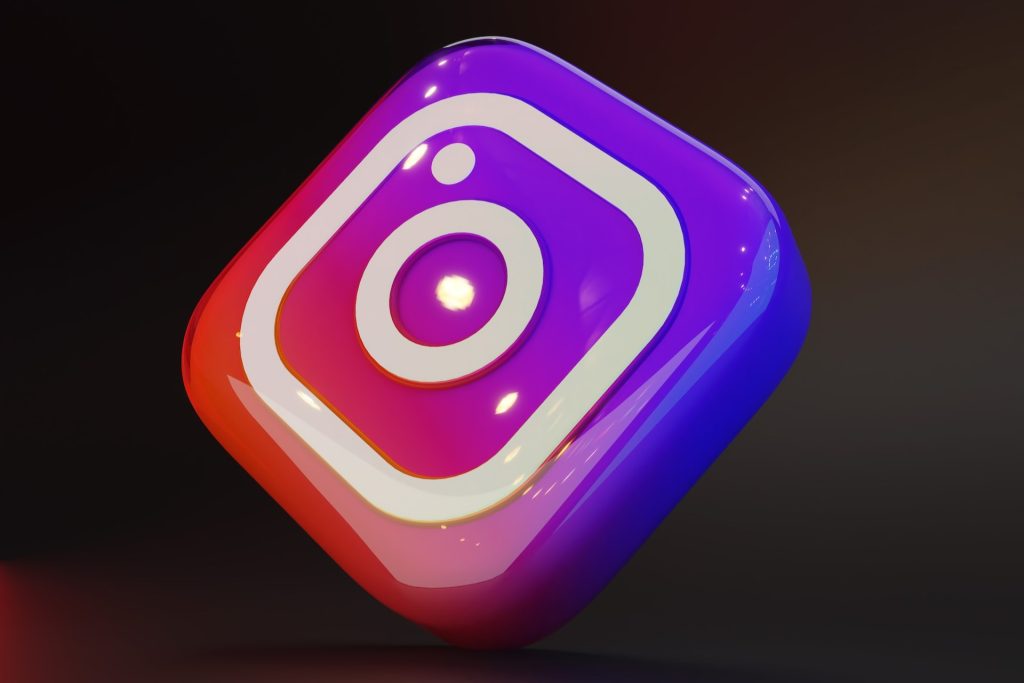
Neumorphic design became popular because it met flat and skeuomorphic design in the middle. Its subtle shadows and slightly three-dimensional appearance made it visually interesting yet functional. People would see a button and immediately recognize it as something that’s able to be pushed instead of wondering if it was part of the background.
While neumorphism remains somewhat unpopular outside of app icon mockups — its popularity fluctuates as it competes with trends like illustrations and simplified shapes — it remains the go-to choice for many UI designers. It is accessible, visually appealing, and easy to design. What more could anyone ask for?
The UI trend of creating glass-like design elements came years after skeuomorphic design. It only recently began gaining traction as a modern, fresh alternative. For now, the apps and websites using it consider themselves high-end. Most want to create an air of exclusivity, convey a feeling of luxury, or seize on modernity.
Skeuomorphic Design Will Make Another Comeback
Since these UI design styles have been around for years and each had its moment to shine, it’s very likely most will resurface once again after going out of style. Skeuomorphic design has the highest chance of returning since modern digital experiences are becoming novel and unfamiliar again — mixed reality is an excellent example of this.


Leave a Comment