

There’s always a new way for businesses to drive novelty and capture attention for their brands to differentiate themselves from the rest. One such method is through a dynamic logo.
The movement, the shifting colors, and the transformation from one shape to another — dynamic logos are versatile symbols that can adapt from one platform and context to another but remain recognizable. Find out what makes them so appealing in the digital space and which companies implement them best.
What are Dynamic Logos?
Dynamic logos are fluid emblems that move and transform their appearance depending on the context. Unlike traditional logos, which are static and unchanging, dynamic logos adapt across different platforms. They exhibit unique flexibility by taking on various iterations in different colors, shapes, and even content that suits specific uses. Think of them as shapeshifters that adjust based on how the brand needs to capture attention as they change right in front of the audience.
This evolution has made logo design a crucial aspect of modern branding, completely changing the game. Gone are the days of static symbols, where brand repetition was largely fixed. Now, brands can express themselves in new ways without losing their identity, keeping up with the ever-changing digital landscape.
What Makes a Logo Dynamic?
The word dynamic refers to the constant movement and change that is characteristic of fluid logos. Here are other markers that give logos their dynamic nature and what designers should consider when making them.
1. Motion and Animation
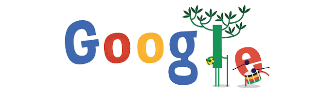
Movement breathes life into logos. What is otherwise static is now more engaging, memorable, and visually striking. Animated logos, otherwise called in-motion logos, incorporate elements that shift, transform, or interact with the elements within a logo. The movement can be subtle, like a change in color or shape or a moving component, while the rest of the logo stays static, just like this Google Doodle during the World Cup.
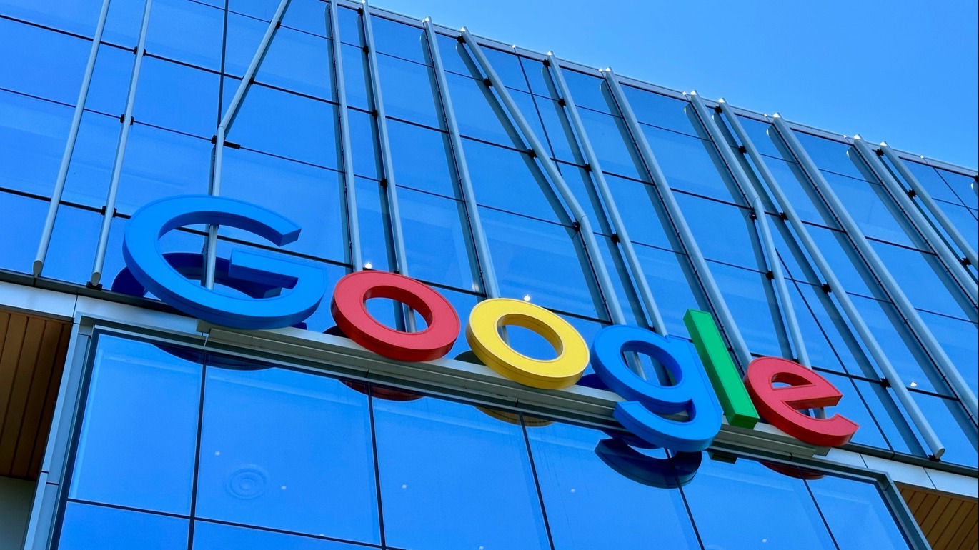
Or it could also be more elaborate, like a complete metamorphosis from one thing to another, like this more modern logo Google uses today across its many clusters of services.

As seen, Google’s logo is already iconic in its identifiable blue, red, yellow, and green shades. However, it’s also the most memorable brand that periodically incorporates motion into its various Doodles, making it fun and engaging for audiences to look at.
More recently, when Facebook rebranded itself to Meta, they also embraced the power of motion and animation. The logo expresses the core concept of Meta or the intersection of reality and technology.

Meanwhile, MasterCard takes logo animation to the next level, transforming it into a full-fledged advertisement for the brand. Their animated logo morphs into various objects — a taco, a suitcase, a camera, and a map — using the same signature colors. This clever design choice highlights the diverse ways their services can be used, reinforcing the brand’s versatility and global reach. MasterCard’s approach demonstrates how motion and animation can not only enhance a logo’s appeal but also create a distinctive brand identity that sets it apart from competitors.
2. Color Changes
Color makes brands memorable. Certain colors are strongly associated with specific companies — red for Coca-Cola and navy blue for Pepsi, for example. In fact, the entire field of color psychology is dedicated to choosing the right hues to evoke specific emotions in an audience.
However, Apple has completely redefined this concept, relying on its iconic shape rather than a fixed color palette. The distinctive apple silhouette gives the brand the flexibility to experiment with different colors while maintaining instant recognition. Because Apple’s identity is rooted in form rather than color, it can seamlessly adapt its logo to various marketing and branding efforts without losing its essence.
A perfect example of this adaptability was Apple’s “There’s More in the Making” campaign in 2018, where the company created 370 unique versions of its logo, each with a different artistic interpretation. Here are some of them.

As seen, the core shape remains consistent. This ensures the brand remains instantly recognizable despite changes in color and even variations in form.
3. Visual Alteration
Adaptability is a key feature of a dynamic logo, allowing it to evolve across different departments, branches, or subsidiaries while remaining instantly recognizable. By introducing variations in color, typography, or styling, brands can create multiple versions of the same logo to suit different platforms and audiences without losing their core identity.
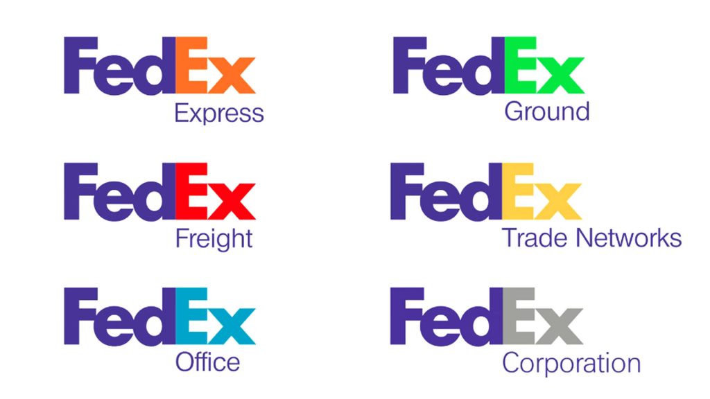
A great example of effective visual alteration is FedEx, which strategically changes the color of its logo for different business divisions, such as FedEx Express, FedEx Ground, and FedEx Freight. While the typography and design remain consistent, these subtle color shifts help distinguish each service while maintaining a cohesive brand identity.
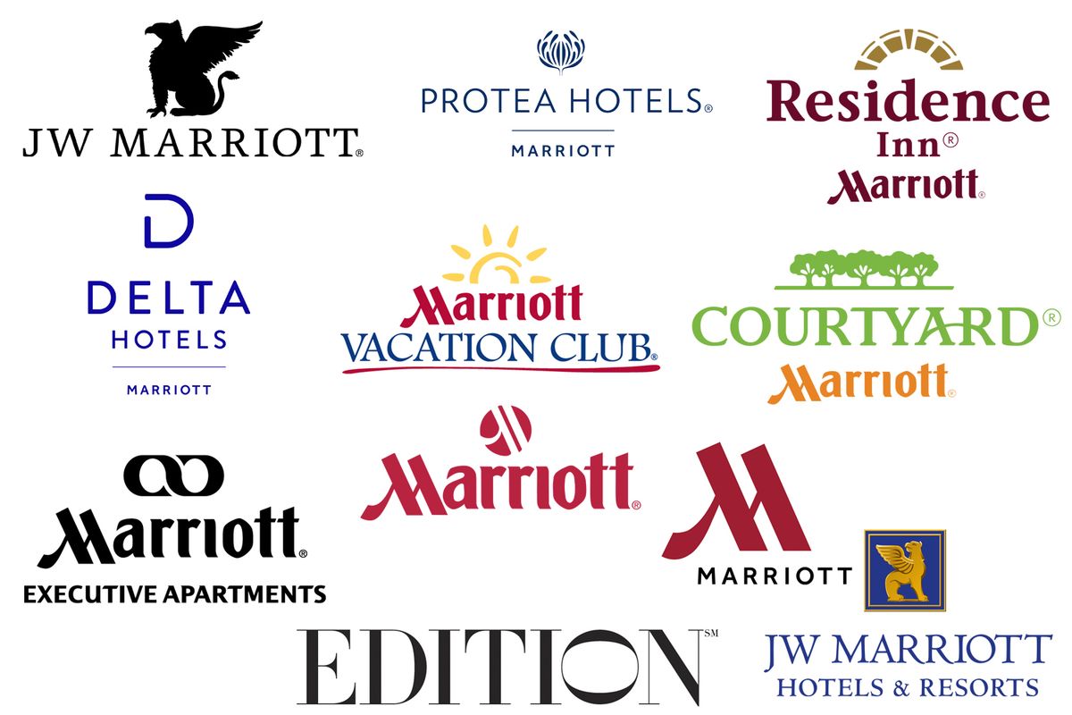
Similarly, hotel chains like JW Marriott utilize typographic variations to emphasize their dynamic branding. Instead of altering their original logo entirely, they create unique versions for each location or property, achieving a customized look while preserving a unified visual identity. This approach allows each individual property to stand out through slight alterations while ensuring the JW Marriott name remains prominent, reinforcing a strong and recognizable brand presence.
4. Themed Versions
When it comes to themed logo iterations, Google is a standout example. The brand’s willingness to adapt its logo for holidays and special events has made it even more recognizable and engaging.
For instance, a holiday-themed Google Doodle maintains the brand’s signature colors but replaces the green “l” with a decorated Christmas tree, incorporating festive trimmings while preserving the overall structure of the logo.

Another example is the 2024 Thanksgiving Doodle, where an animated turkey leaves a hand-drawn turkey in place of the second “o.” Unlike the traditional Google logo, this version features warm brown tones to complement the Thanksgiving theme. Despite the color shift, the Google name remains instantly recognizable.

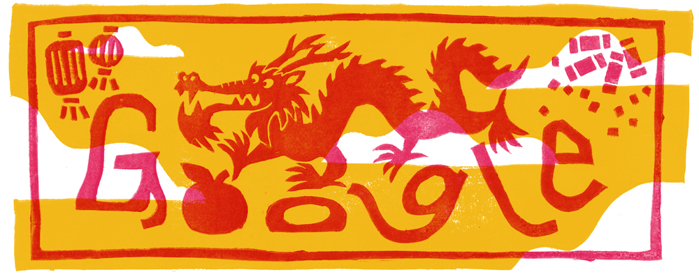
Similarly, the Lunar New Year Doodle embraces an oriental-style typography, replacing the first “o” with a mandarin orange. While this version isn’t heavily animated, it includes subtle movement variations, reinforcing the celebratory theme while keeping the Google identity intact.
5. Interactivity
Interactive logos are a rarity. While many logos are linked to websites or platforms, allowing users to navigate with a single click, these are not truly interactive—they are simply static images with embedded hyperlinks. A true interactive logo goes beyond basic navigation, responding to real-time data and user input to create a genuinely dynamic experience for the audience. A standout example of this innovation is Bordeaux Métropole’s logo.
The design represents the 28 municipalities within the metropolitan area, each symbolized by a black dot. These dots are interconnected by beams, forming a constellation-like structure. As the focus shifts to different municipalities, the center of the logo adapts to highlight specific locations, creating unique variations — one for Bordeaux’s center, another for Martignas-sur-Jalle, one for Bègles and another for Pessac.

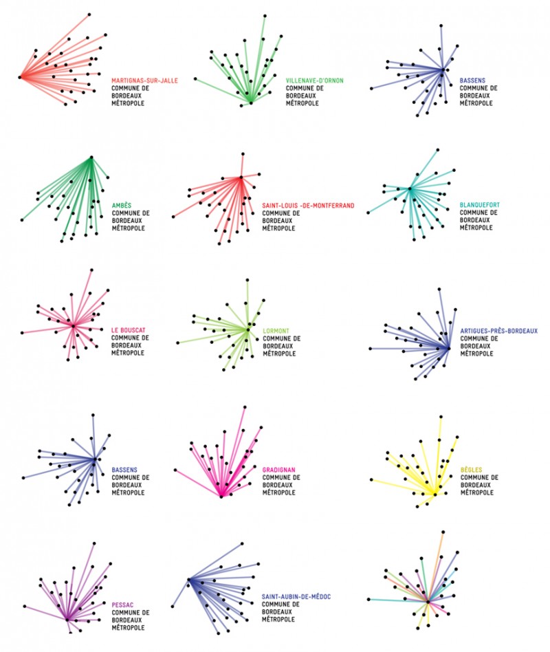
Despite these differences, the logos retain a cohesive identity, visually uniting the entire metropolis while allowing each region to maintain its distinct representation.
The Scientific Appeal of Dynamic Logos
Dynamic logos captivate audiences not just through creativity but also due to fundamental principles of human cognition and perception. Humans are naturally drawn to movement and change. This preference is rooted in evolutionary survival mechanisms, as our brains are wired to detect movement as a means of identifying potential threats or opportunities in our environment.
People remember moving objects over static ones. Studies in sensory processing indicate the more senses engaged, the more memorable an experience becomes. A logo incorporating movement, transformation, or even sound activates multiple neural pathways, reinforcing brand recognition and recall. All this to say that the more senses are involved, the more memorable a brand becomes over its competitors.
Furthermore, humans are inherently attracted to novelty. The brain’s reward system, particularly the dopaminergic pathways, responds positively to new stimuli, making subtle variations of a familiar logo more engaging. This phenomenon explains why brands that introduce evolving or adaptive logos maintain consumer interest and foster stronger emotional connections.
How Dynamic Logos Benefit Brands
There are endless ways dynamic logos benefit brands. Brand consistency has always been drilled into the heads of marketers, but dynamic logos offer a new way to create something new to cut through the noise of the competition.
- Scaling effectively: A dynamic logo should be effective across all sizes and mediums, from app icons to billboards. Nike’s swoosh remains recognizable whether on a sneaker or a massive outdoor ad, proving the power of a well-designed, adaptable logo.
- Enhancing brand recall: The effect of novelty and consistency across platforms enhances recognition. Dynamic logos invite interaction and curiosity, which encourages audiences to engage deeply with the brand.
- Demonstrating versatility: Businesses that offer different uses for their products and services benefit from a dynamic logo by representing the ways it can be used. A great example is MasterCard’s transformations into various activities where clients can use the card to access leisure.
- Personalizing branding: Local elements can be added to adapt the logo to fit cultural nuances to reach audiences across different regions. This is why a Google Doodle in one country may be different in another when viewed at the same time. Personalized logos make the audience feel the brand understands them, which enhances patronization.
- Staying relevant: Maintaining relevance is paramount in a world where digital content is consumed rapidly. Dynamic logos can be updated to align with trending topics, seasonal events or cultural moments, ensuring the brand remains pertinent and top-of-mind for its audience.
What to Consider When Creating Dynamic Logos
Movement, novelty and colors are not the only things to think of when transforming static logos into fluid ones. There’s more that goes into the planning. Here are things to consider.
1. Maintain Core Identity
While dynamic logos allow for flexibility, maintaining core design elements is crucial for brand recognition. Consistently using specific colors, shapes, or typography provides a stable foundation, ensuring the brand remains identifiable even amid variations.
If preserving shape is the priority, consider Apple’s approach — its iconic form remains recognizable despite changes in color or slight modifications. Similarly, Nike’s swoosh remains memorable, even when patterns or colors are altered.
For brands emphasizing color, Google is a prime example. It consistently incorporates its signature blue, red, yellow, and green hues across various iterations, including dots and abstract shapes, seamlessly extending into its G-Suite services while maintaining brand identity.

2. Align With Brand Values
Changes to a static logo are not random. Rather, they’re thoughtful changes curated to align with the brand. Each variation of the dynamic logo should reflect the brand’s core values and messaging. Ensure that adaptations are meaningful and resonate with the intended audience, reinforcing the brand’s identity.
3. Test Across Platforms
Given the multitude of digital platforms nowadays, it’s vital to test how dynamic logos perform across various mediums. With more than 54% of today’s internet traffic coming from mobile phones, it’s simply smart for designers to cater to this audience.
Ensure the logo maintains its integrity and appeal, whether viewed on a mobile device, desktop, or digital billboard.
4. Consider Cultural Sensitivities
When adapting logos for global audiences, it’s crucial to consider cultural nuances and interpretations. Colors, symbols, and themes acceptable in one culture may carry different meanings in another, making thorough research essential to avoid missteps.
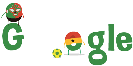
A notable example is Google’s 2014 World Cup Doodle, where an incorrect flag was initially used for one of its characters. Fans quickly pointed out the mistake — the Ghanaian flag had been mistakenly included instead of Cameroon’s.
In response, Google promptly corrected the design, demonstrating the importance of cultural accuracy in branding.
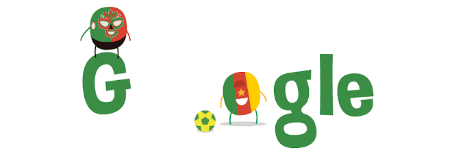
Google managed to diffuse the situation with humor, tweeting an apology that included a pun — “P.S. Thanks to our followers for pointing out the graphical error in our Mexico vs. Cameroon Doodle. We’re not Ghana let it happen again.”
However, not all audiences are as forgiving, and not every brand can recover as easily from such mistakes. This highlights the importance of thorough research and accuracy in global branding to prevent missteps which could damage credibility or offend audiences.
Beyond Static: The Power of Dynamic Branding
Dynamic logos are becoming the next big thing in branding as a fresh and flexible way for businesses to stand out online. With the right dynamic elements, brands can grab attention by showcasing their creativity to connect with audiences from across the globe. As with any branding strategy, it’s essential to balance innovation with consistency to ensure the brand’s core identity remains recognizable and trustworthy.

Leave a Comment