Choosing one winner for the Designerly Award amongst the millions of websites online isn’t an easy task. It often boils down to finding something with a little extra edge. This month’s winner is from a small southern Indiana eatery: The Exchange Pub+Kitchen.
Our focus for the month is on mobile-responsiveness. While we chose the winner based on the overall design, how well the site translated on a small screen played into our decision.
According to StatCounter, about 52.95% of internet traffic comes from mobile devices. Although the numbers vary by region, the mix of desktop browsers and mobile searchers are about even. A well-designed site considers mobile users and makes sure the site functions well no matter how people access it.
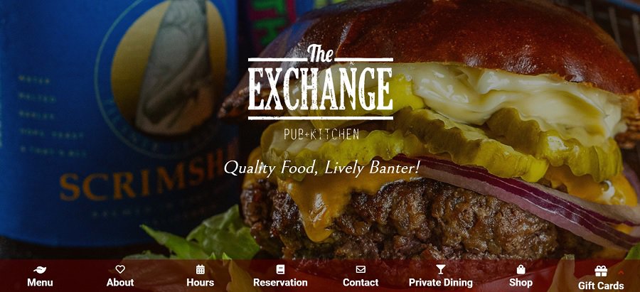
This month’s Designerly Award goes to The Exchange Pub+Kitchen for their sleek style that translates well on mobile devices. The restaurant is known for its gourmet offerings and seasonal menus.
The restaurant’s location is in New Albany, Indiana, in a historical building once home to Shrader’s Stable. The building is well over 100 years old, and the building’s design is as close to the original as possible, with some obvious upgrades for patron comfort.
They showcase some photos of the inside of their establishment, including the garage-style doors, which they open during warm weather to extend the interior. Images highlight both the inside and outside of the old building.
Why We Chose Them for the Award
In addition to celebrating small businesses here at Designerly, we love the mobile version of the site just as much as the desktop view.

In addition to a mobile responsive design, The Exchange Pub+Kitchen website also features gorgeous photography. The focal point of the image is their food. Everything else fades into the background. The visuals send a strong message to site visitors.
Some other features of this site we recommend emulating:
- Navigation: The sticky nav bar is in an unusual spot at the bottom of the page, but it works since it remains fixed as the user scrolls down.
- Call to Action: The online ordering feature is set off away from the other elements and has a minimalistic look, highlighting it as a call to action for the user.
- Blog: The blog is highly informative, sharing insight into the chef and the restaurant. The storytelling helps potential customers feel connected.
The overall look of the site is visually pleasing. There’s a nice balance of white space. The webpage is also scrollable, giving snippets of info without overwhelming the reader.
What We Would Do Different
While we adore the site’s overall look and its functionality, the menu leaves much to be desired. It is small with no easy way to blow up the size, such as with a simple click.
If you own a restaurant, your online menu is one of the most essential features of your website. We would make the menu either a searchable section, its own page, or we would, at a minimum, make the image resizable to much larger proportions.
Since they frequently change their menu, we recommend a website page for their menu offerings, as they could easily edit it seasonally.
This website offers a lot of advantages from which you can learn. Your site visitors will appreciate beautiful imagery, a tantalizing blog and easy navigation.