Trying to uncover hidden gems across the internet to select our first winners isn’t an easy task. We set some pretty high standards for any site we feature as award-worthy. When we stumbled across the website for England’s royal family on our internet adventures, the page’s whole tone brought a smile. Not only are there beautiful images, but there is a warm love of country that is quite inspiring.
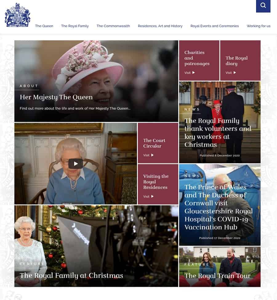
Fans of the Netflix series “The Crown” will appreciate the images of the queen and links to her life story. The page has an interactive element where pieces move in and out like puzzle bits as you scroll down the page.
The Royal Family

This month’s Designerly award goes to The Royal Family’s website. It’s probably no surprise they have a stellar design as they can afford the best graphic artists and experts in the world. However, many big corporations and governments websites don’t stack up to this one.
The website is set up like a magazine, featuring links to news, videos and updates. Other site areas include virtual tours of the royal residences and even information on working for the family.
The photographs on the site are rich with history and showcase dozens of photographer’s talents over the years. Part of the reason the pages are so aesthetically pleasing is due to the richness of the images.
Why We Chose Them for the Award
While we adore the beautiful photographs on the Royal Family website, what completely sold us was the parallax scrolling effect. Slowing down some parts of the page and speeding up others gives the entire site an interactive feel.
However, there are thousands of sites featuring parallax scrolling. The addition of online virtual tours adds such a beneficial element to people interested in information that it sold us even more on this particular design.
You can repeat this type of feature whether you sell real estate, give a tour of your factory or showcase your office building. A virtual tour brings the user inside the inner sanctum of any business and makes the viewer feel part of things.
Some of the things you can easily repeat on any type of website:
- News: Sharing your company’s core values pulls people in and makes them feel part of your business. Set up a press release page or update your site visitors with links to stories about your brand.
- Storytelling: Your business may not have the history of a monarchy, but you still have a tale that covers why you started your business and the challenges you’ve overcome. Set up a timeline of events, include old photographs and tap into people’s imaginations.
- Social Media: Tap into your social media accounts by sharing feeds on your website. For the Royal Family, they include posts from popular social media from members of the family. Utilizing several royals’ posts allows them to gather information from all over the internet and multiple households in one spot.
The grid layout of the site gives it a clean and uncluttered look. The designer didn’t just use the same size boxes, but varied sizes for a geometric look.
What We Would Do Different
There isn’t much to change about the design of the site. It works perfectly on many different levels, hitting all the marks of a well-designed website. Even the color palette embraces the overall feel of a regal design.
We noticed the contact button is not in the main navigation bar at the top of the page. Trust factors may not be quite as necessary for royalty as they are for a business website.
We highly recommend companies include contact information near the top of the page, so users have an added level of trust they can get in touch with you if something goes wrong.
We hope you enjoy browsing through the Royal Family website as much as we did. Finding inspiration should be relatively easy, whether you study the color palette, typography, the layout or the scrolling effects.


