Whether you’ve designed sites for a long time or are just beginning, there are some standard parts of a website that make it function at optimum capacity. While some companies get by with losing navigation or other features, most businesses benefit by sticking to what users expect when they land on a page.
The last couple of years have been particularly challenging for small business owners. Statista reported a 32% increase in online sales immediately following COVID-19 knocking the world to its knees. People adapted and have embraced online ordering, pickup and delivery options.
What does that mean for business owners? Now, more than ever before, an excellent website presence is a must. Your website needs to offer all the correct parts in the right location to create an excellent customer experience.
Here are the key parts of a website built to draw in customers. We’ll also offer tips along the way for how to make the most of each area.
1. Header
The first thing people see when they land on your website is your header information. Even if you’re going for a seamless look, there are still some things users expect to see near the top of your page, such as your menu and your logo or name.
The header appears throughout your site, serving as a sort of placeholder people know they can return to when they need a quick move to another part of your website. For example, if they land on a page unrelated to what they’re looking for, they can click the logo and return to home.

Aston makes their hero image part of their header. However, they go with a traditional placement for the logo in the upper left corner. Integrating the header so it is a seamless part of the overall design gives the page a modern edge.
2. Menu or Navigation
People expect a certain structure to your site. Your navigation is a core component of how usable the pages are. About 80% of people say if they don’t like a website’s design, they’ll simply bounce to a competitor’s page.
Whether you choose a hamburger menu that expands, a mega menu with tons of detailing or a navigation bar, the key is to put it in a place people expect and keep consistent placement throughout your pages.
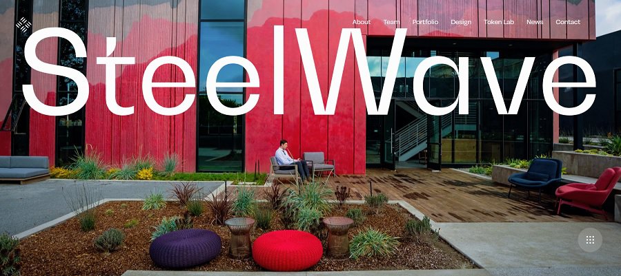
SteelWave places the navigation bar at the top of the page where visitors first look. They incorporate it with the wordmark logo, but it still matches customer expectations. Note how the nav bar stays in the position throughout the pages. The user always knows where to look to backtrack or go to other parts of a website.
3. Content
No matter what other trends change, content will always remain king. People come to your site to learn more about your products or industry. Excellent content keeps them coming back for more.
You can use your content on social media to draw new leads. Well-written content never goes out of style and is an asset that helps your business grow over time.
What you put on your pages matters. The body of your site is arguably one the most important parts of a website. Make sure you pay attention to the wording in your headers, the readability of your font and if the information matches reader expectations.
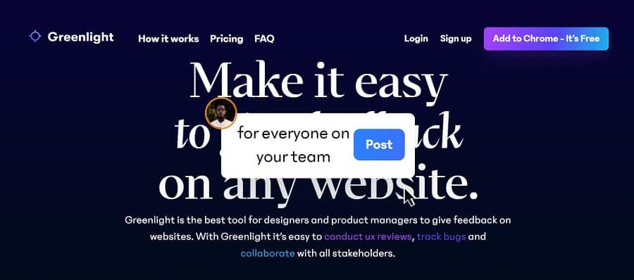
Greenlight uses a beautiful serif font for their headlines. In addition, they add some interactive animation to show how their product works for the average user. The content is simple and to the point but outlines the advantages of using their service.
4. Photos
Gone are the days of text-only websites with boring backgrounds. Today’s designers utilize images to create an aesthetically pleasing site. Some ideas include video backgrounds, images in the header and throughout the body of the content. Even illustrations to indicate different sections of your site add some powerful details to your design.
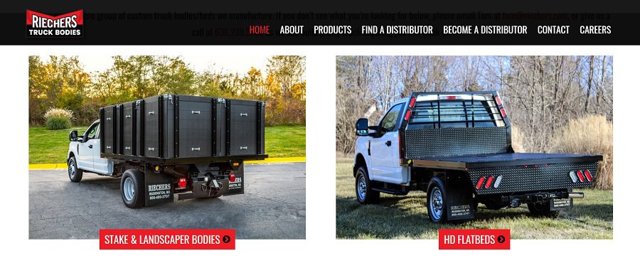
Note how Riechers Truck Body utilizes photos to showcase the different types of products they offer. The photos showcase truck beds and bodies so businesses utilizing their products can see what they’re capable of creating.
5. Footer
The footer is often overlooked, but can be a crucial part of a website. When people want to see who to contact or directions, they often zoom to the end of the page and check out the footer. It gets a lot more action than some designers realize.
Your footers should be one of the parts of your website that naturally meshes with the rest of the design. However, you also should add a bit more importance to it as it appears on every page.
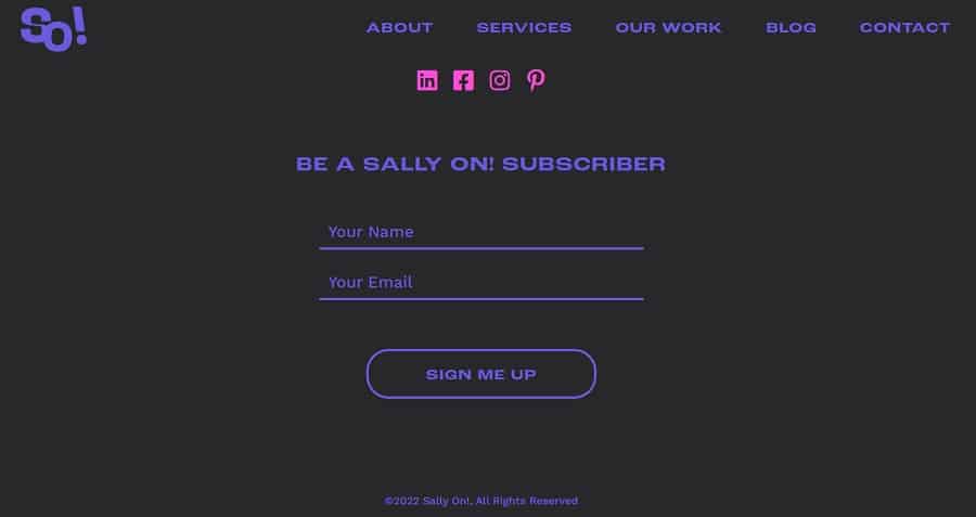
Sally On adds a sign up form to their footer. Capture site visitors and turn them into leads. They also add links to their social media pages.
6. Sidebar
Not every design utilizes a sidebar, but they can be quite effective to highlight specific features on your site. For example, an e-commerce site might utilize the sidebar to add filters for sizing, colors and other product specifications.

Furcoat uses the sidebar to showcase their models. Choose the one that looks most like you and your body type to see how the faux fur designs might look on you. The sidebar creates a gallery of choices for the consumer.
7. Features
Out of the various parts of a website, some things work to attract new visitors and keep them engaged. For example, you might add a survey, how-to video or calculator. Whenever you can solve a problem and make your site useful, you’ll increase attention and conversion rates.
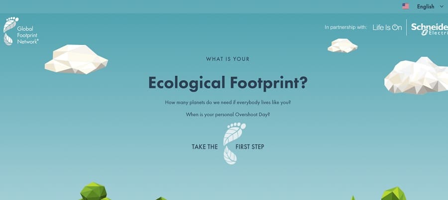
The Global Footprint Network offers a carbon footprint calculator so people can see their impact on the environment. You’ve likely seen similar features on mortgage websites. A useful tool helps attract new users.
Favorite Parts of a Website
Designers often have a favorite website part they excel at. Perhaps you’re great at designing navigation bars or you write the most amazing content on the planet. The key is to be aware of the importance of all the sections and how they work together. With a bit of work, the entire site will hum in harmony and meet user needs.
About The Author
Eleanor Hecks is the Editor-in-Chief of Designerly Magazine, an online publication dedicated to providing in-depth content from the design and marketing industries. When she's not designing or writing code, you can find her exploring the outdoors with her husband and dog in their RV, burning calories at a local Zumba class, or curled up with a good book with her cats Gem and Cali.
You can find more of Eleanor's work at www.eleanorhecks.com.
