


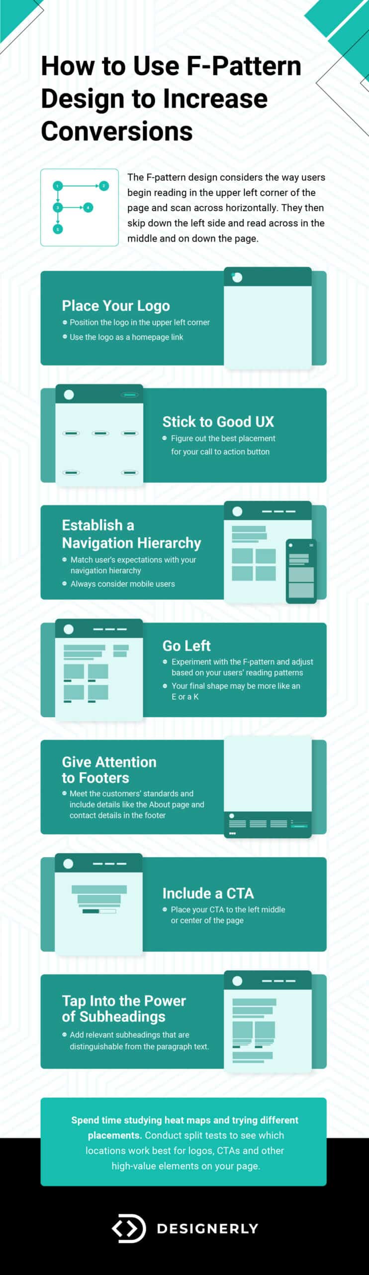
The F-pattern design considers the way users begin reading in the upper left corner of the page and scan across horizontally. They then skip down the left side and read across in the middle and on down the page. There are both pros and cons to F-pattern design.
An F-pattern design is probably one of the more popular ways to set up the layout of a website. You’ll also find Z-pattern quite frequently. Regardless of which style you choose, most readers start in the same spot when landing on a page, so vital elements must go in that position to help establish your brand and the purpose of your page.
F-Pattern Reading and Studies on Human Eye Scanning
Nielsen Norman Group claims to be the first place to identify the pattern related to web pages and phone screens back in 2006. They point out there are far more patterns than just the F-pattern design, and it may not be the most desirable one.
That said, knowing the reading hierarchy on your site and how your particular audience responds allows you to hit the high notes where you need and increase conversions. Every page has a different purpose and what works well for one brand might not work at all for another.
Knowing how the human eye scans across the top of the page, drops down and scans across again allows you to put the highlights where people are most likely to look for them. If your heat maps show your readers use an F-pattern, here are some ways to tap into the knowledge and make a lasting impact.
1. Place Your Logo
Since most English-speaking readers start their journey on your page in the upper left corner, this is the ideal location for your logo. Your logo brands your page and shows the user what your business is about. When you put it in the same location on every page, you create consistency for the reader. People know what to expect in your header no matter where they move within your site.
You can also use the symbol as a homepage link. No matter where the person lands on your site, they can click the logo and go back home. Even if they aren’t reading in an F-pattern design, they will likely start in the upper left.
When they see your logo, and ideally your brand colors, first, they remember who you are and what you do. They also see you’re a real company with a professional design. They’re more likely to spend their money if they trust you. Brand recognition plays a rule in trust.
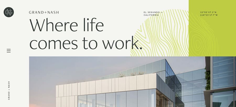
Grand + Nash adds their logo in the upper left corner. When you hover over the logo, it turns into a circle with a home symbol to indicate you can click on it as a navigational tool. The logo placement and interactive design set the tone of the rest of the page’s design.
Although the logo is black and white, it has a modern, geometric look that ties into the brand and enhances the rest of the color palette. Even the hero image ties into the overall color scheme.
2. Stick to Good UX
About 80% of people who feel dissatisfied with your site will turn to a competitor’s page. The laws of user experience (UX) state you should create a user-centered design that meets expectations. People read in specific patterns, so being aware of them while making your site means your page will be more usable.
Knowing how the eye moves in F-pattern design allows you to place the most vital info where users can access it easily. Think about the goal of the page. Why are people most likely to visit you? How can you make it almost effortless to perform an action that converts them from browsers to leads?
You have to figure out the best placement for your call to action button, where contact info goes and how soon people want to learn more about your brand or a product. If your goal is to convert visitors into subscribers, place your newsletter call to action button where your heat maps show they spend the most time on your landing page.
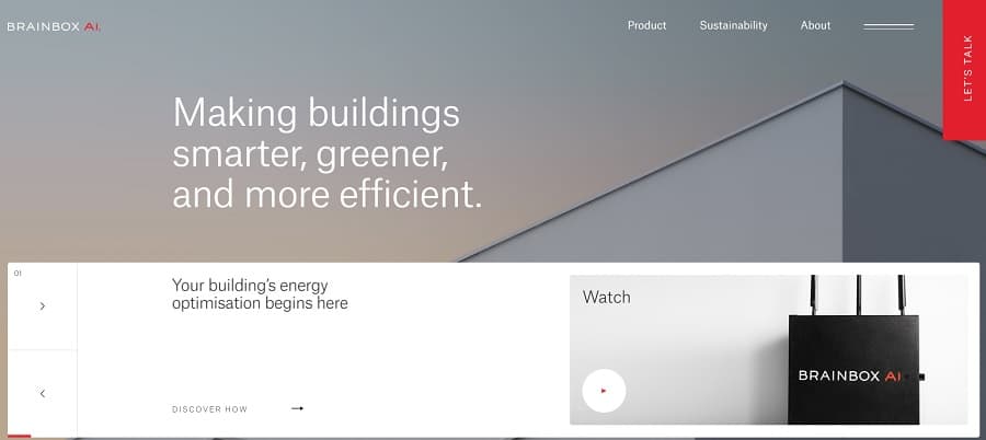
Brainbox AI places their CTA in the upper right corner of the page. The user’s eye drifts from left to right, and the pop of red grabs attention. if someone needs more info, there is a video and additional details below. However, if they are ready to talk to the company, the CTA is easy to locate and resides above the fold on the top line of the F-pattern.
3. Establish a Navigation Hierarchy
There is a reason the majority of websites have a top horizontal navigation bar. Not only do users expect your menu to appear near the location, but it matches the way they read through a page in an F-pattern design. Most readers of all languages start at the top of your site and scan across before moving downward.
The navigational hierarchy establishes what information is most important on your website and where to find it. Limit the options to four or five. Think about the categories users click on most frequently and reduce the choices to a handful. Anything else becomes a subcategory. Mega menus and expandable features allow you to tuck away things that aren’t as popular and highlight others.
Don’t forget that many of your users will access your site via mobile devices. Are there too many menu items to fit across a smaller screen? How does a hamburger menu work on a smaller screen? Be aware of the different ways people access your website and how their devices impact their reading patterns.

Hunter Yeany’s website is a great example of limiting the number of categories in your menu hierarchy. There are only five possible options:
- Home
- Events
- Partners
- About
- Contact
By narrowing the options to a handful, the user experience ramps up a notch. There’s no need to hunt through piles of information. People can go right to what they want to know. If they want to see him in action, they click on events. If they need information that isn’t readily available, they can click on the Contact button and ask.
4. Go Left
Do you always have to put your menu across the top and logo in the upper left corner? Of course not. Simply knowing user expectations and the pattern they read allows you to think outside the box. Place your logo in the middle, for example.
It’s okay to add a pop of color where the eye doesn’t naturally travel to grab attention, for example. F-pattern design doesn’t dictate everything is in the shape of an “F.” Instead, it gives you a blueprint for where vital elements should go and an idea of how to grab attention away from those areas when needed.
Your final shape may be more like an E or a K. It’s alright to deviate a little. Understanding natural reading patterns shows when you need to make something bigger, bolder or animated to grab attention away from typical viewing habits.
In addition to using bright pops of color, you might wish to incorporate an analogous color scheme into this type of design. Choose colors next to one another on the color wheel. However, you can also vary perception with different analogous shades select a muted green and vivid blue to draw user attention where you want it to go.
While people do tend to look to the top of the page for the navigation, they also know it is sometimes located on the side near the top. it’s okay to mix things up and see how users respond. You can always revert to a more traditional placement if having the menu on the side isn’t working well with your target audience. Conduct some split testing to see which placement users respond to best.
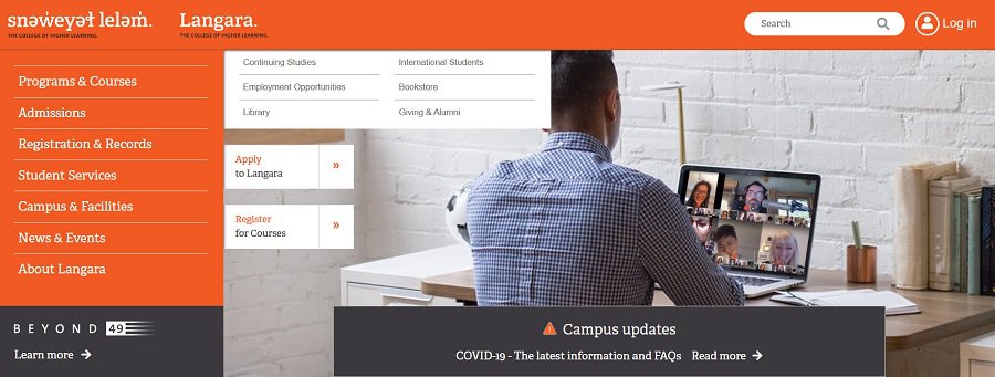
Case Study: Langara College
Langara College places their menu on the left and keeps their logo and a search feature across the top. It’s clear they are using an F-pattern, but they haven’t limited themselves to only placing a horizontal nav bar on the page. The orange background draws the eye and shows where the nav bar is.
The image in the center sets the tone but they stay away from any bright pops of color. The user naturally moves to the top and side because of the vivid orange hue.
5. Give Attention to Footers
If you’re using an F-pattern design, should you ignore the footers? The reason people read in an F-pattern is to save time. Users scroll across the page, skip down, scroll across and skip down. People expect some details to always be in the footer, such as a link to an About page and contact details. They may even hit Ctrl + End to get to the bottom quicker and the links they know they need most.
People often go back and read things more carefully if you’ve engaged them fully. Your footer is an opportunity to share details you didn’t have room for in the F.
There may be details not vital to decision-making but are still important such as how to contact you or the history of your company. Think about what you’d like to share in your footer and what information is of secondary importance to users deciding to buy from you.

Karalyte does a brilliant job with their footer. They make it longer than most traditional ones. They add links to their main categories, Links to brand strategy tools and then on the right is a big CTA to try to get users to sign up for their email list and get tips. Even the image grabs attention and highlights a separation between the form and the links.
Note the small social media icons in the lower left. Social is a growing medium and an excellent way to stay in touch with your users. Adding links to your social media presence is a smart move that adds to the trust factors of your site and also helps you engage readers. When people follow you, their friends and family may be more likely to check out your social media pages, expanding your reach.
6. Include a CTA
The call to action (CTA) is one of the essential elements of a high-converting landing page. It tells the user what movement to take and how to enter the buyer’s journey. Since you understand the way your visitors glance across and down your page, you’ll understand the key locations a button might work best.
Place your CTA to the left middle or center of the page, for example. Study heatmaps to see where people spend the most time on your page and put your CTA in a hot location. Make the button larger and brighter than the rest of the page.
Color scheme becomes crucially important when placing a CTA button. You can break a reading pattern by grabbing user attention with animation, bold colors or large elements. Even the text you use on your CTA might pull readers to a different location.
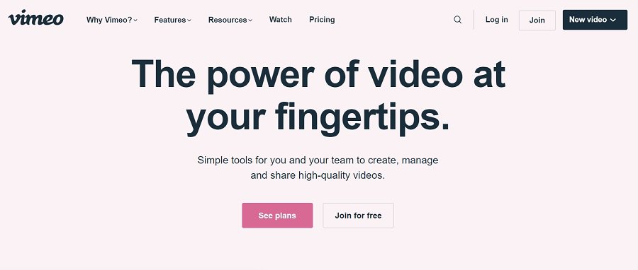
Vimeo places their call to action buttons across the second line of the F. This makes them both pop and draws the eye to their location. It’s clear you have options across the first line for navigation, but the next thing the user sees is the CTA.
They stick with a pink color palette, but the CTA is a deep, rose color. It draws attention because it’s different than everything else in that area.
Some experts say CTAs should be above the fold. Others say below after the user reads all the info. The truth is likely somewhere in the middle. You can place the same CTA in multiple locations on your page, so it gets noticed no matter where the user scrolls. You could also place it across the top of the F and make it sticky so it moves when the reader does.
7. Tap Into the Power of Subheadings
You’ve probably heard SEO experts talk about the importance of adding relevant subheadings to your text but F-pattern knowledge explains the importance of a bolder line that draws the eye. Think of an F with multiple lines instead of only two. Each subheading represents another line the reader glances across before going back to the left and moving down to the next line.
People today tend to be busy. They’d much rather skim over an article and get the gist of it, going back to read more detail if something interests them. When you utilize subheadings, you give them an opportunity to absorb the information quickly and efficiently.
If you’re unsure what type of headings to use, pay attention to the top ranking articles in search engine results pages for your keyword targets. What do their headings look like? What language do they use? How many do they have? Break down every element and learn how to present subheadings in smarter ways that bring results.
Test Your Theories
While an F-pattern design works well for many different industries, you may find your users read in a Z-pattern or some other method. Spend time studying heat maps and trying different placements. Conduct split tests to see which locations work best for logos, CTAs and other high-value elements on your page.

Leave a Comment