


In This Article
Trends come and go from season to season. One thing that never goes out of style is classic, minimalistic design. You can also use a simple, beautiful website to showcase the latest trends here and there without changing the underlying look of your pages.
There are approximately 1.8 billion websites in the world. To grab the attention of users, you must compete against all the other brilliantly designed sites, social media, texts, phone calls, in-person conversations and a million other little things. A stellar site is your chance to stand out.
Minimalism forces you to put the focus on your design and the goal of each page. If you love the minimalist look, there are numerous things to keep in mind that create an amazing user experience (UX). Here are our favorite simple beautiful website must-haves.
1. Select a Limited Color Palette
Nielsen Norman Group looked at 112 minimalist websites and found 95% of the sites featured monochromatic or limited colors. Simple websites stick to one color in various shades. They might also go with neutrals, such as black and white, and then add a single pop of color to draw attention.
You will rarely see bold colors with this style. Earthy tones, muted colors and neutral shades rule the day. If there is a pop of color, it is quite limited. You might see a button in a vivid hue, for example.
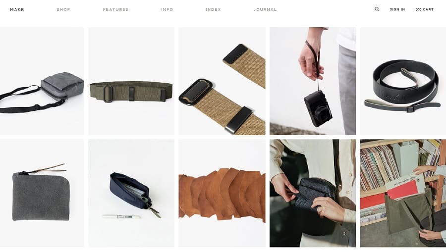
MAKR is a design studio creating goods from natural materials such as leather. The simple grid layout of their design utilizes colors you’d find in nature with a black and white palette. Note how the images within each box tend to use earth tones. Only one image has a pop of color to grab attention and break up the monotony a bit.
2. Find Flat Patterns
Most minimalist websites turn to flat patterns and textures. You won’t see three-dimensional features or anything to distract from the main purpose of the site.
A few years ago, flat icons were all the rage and inspired by minimalist design. However, today you might see similar illustrations and photos to keep websites basic but gorgeous.
3. Limit Features
A beautiful and simple website doesn’t have loads of features or ways for the user to engage with the site. Instead, the focus is on one or two amazing offers. The minimalist designer fully understands the purpose of the page and seeks to push the user through the sales funnel in a singular direction.
Consider only what you must have to create an effective site, such as navigation and a call to action (CTA) button. Keep your design uncomplicated so the focus remains on the elements that are there.
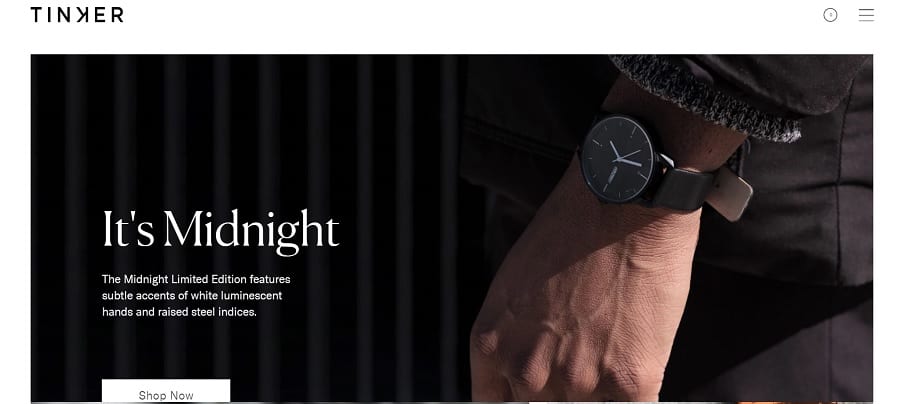
Tinker Watches sticks to a monochromatic color scheme. Their navigation offers only the bare minimum, and they have a single CTA button above the fold. Even the images on the landing page are honed in on the watches and nothing else.
The website designer cut any additional elements. When someone lands on their site, they know what the brand sells and can focus on a limited selection to get right to what they want. There are no distractions.
4. Use Big, Beautiful Images
One thing that makes sites gorgeous is the photographs used. When you limit the number of items on a website, people will naturally gravitate to the visuals.
There is an old saying that a picture is worth 1,000 words. It’s true you can say a lot more with an image than words alone. People also retain information better when you add relevant photos to your message.
However, smartphone screens and computer monitors have much higher resolution than ever before. If you want to grab attention, you must use crisp, sharp images that tell a story. At the same time, avoid busy photos with a lot of unnecessary noise.
5. Embrace White Space
Minimalistic design embraces negative space. Don’t feel you have to fill every section on the page to make the most of the space.
White space gives the human eye a break from all the noise. It can be used to draw attention to a boxed section or invite the user to scroll down the page to the next action.
Consider adding as much white space as possible to help you cut anything you don’t need.
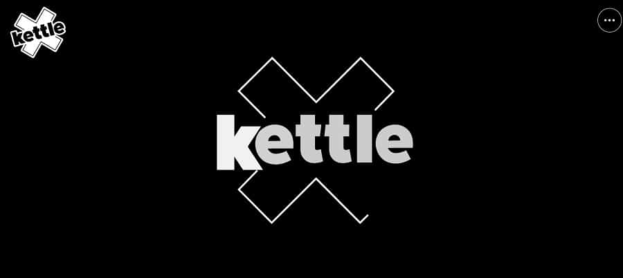
Kettle features a ton of negative space. When you first land on their page, you see the logo in the upper left corner, a hamburger menu in the upper right and an animated graphic that segues into an image.
The purpose of the site is clear and to the point. They are an agency working on various projects and highlight some of those without going into so much detail the user grows confused. There isn’t anything to distract the site visitor from the purpose of the page.
6. Add Amazing Typography
Once you embrace negative space and limit the number of elements on a page, you have room to get a bit more creative with the fonts you use. One thing most simple, beautiful websites have in common is the use of amazing typography.
Perhaps you create a hand drawn font specifically for the brand. There are also a ton of useful fonts available you can tap into. Many companies now use animated typography to draw attention to vital headlines and information.
7. Keep CTAs on Topic
Your calls to action (CTAs) should focus on the exact action you want users to take without a lot of added bells and whistles. You want the button to mesh with the rest of your design but also grab user attention.
If you’re already utilizing a minimalistic design, you want to keep your CTA button simple as well. You can set it off with animation, bolder text or the words you use. You should leave enough white space around your CTA to show it is something special set aside from other elements.
Make sure the language you choose makes sense for the goal of the page. Action verbs and first or second-person wording works particularly well for most CTAs.
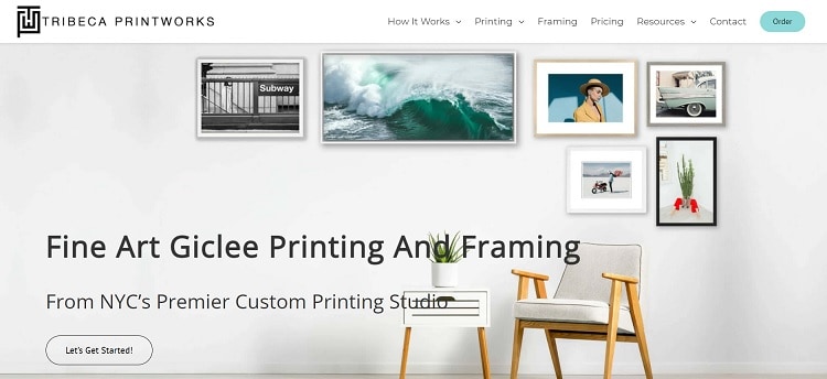
Tribeca Printworks uses a minimalist design. Even the photo in their hero image embraces simple lines and uncluttered décor. The CTA button is also a basic oval outline with the words “Let’s Get Started!” It’s clear what happens if the user clicks on the button. There isn’t any subterfuge or confusion over what happens next.
8. Choose a Grid Layout
Most simple, beautiful designs utilize a grid layout. This keeps everything neat and within its own space. It also allows you to add additional white areas between boxes.
While a grid layout works well for minimalistic design, you can also choose geometric shapes and still keep things basic. For example, you might have triangular boxes that sit next to one another.
Think of your layout like a puzzle. You want pieces without anything and pieces with one element each.
What is the hierarchy of your website’s navigation? When users land on your site, do they know how to get back to the home page? Is it clear what subcategories belong under what categories?
If you serve more than one buyer persona, you may also need to filter site visitors to different areas. When people arrive, do they know what to do next? Is it clear what areas serve what needs? How can you make it simpler for your visitors so they know where to go to get the information they need?
You should also include a search feature. People sometimes want a specific product or information but aren’t sure what category it appears under. By allowing them to look via keywords, you make it easier and faster for them to get to what they want.
10. Cut Clutter
Over time, it’s easy to add more and more to your website. After all, you want to ensure your site visitors have all the information needed to make an informed decision.
However, most site visitors only look at a couple of things on your page. You can see where they spend the most time by studying heatmaps and tracking clickthroughs. Anything that doesn’t grab their attention may need cut from your page.
Consider the goal of each page. Does each item point the user toward the objective? Does anything distract from the purpose? Cut anything not moving them smoothly through the sales funnel. Only add things when absolutely necessary.
11. Test Your Site
For customers to truly enjoy your website, everything must function as intended. Spend time clicking through each link and testing all forms and features. Does everything work the way you intended?
Pull your site up on different screen sizes and make sure it looks the same on mobile as it does on desktop. What if someone is colorblind? How does the site translate for them? Are any colors blending into one another and creating unrecognizable globs of grey?
Look at everything through the eyes of your user. Make any changes needed for your site to appear the way you want.
Is Your Website Beautiful?
How can you know if your simple, beautiful website design works for your users? Start by running some split tests. Try different layouts and elements and see which your audience responds best to.
You should also survey your regular customers. Is your site lacking anything? Do heat maps show people aren’t using a particular section on your landing page?
In an ideal world, you will constantly change and revamp your site little by little until you hit the perfect mix for the time being. A beautiful site is one that works for your users and meets the objectives you have for your brand.


Leave a Comment