Top 6 Creative Food Websites Examples

Posted on June 2, 2021 | Updated on March 29, 2022
Food websites draw vast numbers of site visitors and provide entertainment for the masses. Budding home chefs love to see what creations others come up with and spend hours online viewing unique food designs for entertainment. In addition, creative food websites offer an opportunity for fun and learning.
The past year was particularly challenging for food professionals. Many restaurants closed their doors, and others had to find unexpected ways to increase revenue streams. The State of the Restaurant Industry Report shows about 68% of consumers are more likely to order takeout than pre-pandemic.
Whether you own a restaurant or enjoy sharing your most exciting food creations, having a creative food website helps draw new eyes to your abilities. If you tie your restaurant to a website, you may attract a new local clientele you never reached before.
Food connoisseurs must embrace the unusual and find a specific niche. We’ve scoured the internet and found some favorite examples of creative food websites everyone will love. Then, we break down what makes each design work so well and how you can implement similar elements into your site.
1. Highlight Your Personality
Whether you run a food blog, host a television show, or own a restaurant, you are the voice of your brand. Include an About page and highlight your personality on your website. People want someone they can relate to, especially when it comes to unique food options. So give them the backstory and share what’s special about you.
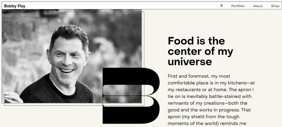
What list of creative food websites would be complete without a nod to the fantastic Bobby Flay? The chef, restaurant owner, and television personality seems to be everywhere food-related. The landing page features his photo and a summary of his biography.
On the off chance someone hasn’t heard of the chef, they get to know him immediately through his own words and the story of his life.
2. Add Animation
If you want to engage users from the minute they land on your website, animation adds interest and grabs attention. People’s internet connectivity is faster than ever before, allowing sites to rapidly stream videos and animated cartoons.
Where you might have avoided animated elements in the past to keep those on slower connections from growing frustrated, you can now confidently assume most people have access to high-speed internet or 5G potential.
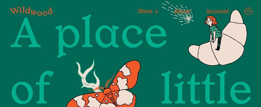
Wildwood Bakery shows its whimsical side with animated croissants and a butterfly on the landing page. The eye goes to the elements, and the user scrolls down to see what else might be moving on the page.
Creative food websites must embrace the personality of the brand. Not every product lends itself to animation, but a bakery is the perfect place to highlight a bit of childlike wonder.
3. Set a Video Background
Videos are effective at getting your point across without using a lot of words. People tend to remember what they see in a video. Utilize your hero image section to add a short clip on a loop and grab attention.
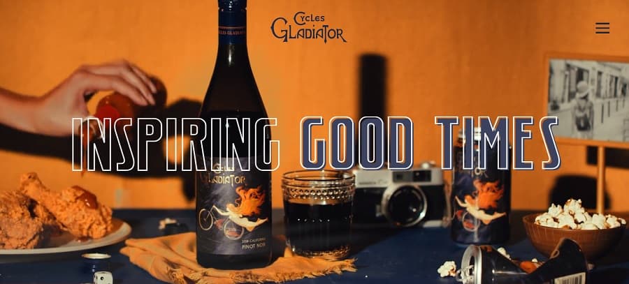
Cycles Gladiator sets the scene with a video background in place of a hero image. They showcase their product in the setting and use just a tiny part of the screen to add movement. The result is a fun, modern vibe for creative food websites.
4. Focus on Vintage
Does your company have a long history or tie into yesteryear? Although the different styles come and go, a retro look grabs user interest and reminds people you’ve been in business for a long time.
You can add just a few elements or make the entire look tie into the theme. The key to a great vintage food website example is utilizing modern design elements but making them look like they’re from the past.
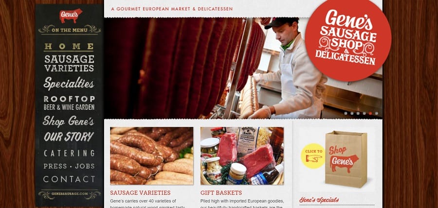
Another of our favorite creative food websites is Gene’s Sausage Shop & Delicatessen. Two Polish brothers started the sausage shop in 1972, so adding some retro flourishes in the logo and the navigational bar helps give the site an old-time feel.
Note the fonts used and how they vary to give the design a handwritten look. While the fonts and images create a vintage feel, the site still features modern design elements, such as lines appearing on mouse overs.
5. Keep Navigation Simple
When people land on your website, you don’t want them to feel overwhelmed. Most look to the navigation bar to orient themselves with your site and figure out what you offer and where to go. Get rid of anything that doesn’t move the buyer into the sales funnel. Cut the clutter, reduce categories and keep your nav hierarchy as basic as possible.
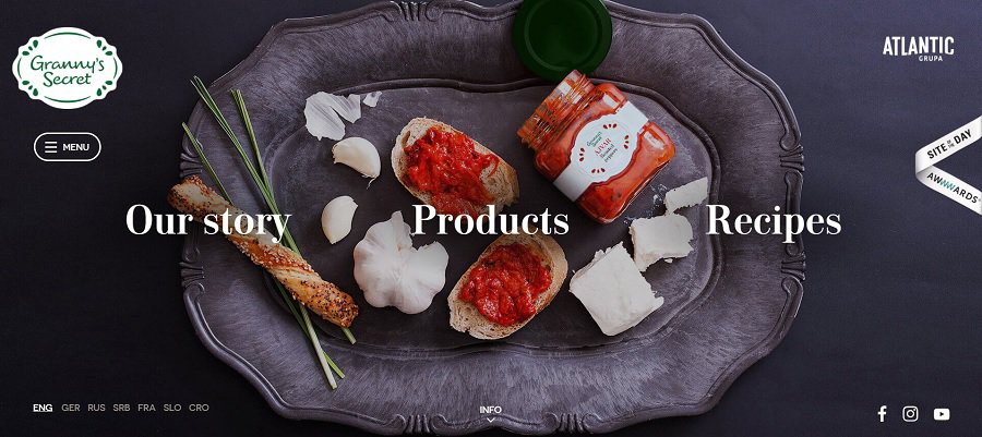
Granny’s Secret narrows the options down to three choices. Choose from “Our Story,” “Products,” or “Recipes.” As you mouse over each option, subtext slides up to let you know what you’ll find on the page.
6. Use Sharp Images
The photos you use on your creative food websites make a difference in how users see your brand. Choose only the best pictures possible and center them around a theme. If each image has a similar appearance, it ties everything together and gives your site an aesthetically pleasing feel.
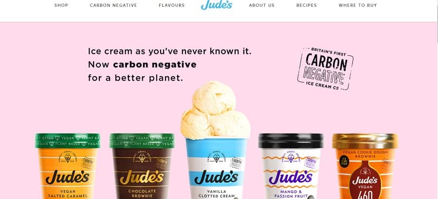
Look at the beautiful images on Jude’s website. When you land on the home page, you see a dish with some of their products featured. You see pops of turquoise, orange and green set on a light pink background.
Gain Inspiration
What are some of your favorite creative food website examples? You can find inspiration from restaurants, food bloggers and product pages. Take the best elements from each site you like and implement them on your website.