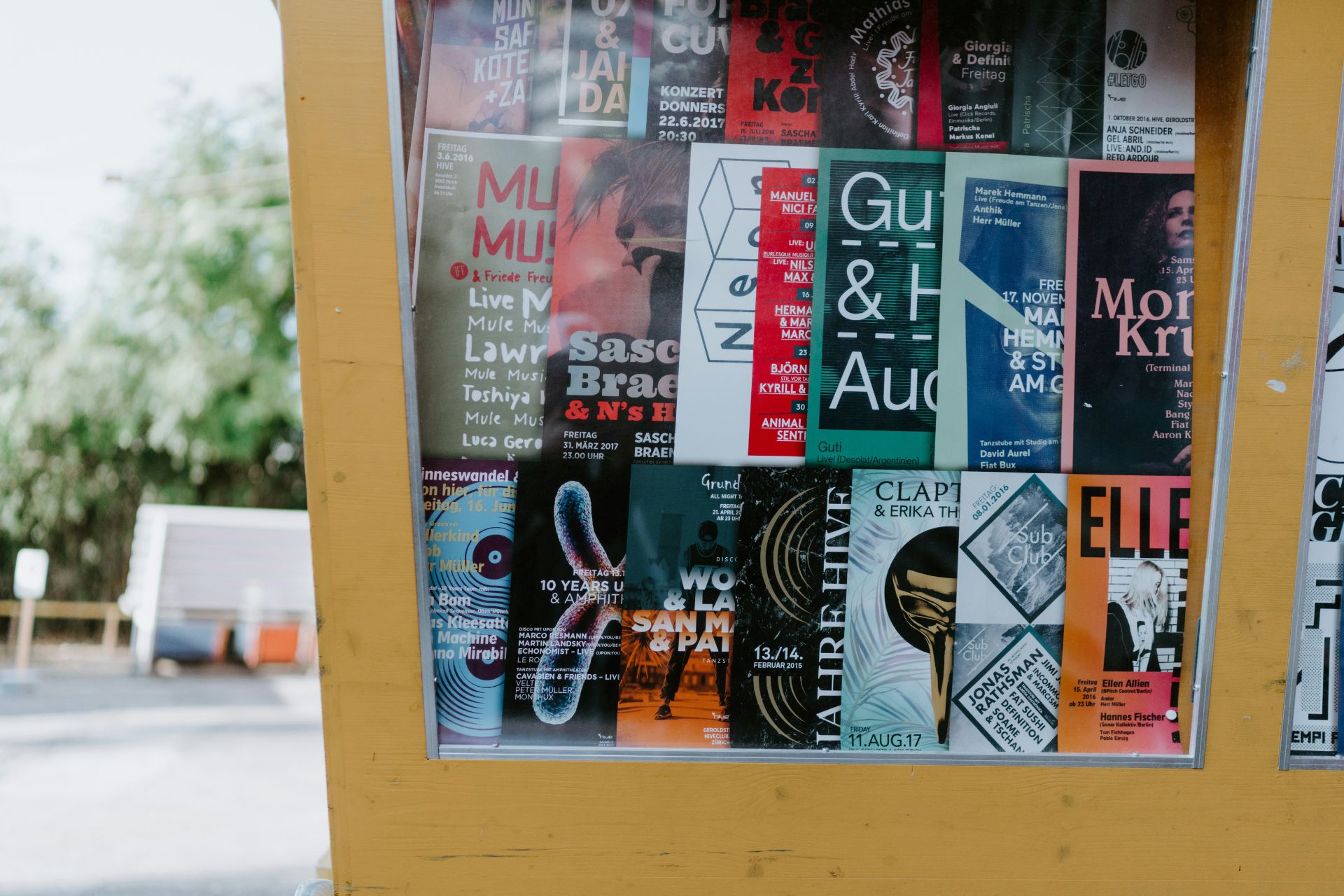
Effectively using color in marketing can be a complex, drawn-out process since there are many factors to consider. However, strategic use could result in a massive boost to sales. Here’s what color makes people want to buy.
How Does Color Influence People?
Most people have predetermined associations with color, so it influences them — even if they don’t realize it. In fact, up to 90% of a person’s impression about something comes from color. It’s why street signs and warning labels are almost always the same shade.
To put it in perspective, imagine how people would react if every stop sign were suddenly purple instead of red. Even though the message stays the same, they wouldn’t listen as well since they no longer tie it to danger and authority.
Color substantially impacts people’s everyday lives, so it’s relatively easy to use it for intentionally triggering emotional responses. Calling out specific subconscious associations makes them react in certain ways. With enough careful consideration and strategy, marketing professionals can get the exact reaction they want.
Can Colors Influence Purchasing Decisions?
Yes, colors can influence purchasing decisions. They create emotional and psychological reactions in consumers, potentially making them more likely to buy something. In fact, around 93% of people make purchasing decisions based solely on color.
This fact is crucial, considering people make up their minds about something incredibly quickly. It only takes as much as 10 seconds for a person to decide what their impression of a product is. If they feel a specific feeling when looking at it, they’re more likely to associate that emotion with it.
Using color to trigger particular emotional responses can shape people’s perceptions of a brand and its products. If they think of things like value, security, content, or trust, they’ll believe their item must embody those concepts. Essentially, if a marketing campaign picks the right colors, they dramatically increase the chances of a sale.
What Color Makes People Want to Buy?
It’s challenging to definitively say what color makes people want to buy a product because the answer is complex. Firstly, a brand’s industry heavily impacts how its consumers will react. People buying something from a nature-centric business will prefer cool and neutral colors, while those getting fast food will like vibrant and intense hues.
Additionally, even color psychology isn’t some concrete concept. Cultures often have extremely different associations, impacting how marketing affects them. For example, people in the United States think red represents danger and passion, while those in China believe it stands for longevity and prosperity.
Color combinations play a more minor role, but they’re still important. Particular pairings can heighten the emotional impact of a marketing campaign. For example, sale signs often use red and yellow to create a sense of urgency and impulse. If professionals use color psychology and associations to their advantage, they can create powerful pairings.
How Does Each Color Impact Buying Behavior?
Each color impacts buying behavior in different ways. To find out what color makes people want to buy, it’s essential to know each shade’s psychology and standard associations.
What color makes people want to buy a product immediately? The answer is red. In most cultures, it creates intense feelings like urgency, passion, hostility, romance, longevity, and hunger. It also doesn’t naturally occur in the environment very often, making it the best option to influence purchasing behavior.
1. Red

After immediately drawing attention, it stirs up powerful emotions. It doesn’t matter if they’re positive or negative since the point is to create a strong psychological response. Consumers will associate their reaction with the product, making them want to buy it.
2. Orange
While orange is very similar to red, it’s generally more positive. It has an air of excitement, motivation, energeticism, and happiness. Since consumers believe orange represents cheapness, many marketers use it to make a sale feel more valuable than it is.

Orange isn’t as popular as red, but it has the same level of intensity. Marketing campaigns can take advantage of this to create a unique psychological reaction in the viewer. If someone feels a strong emotional connection to something — whether positive or negative — they’re more likely to engage with it.
3. Yellow
Yellow is the best supporting color for making people want to buy products. It conveys feelings of cheer, anxiety, impulse, surprise, competitiveness, and optimism. In marketing, these emotions translate to a sense of urgency and drive.

When people fear missing out or sense they must act quickly, they feel compelled to make a purchase. While yellow can be overwhelming on its own, using it strategically in marketing can drive engagement and boost sales.
4. Green
Green elicits feelings of relaxation, prosperity, decisiveness, safety, and loyalty. Since it’s such a common color in nature, it can also feel grounding and secure. Plus, the rise of environmental awareness in recent years has caused people to associate it with higher-end products.

Although green isn’t the best color for creating urgency in marketing, it can still dramatically impact sales. If people associate loyalty and decisiveness with a product, they’re much more likely to feel compelled to buy it. This idea is especially true for brands that have a connection to finance, nature, or cybersecurity.
5. Blue
Blue conveys positive emotions across all cultures — it’s one of the few colors that does so. It brings up feelings of peace, solemnity, confidence, tranquility, stability, trust, and optimism. It’s almost the exact opposite of red, so marketers should use it accordingly.

This color is among the best to use to incentivize buying behavior. Consumers are much more likely to want a product when they consider it valuable and trustworthy. Additionally, instead of rushing them toward checkout, it makes them feel secure in their purchases.
6. Violet
Violet represents extravagance, luxury, sensuality, creativity, importance, and fun. It’s rare to find a vibrant purple color in nature. Also, it’s historically associated with majesty, making it the best color for high-end marketing. However, it also works for laid-back campaigns.

If marketing professionals want to catch attention and inspire thought, they should use violet in their designs. Since it’s relatively uncommon and is a unique color, people are more likely to notice and engage with it.
What Is the Best Use for Every Color?
The best use for every color depends on the brand type and marketing campaign. To really understand what color makes people want to buy, learning about placement is essential. Deciding whether to put the hue on the packaging, sale sign, or the product itself makes all the difference.
For example, while a small red and yellow sale sign emphasizes the value and urgency of a sale, it may cheapen the product’s look. In the same scenario, blue text pointing out the item’s high value seems trustworthy and classy. While a straightforward answer is ideal, the truth is that marketing with color is flexible and complex.
Steps to Choosing the Right Color in Marketing
It can be challenging to choose a color for marketing purposes, knowing each has a distinct psychological effect. To ensure you pick the right color, follow a few simple steps.
1. What Is Your Brand Identity?
Your brand identity is the essence of what your company represents. It embodies your core values, mission and the overall vibe you want to convey. When choosing a color in marketing, consider the characteristics and personality of your brand.
For instance, if your brand is luxurious, deep purple, black and gold can convey its high-end appeal. Or, bright and vibrant colors like orange or electric blue can be fitting for a fun and energetic brand.
2. Who Is Your Target Audience?
It is also essential to consider your target audience. Different groups respond to colors in various ways, so what appeals to one type of audience may not resonate with another.
For example, bright and bold colors might attract younger consumers as they are full of energy and excitement. Meanwhile, muted and sophisticated tones could appeal to an older generation seeking reliability.
Additionally, cultural nuances play an important role — colors have different meanings for various cultures. Understanding this ensures your color choices align with your audience’s expectations and emotions.
3. Analyze Competitor Strategies
Conduct market research to understand your industry’s dominant colors. Then, consider whether you want to align with these trends or differentiate your brand by choosing a unique color palette.
Opting for a contrasting color may make your brand stand out, but it’s important to balance that differentiation with relevance. That way, your color choices still appeal to your target audience.
4. What Emotion Do You Want to Evoke?
While colors can define the right aesthetic, they also make people feel a certain way. That is where your color choice should align with the emotional response you want to elicit.
For example, if you create a limited offer, you may want to use red to develop a sense of urgency. This enables your audience to understand that your deal does not last forever and that they should take advantage of it.
5. Test and Refine Your Strategy
After selecting a color that aligns with your marketing project, you should always use A/B testing to see which colors work best. Try different color schemes across your marketing materials. Pay close attention to metrics like engagement rates, conversion rates and customer feedback. Doing so will help you determine the effectiveness of each color choice, allowing you to achieve the best results.
The Value of Color
Color alone can influence purchasing decisions and incentivize someone to buy a product. Marketing professionals should realize this value and use it to their advantage. Strategically coloring packaging, advertisements, email graphics, or products could significantly boost sales and engagement. It’s an easy way to secure customers and improve brand perception.


Leave a Comment