How Can You Make a Better Login Page?

Posted on January 25, 2023 | Updated on January 25, 2023
The login page is an essential part of most websites. If people can’t log into a website quickly and easily, they may give up and look for other online destinations to fill their needs. The part of a website where people log in can also support strong design and branding principles. Here are some actionable things to do to create a login page your visitors love that aligns with your company’s goals.
Consider Letting People Use a Third-Party Service
First-time users of a website don’t always have the time to fill out a registration form to proceed. Similarly, if a person hasn’t been to a site in a long time, they may not remember their details.
You can help them get around those obstacles by including functionality on your login page that lets them use a third-party service. You may also know this option by the name “social logins.”
Check out this example from a food delivery website. It allows people to log in using their Facebook or Google details. This approach significantly reduces friction, which should increase the chances that people stay on your site for longer and take actions that result in conversions.

The idea is that you want to make it as easy as possible for people to use the login page. Allowing the sign-in process to happen through a third-party service is a common way to do that, and it’s an option users typically appreciate.
Give the Login Page a Cohesive Look
People frequently debate about the best website colors. Research suggests certain colors cause particular reactions in those that see them. For example, green is a hue often associated with relaxation.
The right color choices can also help people log into a website without problems. A login button in a very noticeable color is arguably better than one that’s hard to see because it blends in with other stuff on the page.
It’s also ideal if the page used for logging in supports the company’s branding. See how the web designers at OptinMonster took that approach by making a page with nicely connected visual elements.
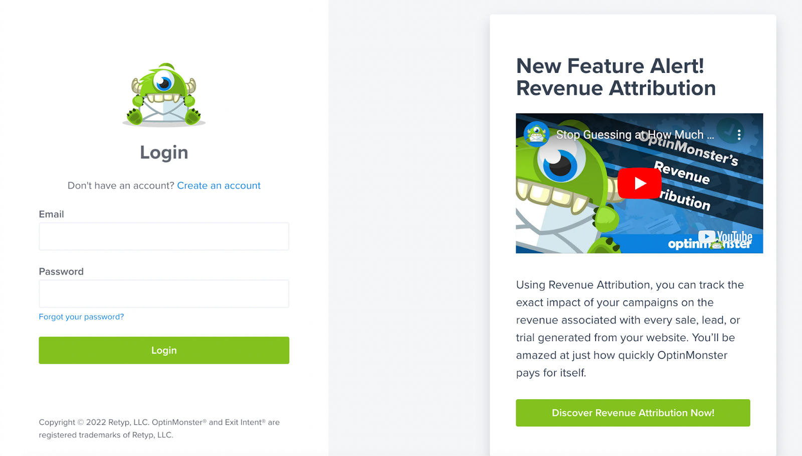
It was also a nice touch to include a feature description on the right-hand side. It’s not distracting and is useful for people who are interested in what OptinMonster offers but need a bit more convincing before they take the plunge to sign up.
Think About Using a Suitable Background Image
As the previous example shows, there’s no reason to make your login page overly plain. Another option, if it makes sense for your brand, is to put the login area over an appropriate background image. Doing that can add visual appeal while helping people feel excited and inspired.
LUSH, the company known for its handmade cosmetics, did that with its login page. You can’t help but notice the brightly colored bathwater that makes a memorable backdrop as people sign into the site.
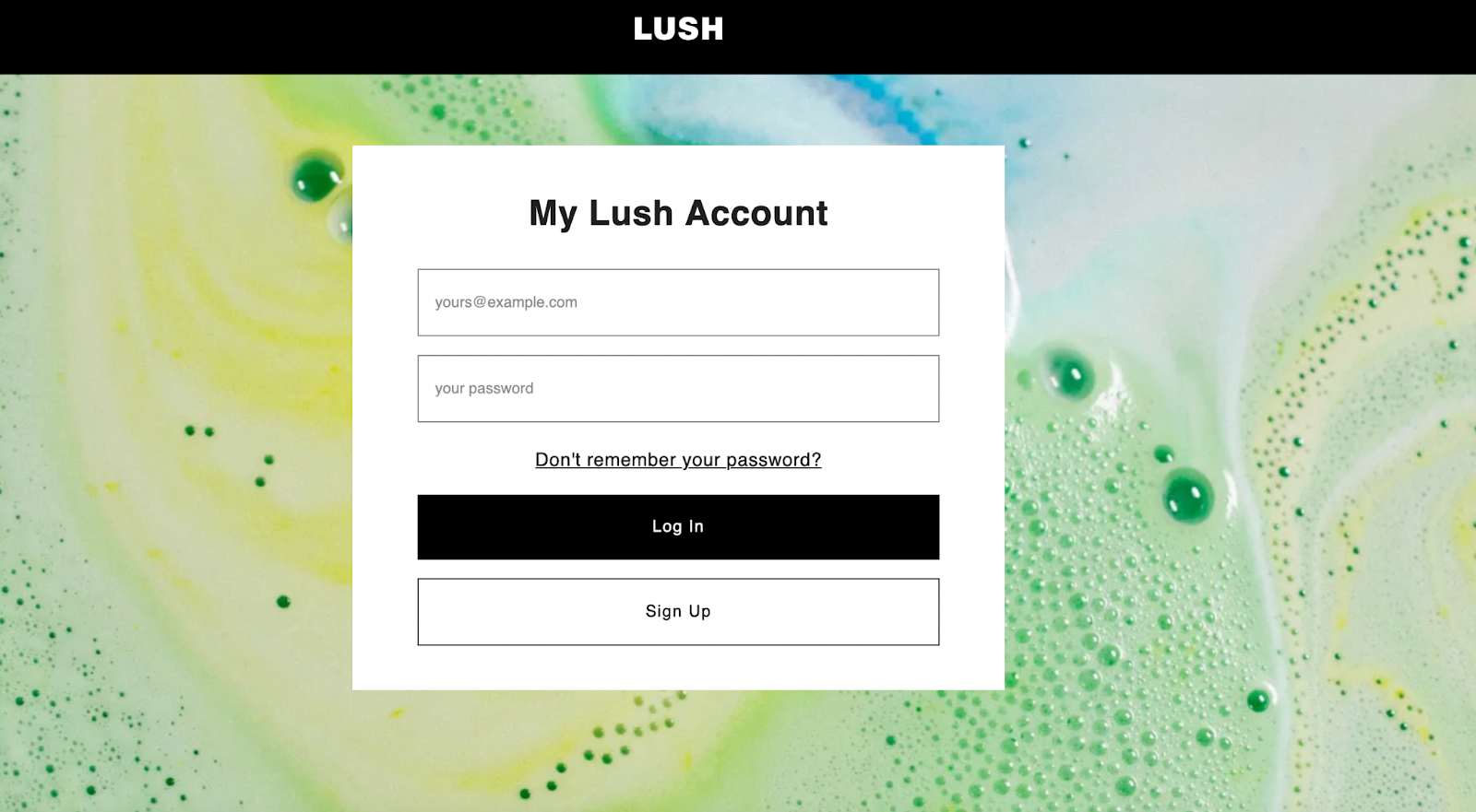
Many LUSH products, including the company’s bath bombs, turn the water in the tub into a work of art. This login page illustrates that outcome beautifully. As a result, it helps people look forward to using LUSH items, whether for the first time or as long-time happy customers.
Notice, too, how the buttons for logging in and signing up match the color of the website header. That’s a simple but effective way to pull the visual elements together and help people stay focused.
Don’t Make Logging In Mandatory
There are certainly benefits for your business if a customer logs into the site. They include:
- The ability to send people content that reflects their past actions
- The option to give customers materials exclusively for registered people
- More ease in tracking orders in progress or helping people find order histories
- The ability for the person to earn rewards or loyalty points
However, some people just want information quickly and would rather the login process not slow them down. That’s why it’s smart to allow people to get some information from your website without logging into it.
Outdoor goods brand Patagonia did that by letting people get order information without being registered users first. They just need to provide their order number, billing ZIP code and last name.
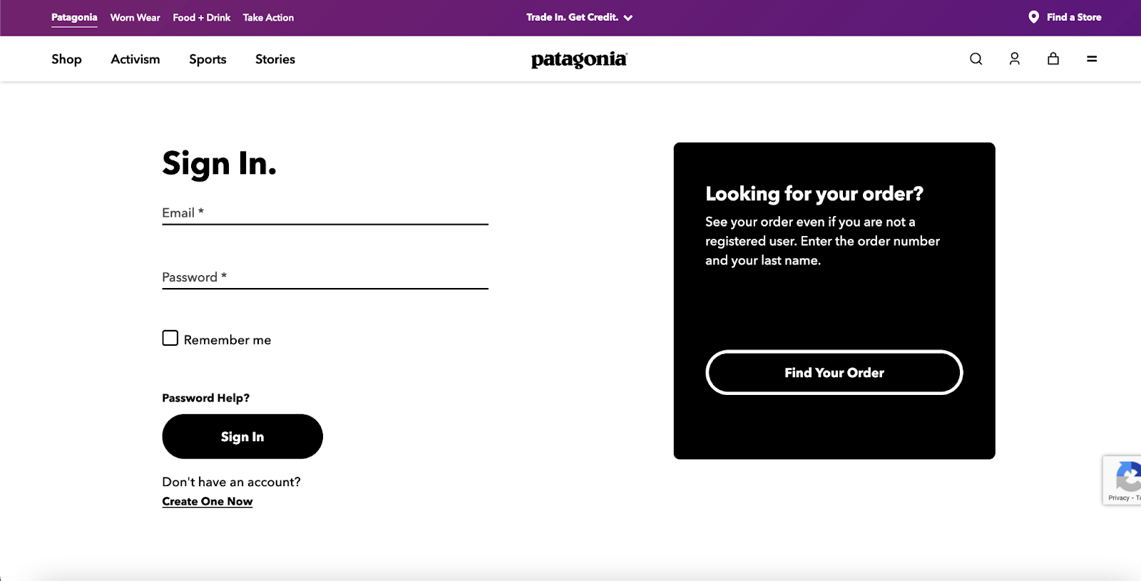
Notice how the header on the login page has several relevantlinks, such as those that let a person find their nearest store or learn more about Patagonia’s commitment to activism. They encourage people to spend time on the site for longer than they otherwise might. Think about how you might add similar links to increase how long people stay at the site before leaving.
Use the Login Page to Encourage Participation
Many people who visit your site may not take the steps to become registered users unless you spell out the benefits for them. Research from NordPass showed that 7 in 10 people in the United States and the United Kingdom have at least 10 password-protected accounts. Then, 2 in 10 people have more than 50. Additionally, 80% of respondents find password management stressful.
Given those statistics, it’s not surprising that many people would balk at the prospect of setting up a new account. However, if you can use the login page to tell them the perks, they’ll be more likely to opt for registration.
PetSmart does that on its login page. The overall appearance is a bit cluttered, but you can get a good idea of how to present the perks.
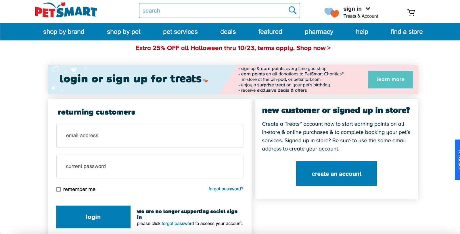
The banner on the login page explains that people can get points every time they shop, receive a surprise treat on their pet’s birthday and take advantage of exclusive deals. The turquoise button on the banner also brings people to a more detailed breakdown of what they’ll get for signing up at the site.
Keep Your Login Page Simple
Another best practice for creating a login page is to get rid of all unnecessary information. Doing that tends to result in a clean look that helps people stay focused. Prioritizing simplicity may even mean you cut down on the number of fields users initially see when they land on the page.
The login page for Apple’s iCloud storage service offers an excellent example of how simplicity can look. Notice how it only has one field where a person should enter their Apple ID.
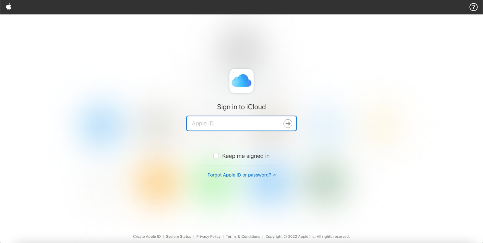
Once someone does that, another field for the password appears below the first one. In this example, even Apple’s branding takes a backseat. The one downside of this approach is that it could be a bit confusing for people who don’t yet have an Apple ID. There’s a link down in the page’s footer where someone can create one, but it’s easy to miss.
However, Apple has a justified reason for that design choice. Whenever someone starts using one of the company’s devices, creating or logging in with an Apple ID is one of the first things they do. That means it’s highly unlikely someone would land on this iCloud login page before having an Apple ID.
Combine Smart Branding With a Hassle-Free Login
We’ve already seen some creative examples of how companies can use subtle but impactful branding on a login page. There’s no harm in including brand elements on a page, as long as it doesn’t cause distractions or confusion.
The login page from Uber provides another fantastic example of how that can look.
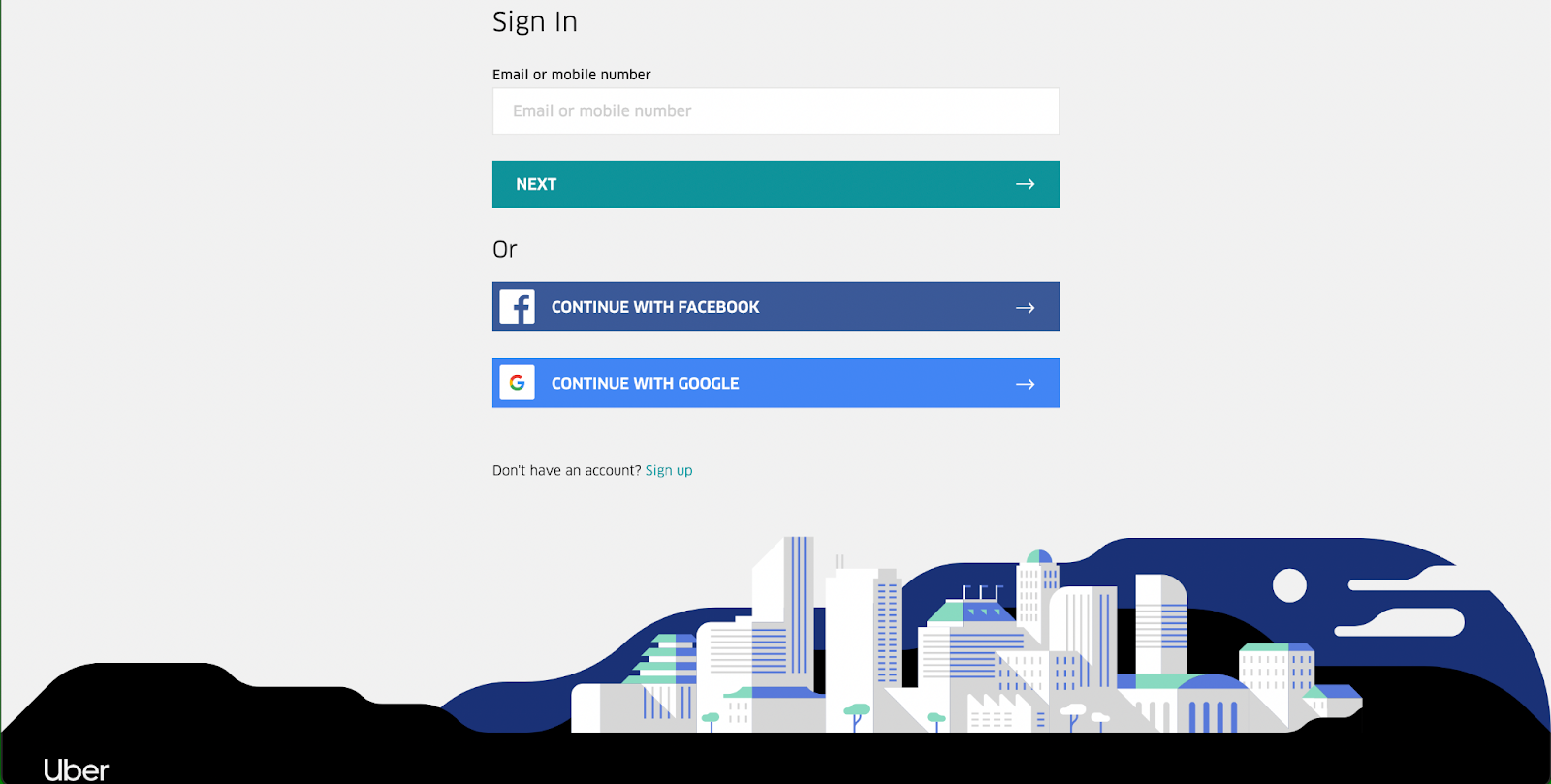
Check out how all of the colors in the cityscape design are also part of the login page’s design. The outcome is both stylish and thoughtful. Notice, too, how Uber decides to use the social login method discussed earlier. That’s an excellent way to let people log in as quickly as possible, even if they can’t remember their passwords.
Give People Multiple Login Options
Most people can recall times when they forgot parts of their login details but could remember other bits of identifying information. Think about how your login page might cater to those situations by giving people a choice of what information they use when logging into your site.
Take a look at how Microsoft does that on its login screen. People have three things they can enter into the first login field.
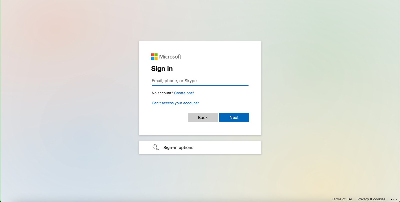
They can use an email address, a phone number or a Skype username. Those options mean people must provide more information when signing up for a Microsoft account. However, the additional details make it easier if people can’t recall a key login detail.
One possibility is to explain that your company will use those login details to help a person sign in when they can’t remember which information they used to register. If people know the reasoning behind a request for more information, they may be more likely to agree.
How Will You Improve Your Login Page?
These eight examples will get you familiar with some of the best practices that are essential for making an excellent login page. A good starting point is to assess how your sign-in screen stacks up to those mentioned here. You can then think about which specific changes you’ll make to enhance the user experience.