


In This Article
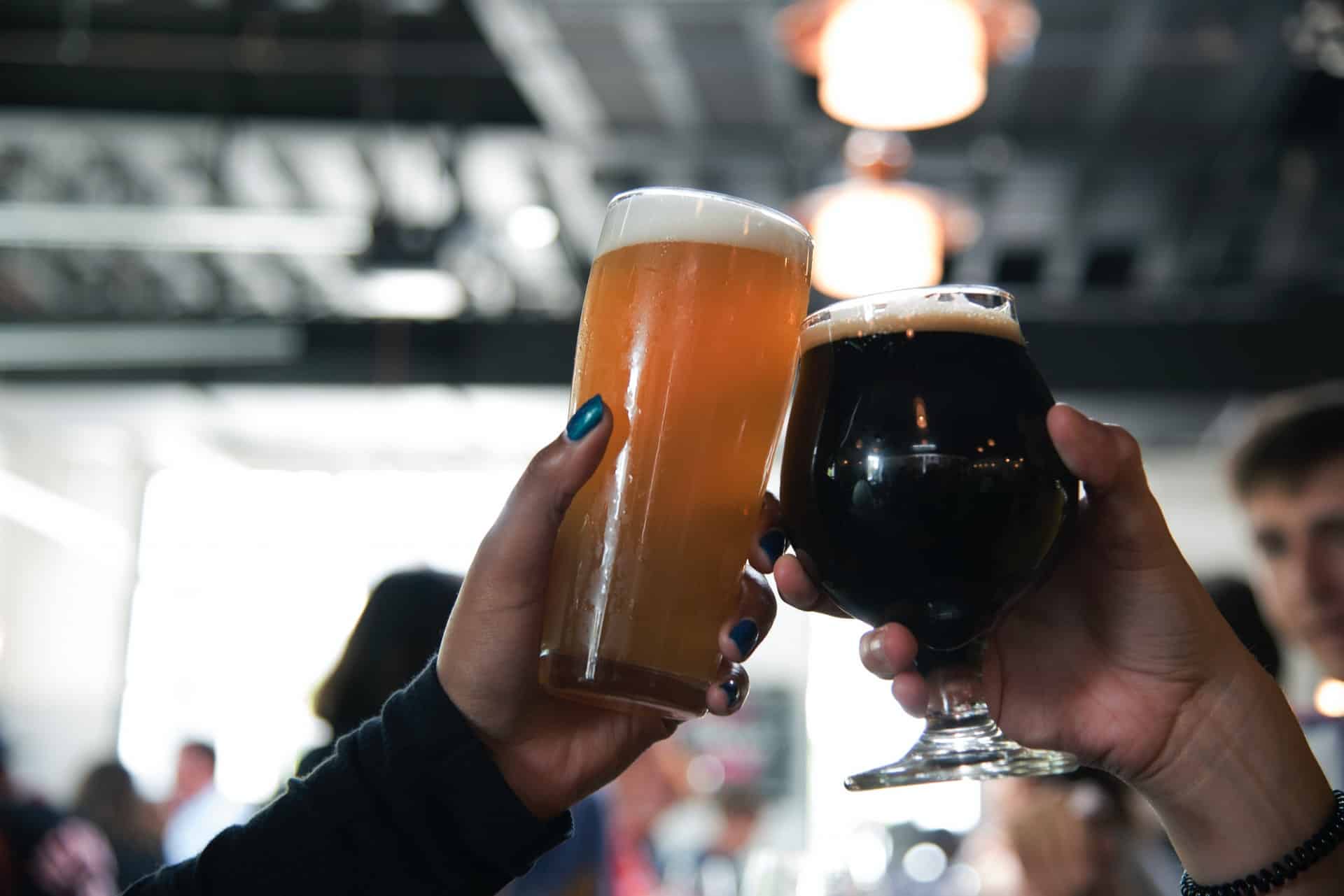
Big brands often spend millions of dollars on logo design alone. Remember that your branding is more about how other people see your company than the way you see it. Beer is one of those products that has a lot of personal associations for people because it is a part of family celebrations and fun nights out with friends. Studying beer logos allows you to see how to make an impression with your designs and create an emotional pull on consumers.
In marketing, the Rule of 7 means someone must see your logo or brand name seven times before they recognize your company. If you get your logo in front of more consumers, the higher your chances of being remembered. Remember: the better your logo, the more you stand out.
Studying beer logos is a great way to learn the elements of a successful one. A well-designed logo grabs the consumer’s attention and also tells a story about your brand, as you’ll see in the following 18 examples.
1. Innis & Gunn
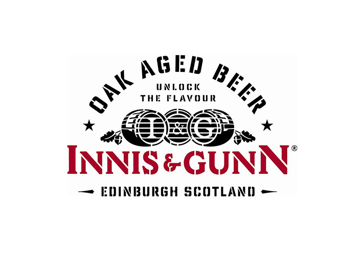
Innis & Gunn creates craft beers aged to perfection. Its logo represents the way it ages its beers by taking on a vintage appearance, with a script font and embellishments reminiscent of times past. Innis & Gunn sometimes uses the ampersand in its logo to represent its brand. One unique thing about the logo is that the background color changes, allowing it to use the emblem on different beer bottles, as well as its website and social media.
2. Storybook Brewing

Storybook Brewing features a logo that looks as though it jumped straight off the pages of a storybook, complete with dragons, princesses and knights. It’s memorable because it’s unique. In fact, the light blue is a color you don’t see as often in beer logos, so that makes it unique enough for people to remember. When choosing colors for a logo design, look for ones that tie into the brand but aren’t overused by competitors.
3. Big Timber Brewing Co.

Big Timber Brewing Co. features a logo that creates an image of its name. Its background looks like a cut section of a tree, and everything gets tied together with the silhouette of an ax. Big Timber Brewing Co.’s logo also keeps the look rugged with black and white for the colors. A logo doesn’t have to be extraordinarily modern or complicated to work — it merely needs to reflect the values and history of the company.
4. Triton Brewing Co.
![]()
Triton Brewing Co. uses a trident to signify water, power and King Triton of mythological fame. One particularly efficient way of utilizing an image within your log is to integrate text within the graphic itself. Note the way the Trident breaks just before the forks and inserts the name of the brand. The typography matches the color of the graphic, making it a seamless whole.
5. Avery Brewing Co.
![]()
When it comes to beer logos, you’ll find a lot of them are quite intricate. Avery Brewing Co.’s logo is relatively simple, highlighting the first letter in the company name with a bright red letter A. It also markets its beers as American-made craft beer, so the red color plugs into the colors of the U.S. flag — red, white and blue. The center of the circle is open, and a thick border boasts the full name of the company, along with its headquarters location.
6. New Holland Brewing Co.

New Holland Brewing Co. does something interesting with its logo, integrating a symbol of the Dutch: the blades of a windmill. By incorporating the windmill blades, it creates instant recognition for its logo and an association with its name. In addition, the blades appear in motion because of the embellishments, which make it look as though they are circling.
7. Rivertown Brewing Co.
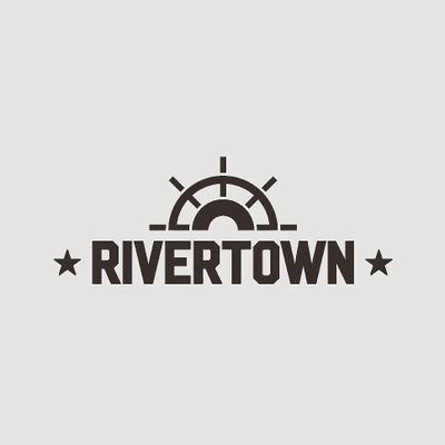
When you think of a town on the river, do you think about old steamboats? Rivertown Brewing Co.’s logo features the wheel of a ship. This logo focuses on the word “Rivertown,” and the wheel sits atop the fat letters. There is less emphasis on the rest of the brand name, which is shown by placing those words at the bottom in a smaller size font.
8. Carlsberg
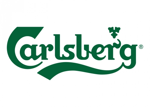
Carlsberg focuses on offering beer made from the finest, highest-quality ingredients. This company’s color is a vivid green like you’d see in fresh plants. Meanwhile, the logo itself consists of the company’s name with only a small embellishment for interest. Because the Denmark-based brewing company is already well known, there isn’t a reason to further identify who it is or what it does. The green also reflects the color of the beer bottles for its iconic brew.
9. Budweiser
![]()
Budweiser is another brand with a name that is instantly recognizable. The original designer created the script logo in 1860. In 2016, the logo was reworked to make it a little more modern with the removal of some three-dimensional effects and addition of a crest to show the brand’s long history. Everything about the logo design is meant to invoke trust in a well-known name that stands the test of time.
When working with an established brand, don’t try to reinvent the wheel. Customers already associate the logo with the brand. Instead, figure out how to make the logo better and bring it into the modern age.
10. Odin Brewing Co.
![]()
Odin Brewing Co. uses the image of a mythological beast along with a deep green to elicit the feel of Old-World beverages. If you look at the designs on its products, you’ll find beautiful drawings that tap into the names of each type of beer. For example, Odin’s Gift Amber Ale features an image of Odin with the logo appearing on his garment at his waist. Galactic Space Dragon India Pale Ale features a green dragon breathing out fumes, and the logo turns from red to green to match the overall design.
11. Anchor Brewing
Anchor Brewing is a San Francisco company founded in 1896 by German brewer Ernst F. Baruth and his son-in-law Otto Schinkel Jr. Although Baruth already owned a saloon and brewed his beer long before this, the official company was born in 1896.
Today, the logo is a reflection of the company name and the branded logo associated with the business’s long-held traditions. Note that the anchor appears on all the beer labels, even when nestled amid other elements. Beer logos should reflect both modern times and the history of a company.
12. Islamorada Beer Co.

Islamorada Beer Co. isn’t as well known as some of the other craft beers on this list, but its brilliant logo design groups it into this list of brands to keep an eye on. Note the simple circle with lines, reminding one of beach bungalows. This pattern repeats on the product label designs with a ring with vertical lines in a variety of colors. Replicating the design over and over throughout products, website and social media creates a strong brand presence.
13. Full Sail Brewing Co.
![]()
Full Sail Brewing Company has a very simple logo; it emphasizes duality in that it could show up black on a white background or appear white on dark backgrounds. The simplicity of a white sail between the logo’s first two words draws attention to the larger symbol. This symbol, depicted on the beer bottles, includes a white sail with a stripe of color.
The color of the sail’s swipe varies depending upon which flavor of beer is inside the bottle. Carrying the logo across different products offers some design consistency and gives the company a more professional look. Customers can instantly recognize the symbol no matter where it’s at.
14. BrewDog
![]()
BrewDog’s modern logo plays on their fun name. It includes a simple silhouette of a small dog inside a traditional shield. It gives the user an impression of traditional brewing styles with a contemporary infusion of flavors that only the best India pale ales (IPAs) bring. BrewDog uses the logo widely on all their canned beers. Their website focuses more on branding their name, but you still see the logo on every product photo.
15. Drink Me Brewing Company

Drink Me Brewing Company is a family-owned business based in Sibley, Iowa. While their brand isn’t as big as some of the corporate players, their logo says everything about their philosophy on micro-brewing. Drink Me Brewing Company’s logo is the outline of a beer keg in black with the brand name within the barrel.
This symbol lends itself well to scaling up for larger advertising initiatives or downsizing for small marketing efforts, such as a profile image on Facebook. Drink Me Brewing Company uses negative space to spell out the words and positive space to show the type of business they are, which works perfectly for a minimalistic logo. We can see that the entire design curves around in imitation of a barrel’s shape.
16. SweetWater Brewing Company

SweetWater Brewing Company focuses more on their location than the product they produce. The term “sweet water” makes one think of something refreshing and wholesome, so it works wonders for the brand’s image. Note the beautiful script font in their logo and its repetition on their beer bottles and cans. The fish within the logo doesn’t always appear every time their name does.
SweetWater Brewing Company presents a Southern image of good times, fishing and festivals, which is reflected in their logo.
17. Treehouse Brewing Company
![]()
Treehouse Brewing Company uses an outline of a crooked tree with a slanted treehouse nestled in the branches. The shape appears on various backgrounds. On Instagram, they use an orange circle with the white logo. On their website, they use the white logo on a partially transparent black bar set over a photograph. The logo’s flexibility means they can use it anywhere and in any hue. It appears on their products, packaging and marketing materials.
Treehouse Brewing Company’s logo is quite different than some others you see. However, it still conveys a sense of natural ingredients and pleasant memories. What signifies happy memories more than a tree hangout?
18. Holsopple Brewing

Holsopple Brewing has a unique logo showcasing the types of ingredients they put in their IPAs. They set their lettering and image on a black background, using both positive and negative space. These design elements draw the eye to their brand name and visuals. Holsopple Brewing’s logo consists of their home state — Kentucky — with a small graphic in the center of the outline. The graphic looks to be either hops or possibly berries.
One of their beers has notes of strawberries and mango, which fits with the berries on the logo. This symbol works well no matter which brew they advertise.
Learning From Beer Logos
Studying these beer logos should give you an idea of how to make minor changes for maximum impact with your target audience. A logo must simultaneously tell the story of the brand while giving customers a glimpse of what the product offers for them. Every element of your design, from the colors to the arrangement of the text, has an impact on the impression users have of the company.


Leave a Comment