
Finding just the right color scheme for your website might seem like a daunting task. After all, you have your brand color palette and some ideas about what grabs user attention with the background and graphics you use. The best color schemes for websites aren’t cut and dried but can vary based on a variety of factors.
What Are the Best Colors to Use for a Website
Internet Live Stats estimates there are around 1.88 billion websites in the world. Of course, not all are your competition and not all are active at any given time. Still, you’re competing for attention, so you need to make sure your color choices hit the right emotional cues and are readable for people of all abilities.
A few rules of thumb to keep in mind as you select the best palette for your brand:
- Contrast between the background and text matters. If you want users to easily read what you’ve written, they must be able to decipher it.
- Some colors don’t translate well digitally, including some shades of yellow, cream and colors that people with colorblindness might see as grays.
- A pop of color outside your palette can draw attention.
The best way to figure out the best color schemes for websites is to see what others have done for theirs. We spent some time scouring the internet for some of the best looking designs available and came up with some options we think you’ll love.
You can grab the hex codes from these and use them in any combination or simply utilize them as inspiration for coming up with your own palette.
1. Instructure

Instructure recently won the Designerly award for its use of a nice contrasting color scheme that pops on a white background. Note the beautiful use of orange and blue and how it repeats itself in the photos used on the page. There is ample negative space, so the eye is drawn to the call to action (CTA) button. The CTA is in the same hue but has a gradient effect.
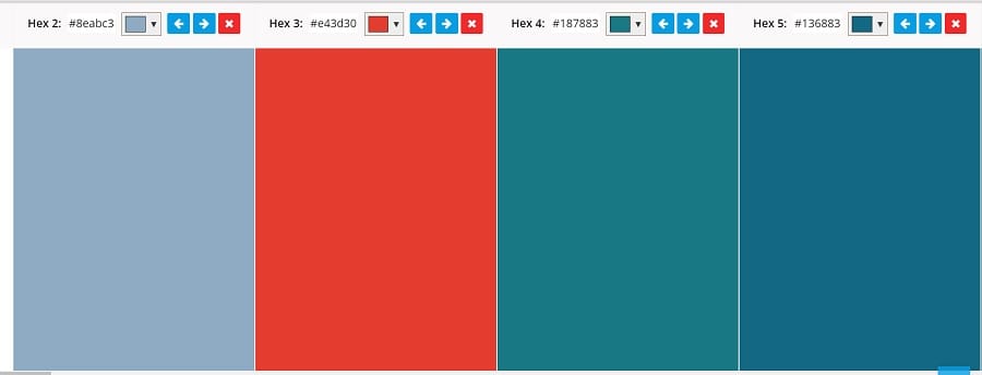
Hex Codes
- Light Blue: #8eabc3
- Dark Orange: #e43d30
- Deep Green: #187883
- Deep Blue: #136883
A combination of blue and orange works well if you use it in moderation. You can use any hues to create a bit of variety. A soft pastel creates a more feminine look, while bold colors are more youthful and exciting.
2. Tasty Basics

We adore the look of the deep plum on this Dutch website. It reminds one of an eggplant, which is perfect for a site dedicated to whole foods. Note the solid background when you first land on the page. The background is dark so they use a light text and a green stamp to draw notice.
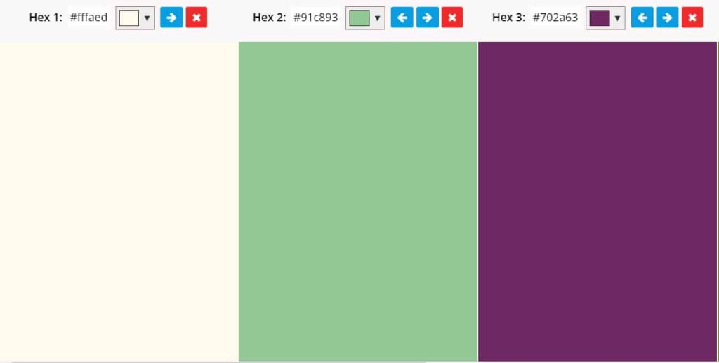
Hex Codes
- Off White: #fffaed
- Light Green: #91c893
- Plum: #702a63
Sticking to a single color for the majority of your color palette works well when it aligns with your brand message and is a bit unique. You don’t see a lot of sites with this beautiful shade of plum. It is a regal looking huge that would work well for luxury items, weddings and natural foods.
3. Zumtobel
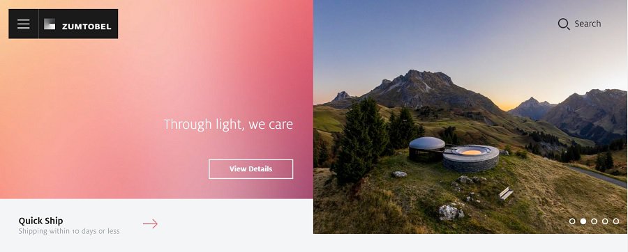
Modern sites often try to tap into color options their competitors don’t use. However, every color elicits a different emotional response. It’s crucial to know how the hues you select impact your users’ feelings.
Zumtobel taps into a soft rose color alongside a peach. It softens some of the harshness of the overall design, which has some muted greens and browns from the landscape.
Hex Codes
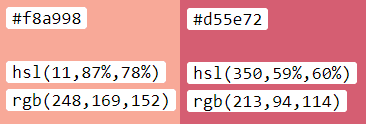
Peach: #f8a998
Rose: #d55e72
The gradient goes from a soft peach to a rose color on the left. The color palette for the site also incorporates a lot of earthy tones such as deep green, brown and grey. You can tap into this style by choosing some softer colors to complement earth-toned hues.
4. Veronica Solomon
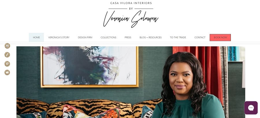
The deep, rich colors on Veronica Solomon’s website draw the eye and give the site a luxurious appeal. From the bright pop of the curtains in her hero image to the orange CTA button, the entire site screams regal.
There is ample white space and some neutrals to keep the bold color choices from overpowering the design. Note the use of patterns alongside solids to create visual separation.
Hex Codes

- Royal Blue: #221075
- Vivid Blue: #116dff
- Medium Grey: #869194
- Bright Orange: #e84a43
There are numerous other shades that pull up when you plug the website into a color palette grabber. Most of them are neutrals, so for the sake of simplicity we left them out of the equation. You can almost always add white, black, browns and grays without changing the feel of the site.
5. Storming Crab

Storming Crab uses some bright hues to grab attention. It works perfectly for a seafood restaurant. They also pull in some deep blue to create a sense of authenticity and trust. The yellow is a deep enough shade to pop against the darker colors on the page.
Hex Codes

- Orange-Red: #ce4126
- Vivid Yellow: #ffd131
- Deep Blue: #213d65
Using three bright colors together might seem counterintuitive but the blue is dark enough to serve as more of a neutral color. The bright pops of yellow combined with an orange-red are bold and striking. The color palette gives off a youthfun, hip vibe.
The Best Color Schemes Vary by Industry
You’ve likely noticed some industries utilize similar colors, but may choose a slightly different shade than another. Banks often use blues, restaurants tap into the power of red and natural products hone in on the neutral greens and browns.
What color scheme is best for your site might be similar to other sites in your niche or might be something totally unexpected. Study the samples, play around with ideas and find the best selection that represents your brand image.


Leave a Comment