The National Basketball Association (NBA) features 30 different teams. Each has a logo and a strong history of how their look and branding has adjusted to match modern demands from fans everywhere. Narrowing the choices for the best NBA logos of all time down to a handful isn’t an easy task.
We started by looking at the teams we like best. However, to be fair, we then considered all 30 teams. From the design itself to the color palettes, everything was factored into our decision of which logos to feature.
The task was challenging. These professional teams have skilled graphic designers working with them to grab attention and keep it. To make our final selection, we narrowed down everything from the contrast to the size to the detailing. We wanted a nice selection of minimalistic and more complex designs. We also considered the meaning behind each logo in our final decision.
If your favorite team isn’t listed, their logo may still be excellent and their game on par. We just felt these were the exceptional choices from a design standpoint.
1. New York Knicks
The New York Knicks grabbed our interest right away because of the contrast of blue and orange in the design. They also add a bit of gray to add a 3D effect to the logo that makes it pop against almost any background. We like the inclusion of an orange basketball to signify what the team does. Their word mark is slanted back as though the ball is out in front of them.
Designers can learn a lot from this logo. The overall design isn’t complex at first glance, but the detail is what makes it truly exceptional. Note the curved lines on the basketball icon that give it a rounded shape that almost appears in motion. The letters are tall and stand out in stark relief above the ball.
2. Philadelphia 76ers
The Philadelphia 76ers have quite a number of nicknames that make them instantly recognizable, including “Sixers.” This wasn’t initially one of our favorite teams but some truly great players have come from their ranks, including Wilt Chamberlain, Hal Greer, Allen Iverson and Charles Barkley.
The logo gives a nod to Philly’s roots as the birthplace of the nation. Note the 13 stars just as there were 13 original colonies formed through the new Constitution of the United States. The team colors of blue and red stand out in stark relief against the white background. Again, the nod to red, white and blue is in keeping with the location of the team. The consistency in branding makes them stand out from the competition.
The unique nature of a huge number for the logo shows how well known they are without even mentioning where the team is located or including a logo of a basketball.
3. Toronto Raptors

When you think of a raptor, you likely think of the sharp claws and fighting spirit seen in the Jurassic Park movies. Perhaps you think of a bird of prey. The logo for the Toronto Raptors matches their name perfectly. The shape of a basketball takes center stage but there are claw marks rather than lines on the left side, giving the logo movement and backing up their legacy as a team that draws blood.
The logo is also red, defining not only team branding and color palette but the idea of them being vicious killers.
4. Indiana Pacers
The Indiana Pacers went with a traditional ball in motion look for their logo. However, to give it more definition and help them stand out as the team they are, they added a P and used the curve of the letter for ball placement.
The team colors are reflected nicely in the blue and gold used in the logo, too. We like the outline of the letter “P” to give it a bit more dimension and the way the lines of the ball extend all the way to the left side to give the impression of a ball in motion at high speed.
5. Chicago Bulls
We almost overlooked the Chicago Bulls. The team is an excellent one but we’d already covered the Indiana Pacers. Chicago is a mere four-hour drive from there. However, after looking at the logo several times, we wanted to include it for the complexity and subtle message it sends as one of the best NBA logos of all time.
Note the horns tipped in red to signify blood or fierceness. We like the determined expression of the bull. The lines and the darker edging around the eyes gives it definition and character.
The word mark fits perfectly between the two horns at the top of the bull’s head. In some instances, the team uses the logo with only the bull. In others, they include the name of the team as well.
6. Los Angeles Lakers
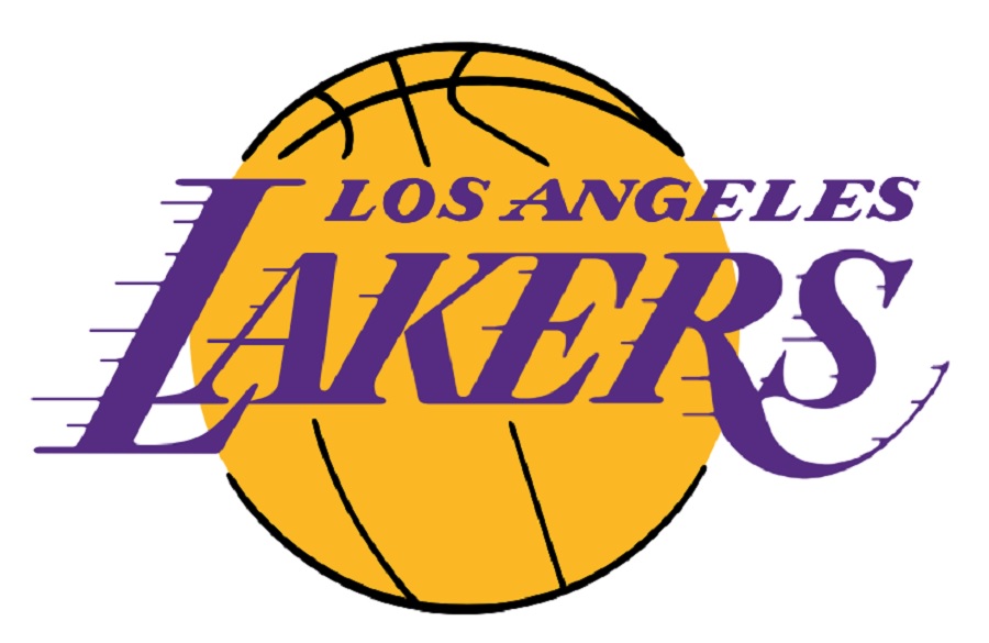
Let’s talk about the Los Angeles Lakers’ logo. We may have saved the best for last here. Not only is the contrast between complementary colors striking with the vivid yellow and deep purple, but the entire logo screams movement.
When considering which were the best NBA logos, narrowing the selection took time. However, this one made the cut and we think you can see why. Not only does it clearly show what kind of team it is with the basketball but placing the word mark over the top of the image is a bit unique. They use lines on the letters to depict motion.
We like the swoops and the font choice as it also indicates a team running fast up and down the basketball court. The color selections are unique. You don’t see a lot of purple and yellow combinations. When compared side-by-side with other logos, the Lakers jump off the page.
Which NBA Logos Do You Think Are Best?
Outside of your favorite team, which we are all a bit partial too, take a look at the 30 different logos on the NBA website. Which ones do you like best from a design standpoint? There is a lesson to learn from each design that can be applied not only to NBA logos but to all types of logo design.
About The Author
Cooper Adwin is the Assistant Editor of Designerly Magazine. With several years of experience as a social media manager for a design company, Cooper particularly enjoys focusing on social and design news and topics that help brands create a seamless social media presence. Outside of Designerly, you can find Cooper playing D&D with friends or curled up with his cat and a good book.

