

For our Designerly award each month, we try to vary the industries we select winners from and embrace the best in current design trends combined with traditional excellent design. As we browsed around different options, the City of San Jose, California website stood out to us as a well-designed, information-packed option.
State and city government websites can range from informational to multifaceted but are typically aimed at a very specific audience of people who live in the area. Well-designed local websites should understand the user personas for their target audience.
Winner: City of San Jose, California
The world is headed into the Web3 era, where companies will focus more on building content and improving cybersecurity. Researchers estimate the global Web3 market will grow at a 40% CAGR and reach $23.3 billion by 2028.
With that in mind, we chose the City of San Jose, California’s website to showcase some of the excellent user engagement design that will be the next wave of internet design.
Not only is San Jose’s website design visually appealing, but it functions very seamlessly and engages the user almost from the instant they land on the page.
What Is City of San Jose, California Website?
When you click on “Our Story,” you go to a YouTube video about the City of San Jose, California. Videos are a brilliant way to share information and engage your audience.
Around 86% of companies say they’ll use video as part of their marketing efforts. People respond to visual content, retaining a lot of the information. Adding your company history or other details via video is an excellent way to entertain your site visitors while condensing information into digestible bits.
Located in the Santa Clara Valley and the Guadalupe River, San Jose was established in 1850. It is about an hour southeast of San Francisco. The area is known for a mild climate and mostly sunny days.
The city is the third largest in the state. It has the highest population thanks to the bay area spreading out so far. The city is also home to many workers from Silicon Valley. The city itself is made up of 178 square miles and has a population of over one million people.
San Jose is famous for:
- Being California’s first state capital
- 10th largest city in the United States
- High-tech culture
- Home to one of three Japanese communities/towns
It isn’t surprising that in the heart of Silicon Valley, the town’s website is one of the best ones we’ve seen in this category.
Why We Chose the City of San Jose, California as a Top State/City Website
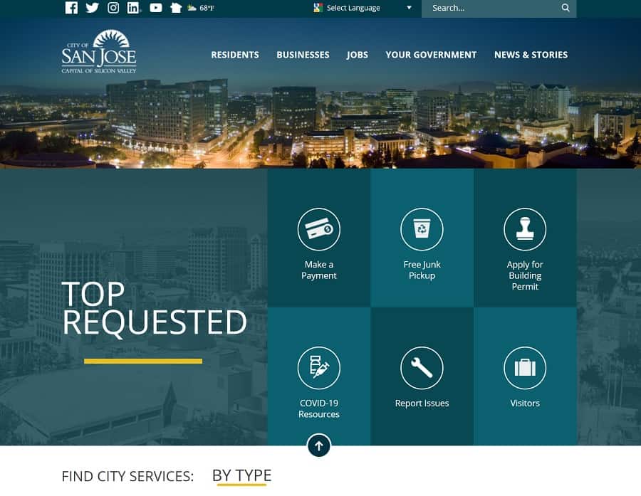
The navigational structure of this site is one of the main reasons why we chose it for our monthly website award. The designers started by breaking down the site into several categories based on user personas.
- Residents
- Businesses
- Jobs
- Your Government
- News & Stories
When you land on San Jose, California’s home page, you immediately see some clear signals about where to go. Everything else about the site pulls the user in and keeps them engaged from the first millisecond until the last.
Color Palette
The lush Santa Clara Valley is filled with vivid greens and lush foliage thanks to the near-perfect weather there. The deep greens they use on the site reflect the city’s natural features perfectly. As the user moves down the page, blocks of bright color are broken by neutral white and variations of blues and greens.
Choosing the right color palette can increase user engagement and add some emotion to your design. What color represents your city or business best?
Social Media
Since many people keep up with their local happenings via social media, it makes sense to put links to their social pages across the top of the website. Small icons show they have pages on Facebook, Twitter, Instagram, LinkedIn and YouTube.
Highlight the Positives
One thing we really loved was the little weather icon next to the social media icons in the uppermost bar. The user sees if it is cloudy, sunny, rainy and what the temperature is that day. For someone thinking about moving to the Capital of Silicon Valley, they’ll be enticed by the beautiful weather.
Choose Your Language
Since the city has people speaking nearly 56 different languages, it makes perfect sense to tap into the power of translating the site into a language that matches what the person is most fluent in. We also like that this feature is near the top and easy for visitors to find.
Grid Layout
Different trends come and go, but we still love a neat, simplistic grid layout for ease of use. The boxes also translate well on a mobile device, giving the site a responsive perk for users accessing via their mobile devices.
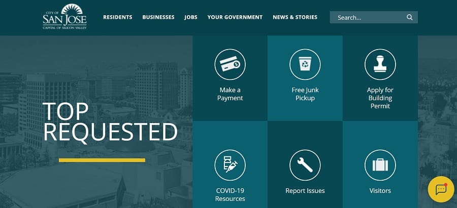
Note how the colors vary between boxes to make it more visually appealing and separate the options without using harsh lines around them.
Chat Bot Feature
A chat feature pops up when you land on the page, wanting to know if you have any questions. By utilizing artificial intelligence bots and frequently asked questions, the system can answer almost anything.
The chat doesn’t seem to be staffed with live agents, so it is limited to the information in the database. However, it may refer you to a local agency or phone number for additional assistance.
Mobile Responsiveness
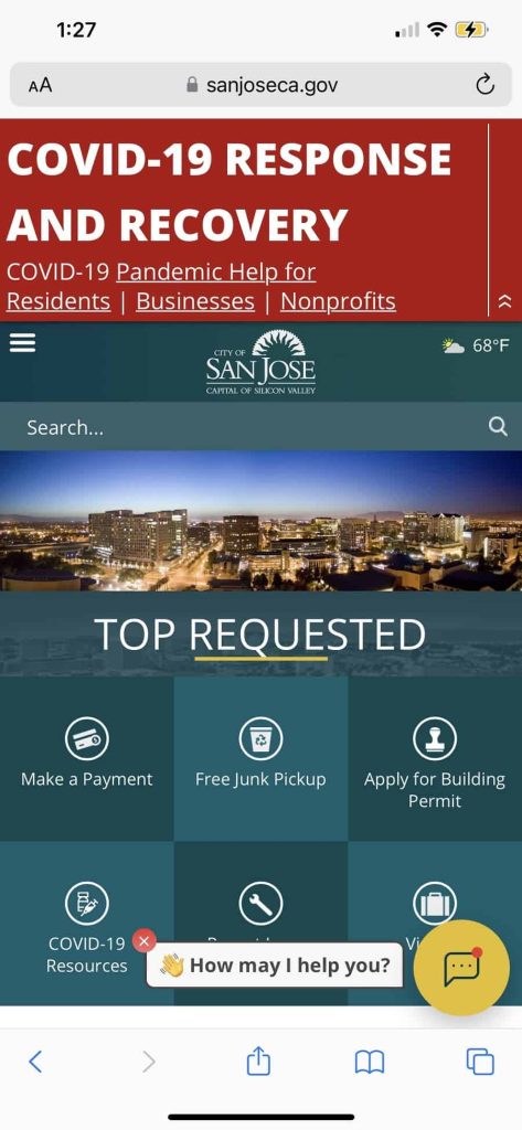
With the growth in the number of people using mobile devices to access the internet, we always look at how well a mobile version of a site performs. The grid layout looks just as strong as we imagined it would. The menu turns into a hamburger icon. The weather detail condenses and appears in the upper right corner of the page.
What We Would Do Different
The City of San Jose, California website is well designed and functions exactly as users expect it to. The designers clearly thought through user intent and came up with almost any scenario one might imagine.
One thing we’d do is remove the COVID notice at the top of the mobile version and place it elsewhere. While it is easy enough to skim past on a desktop version of the site, it takes over a huge portion of the page on a smaller screen. There is an arrow users can tap to reduce or take away the notice, but it is another step we don’t think people should have to take. Perhaps automating it disappearing as the user scrolls would be the best option.
Towns looking for the best way to organize massive amounts of information would be well served to study San Jose’s user-friendly model. Good job to the designers and website planners for coming up with a highly functional and visually appealing look.


Leave a Comment