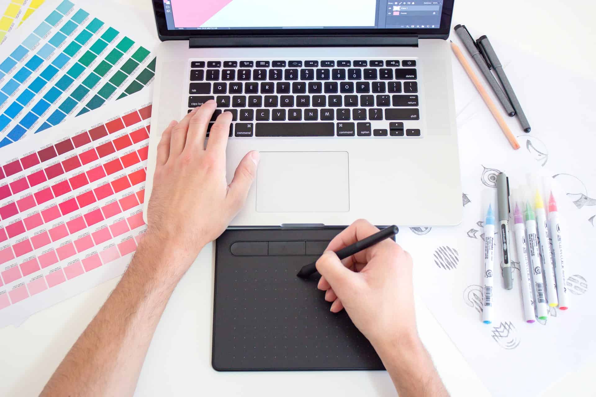


The basics of graphic design all come down to color. The tones on a page can influence feelings of excitement, happiness, and even negative emotions like rage. Each one can be useful for different businesses, so it’s vital to know what colors can accomplish. Luckily, there’s an easy way to find out with color theory for designers.
Read on to discover what different shades can do for website and logo design. Emotions are a valuable asset for marketing, so it’s beneficial to know what feelings they can evoke.
The Emotions of Red
As many can assume, red is a very passionate color. Depending on what the design is trying to convey to the observer, it can create feelings of love, anger, and power. It can also create excitement, warning, and danger. Many psychological studies show how the color red can bring out these emotions both through natural reactions and association. Red is often thought of as the “love” color, so it could influence desire in the people looking at the design.
People recognize red as the signal to “stop,” — which makes it useful for designs that require some kind of urgency. They may also associate it with anger, so it could be great when a client needs to portray they are against something.
The only caveat is too much can make people aggravated, meaning they’ll associate the logo or website with negative feelings. When using it for this purpose, exercising restraint may be the best option.
How Pops of Orange Feel
Orange may not be a graphic designer’s first choice when forming the layout for a logo or website — primary colors are very popular. However, missing out on this color could be significant. One of the most prominent occasions orange represents is the changing of leaves in fall, meaning it can convey warmth and adventure. The color could inspire people to move and change, making it great for encouragement.
It was also a hit in the 1970s, so using it in designs could evoke a throwback to groovier times. Orange can also signify health because of its relation to the fruit it was named for. For more eye-catching and bold designs, the hue of traffic cones and safety vests can make people feel the need to stop and look at what they’re seeing.
However, stylists warn orange can also make a design feel cheap. Warmer tones could bring about that autumn feel, but too much bright orange could decrease the sense of value in a design.
Yellow in Color Theory for Designers
Varying shades of yellow can quickly give off opposing reactions in people. For example, warmer yellows can remind them of the sun, bringing out feelings of joy and hope. These tones are also very optimistic and can instill a sense of hope. The color can even improve memory — meaning it could be a valuable tool when creating advertisements and logos.
There are plenty of positive feelings this color can evoke. However, there are also some common associations between sickness and yellow. People don’t want to think of jaundice when they’re looking at a website. It could even make them feel the design is excessive, which could cause them to pass on the client because the hue of yellow makes them appear hedonistic.
With yellow, there needs to be a careful balance of tone and use. There is a fine line between bursts of positivity and overbearing brightness.
What Going Green Can Do
Much like red, green has some fairly obvious connotations. It’s the most common color in nature, meaning it feels very soothing and therapeutic. It can help people feel more stable and even improve their endurance. Companies that produce medical products and drugs often use green because of its healing feeling, aided by its ability to reduce depression and anxiety. Overall, this color has a large number of positive associations.
But — like every tone — it has its negative potential as well. The Ancient Greeks thought humans made more bile in their bodies when they were feeling ill or jealous, which turned the skin green. Therefore, this color can remind people of envy or sickness. Those yellow-greens might go well with the other shades in the design, but they could unintentionally gross viewers out.
Many darker shades can also evoke feelings of wealth and greed, which could also turn people off from a design because it seems too expensive for them. While hints of dark green can be comforting, using too much can make a business feel more luxurious than some people can afford. Color theory for designers can help graphic designers find the right balance of these emotions.
Feeling Blue
While there is a simple association between blue and sadness, it actually has plenty of uplifting purposes. Like green, blue can have a very calming feel — possibly due to its relation with water. It can bring out feelings of stability, creativity, and confidence. Many royal figures were thought of as having “blue blood,” so the color can evoke strength and authority because of such associations. Lighter shades even have the power to produce a chemical that promotes rest.
Blue has a host of not-so-desirable influences as well. For example, it is a mourning color in Iran, which could explain the common association of sadness. Some could find darker shades comforting, but they could remind others of stormy seas and danger. Additionally, blue has the ability to slow metabolisms and make people no longer hungry.
For this reason, blue is not a good choice for any business selling food. It’s also not useful in designs that want to promote action and activity. Blue is great for websites and logos that want both a sensation of authority and relaxation.
Purple Completes the Rainbow
What some might not expect is how powerful purple can be. The color is rare in nature, making it bring about feelings of mystery and imagination. Royalty were the only ones with access to purple dyes for a long time as well, which means it can convey a sense of power and elevation. It also has frequent uses in many religions, so it could also give off a spiritual and reverent feeling, too.
Purple’s positives could quickly become negative. The same spiritual vibes can also cause a design to feel too emotional without other balancing colors. Many people also harbor negative feelings against royalty, so it could evoke a sense of arrogance in a website or logo. Because of its associations with imagination and mystery, some could also see purple as childish as well.
Like all colors, purple requires a gentle hand to dissuade these adverse effects. A client can show their authority by using this color, but too much can be condescending. While it could also appear immature, it may be an excellent option for people working with kids.
Use Color Theory for Designers to Elevate Layouts
All the natural hues can influence people to feel a certain way when looking at a logo or website’s design. Color theory for designers is crucial because including too much of one tone can create a host of negative emotions they don’t want to include in their product. Therefore, it’s essential to use these tips to remember what colors can do in the human mind to bring out the feeling the client wants.

Leave a Comment