


The main intent of a newspaper ad design is to grab your readers’ attention and persuade them to take action. No matter what type of newspaper you’re advertising in, the overall layout will significantly impact your ad’s success.
To ensure your newspaper ad achieves your desired results, follow these design tips to help you further.
1. Minimalist Design
Keeping things simple is always better when designing your newspaper ad. In the past, newspapers have always looked busy. Therefore, creating a design that looks crowded may not help your ad stand out.
If you truly want your newspaper ad design to be eye-catching, a minimal or modern look will be most effective.
Modern designs use lots of white space, emphasizing images and text within the page. Using this concept works since it makes the newspaper look less cluttered.
Essentially, it helps to space your text and images, so there is enough white space in between.
2. Ensure It Flows
When you consider the layout of your ad, the design must have a good hierarchy and flow. Most readers skim over an advertisement if the format doesn’t flow from the title to the end.
Some factors that influence this are the size, logo location, copy placement and amount of whitespace. Suppose you’re placing an ad in a large space. Here are some things to consider in design:
- Your image should cover the most space in your ad — at least 60% to 70%.
- Place your body copy below the main image since people read from left to right and top to bottom.
- Ensure you include the company logo in the bottom right corner. This only needs to take up about 5% of the ad space.
3. Alignment
Aligning your newspaper ad is a crucial aspect of design. While it may seem like extra work, the effort will be well worth it in the long run.
Aligning your design ensures that your ad will capture your readers’ attention. Therefore, these are the areas of alignment to consider:
- Columns: Ensure your columns are the same size width and that you align them correctly from top to bottom. In other words, you should space them evenly in between.
- Images: When placing more than one image in your design, they need to be straight and lined up with each other accordingly.
- Titles: Whether you choose a horizontal or vertical title, ensure they are centered correctly over the columns.
- Spacing: Suppose you have space on the left side of your design, ensure you have the same amount of space on the right side. Spacing between the title and the text also needs to be even.
- Maintain image aspect ratios: If you need to decrease the image’s size to make it fit within a particular space, avoid shrinking it. Instead, you can crop the picture so it looks more naturally fitting.
4. Color Scheme
Avoid using too many colors in your ad’s design, as it can impact the results of your ad. When you use lots of colors, the ad tends to look disorganized.
Instead, you can keep it simple by choosing two to three colors and finding out which of them work well together.
For instance, sticking with the brand’s color scheme is always a good idea. You can incorporate them into your text. Or, you could even use a color from the image and have it match the text.
One tip to remember is that newspaper colors always print in a darker scheme than how you see them on a computer screen. Therefore, it’s best to lighten the shading to refine your ad when it’s ready to print.
5. Use an Attention-Grabbing Element
It’s important to be mindful of your readers and how you can grab their attention. The main intent of the reader is to read about the latest events happening within their community. As a result, newspaper advertisements can be easy to miss, especially when they don’t stand out.
Therefore, it’s essential to consider what possible elements will capture your readers’ attention. If you include a catchy title or a humorous image within your design, you’ll have a higher chance of getting a response.
6. Typography Choice
Newspaper ads become compelling when you choose the right typography. The key is to select fonts that are easy to read, as clarity is crucial in print media. When selecting fonts, opt for those with clean lines and avoid overly decorative styles. Doing so ensures readers stay focused and continue to understand the ad.
It’s also essential to limit the number of fonts you use. Keeping your fonts limited makes your ad look clean. So, focus on experimenting with sizes and styles to establish a visual hierarchy. Larger fonts draw more attention to the most important elements, like headlines. Meanwhile, smaller fonts can be useful for specific details.
7. Add a Call-to-Action
A call to action is essential in a newspaper design ad because it encourages readers to respond in a way you desire. To create an effective CTA, it should be clear and compelling to readers. That way, it guides them on the action you want them to take. For instance, if the goal is to drive sales, your CTA could say, “Visit our store today for a special discount!”
To ensure your CTA stands out, consider using contrasting colors or larger font sizes. This visual distinction draws the reader’s eye to the action you’d like them to take. For example, a bright red button with the text “Call Now!” on a black and white ad will catch attention immediately.
8. Visual Elements
Visual elements play a part in the results your new ad design generates, as they grab attention immediately. They also communicate your message more strongly and make the ad look better overall. Here are some tips for incorporating visual aspects into your design:
- Use high-quality, relevant images: Choose images that directly relate to the products or services you’re selling.
- Consider borders and frames: Adding borders and frames around images can make your ad appear more prominent and structured.
- Incorporate icons or symbols: These are excellent for conveying information more quickly.
Thoughtful use of visual elements creates an effective newspaper ad. It will communicate your message and engage your audience through its visual appeal.
9. Branding
Branding is vital in a newspaper ad design, as it helps establish recognition and trust with your audience. To be sure your brand is on point, you must maintain consistency through its visual identity. That way, it reinforces your brand’s presence and message.
This includes using a consistent color palette, typography and imagery. Each of these elements should align with your brand’s personality and values. Additionally, your logo should be easy to see so that it’s recognizable. Place your logo strategically in the ad so it’s immediately visible to readers.
Finally, use colors and visuals that reflect your brand. For instance, if your brand is known for its vibrancy and energy, bright and bold colors can convey this.
10. White Space
As mentioned before, white space is essential for making your ad more appealing and readable. White space is the space around and between the elements of your ad. This can include text, images and logos. Proper use of white space is essential for guiding the reader’s eye comfortably.
To ensure you’re using white space properly, ensure there is enough space around each element. This prevents the ad from looking cluttered and helps each part of the ad stand out. For instance, if you have a headline, image and CTA, there should be enough space around each component.
11. Testimonials or Social Proof
Using testimonials or social proof is a great way to enhance your news ad’s credibility and appeal. Testimonials are powerful because they authentically endorse your product or service. This shows potential customers how satisfied others have been after purchasing your offerings.
When including testimonials, consider choosing ones that are concise yet impactful. They should reflect customers’ positive experiences and include specific benefits they experienced. The placement of your testimonials should be strategic for better results. This could be near the headline to establish credibility or close to a CTA as a final push to persuade the reader.
Make Your Mark On the Page
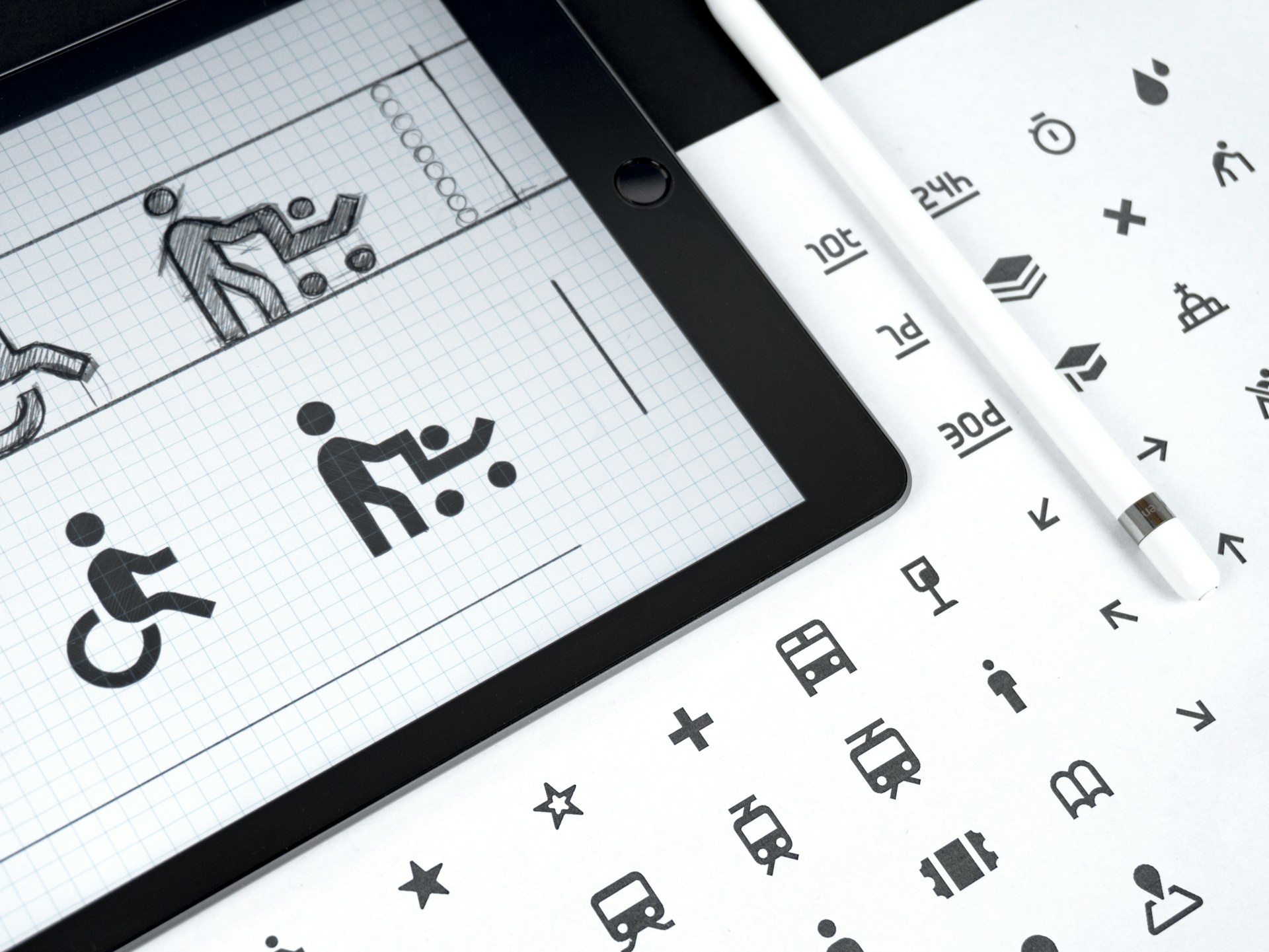
Your ads will only be as effective as the effort you put into them when making your design. Consider sketching your ideas on paper first so you can easily communicate your concept to the client. Finally, keep these tips in mind so you can easily approach your newspaper ad design.

Leave a Comment