


What does simplicity in design mean? Rather than adding all types of features to a design, simplicity looks at the user’s goals and provides only elements that lead to those goals. Some might call it a minimalist design. However, simplicity can include elements that aren’t minimalist.
According to the Bureau of Labor Statistics, there are approximately 254,100 graphic designers in the United States, making an average of $53,380 per year. No matter what type of design technique you’d like to learn, you’ll find a book or video on the topic. Simplicity in design is simply another technique you can learn and use when appropriate.
Why Is Simplicity in Design Good?
Too much noise might drive visitors from your website. Simplicity in design highlights only the things the user needs to have an excellent experience (UX) on your site. Cutting out the extras means customers can focus on the things you want them to.
While not exactly the same thing as minimalist design, simplicity and minimalism go hand in hand. You’ll often find minimalist designs are simple and simple designs have minimalistic elements.
One of the best ways to learn how to embrace a design technique is studying what others have done before you. We’ve gathered up the best tips for embracing simplicity in design, and examples to show you companies doing it really well.
1. Understand the User’s Goals
Simplicity in design requires more than simply knowing your target audience. You also must dig deep into their pain points and understand what drives them to your page in the first place? What are their goals?
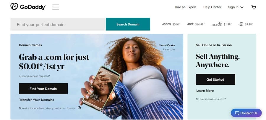
GoDaddy is a complex site with a lot of moving parts. They offer products related to websites and also serve as a marketing tool and web hosting hub. The site could become a cluttered mess, but they scale down the options and keep the user moving through the buyer’s journey.
2. Automate What You Can
The fewer actions a user must take, the more intuitive your site is. If the goal of your page is to convert a visitor into a newsletter subscriber, automate everything leading to the point of actually clicking to subscribe.
Think about what users are familiar with. Go with a navigation system most other sites use. Make scrolling simple. Ensure your calls to action (CTAs) look similar to other sites in your industry. Don’t try to surprise the reader too much with your design.
3. Limit Options
When you want to focus on simplicity in design, cut out all other options but a single one. For example, if you want users to click through to the next page, then that should be the only link on your page outside of the navigation menu.
Some designs even remove the nav bar completely on landing pages. However, keep in mind that people may come to your site from many different venues, so it’s smart to keep at least one way out and back to the main page.
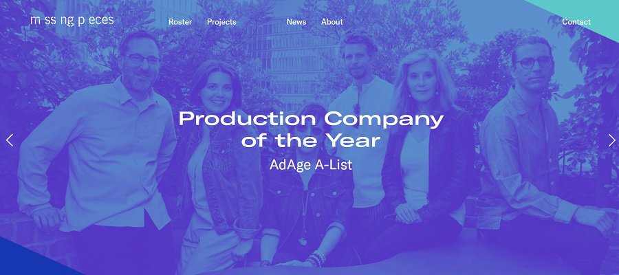
MssngPeces is a production company based in Los Angeles, California. Note how their main page scrolls sideways. The only options for movement are two arrows in either direction. The user can go right or left. Limiting where the user can go streamlines your sales funnel.
4. Find Balance
While you want to remove elements you don’t really need, you don’t want to embrace so much simplicity in design that you don’t have anything for users to do. A bare bones site may look unfinished or bore your readers.
If you’re unsure whether you should remove a feature, poll your users or move through your site, looking at it as though you’re visiting for the first time. If something is useful, keep it.
You can also use heatmaps and internal analytics to see how often visitors click on different links on a page. You might think a calculator is unnecessary, but if it brings significant traffic to your site, keep it.
5. Hide Instead of Remove
Some features might be useful at times but could be hidden at others. Use drop down menus, for example, to shift little used elements out of site and unclutter your page. The user can then pull it up if it’s needed again.
One example of this might be a pop-up box that appears when the user first visits the page to try to get them to subscribe to a newsletter. Once the user subscribes, the box disappears and doesn’t appear again unless the user goes to a specific sign up page.
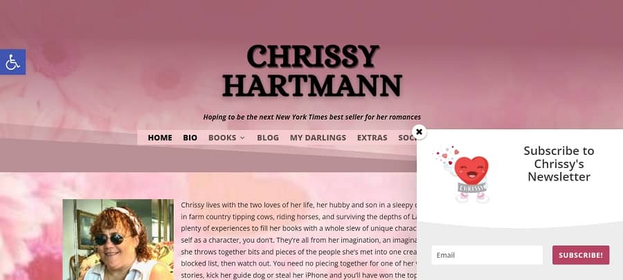
Romance author Chrissy Hartmann uses the disappearing technique for her newsletter subscription popup. The box appears on the landing page. However, if the user signs up, the box disappears on subsequent visits and pages.
You can use a similar technique with calculators, videos and other elements that might require a “play and done” approach.
6. Group Things Logically
Think about the order of things as they’re completed on your site. How can you group them better to make the design more intuitive. The less people have to think about their next step, the more likely they are to stick to your site instead of bouncing away.
More?
Why Choose Simplicity in Design?
A beautiful uncluttered website is one people want to visit and stay on. They don’t have to wonder what the next step is or make too many decisions at one time. Get rid of the things that don’t move the user toward your objective for the page. With a little focus, you’ll soon have a site that has just the right number of features.
Leave a Comment