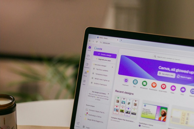
I’m sure you’ve seen them. Favicons are all over the internet. Although they’re tiny, these icons hold a lot of power. Here are some things to keep in mind when designing favicons.
What is a Favicon?

Courtesy of Pixabay
The word favicon is a shortened version of favorite icon. You’ve likely noticed these when you visit sites such as Facebook, Amazon and other big name brands – and many small ones. It is a small icon that appears in the top of the browser window.
In an age when people often have multiple browser window tabs open, a favicon allows the user to quickly navigate back to the correct page without having to open each tab to see what the website is.
Where are Favicons Used?
Favicons are used in three main places:
- In the address bar
- For tabbed browsing
- In a list of bookmarks
Just as with your logo, it is important that your favicon matches the rest of your branding throughout your website and marketing materials.
Imagine someone is browsing through several sites, and they have three or four tabs open in a browser window. Each site has a beautiful, custom favicon – and then there is your site with the default blank favicon. It will make your site look less trustworthy and credible than your competitors’ sites.
Tips for Designing a Favicon
Favicons are images, but they utilize the .ICO extension. Therefore, you can’t just create a JPG file and use it. You can use your own images, but they’ll need to be sized appropriately and you’ll need to upload them to a favicon wizard to have them translated into the correct format.
- Favicons are square and are typically 16 pixels by 16 pixels. Some sites do use slightly larger icons to show more detail, such as 24 pixels by 24 pixels or 32 pixels by 32 pixels.
- A favicon should reflect your brand image. Some great examples of favicons that are easily recognizable as a brand include Apple, Twitter and Google Plus.
- You can add transparency to your favicon, which means you can create a transparent background or easily overlay elements to create the exact look you’d like.
- Since the image space is so small, you should keep the design fairly simple.
- Make sure your favicon contrasts nicely with standard browser tab background. Most browsers use a light gray or blue, so your favicon should pop against that color. Stay away from grays or extremely light colors. At the same time, it’s possible the user set their browser to a different color, even black, so your design must still appear bold on darker backgrounds.
- Keep the design simple. Remember, the finished product is a mere 16 pixels or so. If you try to create an elaborate design, it will get lost in translation, especially on smaller screens such as mobile devices.
- Avoid scalable vector graphics (SVGs) and create multiple sizes of the same favicon instead. At first glance, it might seem to make more sense to create a scalable graphic that adapts to different browsers. The problem is that not all browsers support SVG favicons. The only two that currently support SVG favicons are Firefox and Safari. Anyone who uses Internet Explorer, Chrome, Opera or another browser will get left out in the cold.
You can use any image editing software of your choice to create the basic look of your favicon. Consider creating it in a 64 pixel by 64 pixel size. Then upload to one of the favicon editors listed below to translate into the correct size and into the .ICO extension you’ll need to upload it to your website.
Online Favicon Wizards
Once you have the basic design of your favicon, you’ll want to find a place where you can turn it into the right file extension.
- Favicon.cc – This site allows you to design a favicon from scratch, or upload your own image, make edits and save it as an .ICO file. One thing that’s interesting about this site is that you can study the favicons other people have created. You can look at recently uploaded and favorite icons. If you’re not sure what to do for a design, these examples can give you some inspiration.
- Favicon Generator – If you just need to take your design and convert it to favicon format, this site is easy to use. You choose the size you’d like your favicon to be – default size is set to 16 pixels by 16 pixels. Then, you simply hit the button that says Create Favicon. The site accepts JPEG, PNG, JPG and GIF.
- Favicon from Pics – This is an interesting way to create a Favicon. You can take any picture, even a photo from your Twitter profile, and convert it into a favicon. This can be particularly useful if you are an author, artist or someone who is the actual brand. It can also make for a colorful and interesting icon.
- Real Favicon Generator – One thing that is particularly helpful about this favicon generator is that you can make sure it is compatible across all types of devices and browsers. Also, you can check out your already designed favicon and get feedback about what can be improved.
With these free tools, you’ll be able to create a beautiful, professional looking favicon with just a few quick steps.
Examples of Attention-Grabbing Favicons
Have you ever visited a site and the favicon is their logo, but it is so detailed you can’t quite make out what it is supposed to be? Many well-known brands use their logos as their favicons, and they don’t translate the way you’d expect from a multi-million-dollar corporation. If your logo is too complicated, it’s best to stick with a letter or different symbol which reflects your business.
On the other hand, some logos are simple outlines that immediately draw attention. Learn to create eye-catching favicons by studying excellent examples from other companies. Here are a few examples of favicons in different styles and why they work well.
Handsome Brook Farm uses their logo as their favicon. Their logo is a simple outline of a barn and grain silo. It translates well for a favicon because of the straightforward nature of the design. They use a vivid orange, which pops on any color background, and they repeat the color in the palette of their website design.
Progressive uses the letter “P” for their favicon. Using a single letter is quite effective at marking which tab your page is on for the user without them having to struggle to make out a logo. Note how the blue in the “P” is the same blue they use in their name and brand colors. It creates consistency across different channels where they have a presence.
RXBAR uses both initials and a symbol to get their point across in their favicon. It’s effective because the letters and symbol are evident even in such a small size, but it also shows which page that tab is on. The entire favicon is on a black background with white letters and symbol. This approach works well on a black background, where only the typography appears, but it also works on a lighter background because of the built-in black box.
Uploading Favicons to Websites
Once you’ve created your favicon, you’ll need to upload it to your website. Simply load your site in the FTP tool of your choice, such as Filezilla. Upload the .ICO file with your favicon into the webroot folder.
Next, upload the following code into the HTML for your site between the <head> and </head> tags: <link rel=”shortcut icon” href=”favicon.ico”>
That’s it. Your favicon should now appear when a browser loads your website.
Favicons add a lot of interest to your website. They can help seal your brand as professional and consistent. It takes just a small amount of time to build a favicon, but you’ll get big payoffs from the design.
About The Author
Eleanor Hecks is the Editor-in-Chief of Designerly Magazine, an online publication dedicated to providing in-depth content from the design and marketing industries. When she's not designing or writing code, you can find her exploring the outdoors with her husband and dog in their RV, burning calories at a local Zumba class, or curled up with a good book with her cats Gem and Cali.
You can find more of Eleanor's work at www.eleanorhecks.com.


