As a designer, there are many different places you can find inspiration — even in fast food wrappers. You might not have given it much thought before, but someone has to design every wrapper the fast food we buy comes in. Studying these wrappers can be quite inspirational.
Some days, inspiration is an elusive thing. Working for too long without a break can wreak havoc on creativity. Ideas grow stale and almost every designer experiences a block at some time. Blocks are frustrating because they make coming up with fresh, new ideas seem impossible.
Because creativity is part of our thought process, there are steps you can take to boost your creativity and overcome designer’s block, such as studying the work of great designers, not working under pressure and looking for new ways to think about things. One way you can think differently is to study fast food wrappers — which is definitely thinking outside the box. Here are some things that might inspire you about fast food wrappers and give you some ideas for your own designs:
1. Color
Study the colors used in fast food wrapper design. How do those colors work with the overall color scheme of the business itself? Does the website reflect these colors? Most fast food places vary the color of sandwich wrapping so that workers can pick up the correct sandwich easily. At the same time, those wrappers have to not clash with the logo of the restaurant.
Think about the last time you went to McDonald’s. Did you notice that the cheeseburgers and hamburgers had different color wrappers? They also place bigger sandwiches in sturdier boxes instead of paper wrappers. However, at the same time, McDonald’s adds their logo to these wrappers so that’s it’s clear where the product came from.
How can you apply this to your designs? Think about color both as a reflection of the brand image and as having a specific purpose, such as differentiating products. Color must be within a complementary palette if you want the finished product to look cohesive.
2. Functionality
Another thing to look at when it comes to fast food wrappers is the functionality of the wrapper. One fast food place might use a foil lined wrapper to keep a sandwich warm, while another uses parchment paper lining and a simple paper outside to prevent ingredients from melting onto the paper. When creating fast food wrappers, designers have to consider how they can improve the product with their designs.
You can apply this to your work because the functionality is a vital part of all design. Consider a website. If its images don’t load quickly, about 39 percent of consumers will leave the site. Each element of your design must function seamlessly, whether you are creating a website, an ad or a fast food wrapper. User experience should be one of your top considerations during any project.
3. Logo Incorporation
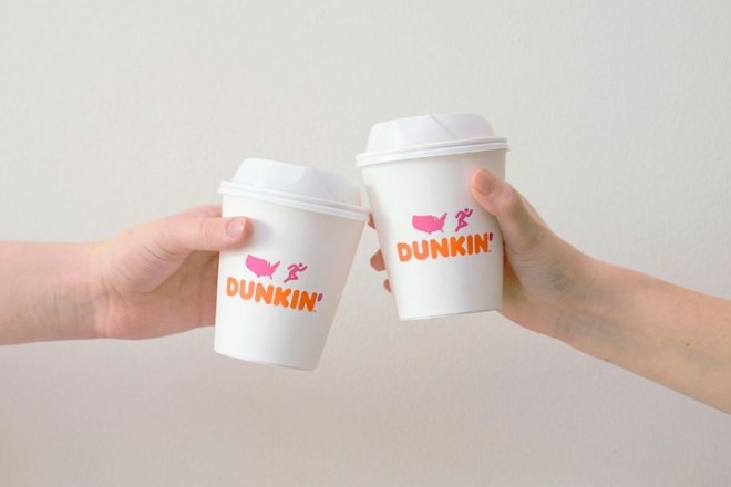
Nearly every fast food wrapper, at least from the big chains, includes incorporation of the company logo somewhere on the wrapper. This is part of their overall marketing. Anyone who sees that symbol instantly knows the person has purchased that brand. If you doubt this, take lunch to any child in your family at school and watch the other kids react when the child pulls out that sandwich wrapped in the logo from their favorite fast food joint. People learn fast food logos from a young age, because of the branding strategies these companies employ.
You can study how they incorporate the logo design alongside differentiating different food offerings. How can you incorporate a logo into your work, even when the focus is on something else? Perhaps you need to fade out the logo and include it in the background. Maybe the logo should be centered. There are many different ways to incorporate a logo.
4. Typesetting
Have you ever noticed that the font on wrappers is the same as the font on other items in the store such as the signage and menu? This is part of the overall branding of the company.
What you can learn from this is that the font you choose is crucial. For most businesses, the same font appears on all materials the company puts out. So, if a business sends out a holiday newsletter, they’ll use the same fonts in the header and text as they use on the website. Even if they don’t use the same font, they’ll probably choose ones that are similar and look good together.
5. Layout
Most fast food wrappers are designed so that the text and images are right on the top of the sandwich. However, there is a lot more to the wrapper than what appears there. The spacing has to be perfectly sized to the finished food item. There has to be enough room for the employees to wrap the sandwich up. Figuring out the perfect layout so that the design is visible takes a lot of time and trial and error.
Take away from this concept that you may need to try out many different designs before you find the exact spacing you need for maximum impact. The first version is usually not quite perfect and needs some minor tweaks to get things exactly where you’d like them to be.
Unusual Inspiration Sources
In the end, if you’re looking for inspiration, be aware that you can find it anywhere. Be open to looking at the world through the eyes of a designer. What haven’t you tried yet in your quest for inspiration? Studying fast food wrappers is a great place to start, but don’t stop there. When you drive down the road, pay attention to billboards, vehicle wraps and storefronts. You can find inspiration anywhere. You just have to be open to it.


