What Are Monochromatic Colors?
Posted on September 27, 2018 | Updated on November 15, 2023
Monochromatic colors are the same color in a range of shades. Traditional color theory states each hue must come from the color wheel and be a primary, secondary or tertiary color. However, that isn’t always the case. As with most guidelines, there are times you can break the rule and come up with something truly unique.
Monochromatic colors might not be the obvious choice for design. However, using a single color makes a bold statement. If you have linked your branding strongly with a specific color, a monochromatic design enhances that overall brand image.
You’ll eliminate the need for matching different hues because colors in the same family will mesh together perfectly. If you haven’t tried monochromatic design yet, you’ll be surprised at the ease of color selection.
Types of Monochromatic Color Schemes
When it comes to using monochromatic colors in your web design, you need to understand there are different types of color schemes. You can also add black or white, in moderation, without changing the overall impact of the design.
Some designs also incorporate shades of gray as accents to help define different elements that are within the same color family, but deserve separate emphasis. You’ll be able to tell if anything clashes as you add elements to your design. As a rule of thumb, white, gray and black can all be added in moderation without changing the overall feel of the design.
There are also variations of monochromatic design. For example, you might add in some gray tones to help create contrast within the design. Design purists will say you can only use black, white and the color, but many designers aren’t afraid to add a pop of another color to create contrast. For example, they might add a single pop of green with a call-to-action button. You could have a blue design and add a pop of purple and still have the same overall feel for the design.
Uses for Single-Color Designs
There are several uses for single-color designs. If you want a simple look that puts the focus on the sales funnel or on an action you’d like the user to take, a monochromatic design cuts through the clutter and puts the focus where it needs to be.
Monochromatic colors are also quite elegant, especially if you stick with classic colors, such as blue, red or black and white. Using a single color allows you to create some harmony in your look.
If you need to add a lot of information to a page, a single-color theme allows you to put the focus on that information and cut some of the clutter of other designs.
Examples of Monochromatic Color Schemes
Turn to an extended color wheel to find an array of hex codes that fall within the same color family. You can also use a color palette generator and input that you want a monochromatic scheme. Once you have an idea of what shades you want and how they contrast with one another, it’s much easier to create your design and make adjustments as needed.
Here are some examples of gorgeous monochromatic color schemes used in websites to give you an idea of what you can achieve.
Bitter Renter

When you consider a monochromatic color scheme, you might envision grays or subtle colors. Bitter Renter proves you can use bright pops of bold color and still create a design in the family. They use a bold orange for the background, some various hues to create a map and white for their text and calls to action (CTAs).
To achieve a similar look, choose a primary color and then add accents in various shades. Use black and white as makes sense.
For the Love of Bread

For the Love of Bread uses grays to create a traditional monochromatic look. The result is something elegant and reminiscent of the past. Since the site talks about the history of bread making, the design makes perfect sense to set the tone for the content.
If you want something elegant or vintage looking, then a gray-toned monochromatic look may be perfect for your needs. Add white and black elements without interrupting the overall aesthetics.
Rotondo
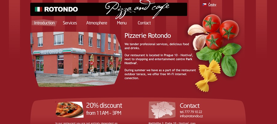
Rotondo taps into the elegance of red to draw users into the site and make them want to eat delicious food. A deep, rich red fills the background with stripes of varying hues. A pop of tomato red in the photo and then the slightest additional colors with the tan pasta and green herbs gives the overall feel one of home.
Keep in mind that you can add a bit of transparency to layers to mute tones and still stay within the same color family.
Digital Ocean

Digital Ocean embraces blues for their monochromatic color scheme. The bright pop of blue in the background has varying shades. The navy blue at the top announces recent news. The CTA button is a dark blue with white text to really make it pop and contrast nicely with the background.
You could repeat this look with any color by varying the tones used. For green, you might choose a dark, forest green for the top ticker, a Kelly green for the background and a soft lime for your CTA button.
Absolute Bica

Absolute Bica takes a midnight blue shade and plays on it to create a beautiful design that pulls the user in. The majority of the page is made up of the deep blue with a brighter shade for the night sky with stars and shooting stars and a light yellow moon. The CTAs almost blend but the white text makes them pop. The entire design is attractive, modern and unique enough to stand out from competitors.
Challenges With Monochromatic Designs
There are a few challenges when designing with monochrome colors. Figuring out the right amount of contrast is difficult. You must ensure your text is legible and that elements blend and pop at the same time, which is a challenge when everything is in the same hue.
However, if you use a color palette wizard, the task becomes much easier, as you’ll have suggestions for darker and light colors. Choose shades on either end of the range for strong contrast. Always eyeball the final result to ensure everything remains legible. Take a step back from the computer and see how it looks from a distance. Check it up close. See what translates well to mobile and what needs adjusting.
Choosing your base color is one of the trickiest parts of monochromatic design. The shade of the base color needs to allow for enough contrast. Don’t be afraid to make tiny adjustments until you find exactly the right hue. Of course, if you’re working within a company’s brand standards, this limits you a bit. However, you can pull up a full palette of shades using that color and choose something that’s still in the same family, as your base. The logo color then becomes an accent shade.
Incorporating Into Your Designs
When it comes to adding a single color to your designs, don’t just limit yourself to designing a full web page with a single color. You can also incorporate this design technique into infographics, logos and portions of a website, rather than the entire site.
Try using single-color design in various places and see where it looks best. Do some split testing to see how consumers respond to the design and adjust as necessary.
Benefits of Designing in Monochrome
There are some real benefits to using a monochromatic color scheme. Instead of working to make sure every color on the page matches and doesn’t clash, you’ll eliminate this issue. You have one color to work with, so there are no worries about colors clashing.
Designing is also much faster. You don’t have to spend hours trying out different color combinations or checking competitor sites to make sure your color scheme is unique. Once you’ve picked the base color, choose different shades based around that hue.
Monochrome also allows you to put the focus on the most essential elements on the page. Whether you want to direct the reader to specific content, an image or a call to action, monochrome sets the base that allows these elements to pop.
Using different shades of a single color also allows those with vision impairments such as color blindness to view your site easily. Because the color is the same, there are no worries about say red and blue blending together. Instead, the color-blind person will view the page in its contrasts, which are naturally built in when using a single hue.
Monochromatic Colors
The best place to start with monochrome design is by learning the basics and sticking to them. As you begin to feel more comfortable with single-color design, branch out and add a pop of color, some gray shading and other elements you might not use just starting off in this type of design. With a little practice, your designs will be functional and beautiful.


About The Author
Eleanor Hecks is the Editor-in-Chief of Designerly Magazine, an online publication dedicated to providing in-depth content from the design and marketing industries. When she's not designing or writing code, you can find her exploring the outdoors with her husband and dog in their RV, burning calories at a local Zumba class, or curled up with a good book with her cats Gem and Cali.
You can find more of Eleanor's work at www.eleanorhecks.com.
Hi Eleanor, I really like your blog, I can get some new knowledge. Is there okay for you I can copy or linked your article on my linked page or our website etc.?
Hi Shane,
Thanks for reading my blog! And yes, if you syndicate any of my articles, you must give me/my site credit and link to the original post.