Examples of Excellent Pink Website Designs

Posted on November 30, 2023 | Updated on November 30, 2023
We are tickled pink to cover the topic of girly, fun, bright and fabulous pink website design examples. Pink is such a fun, youthful color. It’s the perfect choice for a site aimed at selling products to women, teen sites or to create a retro feel.
Pink comes in many different hues and each has a unique personality. A barely there pink is perfect for wedding sites and hinting at romance. A fuschia screams fun and good times. Electric-pink gives everything a 1980s neon and bright colors retro feel.
Why Should You Choose a Pink Website Design?
Pink might not seem like the clear choice, even if the majority of your customers are female. In fact, some might think the hue is a bit unprofessional for some industries. Keep in mind you don’t have to fill an entire page with bubble gum pink, though. You can certainly use it as an accent color, a hue over top a photo or for your call to action (CTA) buttons.
For a more minimalistic look, you could utilize whites and off-whites with a few splashes of pink. For bolder looks, try combining different shades within the pink color family and come up with a girly monochromatic design.
The best way to learn how to utilize pink website designs is by studying what others have already done. We’ll look at a variety of industries to help you see the possibilities.
1. Bold Pops of Pink
Using pink as an accent color helps bring a softer look to any website. Whether you choose to go with mainly black and white or use a soft pink background, adding some pink to a news ticker or navigation bar may be all you need to set the tone.

Mixhers created a drink additive geared specifically toward women and some other nutritional drinks. Their primary audience is women from all walks of life. With that in mind, they use a bright pop of pink to draw attention to their latest sale and the live chat feature.
The name logo also is in a softer shade of pink but not so light as to fade into the white background. As you scroll down the page, you’ll encounter different additions of pink here and there in boxes, backgrounds, images and text.
2. Embrace the Pink
Another option is to go with a lot of pink elements and make the site scream with the color. You might use several different hues, but they would all be pink. A light pink for the background and darker pink for accents create a customized look.

Alessandra Zanghi is a wedding consultant. Since many weddings use pink and people think of lacy, frilly, girly things when they think of planning a marital event, using pink throughout the design just makes sense. The background color is a soft petal pink. Even the images have pink elements in them, such as the flower pictured in the image above. Splashes of extremely light pink and white pull everything together.
3. Choose Almost Pink
To get the emotional appeal of a soft pink, you don’t have to fill your page with the hue. Instead, place an accent here and there and then choose images with a hint at blush colors. For example, a tan with a pink tinge pulls the user’s attention and keeps with a soft theme.
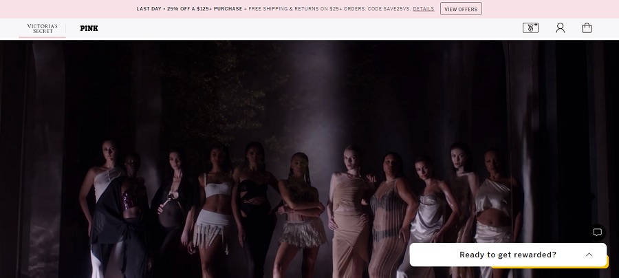
Victoria’s Secret is known for its women’s clothing lines. One of their products is titled “Pink,” which is extremely fitting for this topic. Note how they use a soft stripe of pink across the top of their website design.
However, they also pick up hints of pink in the dresses the models wear and images throughout their site. As you scroll down, you’ll see a number of photos that are filtered to have a pink tinge.
4. Go Retro
Going with a pop of neon pink helps give the feel of days gone by. If you grew up in the 80s, you already know some of the colors and styles of the era were quite unique. Neon signs and bright colors ruled the day.
When you select a brilliant hue, you send a message to visitors that the brand is stronger than they initially thought.

We kind of love the Snog frozen yogurt pink website design. The bright color could be very jarring on the eyes. They prevent this by keeping the elements quite limited. They use white, black and a darker pink text. There are no images above the fold and very little on the main page of the site.
This particular shade of pink makes one thing of pink candy and fun days. It’s the exact right choice for this brand.
5. Pair With Complementary Colors
One of the most powerful statements in pink website design is combining pink with a complementary color. Add in some blue or green for a unique look that is earthy and youthful. Don’t forget to add pink to images, CTAs and popups.

Hey Milestone is a subscription box service for pregnant and new moms. You’ll get to sample different products and everything is geared toward femininity. One thing we love about the pink accents on this site is that they repeat in the popup box. They utilize the same deep pink and emerald green to grab attention.
6. Pair With Another Soft Color
Another option for your pink website designs is to pair a soft pink with another gentle color. For example, you might design a site using tan and pink, pink and lavender or pink and pale blue. Whatever color combination you wind up with, pink has the ability to bring a calm presence or a jarring one, so choose your hues carefully.
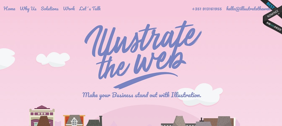
Illustrate the Web fills the background with a soft pink. For the text, they go with a purple, which doesn’t detract from the background. The text is also easy to read on top of the lighter background.
The website focuses on offering illustrations for business owners. What works really well is the addition of cartoonish clouds and houses to make the background look like an illustration.
7. Accent With Photos
Once you’ve chosen a pink shade that represents your brand personality, add it into your photos for a fun, subtle effect that ties the entire design together. Add an image with a model wearing a pink jacket, holding pink candy and putting on pink lipstick. The sky’s the limit with the things you can do with the color pink.

A vivid pink has long been part of Duncan Donuts’ brand image. Whether they use it in a navigation bar, on their cups or as part of their icon identification, pink works well for the donut company.
Perhaps it is the delicious strawberry glazed donuts that grab the most attention. Whatever the case, meshing orange and pink together and focusing on adding in images with similar colors is a stroke of design genius.
Is a Pink Website Design Right for You?
The only way to see if a pink website design might work for your brand is to try one out. Set up some split testing and see if your users respond to a lighter, more magical design. The perfect color may or may not be pink, but it certainly doesn’t hurt to try it on and see how site visitors respond.