A company’s logo can be a vital part of helping it stick in the minds of consumers and make people want to purchase products from certain brands over others. It can also make signs more recognizable from substantial distances, helping people make more confident choices when they have numerous options. One of the first major design decisions relates to the shape. Here are some compelling examples of round logos and discussions about why they work so well.
Starbucks Coffee
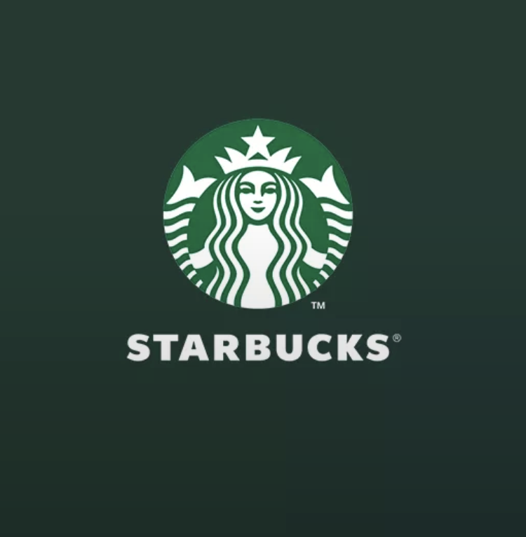
Starbucks Coffee has an instantly recognizable green and white logo of a female figure with two tails. Many people don’t take a lot of time to analyze the logo if they’re just going to visit their nearest location to get a coffee fix. However, this is one of those round logos that has quite a story behind it.
The year was 1971, and the coffee brand’s founders found themselves inspired by a mythological and nautical creature called a siren. They’re like mermaids but have two tails instead of one. The two tails of the siren in the Starbucks logo are on either side of the female figure. The founders also realized their company had major connections to the water.
The Seattle-based company is on Puget Sound. Plus, the brand’s coffees often travel long distances to reach specific retail outlets. Many of those journeys require trips taken on the water. Starbucks’ design representatives have made several tweaks to the siren over the decades, such as to give her a more modern look and remove the words “Starbucks Coffee” from the logo.
That latter change is a testament to how powerful round logos can be. People could instantly see that one and associate it with coffee in their minds, enabling the removal of the words without reducing the overall impact.
NASA
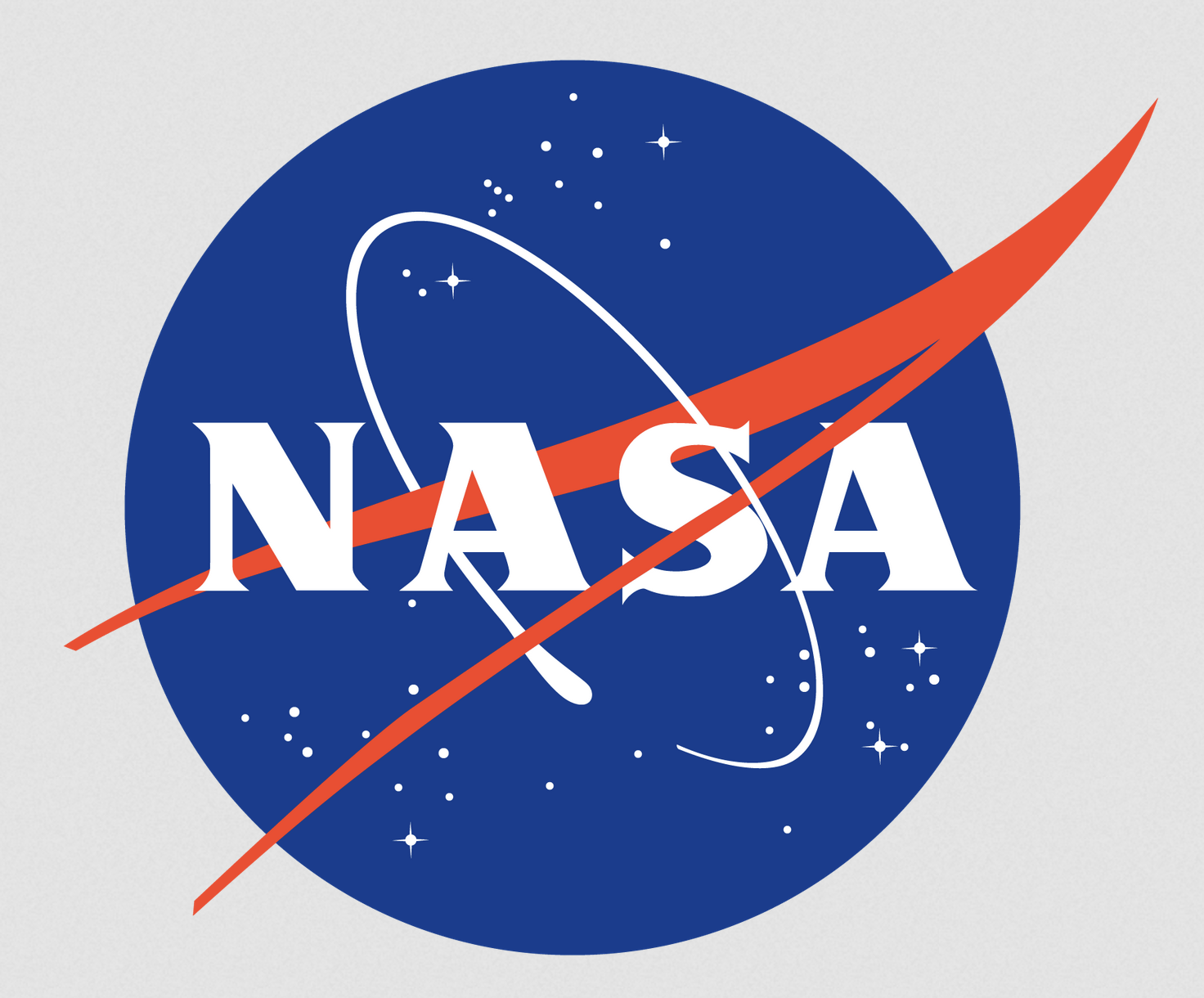
Some of the most famous round logos have multiple thematic elements that come together in a single thoughtful design. Such was the case for NASA, the organization responsible for space exploration in the United States. James Modarelli, a NASA employee, designed it only two years after NASA’s creation. It eventually earned the nickname “the meatball” due to its round shape.
However, this round logo also has numerous thoughtful elements that symbolize NASA’s work. The shape itself mimics a planet, while the stars give reminders of NASA’s commitment to exploring outer space. There’s also a red, V-shaped wing going diagonally through the logo. It stands for aeronautics. Finally, the orbital ring around the second and third letters in the name represents traveling in space.
Some people probably recall seeing a different logo for NASA that only included red letters featuring rounded curves and no horizontal lines in each A. The organization started using that one in 1975 after some people there thought it offered a more modern take. However, after the retirement of that newer logo in 1992, the agency went back to using the round one. It remains the logo of choice today.
That example shows that you don’t necessarily have to permanently stop using a logo after switching to a different one. Change is often good, but many people within and outside of an organization often have strong emotional ties to a logo. That’s one of the reasons why it often makes the most sense to start round logos or those with other shapes again after taking a break.
Keep in mind that NASA used the newer logo for nearly two decades. But, even that period of no longer using the other one was long enough to make the first logo irrelevant.
Firefox

A vital part of a successful logo design project involves seeing things from the audience or customer’s perspective. Is there anything about a proposed logo that could confuse or disappoint them? Sometimes, particularly following negative feedback, brand representatives must engage in damage control to clarify the meaning behind updated round logos or correct misinterpretations.
Such was the case in 2021 when social media memes went viral and suggested Firefox was getting rid of the fox encircling the purple globe. However, people from the browser company confirmed there were no plans to get rid of the fox, and it hadn’t happened.
Part of the confusion likely stemmed from the fact that the logo of Firefox’s parent company does not include the fox design, although it looks similar to the browser’s logo in other respects. It’s also round and has a similar color scheme.
This real-life story of round logos is also a good reminder not to believe everything you read on the internet. The best approach is to go straight to the source rather than latching onto hearsay. It’s also no wonder people are so enthusiastic about Firefox’s logo. The fitting design features the distinctive head of a fox, with the other half of its body featuring curves that look a lot like flames. The result looks great and aligns with the browser’s name.
LG
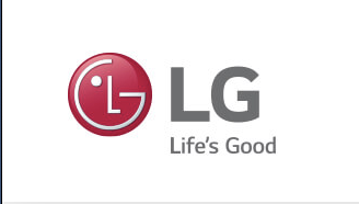
LG’s design also stands out among round logos for creativity. Notice how the two letters seem to make the shapes of a happy person’s face. That decision supports the “Life’s Good” slogan. LG’s brand representatives also say that the primary red color represents friendliness and the company’s commitment to delivering the best.
Moreover, the choice to have the logo’s letters inside a circle design reportedly symbolizes the world, youth, the future, humanity, and technology. Elsewhere, sharp-eyed analysts have pointed out that the slender lines inside the logo’s circle look similar to the power buttons on many electronic devices and appliances. That was almost certainly purposeful since such products represent some of the many LG sells.
Creating a distinctive logo can be a drawn-out process, particularly because there are so many ways to call attention to certain components of a brand’s image and identity. Besides helping people to associate words with specific images, logos can enable viewers to recall particular characteristics of the brands they know and love.
Spend some time thinking about what you want people to take away from your brand and why. How could a logo cause people to bring those things to mind? Consider working with a graphic designer who specializes in logos if you need some more inspiration. Alternatively, browse portfolios of previous work. While you don’t want your logo to look too similar to another brand’s, there’s often much to learn from other examples and best practices in design.
Tide
The combination of an enticing color scheme can make round logos even more impactful. The example provided by Tide detergent shows that principle in action. People immediately notice the yellow, blue, and orange logo, even when spotting it on a crowded shelf of competing products.
Architect and industrial designer Donald Deskey was the man behind the now-iconic logo. The design, introduced to the market in 1946, also stood out because it was the first nationally sold item to feature such bright colors on its packaging.
Tide has updated its products over the years, adding new ingredients to improve their whitening and brightening power. Even so, the logo is largely unchanged and still features the bullseye design with those three eye-catching colors.
This example proves it’s not always necessary to update round logos, even when companies keep using the same ones for decades. Doing something different is not always the best solution. That’s especially true for a company like Tide, which has such a long history of keeping its logo consistent. Even people who prefer using other detergent brands can almost certainly describe the logo’s appearance if asked. That’s meaningful proof the company made the right moves with its design.
Will Your Company Use Round Logos?
The five outstanding round logos described here stick in the minds of today’s consumers for good reasons. If you’re thinking about using round logo designs within your company or brand, the examples you’ve just read about can help you make smart, enduring choices.
If you still feel unsure, consider doing some market tests to see which designs cause the most favorable responses in the target audience. Getting that feedback could provide the confidence needed to help you feel positive about a given design.


Leave a Comment