

In This Article
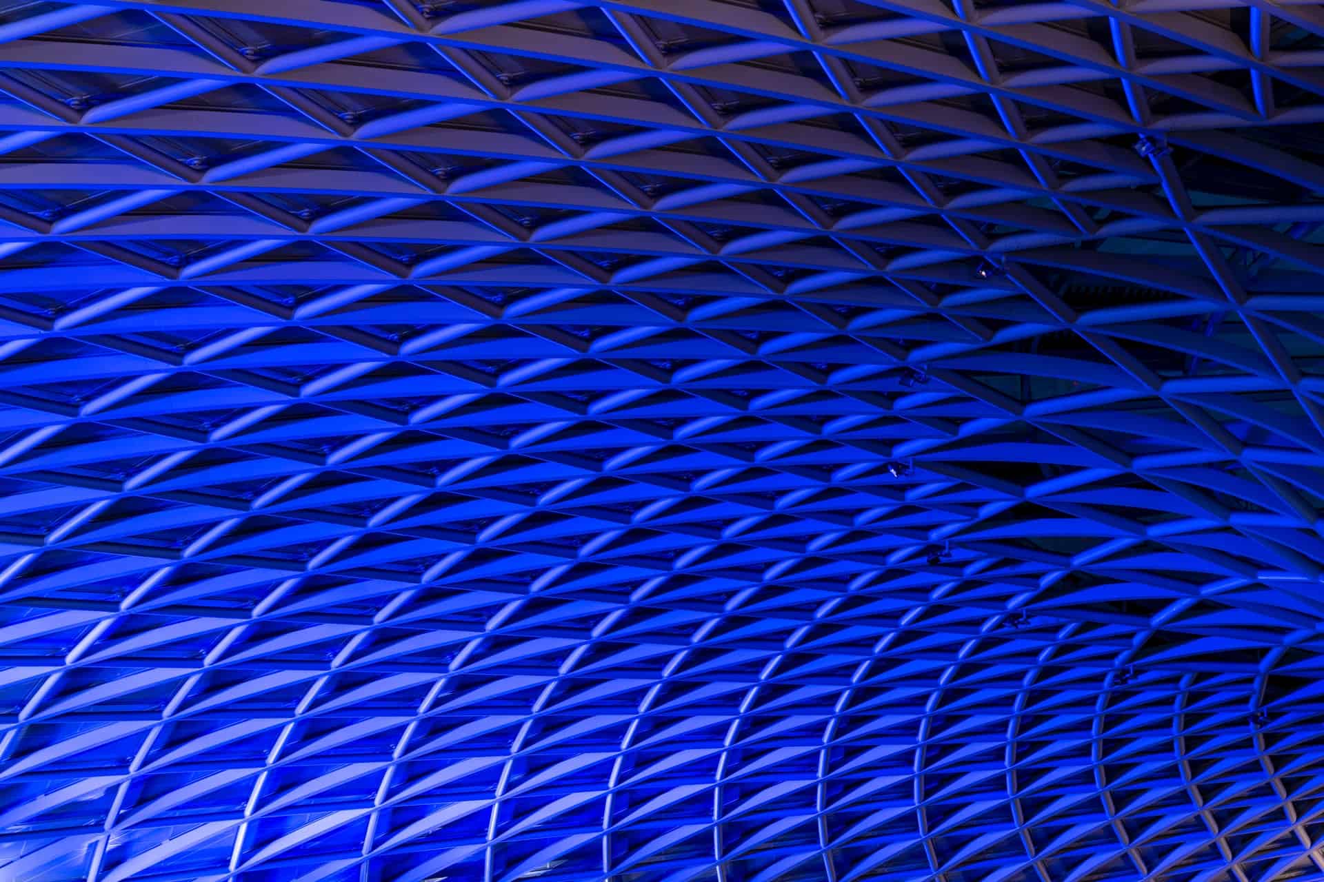
The success of your design relies on how your audience perceives the overall concept. The color and shape of designs impact humans on an emotional level people aren’t fully aware of — the entire package affects your thoughts and emotions, while geometric patterns offer specific shapes for the human eye to hone in on and relate to.
There is a science to geometric patterns, and the way shapes make us feel. For example, triangles represent achievement, squares offer a sense of security and circles stand for the life chain cycle. We see circles, squares and triangles in our everyday lives, so they feel comfortable and familiar.
If you aren’t already feeling inspired about adding geometric patterns to your designs, here are 25 patterns for a bit of inspiration.
1. Geometric Calligraphy

Adobe shows an example of geometric calligraphy, which would work for the typography in a header of any site or as logo design. The use of geometry to create letters and numbers creates a three-dimensional effect which grabs user attention and gives a design a modern edge. In the example above, the colors are soft with shadow and light creating the hard edges of the numbers.
2. Watercolor Background

Want to mix things up and add a bit of whimsy to your web design? Use a geometric watercolor as the background of your page. The softer tones of watercolor allow you to layer text and other elements over the top of the background. However, the vibrancy of the geometric design still grabs the user’s attention and imagination. The effect is subtle, and you can utilize any shapes needed to create an image that ties into your brand.
3. Fun Shapes

Anastasia Gulakova creates bright geometric patterns shaped into various animals, such as the flamingos pictured above. This type of design works well for posters or prints. Imagine a bedspread with this design or an event poster utilizing bold geometric shapes around the border.
4. Floral Focus

Adding different geometric shapes together, you can create beautiful floral designs that look modern rather than old fashioned. In the example above, created by Muhammad Badi, he utilizes shading and a single flower with a pop of orange to draw the user’s eye. You could employ a similar design pattern to draw attention to a specific element in your design.
5. Hidden Shapes

As your geometric design skills strengthen, you’ll begin seeing shapes within the geometric patterns. Placing a hidden shape within your design impacts users on more than one level and shows the overall thought and care you put into a design.
In the example above, Puthithon Pongsai creates geometric shapes which also resemble faces in spots. The shapes are strangely familiar and unique at the same time. The impact is striking, and you can’t look away.
6. Cartoon Fun

The geometric designs used in Francesco Secchi’s geometric wallpaper designs add a touch of whimsy to the walls of an office building, showing the company as cutting edge and fun.
Imagine using brightly-colored geometric lines for the walls of a doctor’s office, or to draw users into a store aimed at young people.
7. Geometric Typography

Take a look at these logo designs by designer Ryan Feerer with geometric typography to add an element of modern trends. The background repeats the geometric design with triangles, circles and swirls although the focus is on the words.
Even if your background features something more traditional, you can modernize any design by adding geometric angles to your typography for a bold look.
8. Geometric Pattern on White

Jon Delman’s geometric pattern on an off-white mug above shows the stark contrast between geometry designs placed on top of a solid background. The overall look has a classic feel but is also active with a lot of solid colored lines and a limited color palette of greens, black and negative space.
Designers should pay particular attention to the use of negative space in this design. It’s a crazy mish-mash of squares, circles and lines, but everything works together because of the way each part of the design fits into a specified space.
9. Geometric Angles

Ken Briggs designed this striking poster, which utilizes angles for the appearance of triangles as the letters come together but without actually using triangles. The result is impressive and makes the user want to read the poster and see what the show is about.
The method Briggs uses to line up the typography on an angle works for a website heading, on stationary or for a flyer about a special event.
10. Geometric Gradients

Andy Gilmore creates a pattern of circles and lines with a color palette that runs from red to blue to black. The design combines two popular trends of using both geometric patterns and gradients.
This method of design works well for website backgrounds or on a business card. The modern and exciting design helps draws the eye across the object without putting the focus on any one element more than another.
11. Hero Patterns

Devanta Ebison takes a look at using geometric patterns in hero designs. Many websites now have a hero image in the header to grab the user’s interest from the minute they land on a site. Using geometric patterns is an excellent substitute for a photograph, especially if there isn’t an image that seems highly relevant to your product or service. Using geometric patterns allows you to show off your brand’s color palette and helps you stand out from the competition.
12. Mixing Bold Color Palettes

Designer Jon Delman takes some geometric designs, combines them with bold color choices, such as yellow and coral, and creates designs for socks and other items.
Use crazy patterns and color combinations to create bold gym bags, tee shirts and other clothing designs. You could also use this type of pattern to develop promotional giveaways for nearly any kind of business. The bold designs grab the eye and are sure to lead to conversation and word-of-mouth advertising.
13. Patterns in Everyday Objects

In the traditional trade magazine cover above, the designer uses everyday objects related to the topic — book covers — to create curves and lines which repeat and form a memorable pattern. The design doesn’t detract from the text on the magazine cover, but at the same time tells the viewer what the magazine is about.
You could use this type of repeating pattern by adding an outline of a common object which relates to your business, such as a service truck or clipboard.
14. Intersecting Lines

Kelly Pope’s wall art concept is brilliant in the use of geometric patterns. The lines intersect, creating the look of nature with its overlapping leaves and lines. To the left side is the outline of a leaf, but it also looks like a woman’s face. The single splash of green for the woman’s face draws interest while also speaking to what the concept is about, which is natural beauty. The written words here and there add to the overall effect.
Think about the elements that speak to the industry for which you’re designing and the natural geometric lines in those objects.
15. Subtle Circles

This poster for the Merce Cunningham Dance Company, created by designer Rosemarie Tissi, uses subject semi-circles to generate a feeling of movement, which goes perfectly with the topic of dance. The circles line up perfectly with the images of the dancers, almost embracing them as they’re in mid-leap.
Circles add elements of geometric patterns without completely overtaking the rest of your design. They’re an excellent way of adding visual interest.
16. Animated Geometric Patterns

Adding some motion to a geometric pattern gives your site a retro, psychedelic look. While the technique might be too busy for most businesses, if you’re hosting a special event or sale, this is the time to use an animated graphic. You could also utilize animation when trying to stand out from competitors, such as on social media.
17. Art Deco

Tony Thomas offers several black and gold geometric patterns which all work perfectly for retro-looking background design.
Art deco has a particular look and feel that makes one think of mid-20th-century art and design. If your client wants a mid-century retro look, look at adding an art deco geometric pattern in gold, black or simple primary colors to the background of your design.
18. Girly Geometry

Designer Snita shares several geometric patterns with splashes of girly pink and soft blue. The impact is something you’d see in a design for a baby girl’s bedroom or the background of a website selling products for little girls.
When you think about geometric patterns, your first thought might be bold, sharp lines and colors, which can be a bit masculine. However, with today’s design tools, there’s no reason you can’t create a girly geometric design such as the ones above, with splashes of pink and pastels as well as smaller, softer lines.
19. Shapes Logo

Valerie’s Jar’s design for a logo for the language learning site garbanzo is brilliant. She uses triangles, lines and circles to create a bird mascot. Colors are bold and reflected in the name of the company as well as the bird itself, creating symmetry.
For your designs, keep in mind that shapes work together to create a bigger image, adding a modern touch to nearly any logo design.
20. Shapes Layout

SonicomEd highlights their web design layout using unusual geometry to draw attention. Note the photos highlighting each destination and how they rest in separated areas on the right side of the page. The lines get repeated near the top of the page and as the user moves down into the content portion.
Use layout geometry with care. You don’t want to create confusing zones users don’t understand, but adding some shapes to your layout does add visual interest and draws the eye to the area with the shapes.
21. Shapes Over Photos

Newcastle Now Business Improvement Association works with businesses in New Castle in Australia. They do something unique with geometric patterns on their site, taking a photo and adding some shapes over top of it to bring in splashes of color. Note how the shapes and colors tie into their logo at the top of the page.
This technique doesn’t work with every type of design, but if you have a colorful, geometric logo and want to tie other elements on a website with your logo, adding shapes aids in that effort.
22. Cutout Shape

What if you want to highlight a specific photo on your landing page, but you don’t want to put a regular rectangular image up? One idea is creating a cutout shape and placing the image behind the cutout as BADR does on their landing page.
The cutout is surrounded by a black background, and the element of parallax scrolling also makes the image move a bit more slowly than other components on the page, emphasizing the product photo. Use parallax scrolling with a geometric cutout sparingly as it places all the emphasis on the cutout and makes other elements on the page fade away.
23. Just the Lines

If you’re looking for a more subtle effect, check out what KIKK Festival did in one of their designs. Instead of using outright shapes, they simply used the outlines of shapes. They connected faded lines to create the feel of geometrics without letting bold lines overtake the rest of the design.
Use outlines to create a subtle geometric pattern while still keeping the emphasis on other elements in your design. Use this for websites, flyers and even on product packaging.
24. Combine Shapes

Take a look at the logo design for Triangle Char and Bar. While the apparent application of the establishment’s name almost necessitates using a triangle, they outline the triangle with flames as a nod to the “char” part of the name. They then add a rectangle shape overtop of the triangle to add the word “triangle” without placing it in the actual triangle. The repeat of the shape and the word makes the logo very memorable.
Think of creative ways to combine different basic geometric patterns and shapes to create a strong logo for your client.
25. Broken Image

Artsy Kid offers an example of a logo concept which takes a solid outline of a bull and breaks it up with lines which are geometric shapes. The result still has the same appearance as the outline of a bull, but the lines add a bit of strength to the overall design.
If you’re working on a logo for a business which needs to show stability and strength, such as a bank or home security service, then consider using a broken image to convey power.
Get Creative With Geometry
The examples of geometric patterns above have hopefully inspired you toward using patterns in your own designs. Experiment with adding shapes to logos or as part of your background. Geometric patterns can make up a small part of your overall design or the layout. Although, it could be a major portion of the design, too. Run the patterns through the filter of your typical audience member and stick with solid design principles, such as allowing plenty of white space around various elements on the page.


Leave a Comment