Taylor Swift Era Colors for Your Website

Posted on December 18, 2025 | Updated on December 18, 2025
Taylor Swift is a huge pop star with a massive following and groups of people hanging onto her every word. Website designers can take advantage of this phenomenon by using Taylor Swift era colors based on the excitement from her recent “Eras Tour.”
What was Taylor Swift’s “Eras Tour”?
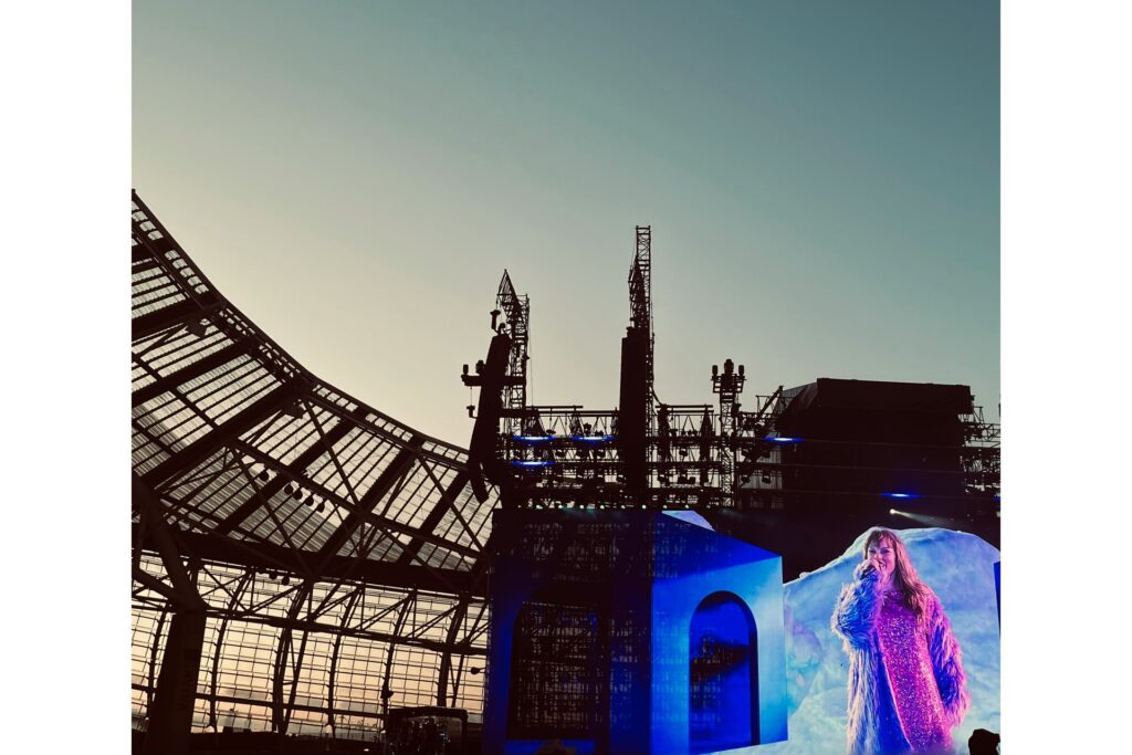
Taylor Swift’s “Eras Tour” was a 21-country tour featuring 40 songs from all of her albums, not just the new ones. The goal of the three-and-a-half-hour concert was to transport fans through each album, or era, with costume changes, song transitions, and elaborate stage sets. The tour was hugely successful, making about two billion dollars.
Taylor Swift Era Colors for Your Website
A certain color categorizes each era. Designers can use these colors when creating their website to reflect each of Taylor’s albums or showcase a few fan favorites. Below are some ideas associated with each era.
Light Green
“Taylor Swift” is Taylor’s first album, released in 2006. The color associated with it is generally a light green. Green fosters feelings of growth or renewal. This could be a good color for a skincare brand, yoga studio, or other types of wellness websites.
Yellow
Taylor’s second album, “Fearless,” won a Grammy in 2010. Yellow is a common color paired with this album because of the cover. Yellow sparks emotions like happiness and optimism. If a brand wants customers to feel that, website designers could utilize yellow.
Light Purple
Light purple is associated with Taylor’s album, “Speak Now.” She is wearing a purple dress on the cover and wrote most of the songs in a diary. Light purple brings feelings like peace and creativity. An artsy brand might benefit from including this color on its website.
Red
Taylor’s album, “Red,” inspires the color red. When Taylor rereleased this album, she included a ten-minute version of the song, “All Too Well” along with a short film, which satisfied many fans. Red incites emotions of love and passion. Designers could utilize this color in a website for a workout brand, an online dating website, or many others.
Light Blue
Light blue is reminiscent of Taylor’s album, “1989,” named after her birth year. The color sparks feelings of serenity and relaxation. Again, this color could fit a wellness brand. Designers might also use it for a brand that sells crystals, incense, or other calming products.
Dark Gray
Transiting into a darker era, Taylor created her album, “Reputation,” as a response to media scrutiny. Dark gray is associated with it, although the feelings it evokes of sadness and fear might not be ideal for a brand. Still, photographers sometimes use dark gray to make their photos pop on websites.
Pinkish Purple
Pinkish purple is the main color for Taylor’s album, “Lover.” This is the first album she fully owned at the time. Recently, she bought back the rights to the previous ones. Pink typically represents kindness and love, whereas purple speaks of luxury and power. Use both separately or together to create these feelings for a brand.
Dark Eggshell
Taylor’s album, “Folklore,” features eight different album covers because it is her eighth album. It is associated with a dark eggshell white, sparking feelings of comfort and security. Consider using this for a bank’s website since security matters to customers there. A technology company specializing in cybersecurity might also benefit.
Tan
Tan is paired with Taylor’s album, “Evermore,” the sister of “Folklore.” The color makes people feel warmth and comfort, another good idea for a wellness brand. A mattress store or candle shop could also use this color on their website.
Dark Blue
The final era is Taylor’s album, “Midnights.” She has more albums now, but this is her tenth one and the original ending to her show. Dark blue is associated with it, inspiring emotions of authority and stability. Law firms and hospitals might benefit from this color in their web design.
The Significance of Orange
While not reminiscent of any actual albums, fans often connect a specific shade of orange to Taylor Swift. This is the supposed color of her “lost” album. However, it could be the new color for her latest album, “Life of a Showgirl.” Brands have been using this orange to market their own products since discovering its significance. Designers could incorporate this color into websites as well, since it is still associated with Taylor.
How to Choose Colors for a Website
It takes plenty of thought to choose colors for a website. Colors have different associations, emotions, and meanings. They also pair well with certain shades over others. Designers should consider these factors when creating a website.
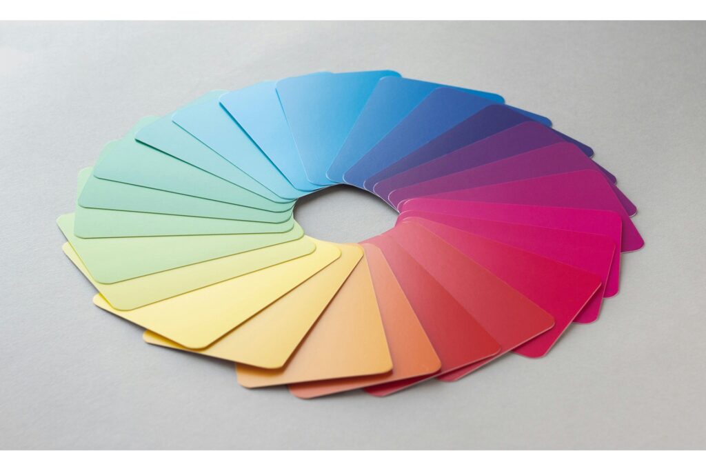
Color Theory
Color theory is reliant on the color wheel and outlines which colors go well together. It consists of primary, secondary, and tertiary colors, along with various tints, shades, and tones. A good rule is to use contrast, meaning how visible the website’s text is over a colored background. Generally, high contrast is the goal for websites since it is easily seen.
Color Psychology
Color psychology is when people associate colors with certain emotions. Choose colors that evoke the emotions brands want to convey. For the Taylor Swift era colors specifically, designers should consider the above list.
Color Palettes
Color palettes are collections of colors. Designers create them for websites. A palette can include a bunch of different colors or the same color in various shades or tones. If a brand’s logo features a specific color, incorporate it into the website’s palette.
60/30/10 Rule
A good rule for website designers is to limit to three colors. Each color must be a primary, secondary, or accent. The 60/30/10 rule states that 60% of the website should be the primary color, 30% should be secondary, and 10% should be the accent. Remember that black and white count as colors, so designers should consider them too.
When incorporating the Taylor Swift era colors above, choose only three to follow this rule. If designers want a fourth, use 60% for the primary color and split the rest into a secondary and two accent colors.
Why Using These Colors Might Boost Brands
Using Taylor Swift era colors might boost brands due to Taylor Swift’s popularity. When she created a movie about her tour, it earned $92.8 million during its first weekend in theaters. People love her, so marketing a website with colors inspired by her albums might garner her legendary fans, the Swifties. Consider the colors above or put a new spin on them to create an era-themed website.
Embrace the Eras
Taylor Swift is a pop sensation with global success. Brands already use her to market their own products. Designers should take advantage of this by using the iconic “Eras Tour” as color inspiration. This might bring dedicated Swifities to the website, garnering more publicity for the brand.


About The Author

Cooper Adwin is the Assistant Editor of Designerly Magazine. With several years of experience as a social media manager for a design company, Cooper particularly enjoys focusing on social and design news and topics that help brands create a seamless social media presence. Outside of Designerly, you can find Cooper playing D&D with friends or curled up with his cat and a good book.