
In This Article
The music industry has long been known for its cutting-edge trends and interesting use of design. If you want to learn how to create an amazing logo, checking out band logos is a good start to figure out how to show off some underlying meaning and personality.
Consumers pay attention to logos because they encounter them more than other forms of design. In one survey, 78% of customers said logos are works of art and tell the story behind a brand.
Band logos capture the imagination and highlight the unique elements of a musician or group. We looked at the logos people know best as well as a few unique outliers. If you want to learn how to design logos, check out these 21 stellar examples from the ages.
1. The Rolling Stones
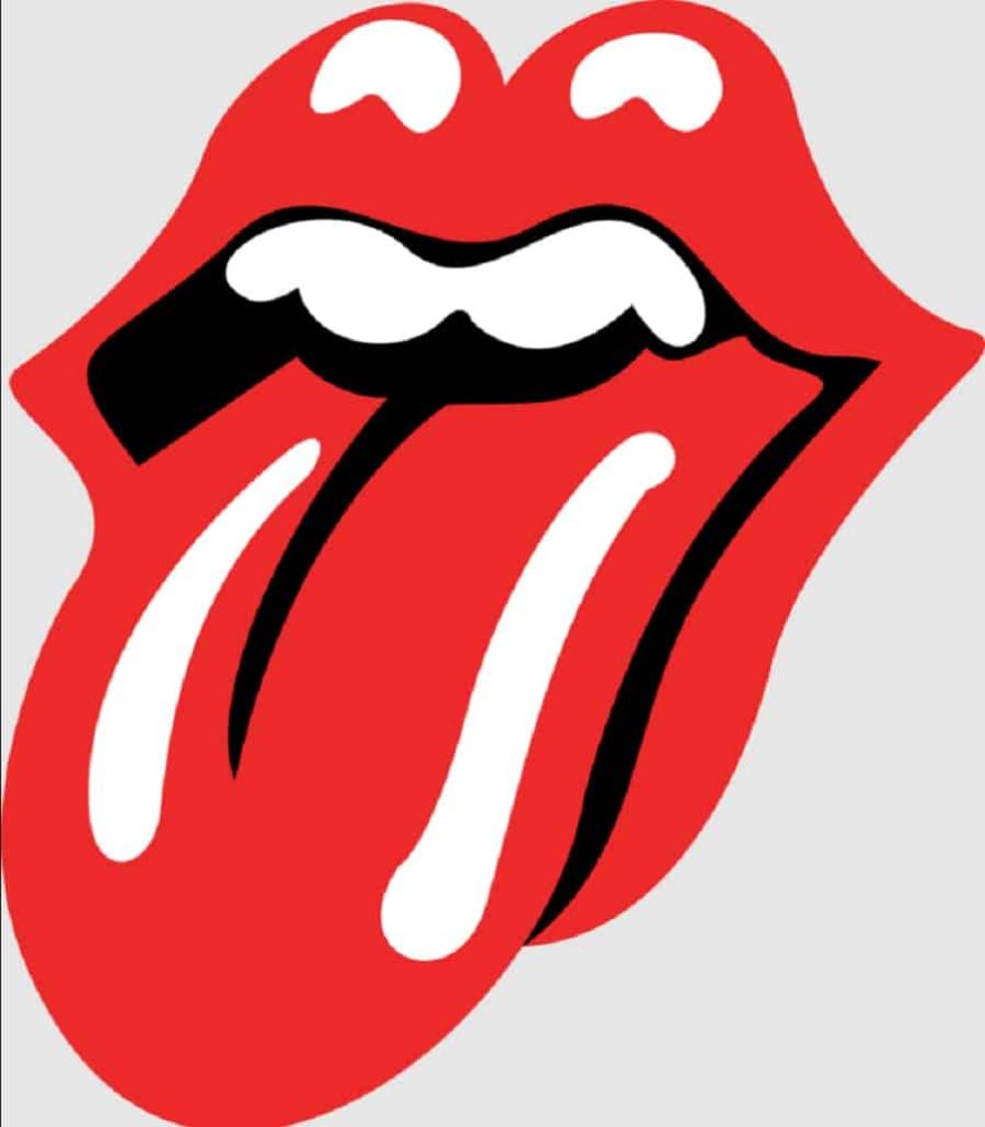
What collection of band logos would be complete without a nod to The Rolling Stones and their famous lips and tongue logo? The English rock band was formed in 1962. They grew in popularity with releases such as “I Can’t Get No Satisfaction,” “Get Off of My Cloud,” and “Aftermath.” They continue to perform six decades later, making their logo easily one of the most recognizable band logos around.
John Pasche designed The Rolling Stones’ logo in the early ’70s, releasing it on the “Sticky Fingers” album cover. The inspiration for the outstuck tongue and lips came from the tongue of Kali, the Hindu goddess of ultimate power, time, destruction, and change. You also can’t miss the similarities between the logo and lead singer Mick Jagger’s iconic mouth and lips.
2. Korn

When one sees the Korn band logo with the backward “R,” they might think of the movie “The Shining” and the word “Redrum.” However, the inspiration for the backward “R” actually came from a place many of the band members worked at one point, which was Toys ‘R’ Us.
The distinctive lettering looks like the handwritten message from a serial killer, giving the logo an edge it otherwise wouldn’t have.
Band frontman Jonathan Davis is the genius behind the Korn logo. It remains unchanged from its inception in the 1990s.
3. The Doors
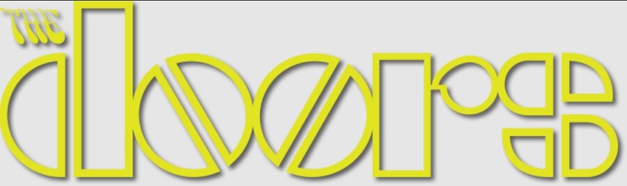
Out of the band logos on this list, the one for The Doors may be most symbolic of the time the band started. Note the psychedelic letters for the word “The” in the upper left. The two “O’s” are geometric and mirror one another. The diagonal split down the center of each “O” makes them look like pills.
The Doors with lead singer Jim Morrison hit airwaves in 1967, releasing hits such as “Light My Fire” and “Riders on the Storm.” Although Jim Morrison passed away in 1971, the band continued with revivals and releasing previously recorded snippets over the years.
Rumor has it that Elektra Records came up with the logo. At the time, Bill Harvey headed up Elektra Records’ art department, and similarities between the font used for the above logo as well as Elektra Records’ “E” logo seem to suggest that Harvey and his art team came up with the logo. The geometric elements scream 1960s design. Unfortunately, Harvey passed away in the early 1990’s, so there’s no one left to ask.
4. Metallica

Metallica is another of the band logos using geometric shapes and interesting fonts for a word logo. The musicians formed Metallica in 1981 after brainstorming some ideas and settling on the name for the group. The lead singer, James Hetfield, designed the logo and used it on nearly all of the band’s releases.
The logo you see above — with the lightning bolt shape on the first and last letters — was the original logo the band used when they released their first song back in the early 1980s — and it’s one that they’ve gone back to again and again. There were attempts to use other logos throughout the years — including a ninja star and “scary guy,” both designed by James Hetfield — but nothing has quite the impact of the original logo. The ninja star has retained some of its popularity because it makes a great tattoo option, allowing fans to proclaim their love for the band without inking its name on their skin.
5. Linkin Park

Linkin Park’s logo has changed a lot in the decades since its inception. For the first couple of years, the band was known as Xero and used a gothic serif logo of half-written Latin letters. Then, between 1999 and 2000, the band was called Hybrid Theory — which would later become the name of their first album. For this short period, the logo was an H and T layered on top of each other.
By 2002, the band had decided on the name Linkin Park and a blocky stylized text that featured a reversed letter “N” in the first word. By 2007, they’d switched up their logo to stack one word on top of the other, adding sharp points to some of the letters. Then, in 2010, they switched again to a simple design without any of the fancy embellishments of yesteryear.
After the death of lead singer Chester Bennington in 2017, the band opted for a simpler logo featuring a sans-serif font of the band name and angled letters “L” and “P” inside a hexagon — six sides to represent the six members of the band. After Chester’s passing, they updated the logo, removing one of the sides in his honor.
6. Limp Bizkit

Limp Bizkit’s logo is a bit unusual for band logos. The red and blue grab attention, but the pattern evokes thoughts of sports teams or sneaker brands, rather than nu-metal music. Nonetheless, it serves to showcase the somewhat erratic nature of the band.
The band formed in 1994 in Florida as nu-metal. They were subsequently nominated for three Grammy awards. The original name came from a brainstorming session where one of the group members mentioned they were so tired of brainstorming their mind was like a “limp biscuit.” The other members loved the phrase and Limp Bizkit was born.
The original logo was a wordmark in a fantasy script, but the style was so unique some had trouble making out the word. The logo got a remake in 2003 to a bold, traditional-looking font in all lower case with a cartoon ghost to the left. The emblem has an outstretched palm.
7. KISS

The iconic logo of the band kiss is simply the name in a bold, geometric font. The letters are outlined in black and yellow and the inside has a gradient from orange to yellow, though you may also see them printed in plain black without any color or gradients.
The band dates back to New York in 1973, when Gene Simmons, Paul Stanley, Ace Frehley, and Peter Criss formed a group wearing costumes and face paint. The band sold over 100 million records globally and made 30 gold albums. Frehley is believed to have designed the logo by sketching various ideas with a felt-tip pen before Stanley approved the design. The goal was to make the “S” look like lightning bolts.
An interesting side note on the logo is that the letter “S” in the typeface somewhat resembles the Nazi symbol with two placed side by side. Countries such as Germany outlaw anything close to a Nazi symbol, so the band has to use a different plain logo in those places. The similarity is completely unintentional — Ace Frehley has admitted that he didn’t mean anything bad by the design. He just likes lightning bolts.
8. 30 Seconds to Mars
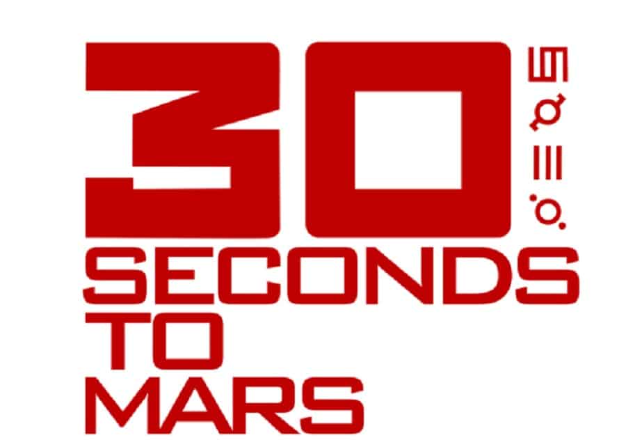
Source: 1,000 Logos
30 Seconds to Mars is another band that has gone through a lot of different logo changes since it released its first album in 2002. The logo above was featured on their first self-titled album, with the primary focus on the number 30. The strange part of this logo isn’t the font or the size, but the runes that run along the right side. The band has never confirmed what these runes might mean.
By the time they released “A Beautiful Lie” in 2005, only one thing remained the same — the red color. This cover featured a circle with two skulls and only one of the runes featured on the previous cover. 2009’s “This Is War” changed it up again by removing the skulls and opting for a simple text-based logo. They used the same one for 2013’s “Love, Lust, Faith and Dreams.” By the time “America” came out in 2018, the logo had vanished from their albums entirely, instead replaced by one of 10 runes, vaguely reminiscent of the ones on the first logo.
9. Lady A
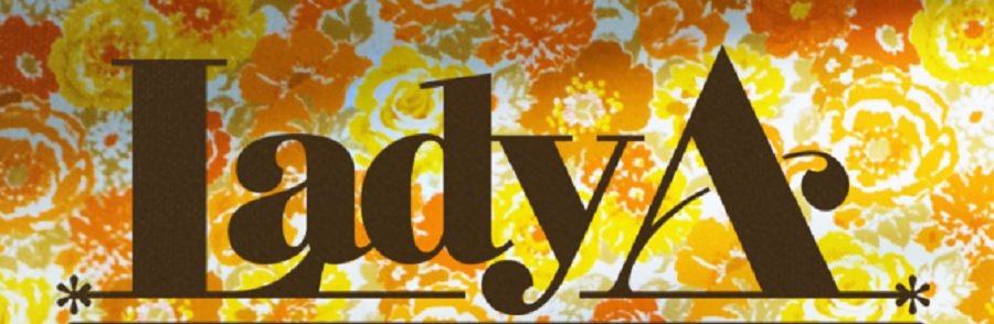
Lady A’s logo has always been a wordmark, but has gone through some interesting transitions in the life of the band. The country-pop group started in 2006 in Nashville, Tennessee. Members include Hillary Scott, Charles Kelly, and Dave Haywood.
The band originally called itself Lady Antebellum but recently dropped the end of their name and became Lady A. Note the swirling openness of the letters. While they are serif, they have some added embellishments on certain letters to give the design a bit of flair.
10. Guns ‘n’ Roses
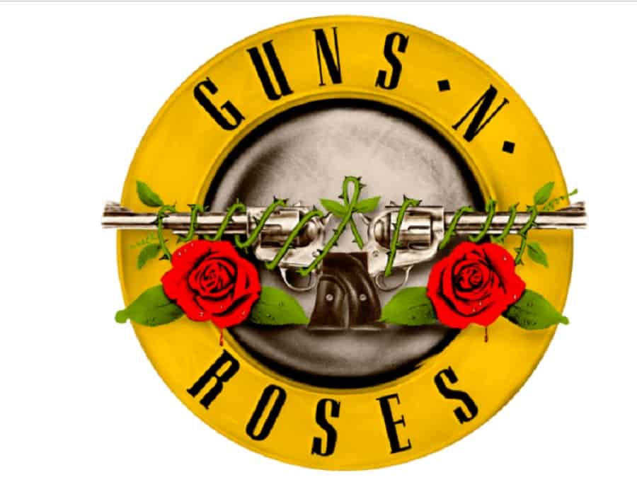
Guns ‘n’ Roses got their name from the two bands that merged to create this popular rock powerhouse: Hollywood Roses — which included Axl Rose, Izzy Stradlin, and Chris Weber — and L.A. Guns.
Today, they’re known as a rock band popular for songs such as “Welcome to the Jungle,” “Paradise City,” and “Sweet Child o’ Mine.” Band members included Axl Rose, Izzy Stradlin, Duff McKagan, and Steven Adler.
Their original logo was a ribbon with the wordmark on top. The colors were red and yellow. In 1987, the logo got remade into a yellow circle with the words spread across the top and button. The designer added guns and roses to the center of the design. The iconic logo they’ve used almost since the group’s inception is a perfect blend of the two bands that came together to make Guns ‘n’ Roses one of the most well-known rock bands of all time.
Guns ‘n’ Roses is unique among band logos for its traditional logo look. Unlike the varied wordmarks and geometric designs in most band emblems, theirs takes on a corporate look with an edge. They kept the yellow and red from the original design.
11. One Direction
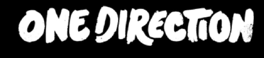
One direction has some interesting things to look at with their group and logo. The wordmark above is in a distinctive cartoonish font with an open “D” and edges reminiscent of brush strokes. They’ve used the same logo from their creation in England in 2010.
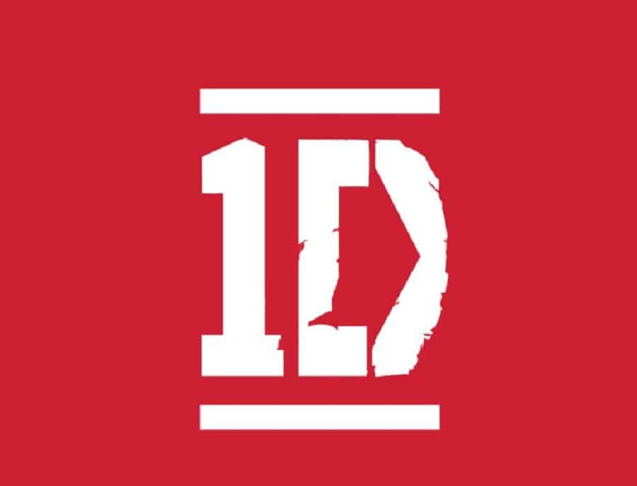
However, the group also shortens its name to 1D and has a logo to match it. The emblem has two stencil letters with a line on top and bottom to give it a symmetrical look. When used inside a circle, the band sometimes loses the straight lines.
Occasionally the band also uses the 1D logo with their full name under or to the side. The versatility of their 1D logo is inspiring in its recognizability and adaptability.
12. The Beach Boys

Formed in 1961 in Hawthorne, California, The Beach Boys is as iconic to America as apple pie, baseball, and hot dogs. When it comes to band logos, they’ve nailed the feel of their music and show a retro ’60s diner flair.
The logo has become iconic, appearing on albums and other promotional materials. Notice how the “B” in the word “Boys” connects to the “H” in the word “Beach. This makes the two words cohesive, showing their longevity and togetherness as a group. The message behind the design is actually genius, showing the retro feel of the group while also showing their ability to work together for many years.
Unlike many of the other bands on this list, the Beach Boys never changed their core logo. The sweeping, almost dreamy font has become synonymous with anything beach-related and you’ll often find it or similar fonts on billboards and gear designed for the beach.
13. Paramore
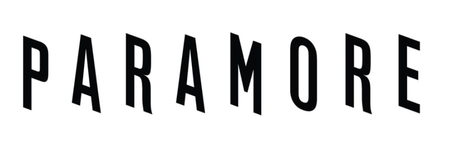
Although their logo changes from album to album, the tilted, off-kilter font remains the same. The colors, animation, and placement might vary, but the letters are very recognizable for their three-dimensional look and uneven placement.
Paramore formed in Franklin, Tennessee, in 2004 with members Hayley Williams, Taylor York, and Zac Faro. The band toured with Jimmy Eat World in 2008 as an alternative rock band. The group is known for their albums, but lead singer Williams also released some other work that skyrocketed to the top of the charts, such as “Airplanes” with B.o.B.
In some renderings in the early 2000s, Paramore added wings to their logo, but more recently reverted back to the tilted type.
14. Pink Floyd
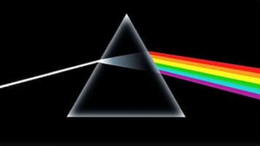

In the 1960s, a group of teenagers from Cambridge formed a progressive rock band. Pink Floyd uses two different band logos depending on where they are used. Even today, the official website has the triangle prism with the rainbow.
The prism in their logo stands for the different facets of living life and gaining knowledge. When they released the album titled “The Wall,” the band used a logo that looked like a simple graffiti script.
After bassist Roger Waters left the group in 1985, the band released a new logo — a monogram symbol of the letters “P” and “F” though the two logos mentioned above are probably the most iconic and easily recognizable even to this day.
15. Bad Bunny

The Bad Bunny emblem is probably one of the most unique of all the band logos on this list. It is the symbol for Puerto Rican musician Benito Antonio. Rumor has it that when he misbehaved as a child, he was forced to wear bunny ears, giving him a kinship to the animal.
In late 2016, he released a single and then performed in singles with stars like Cardi B and Drake. He even performed at the Super Bowl in 2020.
The logo design is simple but the face of the bunny is quite enticing. The angles combined with curves draw the viewer in. The words “Bad Bunny” are etched onto one of the rabbit’s ears.
16. Grateful Dead

Another circular logo comes from the band Grateful Dead. They use the vivid primary hues of red and blue to engage fans. Many of the symbols of the band come from artwork from their albums, but this one stuck. The graphic was used from 1965 through today and is called the “Steal Your Face” skull or “Stealie.” It gets its name from the lyrics “steal your face right off your head” from “He’s Gone.” The lyrics reportedly refer to the band’s former manager, who had previously stolen money from the band. The center of the logo features a human skull with a lightning bolt.
The band is tight-lipped about why the lightning has 13 points, but fans, called Deadheads, have guessed that it either represents the 13 original American colonies or the 13 steps it takes to make LSD.
17. Green Day

Green Day is another American rock band, created in 1987 in California by Billie Joe Armstrong and Mike Dirnt. They then added a drummer and guitarist, becoming a popular punk band. They’ve had 20 Grammy nominations, winning five for their albums.
Their logo is a wordmark that looks like dripping paint. The logo has a three-dimensional feel as though one is looking at wet puff paint. In red, it has the feel of blood. Other artwork for the “American Idiot” album shows a heart as a grenade being held in a tight hand, so it’s possible the bloody feel of the font is entirely intentional.
The band’s logo has gone through a lot of adjustments over the years before they finally settled on the current one in 2016. The dripping letters are handwritten and have rounded ends on the letters.
18. Twenty One Pilots
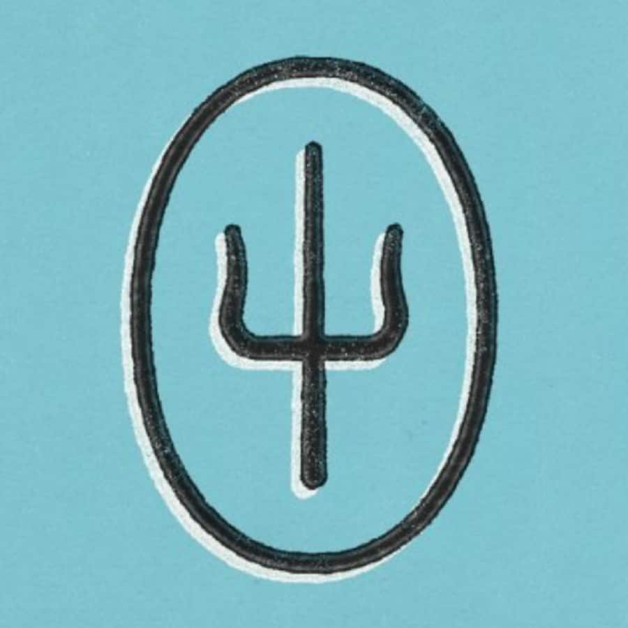
Twenty One Pilots has a unique logo that seems to have transformed quite a bit over the years. The Columbus, Ohio, band is made up of duo Tyler Joseph and Josh Dun. Since its inception in 2009, the duo has gone through six versions to get to the current one.
The current logo was redesigned in 2021 and took on a bright blue hue and a trident inside an oval. Although band members claim the logo has no hidden meaning and simply was a result of playing around with shapes, people wonder why they chose a trident for their symbol.
They mention the logo is linked to the song “Kitchen Sink” and only they understand the true meaning. They’ve also said the symbol means “whatever you think it means.”
It’s hard to say what the actual meaning behind the logo might be, but fans seem to take it at face value and accept that the logo is special to the musical duo and represents something artistic within them.
19. Ramones

Fans of punk rock will recognize the logo above. The Ramones arrived on the music scene in 1974. They weren’t related but went by the last name Ramone. Their inspiration was likely from Paul McCartney, who checked into hotels under the psuedonym Paul Ramon.
The logo got plenty of traction during their 22 years of touring all over the world. All of the original members have died but there are still a few surviving ones who came into the band after the initial years.
The Ramones’ logo is simple. It has the founding band members names inside a simple circle outline. Across the top, the name “Ramones” is in bold sans serif text. An eagle holding an apple tree branch and a baseball bat rests in the center, chosen because they were an all-American band.
20. Kings of Leon
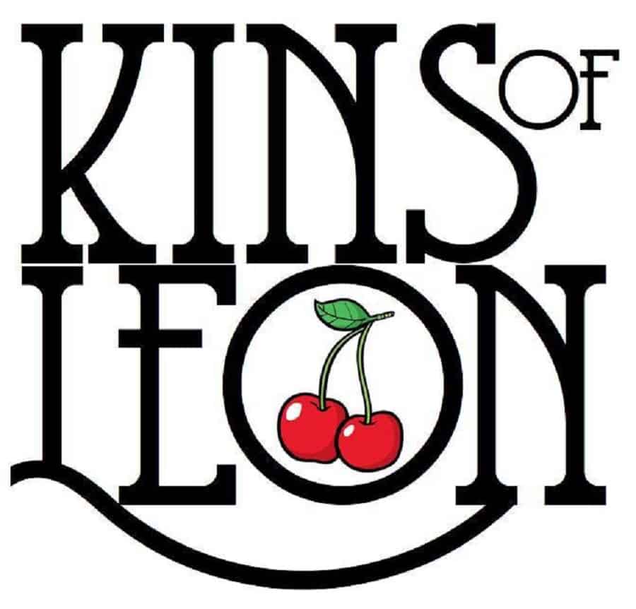
The current Kings of Leon logo comes from their Facebook page. The band formed in 1999 in the country music capital of Nashville, Tennessee. Three brothers, Caleb, Jared and Nathan Followill were sons of a preacher. They were used to traveling with the family as their father preached around the Deep South. Their cousin Matthew joined the band and the Kings of Leon came to be.
The serif font with a swoosh for the “L” is quite distinctive. Some versions don’t have the cherries, but the Kings of Leon Facebook page features cherries for the logo. The logo looks better without the added embellishments as it is already quite striking as a word logo.
If you want to create a similar name logo, try different fonts and adding swooshes and swirls over various letters. How can you make the text flow from Point A to Point B and add movement to plain text?


Leave a Comment