


Logo design is a unique art in the industry. A logo has to showcase who the brand is, what it does and the overall tone of the company. Logo designers must say a lot through simple logos with or without words.
In a survey of consumers, around 78% felt brand logos were works of art and could tell them a lot about the company, including the personality of the brand. Ramping up your own design skills in this area gives you an opportunity to offer more streamlined services to your clients.
What are the elements of simple logos? We’ve summarized the elements you need to create a minimalistic design while still getting the message across. You may be wondering how do I create a simple logo? Here are some of our favorite tips and examples of beautiful ones other artists designed.
1. Cut the Clutter
The best simple logos have a nice balance of positive and negative space. Although it’s tempting to fill every square pixel with an element to make the most of the copy, too much makes for a cluttered look and the user may not know where to look first.
Find a central focal point for your design and place the most crucial elements of your logo there. You can then add or subtract as needed to get the message across.

Suckerpunch Gourmet’s logo offers a nice balance of white space. The name “Suckerpunch” is in larger green letters and takes up most of the logo space. However, the gourmet is under to reinforce the full name. They don’t use any additional images or words, keeping it simple and to the point.
When creating a logo, decide whether images are necessary or not. You can say a lot with a picture instead of words, but there are times when the name of the company is enough to get the point across.
2. Find a Symbol
Is there a symbol that goes hand-in-hand with your business model? For example, a realtor might use a key or a home to showcase what they do. The simple logos from the Olympics for the past several decades show just how creative you can get within simple parameters.
When designing a logo for the Olympics, it must have the rings, certain colors and be a certain size, and so on. Yet, each new Olympics brings a new design that speaks specifically to the themes for that year.
You can make a logo look different than any other companies simply by choosing the correct color combination or adding small embellishments to make it your own.
The current Olympic logo is a simple entwining of the five rings representing different continents involved. There is nothing to detract from the rings in the image above. You may see different examples of the logo in different settings.
Keep in mind that your client may want to use their logo in different settings. Make something adjustable to different needs. The beauty of simple logos is you can add additional elements without messing up the aesthetic of the design.
3. Stick to a Simple Color Palette
Some companies try to add so many different colors that it looks like a rainbow exploded on the design screen. Pick two or three colors from the brand’s color palette and stick with those, making one your primary color.
If you want to design simple logos, you have to keep in mind both limiting the number of elements and the number of colors, fonts and other features in the design.

Niarra Travel sticks with a neutral white for their name portion of their logo. This allows them to place the logo on top of any background, including their hero video without distracting from the purpose of the website page. They then add a single orange dot under the N to grab attention. It is reminiscent of the dot someone might put on a travel map to indicate where they’d like to go.
Think of ways to draw attention to your logo without distracting from the intent of a page, ad or email. You want the user to quickly glance over the image and then move toward the action you’d like them to take.
4. Create Balance
When you do use both an image and text, it can be a challenge for new designers to create balance in simple logos. How big do you make the picture? How big should the text be? While there are some rules of thumb about perspective and where you want attention drawn, you really have to develop an eye for design.
Step back from your computer and see how all the elements look together. Ask for feedback on where user interest goes first. Do you attract the attention of the viewer to the point you want them to look at first? If not, you may need to make that feature larger and others smaller.

Torchy’s Tacos draws the focus to their brand name. They then add a little devil with a pitchfork inside the first “O” to show their food is a bit on the spicy side. This juxtaposition of using a small mascot within larger text forces the user to first look at the name and then the sketch.
What do you want to draw attention to in your logo design? You can use size, italics or colors to pull the user in that direction in the correct order.
5. Limit Fonts
It’s best to stick to a couple of different fonts within your design. Anything over two or three is distracting to the user and can give your simple logos a non-cohesive look.
You can mix and match between serif and sans serif. If you choose to use a script font, it might be best to stick with a simple sans serif to avoid a busy look.
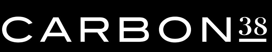
Carbon 38 uses two distinct fonts in their logo. The word “Carbon” is in the larger font and is a sans serif, all capital letters rendering. The number “38” is in a serif font with an underline. The font size is slightly smaller to draw attention to the word “Carbon.”
The fonts you use and how you arrange them can make a difference in the order someone reads your logo. Make sure you choose wisely and limit the number of options.
Study Logos in Your Daily Life
As you interact with various brands, study their logos. What do you love and what do you hate? You can learn a lot from excellent designs as well as ones that don’t quite hit the mark. Implement different features into your own designs, making each one uniquely suited to the brand image. With a little practice, your logos will grab attention and help establish a strong company image.


Leave a Comment