Just like some people have personalities that mesh well and others don’t, some fonts go together better than others. When you’re working on a project, you’ll often need more than one type of font. Using varied typography creates a more interesting design and considers the different sizes fonts appear in. Fortunately, some font pairings stand the test of time and can become your go-tos, no matter what you’re working on.
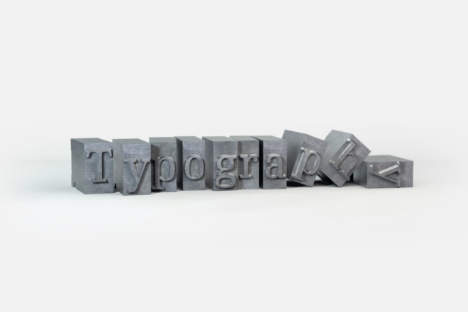
If you’re getting interested in typography, you might find the choices a bit overwhelming. Not only must you figure out if you need a serif or sans serif font, but there are font families and width and height to consider. A single Google search for the term “font family” turns up billions of results, although some are merely explaining what the term means.
Figuring out which font pairings work and which don’t takes a lot of trial and error. Don’t worry, though. We’ve done some of the heavy lifting for you with six font pairings to meet most needs.
1. Lora and Merriweather

If you’re looking for a pairing using Google fonts, this pair meshes well. When you want a more traditional look, pair two serifs like this. Lora has a thicker, bolder weight to it than Merriweather, but both have legs on the letters, giving the pair a uniformity. A traditional design calls for pairing serif with serif and sans with sans. Of course, the rules are yours to break, so you’ll also find some pairings with both or meshed with decorative fonts. However, if you are writing a formal invitation, designing a site for a bank or creating a businesslike publication, two serif fonts are the right choice for your needs.
2. Arial Font Family

One of the easiest ways of combining fonts is by using fonts from the same grouping. Related font pairings will naturally look more uniform. Since the fonts have similar features with only minor adjustments, it makes sense they’ll go together. If you don’t have time to play around with a ton of different font combinations, find a family of fonts you like and pull a few from the same tree for a quick design option. For example, from the Arial font family, you could use Arial Black for headings and Arial Light for the body.
3. Calibri and Candara

If you’re looking for fonts to use with the Microsoft suite of products, you’ll find plenty of combinations of serif and serif, sans serif and sans serif, decorative and a mix of the types of fonts. Calibri and Candara create sans serif font pairings that go particularly well together. They have a similar height and width fingerprint, which keeps them from looking unbalanced. The openness of letters such as “C” also makes these two mesh well. If you’ve ever known a pair of friends who finish each other’s sentences, that would be the personality of this pairing.
4. Garamond and Georgia

Another option when working with a challenging-to-pair headline is to use the opposite. So, if you have a serif font such as Garamond for your headline, use the Georgia sans serif for the body. Not all serifs and sans serifs will pair well together. You will have to use some trial and error here, as the spacing and other issues between the two styles can create a bulky, awkward look.
Font pairings that look good in theory might not look as well in practice. For example, if you have a lengthy block of body text and a single headline, you might find a font such as Tahoma overwhelms the body text. When all else fails, swap the two spots and see if that makes a difference. Be cautious here, though, as some fonts don’t translate well on small digital screens. Test in multiple formats to ensure you’re getting the look you want.
5. Great Vibes and Raleway

There are times when you need to use a script or handwritten font to achieve the look you want. Stay away from scripts for the body text, but they can work well for headers and even occasional subheaders. Great Vibes has a lot of swirls reminiscent of calligraphy. When you have a decorative font such as this, create font pairings with simpler fonts that don’t distract from the personality of the unique font. For example, Raleway meshes nicely with Great Vibes. It’s the supportive friend who lets the star shine.
6. Cherry Swash and Open Sans

Cherry Swash is another decorative font with a lot of accents and swirls, particularly over capital letters. However, Cherry Swash is also quite modern-looking, so you’d never want to create overly traditional font pairings with it. Look for a sans font, such as Open Sans. When creating a pairing for Cherry Swash, we ran into some challenges because the font is quite wide. If you’re unsure of how one choice looks with another, stand up and take a few steps away from your computer screen. Doing so shows you how easy it is to read all the text or if things look unbalanced.
Create Your Font Pairings
These six choices should get you started, but if you’d like to try your hand at matching up different typography styles, download the fonts you think might look good together. Then, start playing around with the choices. Pay careful attention to the white space and the overall balance of the page first. Next, think about whether the personalities of the fonts suit one another or clash. There may even be occasions where you want the user to feel off-balance, so you purposely cause a personality conflict. Understand the reason you’re doing so, and keep practicing until you can create the perfect matches for your needs as a designer.


About The Author
Eleanor Hecks is the Editor-in-Chief of Designerly Magazine, an online publication dedicated to providing in-depth content from the design and marketing industries. When she's not designing or writing code, you can find her exploring the outdoors with her husband and dog in their RV, burning calories at a local Zumba class, or curled up with a good book with her cats Gem and Cali.
You can find more of Eleanor's work at www.eleanorhecks.com.
Great information! I was looking for the best combination of fonts and use with Microsoft Products. Now I see the great pairing of Calibri and Candara fonts that you are providing here. It is well suited for my project.
Thanks, Eleanor Hecks……. It is a very informative article.