


In This Article
If you search for fonts on any typeface site, you’ll find thousands and thousands of fonts available. It can feel a bit overwhelming trying to figure out which one works best for which project. Taking a look at the history of the font and the ways other designers have used the font, though, can make a huge difference. Let’s take a look at the font, Georgia. It’s a versatile typeface that works well with text that will display on a screen.
Origin
Like other serif designs, Georgia has a formalness to it — but it stays readable on a variety of screen sizes. The history of the font is inspired by Scotch Roman designs from the 1800s, and it came to life in 1993, thanks to Matthew Carter.
Where did the name “Georgia” come from? It’s said that the idea for the typeface name came from a headline at the time: “Alien Heads found in Georgia.” Carter’s father was a British historian of typography, even working for Her Majesty’s Stationery Office and University Press at Oxford. Such regal beginnings inspired Carter in his own work with typefaces.
The Internet was growing by leaps and bounds in the early ’90s, so there was a real need for fonts that would look good even at low resolutions and in smaller sizes. Georgia fits that bill because it creates an interesting typeface that is still legible and easy to read. The addition of serifs makes the font suited both for headlines and body text.
The initial release of Georgia was bundled in the core fonts for Web. It then came as a supplemental pack of fonts. The font was compatible with Windows and Mac computers, and because the font looked the same on both systems, it became popular with designers. People working on Windows could create brand marketing materials that matched what those working on Macs put out–consistency helped with brand image. Everyone on the team could easily work on the same design without it being skewed on different platforms. People began to see the many different applications for the font.
Today, many machines come with the Georgia font already installed, making it a popular choice amongst business leaders, students and digital writers.
What is Georgia Font?
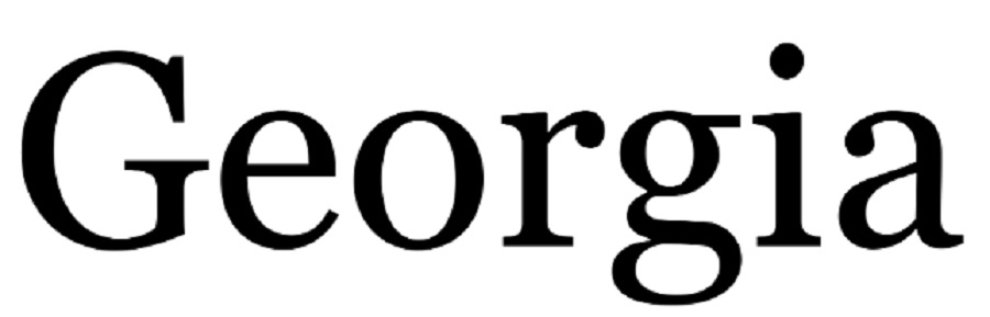
Georgia has strokes that are both thick and thin, alternating between the two. It is slightly italic looking, but not quite as slanted. If you’ve studied calligraphy, then this font might look slightly familiar because the letters blend one to the next. This creates a continuous look throughout the text. However, they do not connect and are not so swirly that they’re hard to read. The type has a slightly formal look because of the varied stroke weights throughout.
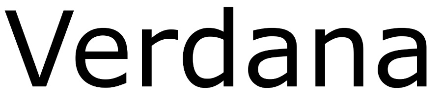
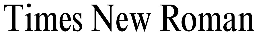
The lower case letters in Georgia are a bit taller than some other fonts. And the typeface is darker, which makes it easy to read even at smaller sizes. One way to describe Georgia is that it is similar to Times New Roman but is taller and bolder. Carter points out that when they were designed, Georgia and Verdana were about binary bitmaps and turning every pixel either on or off in black or white. The higher x-height gives it an elegant look other fonts might miss. In larger sizes, it does not come off as squatty looking.
Georgia isn’t pixelated at all, but offers beautiful clarity both in print and in digital format. If you’re looking for a font you can use across different mediums, this one is well-suited to multiple uses. You’ll see Georgia used often in resumes for a clean, crisp look potential employers find easy to skim and get details from a job candidate.
You might also see Georgia used for subheadings on a poster. You’ll catch it on book covers, websites and wedding invitations. It’s such a versatile font that it pairs well with serif, sans serif or calligraphy fonts.
The creators tweaked the font for clarity on small screens. You can share a document online with a business associate. Even if they pull it up on their smartphone, it remains legible. Not many fonts stand up to scaling up and down, but Georgia works well in both instances. One might argue it is one of the most versatile serif fonts available.
It’s no wonder Georgia remains a popular font in the 2020s. More and more people access the internet via mobile devices and the many digital ads and documents of the day. Any typography that scales for smaller screens without losing function will be a wise choice for most design needs. Georgia accomplishes scaling beautifully.
What Does the Font Imply?
Georgia has been described as having a typographic personality — even called friendly and intimate. Since the typeface is still legible at low resolutions, it creates an old-world charm with a modern appeal for online designs. Georgia is a bit more formal than some of the more common sans serif fonts. However, it’s not so formal as to look old school. If you are looking for a font that is a bit more regal, but not stiff, then this is the one you definitely must look at. It works well for wedding invitations or headline copy.
When reading descriptions of the font, some call it modern and others old-world. Which category does it fit into? Because it has elements of both modern fonts with a bit of asymmetry and traditional fonts with recognizable patterns, it fits both. The font may take on style from the images and typography surrounding it.
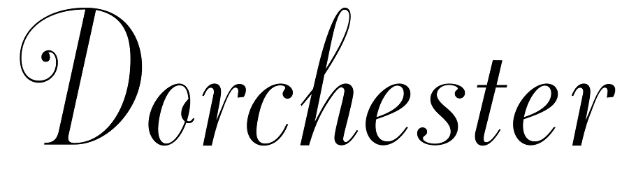
So, if you’d like to use Georgia on a formal invitation, you can easily do so and combine it with something like Dorchester or another script font. On the other hand, if you want to use it on a flyer for a preschool open house, you can combine it with something simple, such as the ever controversial Comic Sans for a fun but more professional look. Modern fonts may give it a more trendy look. Georgia is like the scrambled egg of the type world, taking on the flavor of the other items around it.
Where It’s Commonly Found/Used
Georgia is specifically created for on-screen use, so you’ll find it often online in magazine or newspaper designs. For example, there are a number of big-name newspapers that use Georgia font, including the Guardian, New York Times Times, Telegraph, Wall Street Journal, Huffington Post and the Independent.
Since newspapers are a mix of images and text, it’s vital that the reader can easily scan over lines of text and that it remain readable. Also, the text size might vary based upon the size of the reader’s screen. Georgia adapts well to smaller font sizes. So it will still appear crisp and readable even on a small mobile device screen.
The font works particular well for blogs, keeping the text easy to read without overwhelming other elements on the page. For example, Georgia adapts well to recipe blogs where text must be skimmable as people gather ingredients and follow instructions.
If the person prints out an article on your blog, it should print crisp and clear without some of the shadows and fuzziness of other online fonts being adapted for print. Fortunately, Georgia looks as sharp in print as it does on digital devices.
Another place you’ll frequently find Georgia is in book publishing. You might note that it’s used for the title because it’s easy to read from a distance and also on an ebook cover. However, it works equally well as the body text on the interior of a novel. The font is so versatile but easy to read that it is a favorite with many book designers.
What Should It Be Used As
Georgia works well for anything you are designing for the screen. In addition to online newspapers, blogs and websites, consider all the other ways you might use this font online. For example, if you are creating an online resume for employers, Georgia is crisp and clean. It will be unique from all the Arial and Times New Roman resumes out there.
Even if you just plan to email the resume, this can help you stand out from the hundreds of other applicants. Need to create some memes to promote your business? Georgia is an excellent font to use for these purposes.
Even if you place it over a background, it should remain more legible than many of the other fonts. Remember that Georgia’s bold is a bit bolder than the bold of some other fonts, so you can make a substantial impact. It has more of the look of a black weight font, giving it a lot of power when used in its largest and boldest weights.
Since the bold is such a deep, thick type, consider using italics or a size or two bigger for your typographical hierarchy instead. The reader will intrinsically understand the slightly larger text means the line has more importance without overwhelming the page.
Designers must use their eye to make sure everything balances. With a heavier bold than some other fonts, you don’t want it to take over and make other text fade into obscurity. You might be better off going with a regular weight for Georgia to create more of an aesthetic appeal.
Comparable Styles and Pairings
Georgia is transitional, meaning it shares elements from both old serif styles and modern styles. It pairs as well with a luxury font as a casual one. That makes it a bit harder to match than some of the other fonts out there. At the same time, its versatility means you can pair it with many types of font. You should also consider the weight factor mentioned above and how well the paired font works without fading away.
Georgia is a versatile font you can use for almost any purpose. However, if you’re looking for something similar to Georgia but not quite as common, try these fonts.
PT Serif
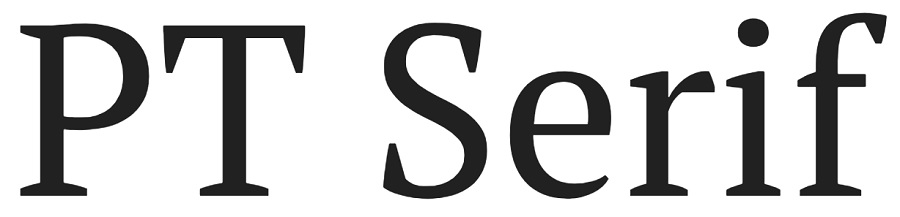
A Google font very similar in appearance to Georgia is PT Serif. The initials stand for ParaType and has been around since 1998, so it hints at TrueType while still pulling in modern elements. There are six styles in the font family, including regular, bold and italic weights.
Noto Serif
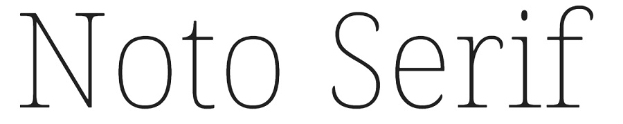
Noto Serif is similar serifs to Georgia, although the strokes are a bit bolder for this particular font. It works perfectly for headlines and even subheadings, but might be a bit too wide for body text on smaller screen sizes. In addition to the fonts above, any font with a straight-edged serif will give you a familiar look that reminds one of Georgia.
You might also wonder what fonts pair well with Georgia. In the examples of Georgia, you likely noticed designers often combine the serif-based Georgia with a sans-serif font, creating a clean, crisp look. Here are some sans-serif fonts that pair well.
Lato
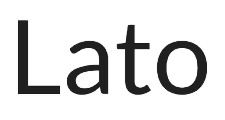
Georgia and Lato have similar widths, and both have medium X-heights, helping them pair well. Many people use Lato for a heading and Georgia for the body of the work.
Arimo
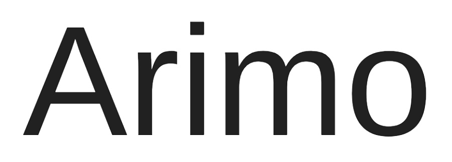
Arimo meshes well with Georgia because it is mainly a sans-serif font with a similar height, but there are small flourishes on letters like “Q,” “G” and “J,” which complement Georgia.
Helvetica
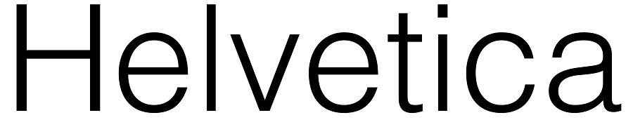
Similar to Georgia, Helvetica has some modern and some old-time elements. It pairs well with Georgia because of these similarities, yet a lack of as many serifs as Georgia contains. If you choose a simple sans-serif font with a similar height and width to Georgia, it’s hard to go wrong. Try out different fonts and see which ones you like best together.
Wensley
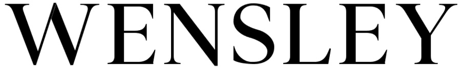
If you’re seeking a font that scales easily such as Georgia, Wensley is an excellent option. There are three font weights available for this one, including regular, light and bold. Wensley has the distinctive larger and smaller lines giving it a distinctive Georgia flair.
Naia
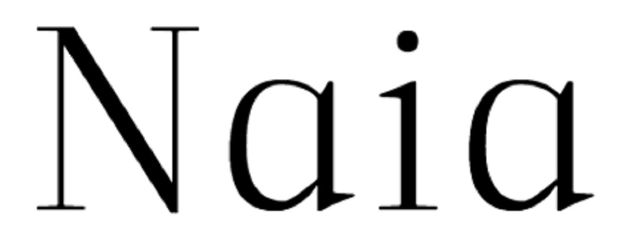
This display serif font is quite similar to Georgia, but the spacing is closer together. Naia’s serifs are wider than Georgia’s giving it a feminine appearance. It works great in presentations and for headers, but is readable in smaller sizes, too.
Adren
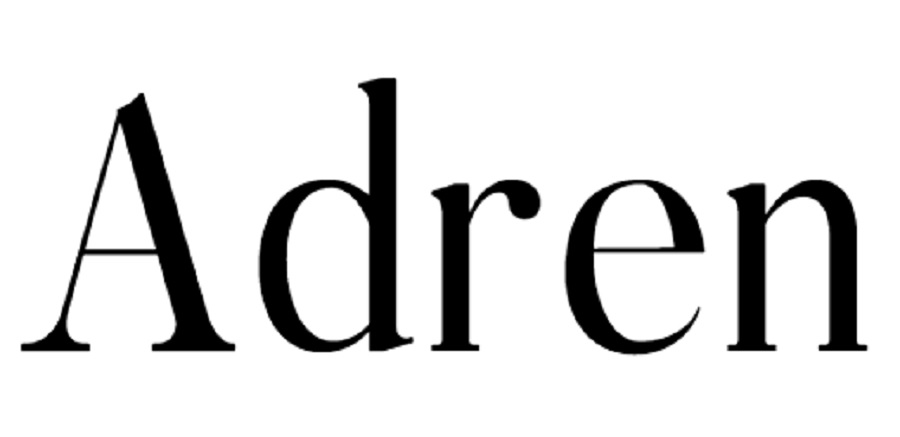
Although you’ll pay a fee to use Adren, the font has much heavier strokes than Georgia with a similar variation in thin and thick lines and more rounded serifs. Adren works well for magazine headers and logos.
Consider pairing Georgia font with:
- Etna
- Arial
- Domaine
- Display GT
- Walsheim
- Didot
- Futura
- Playfair Display
- Helvetica
The above options are fonts that Georgia has been paired with for online and print publications. However, try various combinations to see what works best for you.
Examples of Georgia in Use
Georgia is a cross between regal and casual style and works well almost anywhere as a headline. The serifs add a touch of elegance and Old World flavor, and the straight lines give the font a modern edge.
The examples below show the adaptability of the font. It almost always has an elegant appeal. Use all caps for titles and a mix of capitals and lowercase for a less formal look.
Progetty
Progetty uses Georgia, or something very similar, in second-tier text throughout their site. The headline is in a sans-serif font, so the decorative touches in the descriptive text grab the user’s eye.
Storybird
Storybird meshes Georgia and Times New Roman to create a modern look that is reminiscent of children’s magazines of the past couple of decades. Georgia is in the headlines and also in some of the descriptive text, but navigation and other headlines are in a sans-serif font. Again, the mixture of serif and sans serif on the same page is striking.
Taylor Stitch
Taylor Stitch uses Georgia in their headlines, lending bold strokes to their titles, which also speaks to the rugged nature of their products. They also use Times New Roman for the navigation and calls to action throughout the site. The design puts the focus on their headlines first, helping the user better understand their product before moving toward the action the brand wants them to take.
Time
Time magazine uses a Georgia-looking font on their site to give the entire aesthetic a magazine appearance, even online. Note the sans serif headers and the use of Georgia for the subheadings and the body text. The overall effect recalls a glossy print magazine and draws the user into the story, rather than focusing on the typography. The fonts are familiar, so they don’t distract users from the purpose of the page.
Deborah Zoe Photography
Deborah Zoe Photography uses a pairing of Georgia and Tangier and Sweet Sans for a look that screams wedding invitation. it is just the right mix of elegance and style to draw potential brides into the site so they’ll look at her portfolio.
Royal Drawing School
Royal Drawing School uses a mix of Georgia both in their body text and headlines for an informal regal look. It gives the appearance of hold money and artistic charm, which is the perfect mix for a site trying to get people to sign up for drawing courses.
Huffington Post
Huffington Post uses Georgia when you click through for full articles. The ability to scale the size up or down and not lose readability wins it points with most newspaper sites. You’ll see Georgia frequently on New York Times, New York Post and Huff Post.
Tumblr
The social media site Tumblr uses Georgia to keep a newsy, informative feel. The font also scales nicely on mobile devices. Quotes look classical when people share them, giving the site a consistent feel of classic newsy social sites. It reminds one of the early days of the internet and the news forums where people interacted before AOL and before Facebook.
Digital Butter
Digital Butter uses General Sans in its wordmark design that serves as the logo. The text on the site reverts to Georgia, which offers a similar look but with serifs added.
Glamour Print Magazine
Glamour uses several fonts in its magazines, including some decorative fonts for the title and some of the headings. However, it frequently displays Georgia for readable body text that converts well in print and digital versions.
Financial Times
The Financial Times utilizes Georgia in some of its body text, or a font that looks very much like it. When looking at the page source, they have the font names hidden behind some code, so it’s hard to be 100% certain.
As you can see, many news and information sites turn to Georgia for a classic and uncluttered look. The spacing of the letters works perfectly for long blocks of reading text.
Gawker
The online publication for Gawker uses Georgia within the body text. It pairs well with other fonts on the site, such as Arial and Etna. The mix of serif fonts and a slightly decorative font for the logo gives the site a newspaper feel with a modern edge.
Vogue Business
Vogue Business uses Georgia for body text here and there. Some of the other fonts utilized on VB include Domaine Display and GT Walsheim. They do something interesting with their wordmark logo that captures user attention and helps set the tone for their brand. They bold the first word, putting emphasis on it and then use a thin sans serif font for the second word in their title.
Wikipedia
The free sites taps into Georgia font for many of its headings, giving the site a newsy feel. Although approved users add to the site and edit articles, you’ll find Wikipedia, although it can have errors, tries its best to present neutral facts and prides itself as being an information source.
The Sunday Times
The United Kingdom news outlet producing The Sunday Times and The Times has used Georgia in its body copy. The true type nature of the font lends itself well to reading, adapting to nearly every screen size.
Versatile In Nature
When it comes to using Georgia, the sky really is the limit. Although it was created specifically for screen use, it can translate well in print, too. Just test it and make sure it is as crisp as you desire before sending to the printer. In smaller font sizes, it should look just as good as any other font for print work.
Larger sizes may require a bit more tweaking or mixing in an additional font to ensure you have the crispest lines possible. Georgia does tend to work better on the web than in print. So you may want to consider using Georgia for online material and a different font for print materials to be on the safe side.
This versatile font was created during a time when the Internet needed something that would appear crisp on lower-resolution screens. Although there have been some advances in this area over the years, Georgia still remains a favorite among designers. There is no doubt that the font will continue to be useful to designers and applied widely in online newspapers and other online media.

Leave a Comment