Designerly finds examples of excellent web design each month. Typically, we start by narrowing down options to a category, a niche within that category and then analyzing top sites. As we give out more awards, finding industries we may have overlooked becomes more challenging. This month, we decided to look at the manufacturing industry and TYMETAL became a clear winner fairly early on.
As you can imagine, manufacturing covers everything from steel companies to recreational vehicle brands to consumer product factories. With such a broad selection of potential sites to choose from, we felt the need to narrow our options as much as possible to be fair to the sites competing for the award.
Once we narrowed down the options to companies offering security gates and similar products, it was easy enough to select TYMETAL as the finalist. The site is aesthetically pleasing but also highly functional with excellent user experience (UX).
Winner: TYMETAL
The Global Smart Security Gate Market Research Report 2023 shows a projected growth rate of 9.9% annually between 2023 and 2029. TYMETAL’s website design embraces the opportunities inherent in the industry and showcases why their product stands out from others of their kind.
As the market continues to grow, more players will enter the field. We selected TYMETAL as our award winner in this category because the design should stand the test of time as technology enhances the product and the world changes.
What Does TYMETAL Do?
Although it didn’t factor into our selection, we were impressed that TYMETAL upgraded gate security for the Georgia State Capitol. Some of the cutting edge technology they used included 3D scan site surveys and laser cut templates for exact alignment with the typography of the site.
The company opened in 1985 and provides around 25 different perimeter security products, such as:
- Telescoping gates
- Swing gates
- Crash fences
- Vertical lift gates
- Pedestrian turnstiles
One of the things that sets TYMETAL apart is that they custom design for each client. They are also utilizing modern technology to plan and produce their security gates. Some of the things they use include robotic welding, CNC bending and special painting options. They provide gates and perimeter security for commercial properties and correctional facilities.

If you want to see some of the projects the company has worked on, check out their gallery page. They’ve divided it into categories such as airports, government facilities, chemical plants and refineries.
Why We Chose TYMETAL as Our Site of the Month
Choosing TYMETAL was almost too easy. Not only does the site answer every question a potential user might have, but the overall look has a minimalist quality that appeals to a wide range of users.
Navigation Bar
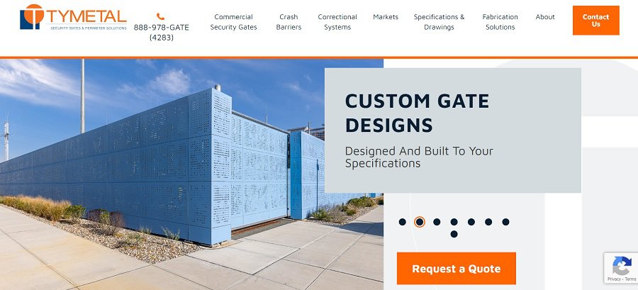
The primary navbar breaks the site into key categories. What we like best about it is that as you hover over each tab, a mega menu drops down, including images and additional categories. Expanded menus give the user a chance to see the depth of what the business offers.
Studies show 94% of users prefer a site with simple navigation. The more intuitive you can make your categories, the better site visitors will respond.
Color Palette
TYMETAL utilizes a blue and orange color scheme, which could be rather garish if used liberally on a website. Instead, they use it as accent colors and have a lot of white space to counteract the vividness of the color combination. The final result is a site that is easy on the eyes but still grabs the user’s attention.
Trust Factors
Users may not realize why they trust or distrust a site, but TYMETAL has a number of factors that put visitors at ease. For example, they list a toll-free number in the upper right corner of the site. Users can find the information and click on it from a smartphone. They also list a number of organizations they belong to at the bottom of the page, such as the American Fence Association and AISC.
Explainer Videos
Because some of what TYMETAL does is complex, they offer explainer videos via their About page and also on YouTube. Site visitors can see a gate crash test in action, get details on detention security and gather details on how gates work even in a power outage.
Testimonials
As a manufacturer, TYMETAL mainly works with other businesses. To showcase their clients and how happy they are with the product, they feature testimonials. People like to hear from their peers on how well something works, so showcasing thoughts from those who’ve already worked with them says a lot about the quality of their product.
Slider
Some people will say sliders shouldn’t be used, but we actually appreciate a well-designed slider in the hero shot. TYMETAL does an excellent job of showcasing their different projects in their slider.
Users will see commercial business gates as they read facts such as how long the company has been in operation. The images include airports, logistics company facilities, custom perimeters and vertical lift gates.
Call to Action (CTA)
The large CTA button grabs user attention above the fold. The text reads “Contact Us” to indicate they offer custom solutions to leads. When the person clicks on the button, they go to a form they can fill in and send. However, to the right are other ways to get in touch, including a toll-free number and office locations.
Mobile Responsiveness
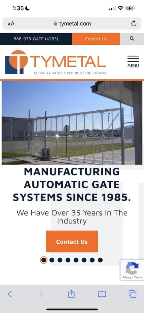
Since more people access the internet via their mobile devices than ever before, Designerly staff always looks at how responsive a site is. We were quite impressed with TYMETAL. Not only does the site translate well on a smaller screen, but we think it looks better on mobile than desktop.
What We Would Do Different

When a site is as well-designed at TYMETAL, it’s hard to find something to criticize. We ran through the list of things we see in a lot of designs that can be improved. The only thing we would change is the additional menu above the primary one. It is too much and it detracts from the overall aesthetic of the site. We’d probably move these links to the footer or into one of the drop down menus and let it live there.
We would keep the “Contact Us” CTA option but turn it into a button immediately instead of scrolling down.
Other than one minor change, we are in love with the design of this manufacturer’s website. It’s a good one to study for ideas on how to design a B2B manufacturing website.
