Studying website wireframe examples ensures your design converts. Whether building a website or redesigning one, you want to ensure the final product provides a good user experience. A wireframe enables you to see the overall layout of your website.
By gaining a big picture of the design, you can evaluate user flows to understand how they function. Along the way, you may find potential mishaps that prevent users from achieving their goals.
However, there are various types of website wireframes that UX designers use to maintain better user experiences. Understanding each website wireframe with a few examples will help guide you through your next UX design project.
What Is a Wireframe?
A wireframe is a blueprint of a website. It’s a simple drawing that shows where things will go on a website. Wireframes are the bare bones of a user interface, outlining the layout and structure of web pages or mobile apps.
They’re not intricately detailed with colors or images. Instead, it uses boxes, lines and labels to show where the elements will be on the website. These can be things like the menu, copy and visual components. A wireframe is basic because it helps minimize distractions for designers. This lets them focus on the website’s arrangements and the user experience.
Typically, a wireframe includes the layout of different pages, like the homepage or contact page. It shows the main parts like the header, footer and content area. It also plans where buttons, links and navigation will go. This ensures that when the website is built, it’s easy and enjoyable to use.
Website Wireframe Examples for Inspiration
Wireframes come in handy in the early parts of the website design process. The following website wireframes are examples of how they’re made and what you use them for.

Source: www.behance.net
1. Low-Fidelity Wireframe
Low-fidelity wireframes are the first step in website design. They are basic sketches that map out the layout and structure of a web page without any detailed elements. At this stage, it’s all about organizing the site’s content and features clearly and logically. It uses basic shapes and text placeholders to outline the overall elements.
In this example, the website wireframe shows a simple layout for a website. It has placeholders for key elements like the logo, navigation menu, main image and content areas like “Our Services, “Project Gallery” and “Testimonials.” Each box and shape represents where text, images or buttons will go, but it doesn’t show what they truly look like.
This type of wireframe is useful for collaborating with team members. Each of you can share feedback on your initial ideas and ensure everyone is on the same page of what the website needs.

Source: www.behance.net
2. Medium-Fidelity Wireframe
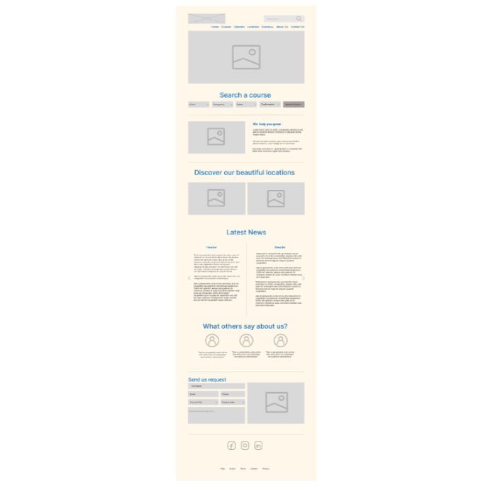
Mid-fi wireframes are a step up from lo-fi wireframes, providing a more detailed outline of a website’s design. They often include a higher level of detail with some elements like basic icons and more precise text placement. It may even suggest the type of content that will appear on the site.
In the medium-fidelity wireframe example, you can see it’s more refined than a lo-fi wireframe. This one includes placeholders for images and text. It even has functionality indications, like a search bar and form fields. There are also simple icons and buttons, and lines or boxes separate the text areas to show content hierarchy and organization.
Mid-fi wireframes are helpful because they give stakeholders a clearer vision of the website’s structure. It helps them choose the right interface components and styles. It also assists with discussing the functionality and content without addressing the full visual design.

Source: www.behance.net
3. High-Fidelity Wireframe
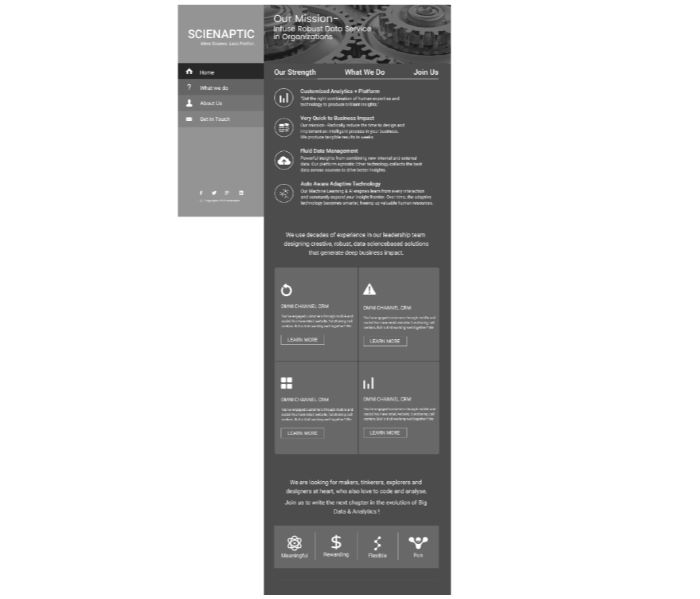
High-fidelity wireframes are the most detailed blueprints in website design before creating the final product. They closely resemble the final design, featuring a precise layout and clear typography. They also bring your copy to life and provide more accurate spacing. Sometimes, they include color schemes and graphics, making it a more polished visual representation of your design concept.
This website wireframe example provides a more comprehensive layout. It details a full menu, content sections and visual elements like icons and graphics. Overall, it gives you a clear picture of how the final website will look and work.
This wireframe level is useful for finalizing the design and user experience details. It provides a strong visual for the team to review and refine before developers begin to build the actual website. It’s also helpful for conducting user testing to gather feedback before the full site goes live.

Source: www.behance.net
4. Interactive Wireframe
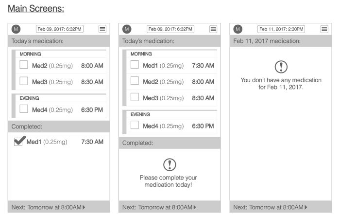
Interactive wireframes — or clickable wireframes — allow users to engage with the interface. These live wireframes go above the static wireframes and enable you to test the navigation, user flow and overall functionality. This type of wireframe doesn’t have any fidelity level, so you can create one at any stage.
The interactive wireframe example is of a medical app where users can click on different elements to see how to navigate from one task to the next. For instance, they can click on a date to view the medication scheduled for the day or check off completed doses. The interactive elements also include expanding lists and popup reminders.
These wireframes are crucial for understanding the user experience and identifying usability issues. They give you a practical demonstration of how the final app will work, offering a hands-on experience without needing fully developed software.

Source: www.behance.net
5. Responsive Wireframe
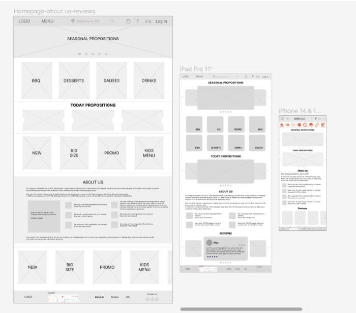
This website wireframe is a depiction of a responsive design. These are crucial in the design process because they show how a website will rearrange its layout across different devices. They ensure the user experience is consistent and functional, whether on a desktop or smaller mobile screen.
In this responsive website wireframe example, you can see it showcase a representation of a food cafe website that’s designed for various devices. It illustrates how elements like the menu, promotional sections and content areas will reposition themselves to fit within the confines of each screen size. For instance, a three-column layout on a desktop becomes a single column on a mobile device. This ensures the content is easily readable and accessible on a smaller screen.
A responsive wireframe is crucial in today’s world of web design, given the many devices used to browse the internet. They help in planning and testing the adaptability of the site’s design, ensuring a seamless transition between different viewing contexts.
Putting the Website Wireframe Examples Into Practice
Understanding the range of wireframes is key to crafting websites that deliver. To implement them, begin with simple sketches and transition into more detailed layouts. You can even use these website wireframe examples as a guide to shape user-friendly experiences.
Every great website starts with a wireframe, so take these insights, plan, and create something amazing. A user journey will always begin with a simple map of a website’s design.
About The Author
Eleanor Hecks is the Editor-in-Chief of Designerly Magazine, an online publication dedicated to providing in-depth content from the design and marketing industries. When she's not designing or writing code, you can find her exploring the outdoors with her husband and dog in their RV, burning calories at a local Zumba class, or curled up with a good book with her cats Gem and Cali.
You can find more of Eleanor's work at www.eleanorhecks.com.


