

In This Article
College football has been a mainstay of American culture for many years. People gather at their alma mater to get entertainment and root for their favorite teams. What would the fall season be without the game? College football logos reflect the personality of the schools they stand for. Each has a specific look and meaning.
There are 858 schools offering football across all divisions in the National Collegiate Athletic Association (NCAA), National Association of Intercollegiate Athletics (NAIA) and independents. There are some pretty strict rules around scholarships and athletic aid. New schools are added frequently, including public and private institutions. With that many colleges, some logos are pure genius — and others not so much.
We’ve taken a similar approach as our best NFL team logos post and have gone through our available choices to find the best of the best. Below are the college football logos we think stand the test of time.
1. University of Texas Longhorns
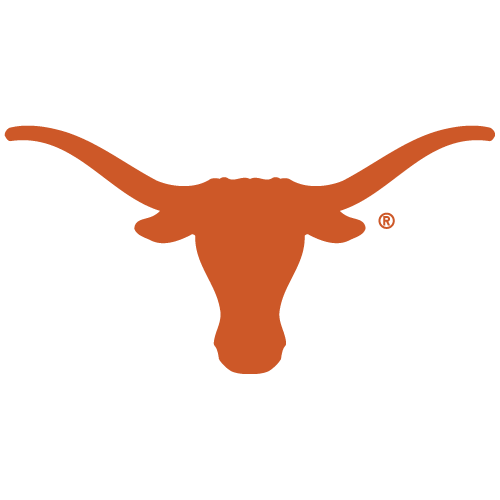
The University of Texas college football logo is used across their different sports teams, including their football program. The team is known as the Longhorns — their logo is an outline of the cattle with the same name. The colors are either the school’s orange on a black or white background or a cream-colored steer on top of a burnt-orange backdrop. One of their football game traditions includes fans holding up their hands with the forefinger and pinky extended as a symbol of cattle horns.
The University of Texas was founded in 1883 and has around 40,804 undergraduate students, with another 11,028 graduate students enrolled. They’ve won 53 national championships since 1949 across their different sports.
2. Akron Zips
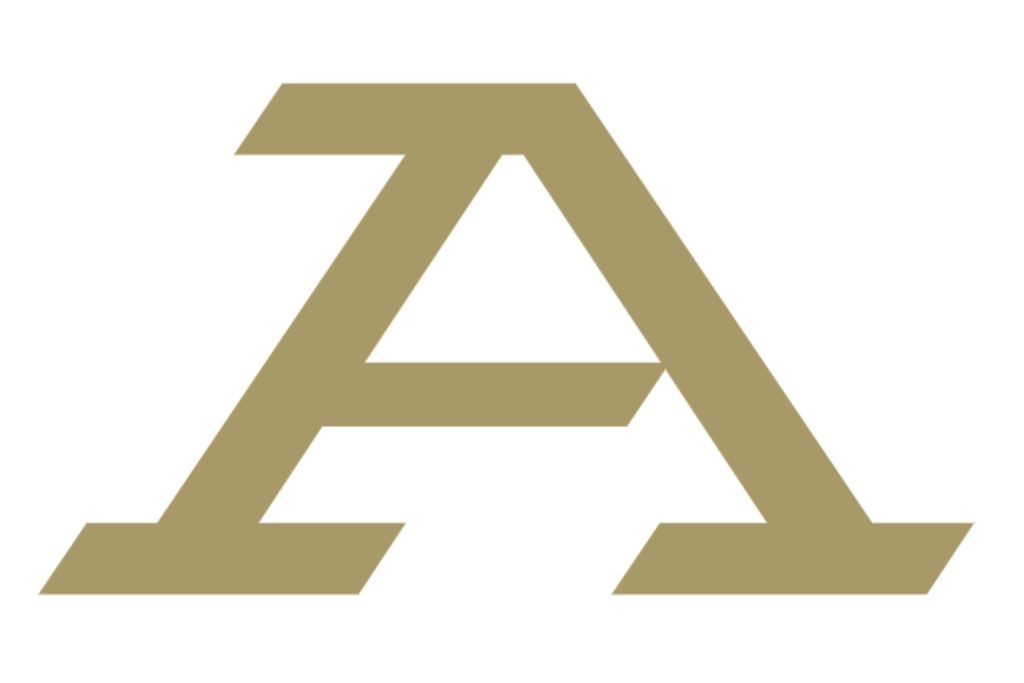
The Akron Zips have used their current college football logo of a letter Z since 2014. Before then, they used the letter A with a kangaroo or just the character A alone. In 2022, the team changed its emblem back to the letter A in gold with a white outline. The logo works well because of its simplicity. The team’s name comes into focus via the new logo. While it features a bold, streamlined A, it also subtly incorporates the letter Z, symbolizing the team’s swift and dynamic playing style.
The Zips were formed in 1891 when the school had a different name of Buchtel College. It didn’t become the University of Akron until well into the 20th century. People called the team Zippers because of popular rubber boots that were made by a company located in Akron. The name eventually shortened to Zips around 1950.
3. North Carolina Central University Eagles
North Carolina Central University recently updated their college football logo. Their football team is known as the Eagles, and for many years, they used a full red and white eagle with wings extended as their trademark. The eagle seemed to be lifting the school’s name. However, they now use an image of the eagle’s fierce-looking face, still utilizing the school’s red and white color scheme.
The Eagles’ first season occurred back in 1922. Since then, they’ve won many championships, including the Black College Football National Championship in 2005 and 2006. They also won the Mid-Eastern Athletic Conference (MEAC) subdivision through the Football Championship Subdivision (FCS) for 2014 through 2016. NCCU is a Division II school, touting a football team that won the Central Intercollegiate Athletics Association championships in 1980, 2005 and 2006.
4. Penn State Nittany Lions
The Penn State Nittany Lions have a current logo with a lion’s head outlined in white on a dark blue background. The genius thing in this logo is the stark contrast between the white and navy. It makes the outline of the lioness pop. The logo matches the school’s colors as well.
Pennsylvania State University is a public university founded in 1855. Penn State is part of the Big Ten Conference and is an NCAA Division I school. They hold a number of national championships dating back to 1911. Famous coaches such as Joe Paterno, Rip Engle and Tom Bradley coached the team over the years, with James Franklin currently at the helm.
5. Nicholls State Colonels
The Nicholls State Colonels have a unique college football logo. Note the bold red that reflects the school’s color and the sword through the capital “N,” which represents the school’s name. It’s a subtle effect but shows they are ready to go to war to win.
Located in Thibodaux, Louisiana, the school was founded in 1948. At one time, the school had a strong Reserve Officers’ Training Corps (ROTC) presence — colonel is the highest rank in ROTC. They are a Division I team and played their first season in 1972. They’ve since won Divison I and II championships in 1975, 1984, 2005, 2018 and 2019.
6. Delaware State Hornets
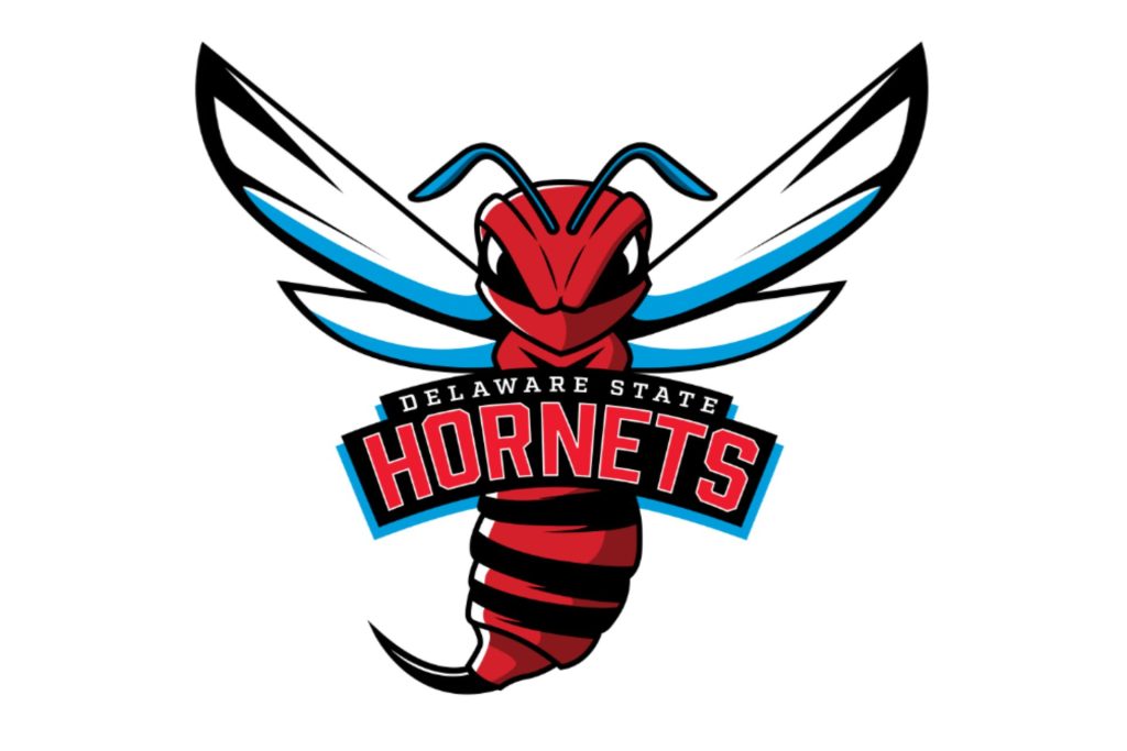
The Delaware State Hornets have a bright, bold logo representing the university’s competitive spirit. Located in Dover, Delaware State University (DSU) has a rich history of athleticism, and the hornet has become a beloved mascot. With an unrelenting sting on the field, the hornet symbolizes the football team’s boldness and strength.
Today, the Hornets logo showcases a dynamic red and black hornet with spread wings, ready for action. The school updated its design in 2023, incorporating sharp lines and vivid colors to bring energy and intensity to the emblem. With “Delaware State” arched above “Hornets” in bold lettering, the logo encapsulates the school’s drive to become champions.
7. Dayton Flyers
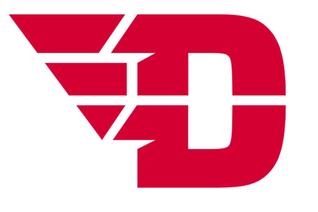
The Dayton Flyers use the letter D as their college football logo. However, they make it really compelling by playing on the name “Flyers.” The character D looks like it’s flying through the air on wings. Note the way the left side of the letter is broken into sections to imitate motion.
The University of Dayton is a private Catholic university in Ohio established in 1850. They compete in the Pioneer Football League. Their mascot is Rudy Flyer, a barnstorming pilot with 1930s goggles and a leather helmet.
8. West Virginia Mountaineers
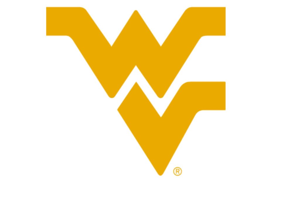
The “Flying WV” logo represents pride, heritage, and the rugged spirit of the Mountain State. Representing West Virginia University (WVU) since 1980, this bold emblem has become one of the most recognizable logos in college sports.
Sportswear designer John Martin introduced the “Flying WV” to create a unified symbol for WVU athletics. Its shape is embellished with sharp angles and clean lines. The logo also displays the university’s signature gold on a blue background. It has become a badge of identity for all West Virginians and appears on the football team’s apparel for all to see.
9. University of Michigan Wolverines
The University of Michigan has a straightforward logo — a yellow letter M in a big block letter font. The character features a dark blue outline to reflect the school colors. Over the years, their logo has included the full word “Michigan” and their wolverine mascot in various forms.
UM is located in Ann Arbor and was established in 1817. They are Division I and part of the Big Ten Conference.
10. University of Arkansas Razorbacks
The University of Arkansas Razorbacks has a very detailed logo. Where most schools go with something simpler, they include a full drawing of a razorback hog that looks like it’s mid-charge. The school is located in Fayetteville, Arkansas, and was established in 1871 as an industrial university. The sports team compete in Division I and are members of the Southeastern Conference.
Recently, they have gone to a secondary logo of just the razorback’s head, but the raging animal is much more effective.
11. Notre Dame Fighting Irish
Notre Dame’s football team is the Fighting Irish. Their college football logo features the school’s two initials intertwined, dyed in the blue of the school’s colors. It is simultaneously simple and yet intricate, offering a geometrical look.
Notre Dame is located in Indiana in a town by the same name. Edward Sorin founded the Catholic University in 1842. This school’s football program has the most members in the College Football Hall of Fame.
12. University of Florida Gators
The University of Florida’s football team is the Gators. Their logo is a little simple, but it gets the point across. One notable thing about their symbol is the way the outside circles follow the top lines of the gator drawing. The public university has a founding date of 1853, making it one of the oldest institutes in the college football lineup.
13. Clemson University Tigers
The Clemson University Tigers frequently change their logo, making minor shifts in the look of the tiger’s paw or the lettering. Their current logo uses the school’s distinctive orange. The paw isn’t a solid outline, which gives it some texture and a three-dimensional look that stands out from other college football logos.
This Division I university is in Clemson, South Carolina, and was founded in 1889.
14. Boston College Eagles
The Boston College Eagles may be a lesser-known college football team, but their logo is quite striking. The double lined letters stand out against any background and on team uniforms. Note how they incorporate their school colors of gold and red into the design but outline everything in black to grab interest.
The college resides in Chestnut Hill, Massachusetts and is a Division I in the NCAA. Their mascot is Baldwin the Eagle. The name Baldwin comes from the bald head of the eagle combined with the word “win.” Reverend Edward McLaughlin dubbed the mascot by writing to the student newspaper and saying they needed a mascot and the Eagle was a symbol of majesty, power and freedom.
15. Michigan State Spartans
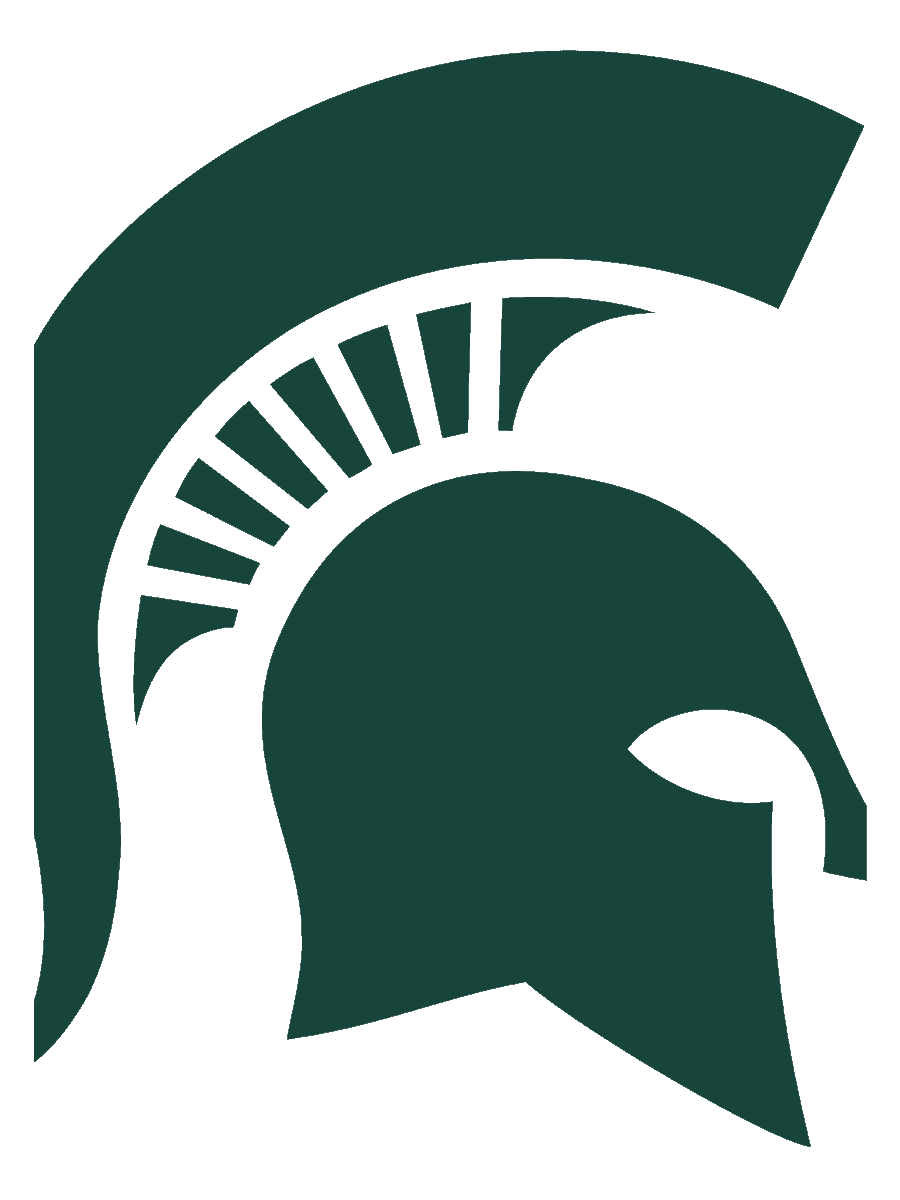
The Michigan State Spartans have a logo that is a study in minimalism. The logo has been ranked in the top 25 of all the college football logos in the country and beat out colleges such as Texas, North Carolina and Miami. Michigan State tried various shades of green over the years before landing on this hunter green that signifies strength and power.
The Spartans are part of the Big 10 Conference. They hold six national championships and 11 conference titles.
The college changed its name to what it is today in 1925. That same year, they held a contest to find a new nickname for the team. They finally chose Spartans and it stuck.
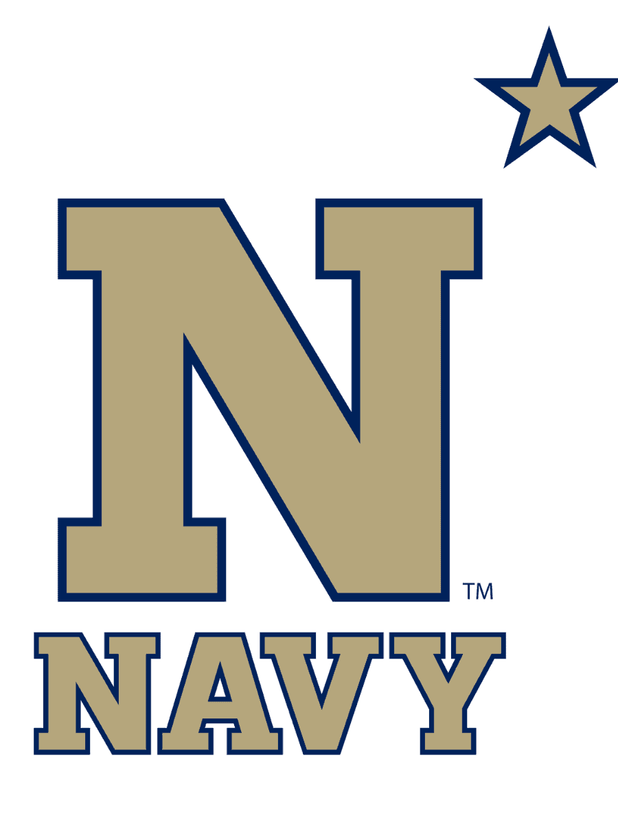
The United States Naval Academy is part of the NCAA and their logo is something to study for great logo design. It’s a simple letter mark but it also incorporates the Navy star, which represents the skies and how sailors have navigated the waters for thousands of years.
The Navy Midshipmen Football team is part of the NCAA Division I tournament. Their mascot is Bill the Goat. The Navy’s program is one of the oldest in the nation, dating to 1879.
17. University of Utah Utes

The University of Utah Utes embrace the two “U’s” in their name and create a letter logo that shows how the two are enmeshed in their identity. The crimson red stands for their school colors and is also eye-catching amidst a sea of other color options by various teams.
The team also is an NCAA Division I competitor. They’re located in Salt Lake City, Utah. Their mascot is Swoop–a red-tailed hawk that replaced their original mascot of the American Indian.
The name “Utes” comes from the history of the state’s name. The name honors the Utes American Indian tribe that inhabit that area of the country. The school adopted the name to match their school name.
18. University of Missouri Tigers
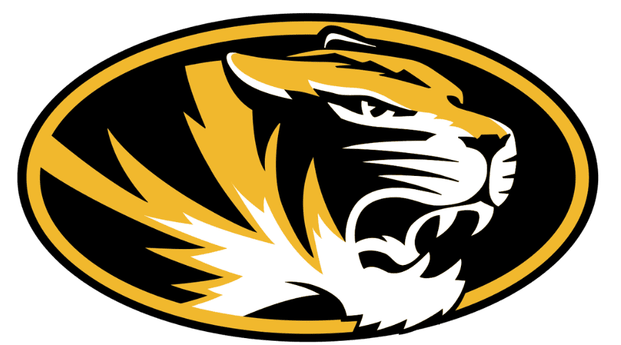
The University of Missouri sports revamped their logo to make it look less like Michigan’s and more like their tiger mascot. Before 1996, they also had a block letter “M” logo. It was so close to Michigan’s that non-fans sometimes confused the two.
The school is in Columbia, Missouri and part of Division I NCAA athletics. They are considered an affiliate member of the Big 12 Conference. The Tigers are one of the oldest football teams in the nation, with a founding date of 1890 for their football program. As of 2023, they’ve had 34 Bowl appearances with a 15-19 record.
The school’s original logo was the word Mizzou with strong block serifs and a tiger resting on top of the word. They tried a tiger paw print with the letter M inside from 1995 to 1999. Next up was their letter M logo from 1999 to 2014. They then came up with the roaring tiger edging out of its logo in 2014. The school slightly adapted the look over the last few years but kept the general concept through the present.
19. University of Pittsburgh Panthers
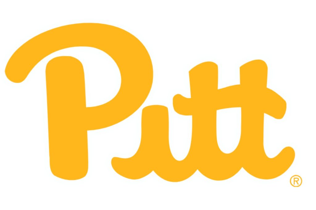
The University of Pittsburgh is home to the Panthers, which has a long-standing presence in college football. While competing in the NCAA Division | Football Bowl Subdivision, Pitt has gone through multiple logo updates. Yet, its visual identity has always remained intact. Its primary logo — introduced in 2019 — showcases the wordmark “Pitt” in gold. It captures the school’s rendition of its storied past while taking a forward-looking approach.
The Pitt Panther mascot was born in the early 20th century when a near-graduate, George M. P. Baird, suggested the panther. The panther’s symbolism reflects the school’s qualities of strength and tenacity, and no other college at that time had a panther mascot. By the 1940s, the logo represented a navy blue panther, which had evolved over the decades to gold, adding “Pitt” next to the ferocious beast. Today, the logo is a simple wordmark, capturing the heart of Pittsburgh pride.
Now, we’ve gone through the more eye-catching college football logos out there — there are many more. What is your favorite college football team’s logo?


Leave a Comment