Although some may seem straightforward at first glance, many NFL team logos have a rich history. Numerous teams have tinkered with their original logo by changing colors or a particular image — though all have generally maintained the same theme and tradition since their formation.

Football fans immediately associate a team’s logo with that team, often without thinking what exactly that logo is or how it came about. You can learn a lot by studying the hidden and direct meanings of popular logos. With football season in full swing, it’s as good a time as any to dig into some of the NFL team logos and their meanings:
Jump to: Arizona Cardinals | Atlanta Falcons | Baltimore Ravens | Buffalo Bills | Carolina Panthers | Chicago Bears | Cincinnati Bengals | Cleveland Browns | Dallas Cowboys | Denver Broncos | Green Bay Packers | Houston Texans | Indianapolis Colts | Kansas City Chiefs | Los Angeles Chargers | Minnesota Vikings | New England Patriots | New York Jets | New Orleans Saints | Oakland Raiders | Philadelphia Eagles | Pittsburgh Steelers | San Francisco 49ers | Tampa Bay Buccaneers | Tennessee Titans | Washington Redskins
1. Pittsburgh Steelers
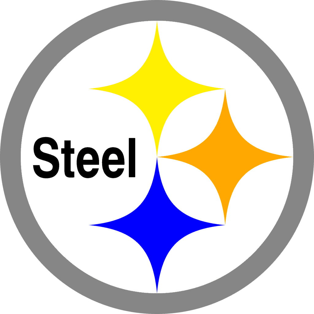
The origins of the Steelers’ logo and name tie in with the city of Pittsburgh’s history of heavy industry. The city saw its steel and iron industries develop quickly in the 1830’s, becoming one of the nation’s strongest producers by 1860.
On the left is the Steelmark logo, which was representative of the American Iron and Steel Institute. It contains three diamond shapes (hypocycloids). The team used the logo in a marketing campaign to educate consumers regarding the integral nature of steel.
In 1969, they implemented the three materials needed to produce steel — orange represents ore, yellow represents coal, and blue represents steel scrap. The Steelers petitioned the AISI to alter the word “Steel” to “Steelers,” with the resulting logo being similar to what we see today.
2. Atlanta Falcons
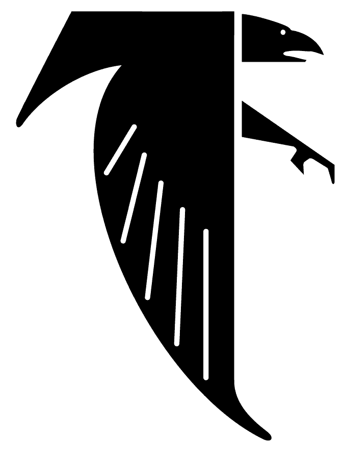
The Falcons’ logo is a falcon in flight with its wings in a downward position. Its looks haven’t changed much since the team’s introduction in 1966. However, in 2003, they added red streaks to the hawk, as well as a more stretched-out neck and separated feathers.
The reason for the hawk’s shape is that, upon close inspection, you can see its resemblance to the letter ‘F’ — Falcons. The team credits its association with the hawk to high school teacher Julia Elliott, who won a contest in 1965 by highlighting how proud and dignified the animal is.
3. Buffalo Bills
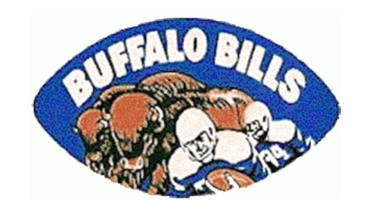
The Bills have always featured a buffalo in their logo, though with varying colors through the years. Their first logo, shown above, only lasted from 1960 to 1961 and featured a buffalo and a football player with “Buffalo Bills” in white text and a blue background.
Their logo from 1962 to 1969 was similar, with a football player and buffalo, though lacking the aforementioned text. For three years, from 1970 to 1973, the team featured a logo with a red buffalo. That later evolved to what we see today: a blue buffalo lunging to the right with a red streak alongside it.
Similar to the Falcons, the Bills’ name came from a contest won by a fan, who suggested the name to inspire a “new frontier” feel.
4. Carolina Panthers

Apart from a few refinements in color and design, the Carolina Panthers’ logo has remained nearly unchanged since the team’s introduction in 1995. Panther statues adorn Bank of America stadium, so despite the team being relatively young, fans approve of the Panthers’ choice. The team valued the animal’s “swift, sleek nature,” which they hope to reflect on the football field.
5. New York Jets

The New York Jets’ first logo, pictured above, was very to-the-point. It featured the word “Jets” in white text, inside a green jet. It only lasted the first year though, as 1964 saw the introduction of a more modern logo. Although that iteration featured a white background and green ‘Jets’ text, it’s the same football-like shape of today, whose logo has a dark green background and white text.
The team took a detour from this logo for a lengthy period, from 1978 to 1997, with a straightforward green “Jets” adorned with a jet-like dash on top of the ‘J.’ However, they returned to the modern take on their classic 1964 logo in 1998, which is the logo the team uses now.
6. New Orleans Saints

The New Orleans Saints’ logo has always featured the “fleur-de-lis,” translated to “lily flower” and representing French royalty. It’s been a symbol of New Orleans since the city’s founding in 1717. As the team’s logo, it’s a loving tribute to the city they represent.
The team’s first logo, from 1967 to 1999, featured a black fleur-de-lis with outlines of black and white. Today’s version, introduced in 2000, is the same, though the fleur-de-lis is gold.
7. New England Patriots
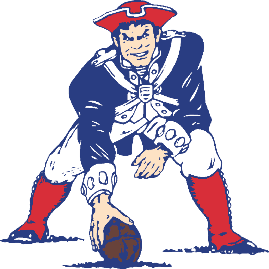
The New England Patriots’ logo has seen one of the most prominent evolutions among NFL teams. Their logo began upon the team’s introduction in 1960, with the simple blue tri-corner Revolutionary War hat.
It didn’t last long — 1961 to 1992 saw a similar iteration of a patriot in red, white and blue ready to hike the football. He looks like a bit like coach Bill Belichick, though that’s merely a coincidence.
8. Minnesota Vikings
The Minnesota Vikings’ logo is — naturally — of a fierce Viking. Its look hasn’t changed much since 1966. The team’s first logo, used from 1961 to 1965, also featured a Viking’s head, though facing left and not as clear or intimidating as today’s version. The name reflects partly the strong identification of Scandinavian-American culture in Minnesota, as well as the fierce and tough nature of historical Vikings.
9. Kansas City Chiefs

The Kansas City Chiefs’ present-day logo is quite tasteful, featuring an arrowhead emblazoned with the initials ‘KC’. Unfortunately, the same isn’t true of the team’s first logo, used from 1963 to 1971. It depicted an Indian chief running across the Midwest with a tomahawk and football. That logo showed a lack of graphical refinement, and would certainly be controversial today, so the team’s decision to opt for their present logo is a good one.
The Native American reference in the name and logo came about from the team’s former owner, Lamar Hunt, who took inspiration from Native American history in the area. It’s also possible that Kansas City Mayor H. Roe Bartle — nicknamed “The Chief” — inspired him.
10. Green Bay Packers
Excluding the addition of a yellow outer border to the logo in 1980, the Green Bay Packers’ logo has looked largely the same since 1961. Art student, John Gordon, and equipment manager, Gerald Brashier, created that “G” logo in 1961, standing simply for “Green Bay.” Before that, their logo showed “Packers” in green, with a football in between the goal posts.
11. Dallas Cowboys

The Dallas Cowboys’ logo has always been a blue star, representing the “Lone Star” state. The team added white and navy outlines in 1964, though beyond that, the logo has looked the same since 1960. Cowboys are a common aspect of Texas culture, so it’s no surprise the team used them for their name and symbol.
In 1960, the original suggestion was to name the team the Rangers. However, general manager Texas E. Schramm felt people would mix them up with a minor league team of the same name. Therefore, he decided to use the Cowboys name, along with the “Lone Star” logo. It’s worth noting that the Texas Rangers baseball team had yet to be founded.
12. Chicago Bears
The Chicago Bears’ original logo, from 1940 to 1945, didn’t project much intimidation. The bear looks like it’s fresh out of a circus juggling act. The team moved the bear on top of a football, with an angrier face, in 1946. That logo lasted until 1973, when an incarnation of the current logo came about. The recognizable ‘C’ had no color from 1962 to 1973, though designers added a blue border and orange filling in 1974 to form today’s logo.
13. Arizona Cardinals
The Arizona Cardinals’ logo started as a steely-eyed red bird and has remained the same general shape and form since about 1947. Small changes take place from time to time. One of the first logos featured a bird with a bent beak, and today’s logo features a bird with a more curved beak and darker accent lines.
The darker lines give the bird a fiercer look, showing the team is ready to fight for every win. The current logo received an update in 2005, and the color of the beak also changed from gold to yellow. Fans jokingly refer to the original version as a “parakeet” compared to the new, bold look.
14. Cleveland Browns

The Cleveland Browns’ logo changed pretty drastically from its original form. From 1948 to 1969, the Cleveland Browns featured Brownie the Elf as their logo, and he also served as a mascot to the team. The story of the elf originated in folklore with little elves — brownies — who helped with household tasks. In the late 1940s, team owner Arthur McBride asked for ideas for mascot logos and chose Brownie for the new mascot for the team.
Over the years, Brownie’s look got updated here and there. However, when Art Modell bought the team in 1961, he got rid of Brownie as fast as possible, switching to the orange helmet of today. Today, Brownie appears on merchandise and some advertising.
15. Denver Broncos
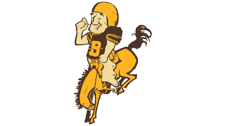
The Denver Broncos started in the American Football League in 1960 and got their name from a fan in a team-naming contest. After a couple of seasons, they shifted to the blue and orange uniforms they wear today. In 1970, the AFL transferred into the NFL, and the Broncos became an official NFL team.
Their first logo featured a cartoon football player riding a bucking bronco. From 1970 to 1996, an orange letter “D” with a horse in the center of the letter became their logo. In 1997 through today, the logo shifted to the outline of a fierce horse head with a flaming orange mane.
Today’s logo looks as though it’s in motion with sleek, long strokes in the design. The overall design is simple and easy to remember. The logo is also scalable for a wide variety of uses.
16. Indianapolis Colts

The Indianapolis Colts once called Baltimore home, but disappointing seasons and changes in the franchise resulted in the team moving to Indianapolis in 1984. The horseshoe logo has been their logo of choice since about 1979.
The logo hasn’t changed much between 1984 and today. Slight changes to the color and a slimmer design that is barely noticeable are the only shifts in the look of the logo.
The design is about as simple as you can imagine — a blue horseshoe with seven holes. The team colors are blue and white, so the focus is on the deep blue logo rather than the background. The two colors offer a lot of contrast.
17. Philadelphia Eagles
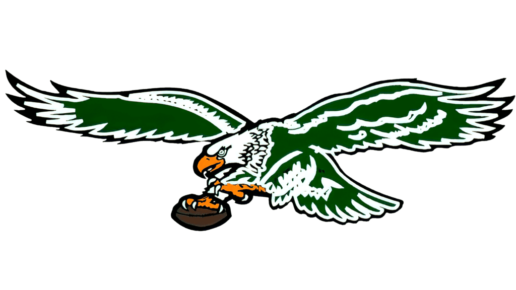
The Philadelphia Eagles’ logo comes with a rich history dating back to the Great Depression. The team started in 1933 and replaced the Frankford Yellow Jackets, who’d gone bankrupt. Their inspiration for their eagle logo came from the logo for the National Recovery Administration, part of Franklin D. Roosevelt’s New Deal.
An early Eagles’ logo featured a flying eagle clutching a football in its talons through about 1972. From 1973 to 1986, the logo became a green helmet with the wing of an eagle on the side. By 1987, the logo morphed back into the eagle clutching a football with some added bursts of color and stronger-looking wings.
In 1996, designers created the logo as fans know it today. It’s now a white bald eagle with a silver beak and black and dark green accents for the outlines. The eagle looks fierce with a heavy brow and piercing eyes.
18. Tennessee Titans
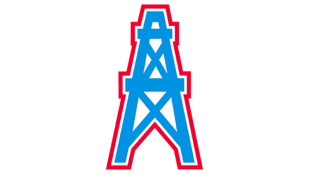
The Tennessee Titans have a varied history. Initially, they were the Houston Oilers from 1960 to 1997, when they relocated to Tennessee. They moved from Memphis to Nashville for two years and played as the Tennessee Oilers, and then became the Titans in 1999. Their logo changes match the variations in location and name. The team went through seven different logo designs over 55 years.
The first year the Houston Oilers were in existence, they sported a logo of a football player in a blue and gold uniform standing in front of an oil field and wearing a cowboy hat and boots. From 1961 to 1968, the logo became a man with an oil hat, but the same background and a similar uniform. The hat changed, but the cowboy boots remained.
By 1969, the logo made a drastic shift and became an outline of a football helmet with an oil derrick in the center of the helmet. In 1972, the colors of the logo changed to blue and red.
From 1980 to 1996, the logo was a simple blue oil derrick outlined in red. When the team moved to Tennessee, the logo remained the same until 1999, when it went through a drastic change. Today, it looks nothing like the previous logos. The current logo gives a nod to Tennessee’s state flag with three stars and a white ring. A trail of flames reaches out behind the logo.
19. Oakland Raiders

The Oakland Raiders have one of the most interesting logos in the NFL. The black, gray and white tones in the logo make a bold impression. The image is of Western actor Randall Scott with a patch over one eye. He definitely looks as though he’s ready to raid something. The image is placed over a shield shape, giving the logo a classic look.
The Raiders are based in Oakland, California. The team was founded in 1960 as part of the American Football League (AFL) and merged with the NFL in 1970 as one of the 32 teams. The logo hasn’t changed over the years and the uniforms match the color choices in the logo, giving some consistency to team branding.
20. Houston Texans
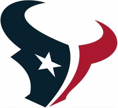
The Houston Texans’ logo has a modern feel but still takes a classic symbol of Texas and brings it into the NFL modern age. Note how the outline of a steer is clear to the viewer, complete with horns. The design then takes the team colors of red, white and blue and uses them to highlight the shapes within the outline.
Originally dubbed the Houston Oilers, the team then became the Tennessee Titans when they moved to Nashville, Tennessee. To keep the NFL at an even 32 teams, Houston was given the expansion franchise in 2002. The team logo was introduced as a new abstract rendering of a Spanish bull’s head and resembling the flag of Texas with the colors and lone star to one side. The star features five points, each point representing courage, strength, tradition, pride and independence.
21. Los Angeles Chargers

The Los Angeles Chargers’ logo is very simple and to the point, almost looking like an emblem you’d see emblazoned on the shirt of a superhero. The logo outlines the electricity behind the team and the idea that they charge electrically into each game. It is a jagged, vivid flash of yellow lightning with an animated look to it.
The Chargers began in Los Angeles as part of the American Football Conference (AFC) in 1959. The next year, they joined the AFL, and by 1961 they re-located in San Diego and joined the NFL in 1970 during the merger of the NFL and AFL. It wasn’t until 2017 that the chargers returned to Los Angeles. The team’s colors are blue and yellow with the yellow logo often appearing over a blue background to make it pop. Note the way the inside of the logo is outlined in black and then blue.
22. Washington Commanders (Redskins)

The Washington Commanders are based in Washington, D.C. and were founded in 1932, making them one of the oldest teams in football history. The franchise’s value rose between 2002 and 2024 to an estimated $6.3 billion.
The Washington Redskins have seen a bit of controversy in recent years, over their previous name and logo. The team started as the Braves and later changed their name to Redskins. Some people felt the name and logo was disrespectful of Native Americans and wanted the them changed.
The controversy was an interesting thing to consider in logo design. What worked in the mid 20th century for logos might become controversial today. No matter what type of business you design for, you should remain aware of social and political undertones as they update their brand image over time.
23. San Francisco 49ers

The San Francisco 49ers were founded as one of the charter members of the All-America Football Conference (AAFC) in 1946 and joined the NFL in 1949 during the merging of leagues. The team is named for the gold prospectors who headed to San Francisco during the gold rush in the 1800s.
The San Francisco 49ers are located in Santa Clara, CA, part of the San Francisco Bay area. Their logo is an oval with the initial S & F intertwined. The type is a wide serif font, giving the letters a bit of a three-dimensional effect. The colors of the oval are red, white and black and gold. The logo is fairly simple, but the boldness shows strength. The colors contrast nicely with one another and pop.
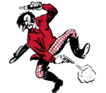
In the beginning, their logo boasted a gold miner complete with guns in each hand. It was a sort of caricature of a 49er. Later, another logo appeared that looked a bit like a crest with the number 49. In 1962, the logo changed to the initials “SF” in the middle of a red logo. From time to time, elements were added, such as black accents and a gold trim until the logo we see today appeared.
24. Tampa Bay Buccaneers

The Tampa Bay Buccaneers take on the emblem of raiding pirates as showcased by their logo with a flag you’d see flying atop a pirate ship. At first, their team colors were red, green, orange and white. However, people kept confusing the teams when they played the Miami Dolphins, so they later swapped the green for Florida Orange. The logo was created separately from other logos in the league with pirate themes.
They are a fairly new team in the NFL franchise, starting in 1974 and based out of Tampa, Florida. The original logo was a cartoonish pirate who people poked fun at and said put fear in no one. Controversy also surfaced over whether the cartoonist stole the logo from a college in another state or they stole the logo from him. Either way, the logo was revamped with the traditional skull and crossed swords and a ragged looking flag.
25. Baltimore Ravens
The Baltimore Ravens are often overlooked for the flashier NFL teams out there, but their logo is stellar. The outline of a deep blue raven with a golden B on its head grabs attention. The beak of the bird stretches backwards, making the logo look as though it’s in motion. The look is repeated in the letter B.
Until 1999, the Ravens featured a shield logo with a genius design in that it added some elements from the Maryland state flag. The colors from the previous logo inspired the current one.
Throughout the years, the Ravens have featured logos with various bird renditions, such as a front-facing raven with spiked up feathers and a bird with its wings outstretched in predatory fashion.
Today, the logo is sometimes depicted on the bird head and at other times just as a letter B.
26. Cincinnati Bengals
Tigers are often seen as fierce and determined. The animal the Cincinnati Bengals take their name from is a good representation of the team that never quits. Their logo through the years often reflects the wild nature of their name.
Note the simplicity of the letter mark logo design. The orange represents the team colors and the black stripes make the letter look like a tiger.
When the Bengals franchise started in 1968, they used an animated tiger carrying a football as it ran. From 1970 to 1980, the team logo was an orange helmet with a sans serif font that read, “Bengals.” From 1981 to 1996, the helmet lost the words and had tiger stripes. Although they tweaked the look here and there, it mostly remained the same until 1997. From ’97 to 20023, the logo was a tiger’s head with orange, black and white.
In 2004, they moved to the letter B with tiger stripes and have maintained the design since. The font the designers used to make the logo is bold and heavy, putting some power behind the franchise’s image.
There you have the history of 26 NFL team logos. Do you have any stories surrounding your favorite team and their logo?
About The Author
Eleanor Hecks is the Editor-in-Chief of Designerly Magazine, an online publication dedicated to providing in-depth content from the design and marketing industries. When she's not designing or writing code, you can find her exploring the outdoors with her husband and dog in their RV, burning calories at a local Zumba class, or curled up with a good book with her cats Gem and Cali.
You can find more of Eleanor's work at www.eleanorhecks.com.


Really enjoyed reading it. Thank you for sharing such an amazing and informative post. Team logo history NFL…
Hi Lisa! Thank you so much for reading 🙂 Really appreciate it!
Very interesting. And it will be interesting to see if Washington demotes the Commanders!
Hi Roger! Thanks for stopping by. It will be interesting to see what happens this year.