16+ Cool Logos to Inspire Your Next Design
Posted on January 10, 2019 | Updated on November 13, 2023
Logos serve as a starting point for many business designs. Most businesses get their logo and signage in place before they turn to any other branding element. Because there are so many logos, designers get creative and create cool logos that stand out from the crowd and serve as inspiration.
Moreover, up to 75% of consumers recognize a business by its logo alone. Meanwhile, half of customers reveal they’re more likely to buy from a brand with a logo they know.
Well-designed, cool logos make an impression on even the youngest consumers and are synonymous with the brand. Here are 16 logos and why they represent the brand well.
1. Duck Commander
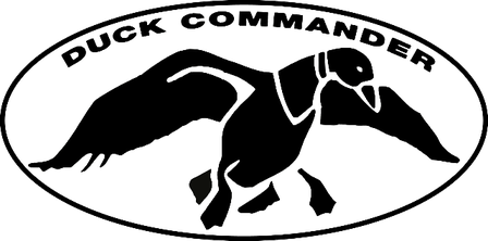
Your logo doesn’t have to be complicated but should reflect your brand’s personality. Duck Commander features a simple black outline of a duck in flight. The company makes duck calls and sells hunting accessories, so the logo perfectly represents its brand and what it offers consumers.
2. Cisco
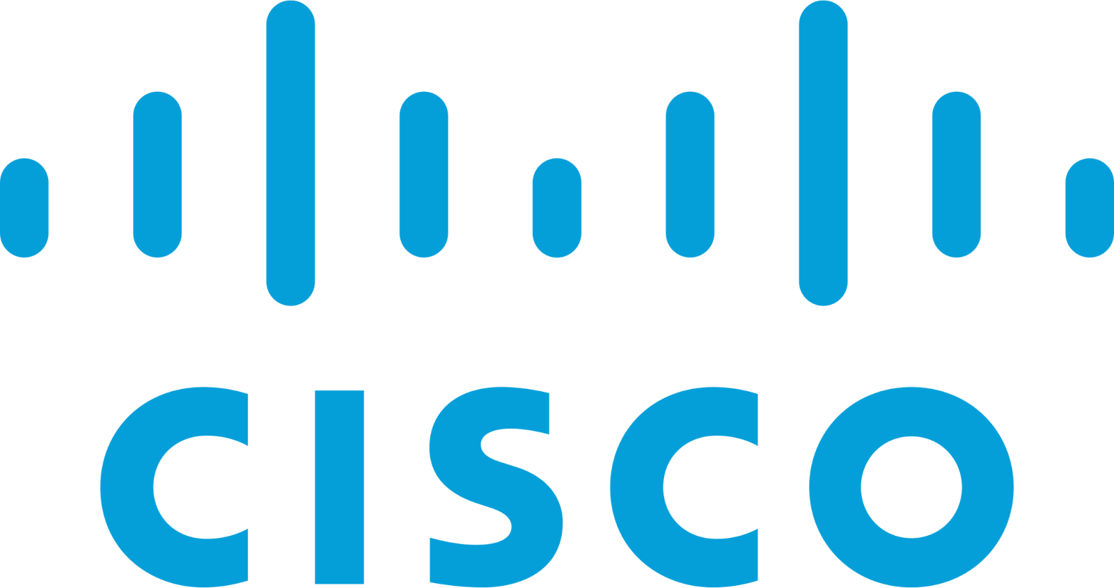
Cisco leads the way in manufacturing networking equipment. It shows its cutting-edge technology in its logo with lines similar to a measurement display you might see on different electronic devices.
You can replicate this type of logo by thinking about an object that represents your business and then outlining it rather than outright using an image of the object.
3. World Wildlife Fund

The World Wildlife Fund uses the image of a panda and has since its inception in 1961, with very slight changes. Pandas represent just one of the many animals the WWF strives to protect and preserve for future generations. The logo works well because it means the organization’s passion — saving pandas — but is also cute enough to attract the attention of fellow animal lovers.
4. Buffer
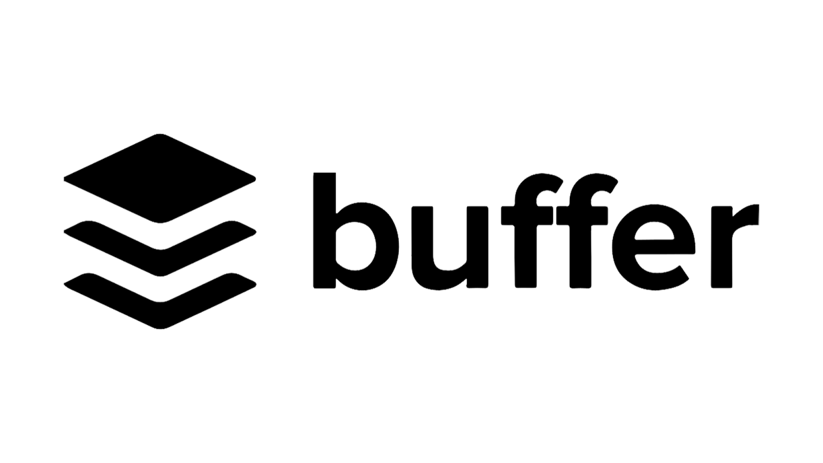
Buffer serves various businesses, streamlining its social media and online content marketing needs. The logo icon is stacked papers with white space between them to give it a three-dimensional effect.
Use space creatively for your logo designs to create depth and dual images.
5. Michelin
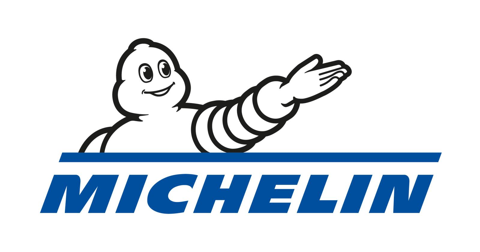
It’s hard to top the Michelin Man regarding cool logos. The company’s founder came up with the concept of a tire man while looking at an exhibit of a pile of tires at the Lyon Universal Exhibition. Over the years, people came to associate the mascot with the brand until people knew at a glance that the tire man represents the brand name.
While you don’t have to use a character for your logo, adding something that reflects your brand image and is immediately recognizable as uniquely yours builds recognition.
6. Sanderson Spartan Golf
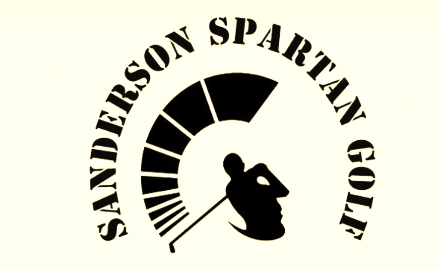
Sanderson Spartan Golf Club’s logo shows a golfer in motion. Adding motion to your logo design takes up more space but impacts consumers. The figure in the logo is obviously in the middle of a mighty swing of the club. This logo also utilizes the negative space and doubles as the image of a soldier’s face with headgear to the left.
7. Anchor Books

Anchor Books uses a simple anchor image inside an oval. This logo stands out for its simplicity and the symbolic power of its imagery. The logo’s minimalist design ensures it remains timeless and versatile, easily recognizable on book spines and marketing materials.
The shape of your logo impacts the psychological response from consumers. Studies show that circular shapes create the perception of softness. Readers see the emblem and assume the books will elicit a warm response.
8. Eco-Pup
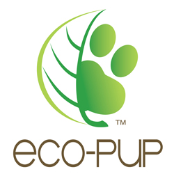
Eco-Pup sells environmentally friendly products for cats and dogs. Notice the logo and how the two sides represent the company. On the right is a green pawprint — green representing environmentally friendly. On the left is the outline of a leaf. The imagery and color choice immediately communicate the brand’s core values and market niche to consumers.
Show more than one side of your company by combining two concepts in the logo. This approach can convey the brand’s mission and ethos effectively. Using nature-inspired elements and colors makes the logo visually appealing and instantly shows the brand’s dedication to eco-friendliness and pet care.
9. Quip

Quip is a collaboration tool that serves entrepreneurs, freelancers and businesses. Note how it represents what the platform does by featuring a conversation bubble. The company name is displayed in thick black letters, so the conversation bubble pops with its bright burst of color.
Your name serves as an essential element in your logo. Think about things that build upon your name and complement what you don’t. Add a pop of color when possible to draw the user’s eye.
10. Baskin Robbins
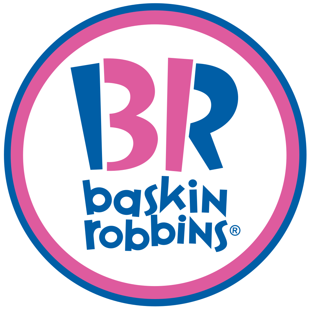
Baskin Robbins is known as the ice cream shop with 31 different flavors. Notice how the logo incorporates the company’s initials with the letters B and R but has the number 31 in the center. The bright colors are fun, reflecting the overall personality of the brand.
Adding hidden meaning to your logos allows you to have a bit of fun with your customers and educate them about your company at the same time.
11. British Airways

Even if your company has a longer name, such as British Airways, you can find cool logos that signify what you do without making it too lengthy. Note how it uses a stylized version of the Union Jack flag, often called the “Speedmarque,” a ribbon-like, abstract interpretation of the flag.
Additionally, choosing a simple, legible typeface for the brand name ensures clarity and ease of recognition, even when the term is longer. By balancing these elements, brands can create memorable logos and representative of their identity, regardless of the length of their name.
12. Madame Tussauds
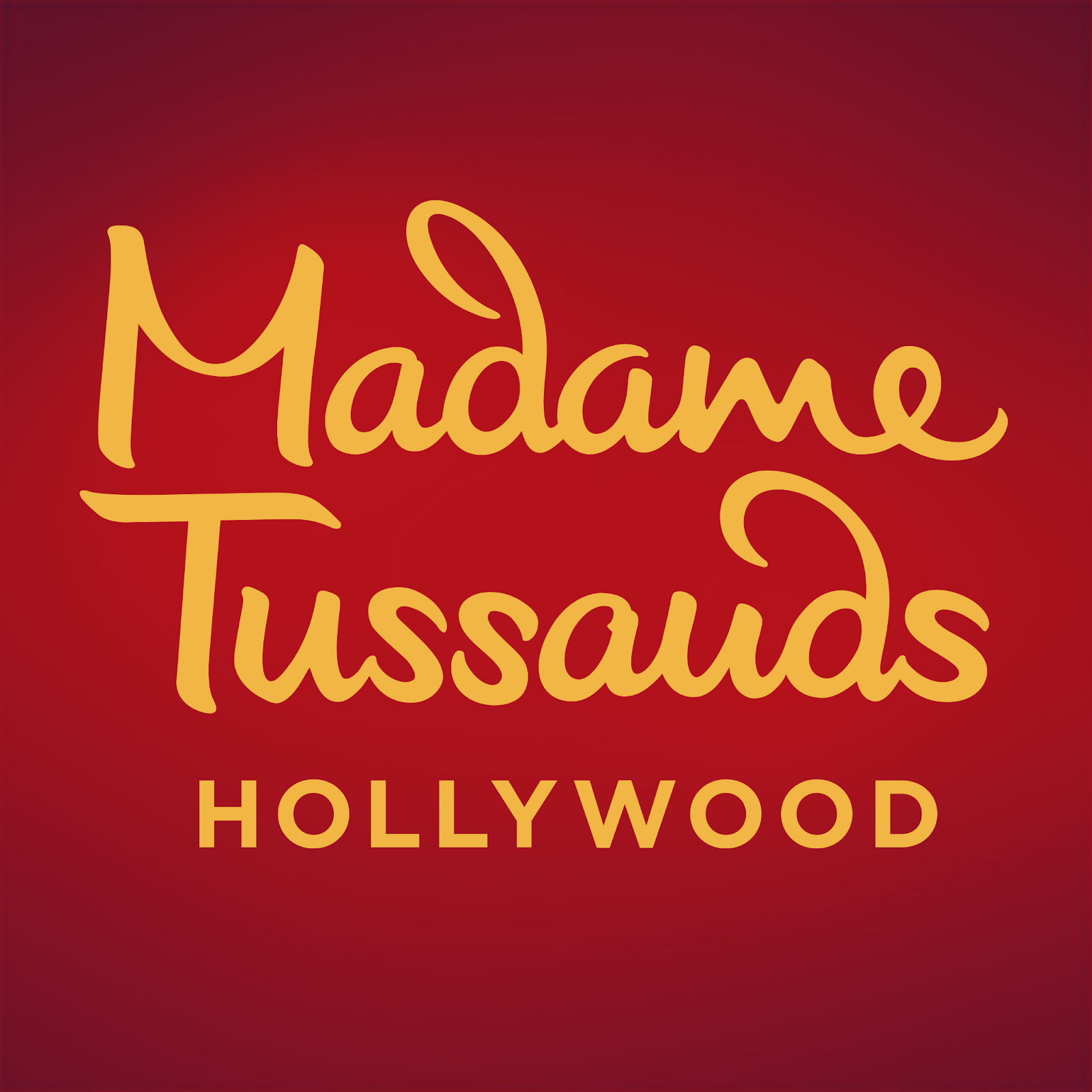
Madame Tussauds is known for fantastic wax figures of famous people throughout history. The logo typically features the brand’s name in an elegant serif font, often accompanied by classic colors — like gold and red — adding a touch of sophistication and luxury.
The font you choose for your logo significantly impacts the emotions your logo conveys. A classic serif font lends a timeless and distinguished character, aligning with the museum’s reputation for showcasing finely crafted wax figures. Moreover, the refined design of the logo aligns well with the museum’s target audience, who often seek a unique and culturally enriching experience.
13. Chupa Chups
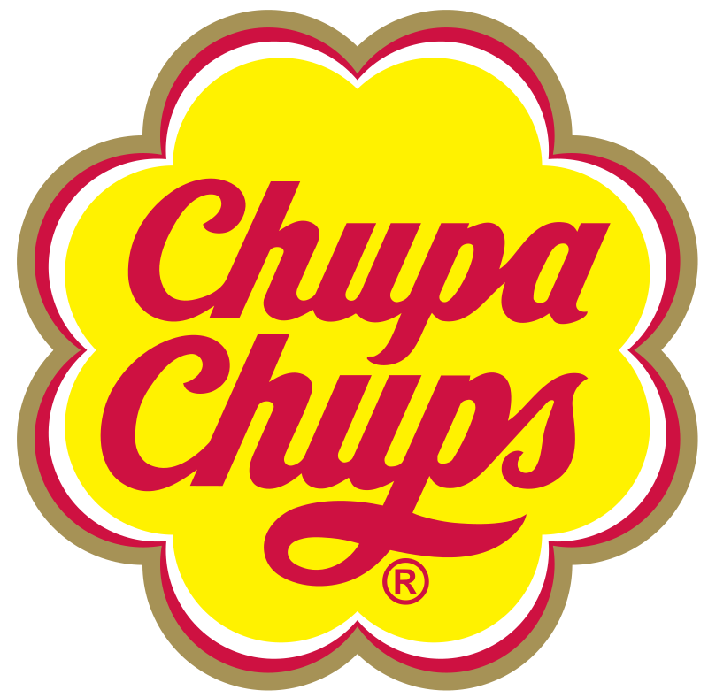
Chupa Chups’ logo screams fun and flavor. The bright yellow is cheerful, and the daisy shape makes one think of a sunny day. Artist Salvador Dali designed the original logo.
Dali is the one who suggested the logo be placed on top of the lollipop because it remains visible even when the candy is on display. The original logo was a simple yellow shape with orange lettering. In 1988, the company revised the logo, adding gold, red and white outlines, giving it more of an appearance of having flower petals. It also updated the background to a more vivid yellow and the letters to a deep red.
14. Fanta
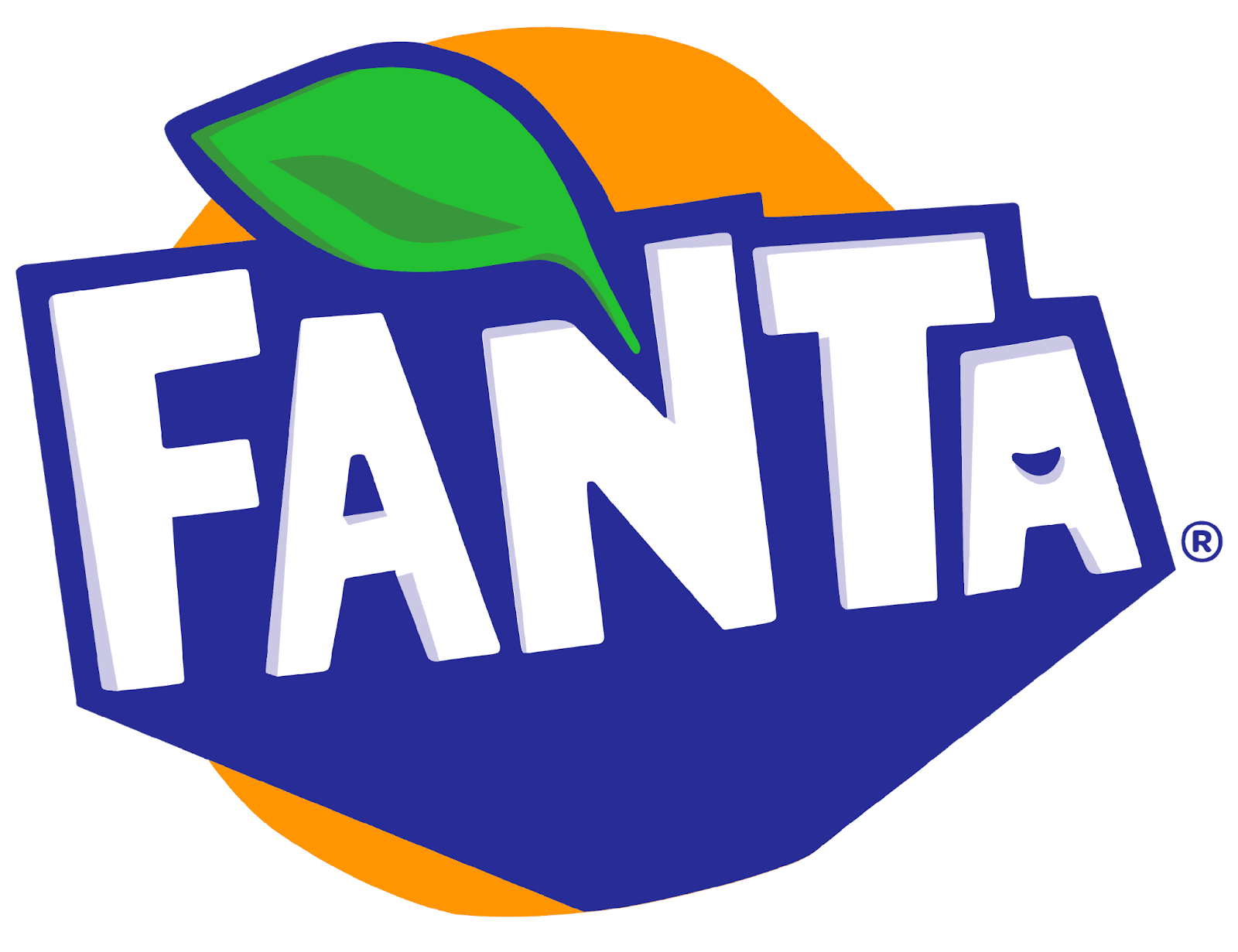
The Fanta logo screams freshness. The color choice of bright orange is one that people associate with happiness, sunshine and the tropics. Its block-like typeface gives the impression of fun and vigor, resonating with the brand’s youthful energy and playfulness image. Additionally, the logo often incorporates a leaf or splash design, adding a sense of freshness and natural flavor to the brand’s identity.
This logo exemplifies how typography and color can convey a brand’s personality. It is a powerful tool in the brand’s visual marketing, effectively giving its message and appealing to its target audience.
15. Square

Square is a payment platform for individuals and businesses. Its logo reflects its name, showing squares within squares, representing the brand name and the look of its payment gateway that attaches to mobile devices.
16. Wendy’s
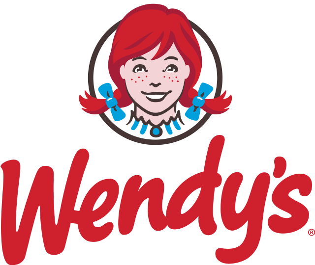
Wendy’s entire concept is homestyle food fast. The character Wendy is modeled after the founder’s daughter, symbolizing the brand’s commitment to family values and a homely dining experience. The red color, a staple in the food industry, evokes appetite and passion, while the handwritten font style underscores the brand’s focus on personal, friendly service.
Note how the logo has a hidden word in the collar — mom. Even though most people don’t see the word until it’s pointed out, the message comes across subconsciously.
17. Shell
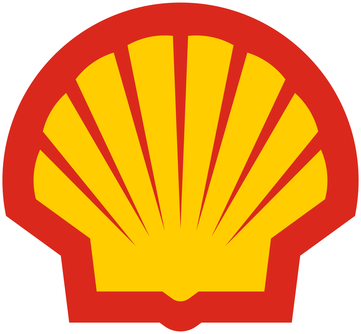
The Shell logo, a globally recognized symbol, showcases a stylized scallop shell in vibrant yellow and red colors. Its design, originating from the company’s early 20th-century trade in seashells, has evolved from a realistic black-and-white drawing to the current simplified yet striking emblem.
The choice of red and yellow, used in maritime signaling, came from the brand’s origins in exports. The owner’s son also chose these colors to stand out against a competitor’s blue kerosene cans on the market shelves.
18. Google
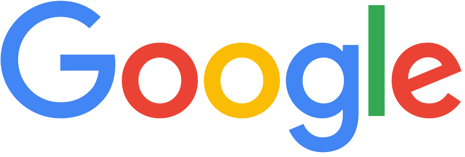
The Google logo is instantly recognizable with its simple yet impactful design. Its color choices reflect the brand’s playful and innovative character, but many believe it was inspired by the Lego case that housed the company’s first server.
Since its inception in 1996, the logo has undergone various updates, with the most significant change in 2015, shifting to a more contemporary typeface. This evolution symbolizes Google’s commitment to staying relevant and user-friendly. Today, the logo is among the most recognizable worldwide, as 62% of the global population uses the internet.
Find Your Inspiration
Studying the cool logos others designed inspires your design. The best symbols often have hidden or double meanings or particular significance to the company. Once you create the ideal logo for your business, it can strengthen your identity and provide instant recognition.


About The Author
Eleanor Hecks is the Editor-in-Chief of Designerly Magazine, an online publication dedicated to providing in-depth content from the design and marketing industries. When she's not designing or writing code, you can find her exploring the outdoors with her husband and dog in their RV, burning calories at a local Zumba class, or curled up with a good book with her cats Gem and Cali.
You can find more of Eleanor's work at www.eleanorhecks.com.