


When it comes to fonts, you probably know most of them are descendants of older typefaces. Typographers designed them in a time where there was only print and no computers or digital displays. Designers adapted older fonts for use in today’s digital world. Understanding where each of these fonts, like Didot, initially originated and how they have evolved over the years can help you choose which type of font you want for your designs.
The modernized typefaces also include symbols and letters used more commonly today. Each typeface has a specific stroke style, height and weight. Not to mention other unique elements that make it stand apart. Some fonts come with special characters and elements such as italics or underlining. Let’s take a look at Didot’s specifics.
It can take ages to sift through all the available serif fonts and find just the right one for a project. Finding modern typefaces inspired by an older one isn’t the problem. Narrowing down the choices can be tricky and take hours of research and trial and error.
Designerly hopes you can take the chapters from this font guide, find some inspiration for the type style that suits your project and use one of these fonts or something similar. Our goal is to save you time and headaches so you can get to your work more quickly and complete a project in a fraction of the time.
Origins
Didot comes from a group of typefaces with the same name. During the latter part of the 18th century into the early part of the 19th century, the Didot family created most of the original family of typefaces. They were quite prolific in their work with printing and being involved in nearly aspect of the industry.
What you might not know about the history of the font is that Didot was a French family filled with punch-cutters, publishers and printers. They were well known for their illustrated books depicting the classics and offering scholarly texts at an inexpensive price. They immersed themselves in the world of presses, typefaces, printing and publishing of the day. During their time, they were quite well-known for their involvement in the industry.
Between 1784 and 1811, they cut out the letters and developed the new typeface that would eventually be named for them. Firmin Didot obsessively worked on his font, perfecting every stroke, serif and line. Pierre Didot, his brother, used the types they created in printing. One example of a work they printed was La Henriad by Voltaire. Studying the volume gives some gorgeous examples of the Didot font in action.
The Didot style fonts were known for high-contrast typefaces with increased stress. The designs of the Didot alphabets reflect the style of another designer during the same period — Giambattista Bodoni. The Didot family was one of the first to offer a printing press in Greece at the time. Typefaces similar to the Didot style are still still popular there today.
Today’s Didot Style Fonts
The shift from a typeface to a digital font is always an interesting one. While the typeface will retain many of its original elements, some elements need to change due to the very nature of digital typeface. Elements that appear clearly in print might look skewed in digital format or create kerning and line spacing issues.
Each designer seems to have their own interpretation of how best to adapt a font to digital type, as well. For example, what symbols are missing that were not in use in the 18th century? Perhaps a dollar symbol needs to be added to the collection of letters for the font. Over time, the symbols people use in their writing and even the order of words and spellings change. All of the shifts in language might impact a font and what needs added or subtracted to make it useful today.
A digital typeface has to be able to scale to different font sizes, and thus some adjustments must be made out of necessity to keep the text readable at different sizes. On top of having to create new symbols, the letters K and W were missing from French orthography at the time, as were italic letters.
Consider line spacing issues that might not have occurred in the past. For example, do wider letters look too pushed together? Add a bit of spacing between the ones that aren’t as decipherable.
Font designers must spend countless hours using their own type to figure out what needs adjusted for digital usage. Even with thorough testing, it is easy to forget an element here or there that needs added. Over time, most creators figure out exactly what they need to focus on to create a usable font family.
Examples of Modern Didot Fonts
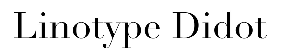
Adrian Frutiger created the Linotype Didot in 1991 for the Linotype Design Studio, giving Firmin Didot credit for the origins of the design. The Linotype Didot features 12 weights, old-style figures and graphic ornaments. Jonathan Hoefler drew another successful recreation of the typeface for H&FJ.
Frutiger’s Didot Revival came bundled with Mac operating systems and works well for headlines. It is a tiny bit different than Frutiger’s adaptation. He adjusts for the hairline serifs that will occur in the smallest font sizes.
Frutiger also gives them a heavier-weight stroke so they will show up in those smallest fonts. This prevents it from fading into the background. There are only minor variations separating the two versions. However, these subtle differences may make one more desirable for a particular project than the other.
What Does the Font Imply?
The Didot typeface is classified as a neoclassical typeface. It is thought to have been inspired by the Age of Enlightenment. The font has an almost formal look that speaks of tradition and yesteryear. It works fabulously in headings because of its unique structure and strokes.
Firmin gained inspiration from the Baskerville typeface but kept experimenting and changing things until he landed on Didot. The similarity with Baskerville is in the variations of the line strokes from thick to thin.
You’ll notice how thought he put into the contrast of thick and thin strokes on various letters. The font also features serifs that are so faint they are barely seen and a bit of vertical boldness in some of the rounded edges of the font. The armature is condensed and the serifs on the flat side.
There are different versions for different font sizes including 6, 11, 16, 24, 42, 64 and 96 point options. For the best resolution and readability, use the right font corresponding to the point of your document.
It lends an elegant feel to any design. Because some of the strokes are heavier and others quite light and thin, it is important to see how the font looks in different sizes before choosing to use it for your project. Some of the characteristics of the Didot font’s structure include straight serifs, teardrop terminals on capital letters and high contrast.
Additional Didot-Like Fonts
If you’re looking for something resembling a Didot font but with a bit more flare, there are numerous options available. Here are some of our favorites:
Didone Room Numbers Display Font
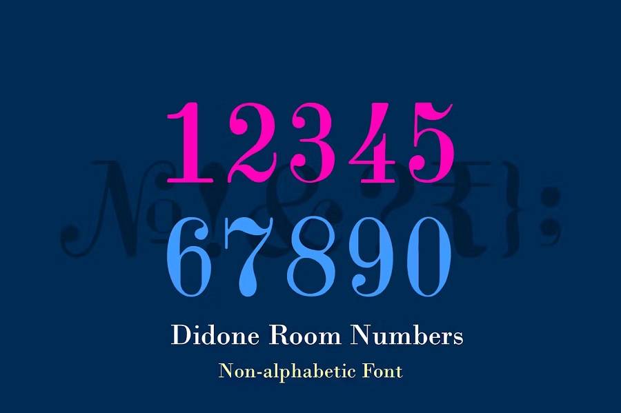
If you’re looking for a Didot style font for numbers, Didone Room Numbers is a beautiful display font with readable numbers. It would work well for a sign for the front of a home or office to show an address. It also looks beautiful on posters and signs, such as an event where you need to show numbered steps.
GFS Didot
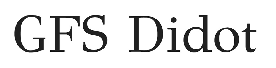
GFS Didot is a Google font that is free to use. It has the wider portions similar to the original typeface but is a bit more balances. Note the strong serifs on letters such as G and F. The font is a good example of how modern typeface designers take the elements of an older design and modernize it for today’s needs.
AW Conqueror Didot
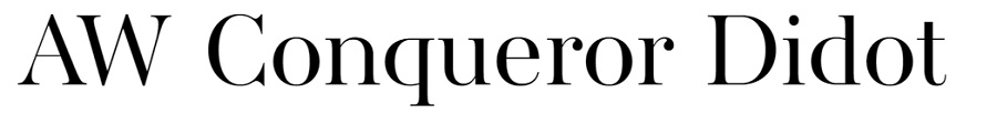
Adobe also has a modern remake of the Didot font with the AW Conqueror Didot option. Not the thin crossline of the A and lowercase E and heavier stress on the outside lines. This particular version of the Didot font is probably closest to the original as far as the weights of different letters. However, it differs a bit in the serifs.
Similar Fonts to Didot
If the fonts above don’t quite match the tone you’re looking for, you might consider a few options that are similar to Didot but slightly varied. Here are a few we love:
RNS Alameda
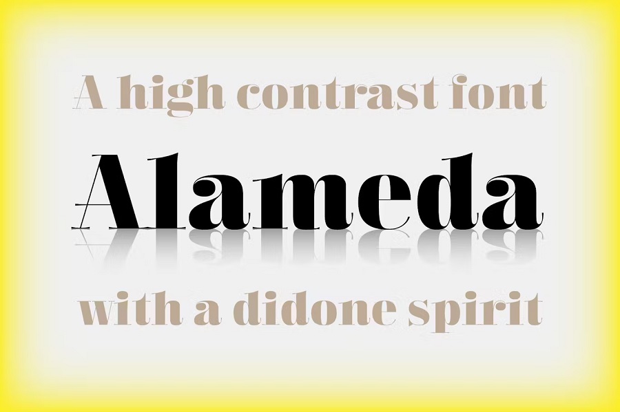
RNS Alameda has some similarities to Didot but also is a bit bolder for a headline. The cross lines and some edges are extremely thin, while the letters are fatter and heavier. The serifs become more curved on letters such as lowercase A and lowercase C.
Bodoni
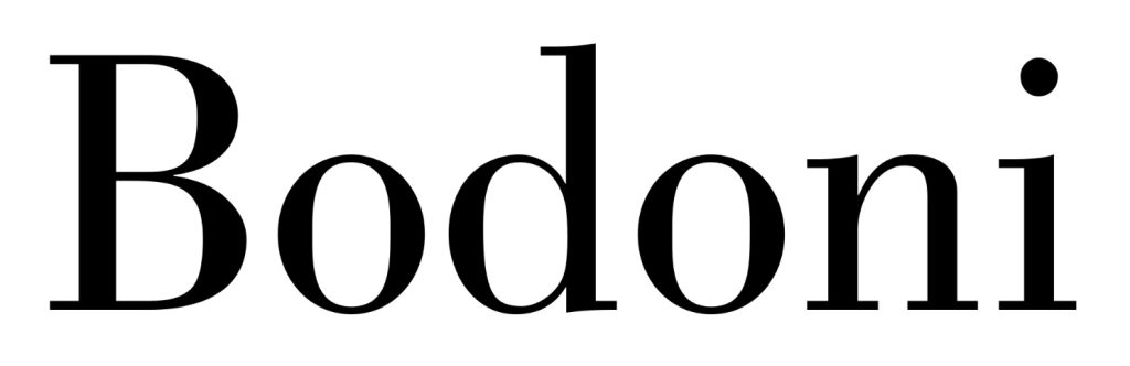
Bodoni is a modern minimalistic serif font. The accents are less pronounced than in Didot. However, there are still stroke differentiations on different portions of each letter, giving the entire look an old-world feel. The font works well for a magazine or book cover as well as headlines. It’s a bit busy for body text, but still readable.
Bodoni Moda
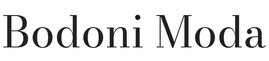
Bodoni Moda is another option for those wanting a font similar to Didot but a bit outside the box. The thin lines on the letter M make the stroke variations quite apparent. Layer multiple lines of the text on top of one another to create a three-dimensional word.
Common Uses for Didot
Today, Didot seems to have found its home in lifestyle and fashion publications, television shows and posters. For example, Style Network used the typeface in part of its logo. CBS also created a version of the typeface to appear next to its eye logo. The font is a go-to in the larger headlines for magazines and posters, as well. The font also has a comfortable home in fashion branding, as seen in Harper’s Bazaar, Vogue and the work of designer Louis Vuitton.
One thing most of these brands have in common is that they are high-end, luxury brands with a history dating back over 100 years.
While Didot works well for headlines and logos, it loses some of its elegance as smaller text. It is rarely used for the body of any work. The thicker lines tend to obscure the extremely thin strokes, making them almost disappear. You will rarely see it used for complete works. Instead, it shows up in titles, headings and subheadings and is frequently paired with a serif font such as Futura or Brandon Grotesque.
How You Should Use Didot
Looking for other fonts to pair the headline type with? Didot is a serif font and pairs well with other serif fonts, such as:
- Times New Roman
- Georgia
- Garamond
- Palatino
- Caslon
- Bodini
- Baskerville
- Rockwell
If you want more of a mix of styles, you could pair it with a sans serif, such as:
- Helvetica
- Proxima Nova
- Futura
- Public Sans
- Jam Grotesque
- VVDS Fifties
- Laro Soft
Since the serif is hairline-thin, the font works best as a headline. However, while Didot works well in headlines, you also have to consider the overall tone of the design. Didot gives a formal, classical look. It might work best in minimalistic designs.
If you are creating a poster for an evening gala for a local nonprofit fundraiser, this font is the perfect choice. On the other hand, Didot would likely be too formal for a flyer inviting neighborhood kids to a picnic and family event in the park.
Didot works well if you are creating a headline or logo for a fashion website or social media ad. It also works well with most lifestyle topics, such as home and garden. Didot is an excellent font to add to your overall design arsenal. Understanding its personality helps you see where you might best put it to use.
It lends a feel of yesteryear to your overall look, but still looks fresh and modern because of its neoclassical design elements. If you need a design with a bit of visual interest and variation, Didot is your go-to.
Choosing the perfect font is never an easy task, but understanding the ins and outs of the font and how other designers have used it can help you figure out if the typeface is right for your project.
[sc name=”the-font-series-guide-table-of-contents”]


Leave a Comment