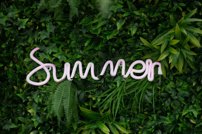
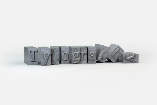
Are you looking for a gorgeous hand-created font for your wedding invitations or other event? Monthoers font falls into the handmade font family. It has a scripted vintage look reminiscent of calligraphy, but with a modern edge that works with digital designs. It isn’t a widely used font such as Comic Sans or Garamond, but still has a place in an overall design toolkit.
The font contains both upper and lowercase letters, punctuation, numerals and more than 20 ligatures. It is free for both personal and commercial use. The creator does ask you to credit them with the font. It isn’t as well known as some other font faces, but it has a beautiful vintage design that stands the test of time.
Origin
Monthoers font was created by Angga Suwista of Sans and Sons out of Malang, Indonesia. They’re known for their modern vintage designs and also created fonts such as Chalmers Type, Moalang X and Bant Achillers Typeface. They describe themselves as a “Family Type Foundry.” There isn’t a ton of information on them as with some design studios, but they have well over a dozen fonts and bundle some of them together on their website.
One thing you’ll notice as you study the different fonts in this series is that each designer embraces particular styles. If you browse through the different fonts available on their website, you’ll start to notice many look handwritten and classical. Sans and Sons has a distinct look you grow to love almost instantly.
For example, Salty Feathers has a distinct calligraphy look, while Last Love takes on a 70s, retro theme. Every font they design has swoops and soft edges giving it a vintage appearance.
Where the idea for Monthoers font came from isn’t quite clear. It may just be a nod to old typefaces or they may have created the font for a particular need. Suwista is probably best known for his design of Hello Paris font.
Suwista has pointed out in an interview that his target demographic is women. The reason many of his fonts are stylish and romantic looking is likely because they’re often used on wedding invites or websites. He mentioned he infused Monthoers font with a serif and script combination. He wanted the pairing to be balanced enough to grab user attention.
What Does the Font Imply?
Monthoers font is a mix of elegance and classic style. It is a script with sans features. You’ll find it implies romance and a bit of old world attitude all at the same time.
Sans and Sons as a brand is run by Suwista and his wife, who also has an online shop where she sells her designs. They have children, thus the name. All their fonts have a traditional, family feel to them perfect for nearly any gathering or romantic occasion.
Were It’s Commonly Found and Used
The Monthoers font family pairs together for a complete look for logos, product packaging or event materials. You can use it on an invitation, to highlight headlines on a website and within program handouts the day of the event. In fact, you can use the font almost anywhere you might imagine.
For example, use the Monthoers font on a wedding invitation, in the headings of your wedding website and on the programs you hand out as guests arrive. You can carry the theme over to the reserved signs on tables, place setting cards and any other notes throughout the wedding and reception.
How Do People Perceive Monthoers?
With Monthoers being a popular font, many businesses and designers use it. Yet, before they choose this font, designers think strategically about what their target audiences may think about the font and whether it resonates with them. Since Monthoers has a vintage style with modern sophistication, it strikes a chord with many.
The bold font makes it stand out in advertisements, logos or headlines. Its intricate details reflect a touch of the hand-crafted signs of the old days. When people see Monthoers, they get a nostalgic feeling. At the same time, they see it as a font that may fit into modern designs. The two sides this font portrays make an excellent choice for brands looking to evoke feelings of trustworthiness and authenticity.
People also appreciate Monthoers for its legibility, even in smaller sizes. There is a clear distinction between letters, which ensures the message you send is understandable. The online world is saturated with overused fonts. Yet, Monthoers offers a refreshing take, blending the past and present in a visually captivating way.
What Are Some of the Alternatives to Monthoers?
If you like Monthoers but you’re thinking of what other alternatives there are, consider the following fonts below:
- Thirsty Rough: This font shares a vintage-inspired aesthetic with Monthoers. However, Monthoers has a sense of boldness with a modern-retro appeal. Thirsty Rough is more textured, and weathered and leans towards a rugged, distressed look.
- Gibson Script: Gibson script has an elegance deeply rooted in traditional calligraphy. In comparison to Monthoers’ vintage appeal, Gibson Script evokes graceful penmanship and timelessness.
- Brother 1816: Brother 1816 differs in its range of weights and styles. It offers a more neutral and adaptable design. Its clean, geometric forms can fit contemporary and classic aesthetics. It also has a less strong presence than what Monthoers commands.
- Dharma Gothic: This typeface has a contemporary, geometric feel. When compared to Monthoers, Dharma Gothic has a more modern design. It’s a minimalistic font, perfect for designs going for simplicity.
- Beloved: Beloved has a classic, playful design. It is an elegant style with a whimsical feel, like something you’d see on an invitation. Beloved captures the intimacy of personal communication, making it a favorite for projects seeking a touch of warmth and romance.
Best Font Pairings With Monthoers
Choosing the right font pairing is essential for creating a balanced, engaging design. When working with a distinctive typeface like Monthoers, it’s crucial to select complementary fonts that bolster its unique features:
- Sans Serif: For a modern twist, pair Monthoers with clean sans serif fonts like Helvetica Neue or Avenir. Their minimalist and straightforward design provides a stark contrast, allowing Monthoers to shine while truly maintaining clarity in longer text.
- Classic Serifs: If your goal is to create a more classic or refined ambiance, combining Monthoers with serif fonts can work wonders. Serifs offer a traditional approach, creating a balanced design with Monthoers’ vintage vibe.
- Geometric: Introducing geometric fonts like Futura or Gill Sans can add a layer of modernity to design featuring Monthoers. Their balanced shapes and lines work well against the boldness that Monthoers portrays.
- Monospaced: For a more technical or digital vibe — fonts like Courier New or Consolas — provide a new twist when combined with Monthoers.
Ultimately, font pairing requires an eye for balance. Each one should complement the other and ensure the design remains easy on the eyes.
What Should It Be Used As?
You can use this script font almost anywhere, but it works best as a heading or in larger type. If you try to use it on body text, it may become hard to decipher and readers could grow frustrated.
Monthoers font would work well in a logo design. You could also repeat the typeface in your H1 headers and possibly H2. People have used Monthoers for posters, signs and store signage.
The bundle is sold as part of the Modern Retro Font Bundle on their website for one user and up to two computers. The standard license is only $15 and gives you permission to use it for large volume commercial projects with up to 10,000 prints or digital impressions. So, for example, use it on a website with 10,000 views per month.
If you need an unlimited views website license, you can pay a one-time fee of $120. They also have offers for ebooks, Zazzle, Game apps, movies and corporate use. The price point varies, depending upon where you’re using it and how many might view the product, website, etc.
Sites such as DaFont do offer a Monthoers font free version with limited capabilities for both personal and commercial use. However, if you want the full impact of this font, you’re better off paying for the licensed version to help you gain access to all the different aspects and features of Monthoers font.
One thing we love about Monthoers font is that it supports many languages, including English, French, Spanish, Italian, German, Swedish, Portuguese, Norwegian, Dutch, Finnish, Danish, Indonesian, Malay, Hungarian, Turkish, Polish and Slovenian.
Finding the Perfect Font
When you need just the right font for a project, one of the most time-consuming tasks can be tracking down one that looks just so. With Monthoers font, you get the best of both scripts and handwritten typeface. It has an old world feel but is modern enough to translate well on mobile devices. The full set includes different variations, including Regular, Clean, Vintage and three types of Signature. You’ll gain letters, numbers and many symbols.
The Font Series Guide: Introduction
Chapter 1: 15 Google Fonts You Should Be Using
Chapter 2: Times New Roman
Chapter 3: Roboto
Chapter 4: Georgia
Chapter 5: Verdana
Chapter 6: Helvetica
Chapter 7: Comic Sans
Chapter 8: Didot
Chapter 9: Arial
Chapter 10: Tahoma
Chapter 11: Garamond
Chapter 12: Century Gothic
Chapter 13: Brody
Chapter 14: Bromello
Chapter 15: Savoy
Chapter 16: Athene
Chapter 17: Calibri
Chapter 18: Proxima Nova
Chapter 19: Anders
Chapter 20: Monthoers
Chapter 21: Gotham
About The Author
Eleanor Hecks is the Editor-in-Chief of Designerly Magazine, an online publication dedicated to providing in-depth content from the design and marketing industries. When she's not designing or writing code, you can find her exploring the outdoors with her husband and dog in their RV, burning calories at a local Zumba class, or curled up with a good book with her cats Gem and Cali.
You can find more of Eleanor's work at www.eleanorhecks.com.

