

In This Article
Figuring out the best symbol to represent your business is a complicated process. You need something that speaks to who you are as a brand and also what you do. At the same time, you must stand out from the competition and come up with something users can easily remember and recognize like a geometric logo design.
Most business owners understand the importance of a strong logo design. In a survey of small businesses, around 67% say they’d pay $500 or more for a great design. A logo is something that stays with your business throughout the life of your brand, so getting it right from the beginning is important.
A Geometric logo mixes different shapes in interesting ways. The best way to learn what makes a good geometric logo is to study what others have already done.
What Makes a Geometric Logo Great?
Geometric logos make appealing choices because they can represent how people may feel toward your brand. With abstract designs and clean lines, these types of logos can connect with audiences. Their structure is simple but can involve different angles or rounded shapes. Because of their symmetrical look, they often stand out from the rest, making them visually memorable and easily recognizable.
These logos also evoke certain emotions. For instance, circles are often associated with unity and trust, while triangles suggest innovation and strength. Squares and rectangles, on the other hand, project strength and stability. In a well-created design, these shapes can tell a brand’s story and create an emotional connection with your target audiences.
1. Red Cross
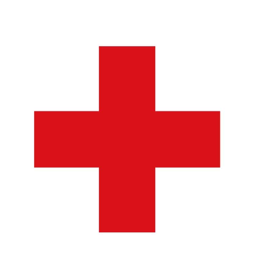
The Red Cross uses simple straight lines to create one of the most recognizable geometric logos of the century. It is also a vitally important logo and it matters that it is easily recognized because it signifies humanitarian workers trying to help others in war zones. In a nutshell, it means “don’t shoot.” The emblem is over 150 years old.
2. Target

Target’s geometric logo takes on the simple circle and uses it to create a bullseye. The logo has several meanings, including that they hit the bullseye with products and pricing, but also refers to the name “Target” as in archery. It is a very simple logo that stays with customers.
The logo first appeared back in 1962. Designers tried different variations over the years, but the red circles remain today’s most popular choice among consumers.
3. Mastercard
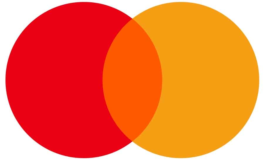
The Mastercard logo typically features the wordmark underneath it. It resembles a Venn diagram with two overlapping circles in red and yellow. Where the two circles meet is displayed in orange. Most people see the overlapping circles as two halves of the world coming together and spending happening globally.
4. London Underground
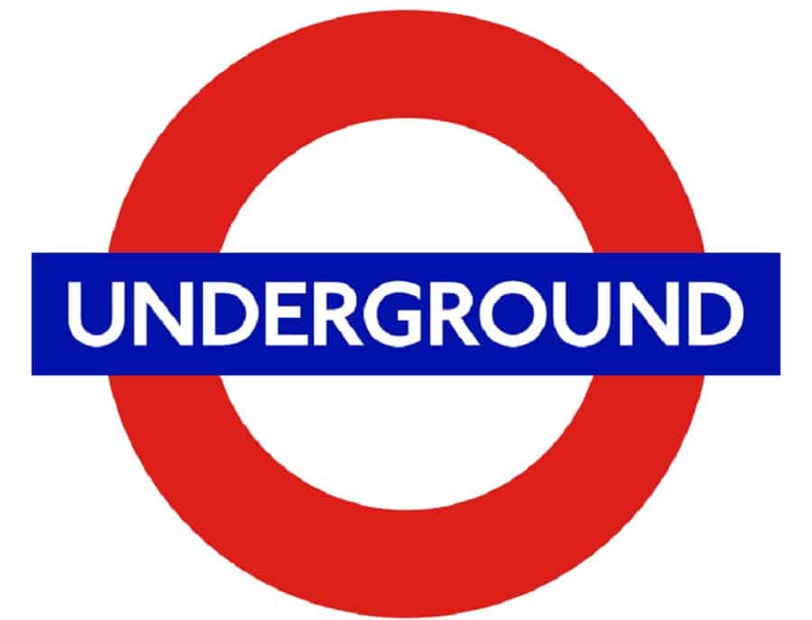
London Underground uses its logo to mark where people can access the subway system and in advertising. It uses a red circle with the center filled in white. Across the circle is a rectangle with the word “underground.” The simple design grabs attention and the bright colors contrast sharply with surroundings. If you want a basic geometric logo design, this is one to model yours after.
5. Apple
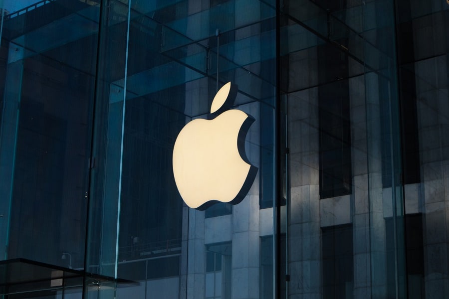
Apple’s logo proves you don’t have to go with anything overly complicated to make an impact on the world. Modern art uses simple shapes and we’re used to seeing those, so it isn’t too surprising to come across an apple outline with a bite out of it.
The logo works equally well in black, white, silver or with colors. The company has changed the logo only slightly over the years, sticking with the tried and true simplicity of a basic shape. The original idea behind the apple was inspired by Sir Isaac Newton.
6. Mitsubishi
Mitsubishi has an interesting three-point geometric logo. The name of the company refers to a three-diamond emblem and is a combination of the words “mitsu” and “hishi.” Mitsu means three and Hishi means diamond shape. The name literally means three diamonds, so the logo makes perfect sense. The symbol dates back to the company founder’s family crest.
7. Adidas
Adidas’ logo has only undergone a few refinements, making it one of the most recognized geometric designs of today. The stripes symbolize variety. When the logo included leaves, they were to symbolize the three parts of the world the company serves (North America, Asia and Europe).
8. Spotify
Spotify uses a circle with three WIFI symbol lines to signify you can stream music from their service. The company name appears to the side most of the time, but occasionally will not be in the image.
There isn’t anything particularly proprietary about a circle and a wifi icon, but when used together with the exact placement, it becomes the symbol for the company and their copyrighted information. It shows you can use anything as a logo, assuming another company hasn’t already claimed it.
9. Ford
Ford’s blue oval is one of the most iconic symbols in automobiles today. The oval has been part of Ford’s since 1912. In 1927, the color palette changed to blue and white and has stayed pretty much that way since that time. Some versions add black lines or silver edging, but the blue and white remain.
10. HSBC
HSBC is another gorgeous geometric logo using just two colors and a variety of triangles to create a unique emblem. Red and white triangles point inward and outward to create a sort of six-sided shape.
11. Google Drive

Google Drive uses a variety of geometric shapes to make a sort of circle as the symbol for their storage platform. The symbol is readily recognizable as Google due to the bright color palette. However, it does vary from the main Google logo. You’ll see the shape on your desktop, in your synced folders and on their website.
12. YouTube
YouTube uses a rectangle with rounded corners and a triangle. Originally, their logo was meant to look like a television screen, but as the arrow became more symbolic with digital viewing, the focus shifted. If one stares at the logo for a bit, though, it still somewhat resembles an old time television.
13. Olympics
The Olympics always use interconnected rings, but did you know that the logo changes from time to time, giving different designers a chance to try their hand at the iconic image within a set of parameters? For example, the colors represent different parts of the world and the interconnectedness of the world coming together to compete.
14. Layerneer
Layerneer is a 3D printing adhesive company. Showing how their product helps the layers stick together, they’ve separated three layered boxes to symbolize the process. By adjusting the angles a bit and making the centers appear empty, the three boxes stack on top of one another and take on a three-dimensional appearance.
15. Microsoft
Microsoft uses four boxes within a larger grid of a box. None of the boxes touch but are all laid out on the grid to fit perfectly squared. The four colors represent Microsoft’s products. The red stands for PowerPoint, green for Excel, blue for MS Word and yellow for Outlook. The boxes resemble the icons for each product.
16. Delta Airlines
Delta Airlines features triangles for their logo. The triangles come together to form what looks like the nose of a plane. The original Delta logo represented the letter “D” in the Greek alphabet, which also is called “Delta.” Over the years, the look of the logo changed but still remains in the shape of a triangle and retains the same meaning.
17. Branch Basics
Branch Basics uses a minimalistic geometric logo that aligns with its brand ethos of simplicity and nature living. The circular emblem utilizes simple lines that branch out and upward, resembling a tree or a blooming flower. This logo fits well with the company’s focus on eco-friendly and health-conscious cleaning products, symbolizing growth and nature.
The logo’s shape also conveys trust, which is a key value for a brand in the wellness space. Branch Basic’s mission is to provide natural, effective solutions for a healthier home, so this design perfectly represents that.
18. The Verge
The Verge’s logo is daring and vibrant, representing the news site as a leader in technology journalism. Its design features a sharp triangular element within the typography. This triangular motif creates a sense of forward motion, reflecting the cutting-edge nature of The Verge’s content. Yet, it also symbolizes progress and direction, which are typical key themes in the tech and media world.
19. Vrbo
Vrbo’s logo is another excellent example of geometric incorporation. The design brings about energy and sophistication to the brand. The use of parallel, curved lines represents movement, which is the best symbolization of the brand. Vrbo’s mission is to connect travelers with different vacation rental experiences, and the stripes within the letterforms capture this feeling.
Which Is the Best Geometric Logo?
The samples above represent some of the better known geometric logos in the world. The best ones are those that have special meaning to the company and help a brand stand out from the competition. When creating your geometric logo, take inspiration from other designers. Try new things and know you can always back it up and take away elements if the logo gets too busy. With a little practice, you’ll find the perfect mix for your own designs.

Leave a Comment