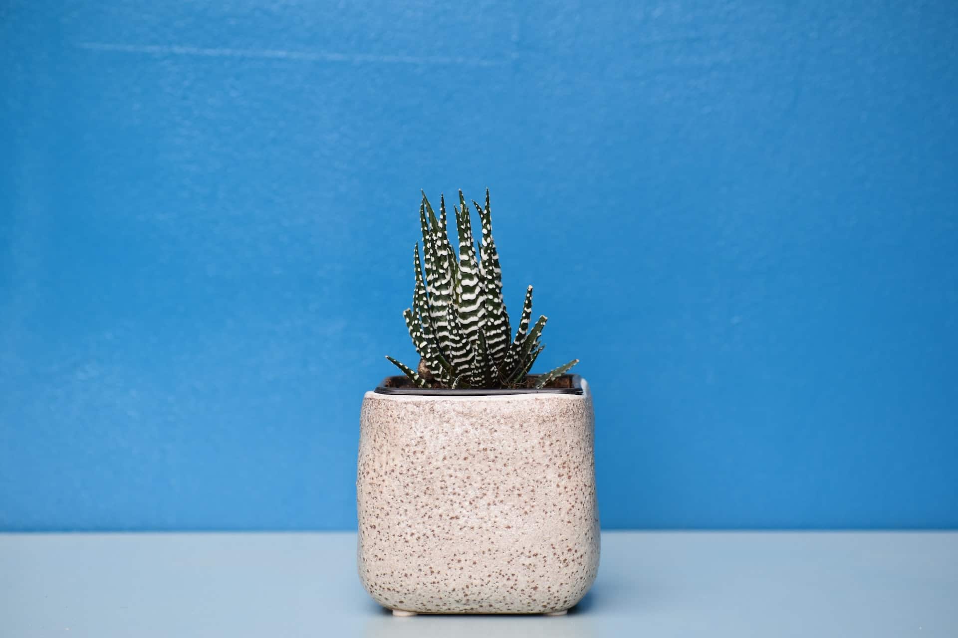


Ask anyone what their favorite color is and many will answer, “Blue.” Studies show both men and women love various shades of the hue. It pairs well with yellow and white. It has analogous colors–next to it on the color wheel–of red and purple. One of the reasons blue color schemes are so popular is because there are huge variations in the options available.
Blue is known to create feelings of trust and tranquility. You’ve likely noticed a lot of financial institutions use blue color schemes on their sites. However, it can also infer water, clean and fun, depending on the brightness. Some interior designers advise using a soft blue for calming and relaxation in areas such as bedrooms.
What Is the Best Color for a Website?
We won’t go as far as claiming blue is the best color scheme for a website, but it is one of the most popular colors for a reason. You are likely to find a hue you love and works well with other portions of your brand’s color palette. Pay attention to how many different industries use some form of blue in their brand images.
Blue is popular right now, however, the favorite shade doesn’t always remain in favor. An article at Live Science looks at different surveys across the years. They found the favorite color was blue in 2015, but by 2017 people preferred deep teal. Color is also dependent on culture and what part of the world you grew up in. Personal experiences can even impact how each individual sees a shade.
There is an entire psychology to color choices and reasons to choose blue color schemes or go with another shade altogether. In art class, you likely learned that blue is a primary color. Mixing primary colors gives you other hues, such as blue and yellow making green. Blue is at the core of design.
If you are intrigued by blue color schemes, we’ve tracked down some of our favorite examples for you to study and learn from. We’ll look at why these color palettes work so well for each brand example.
1. Colorvision
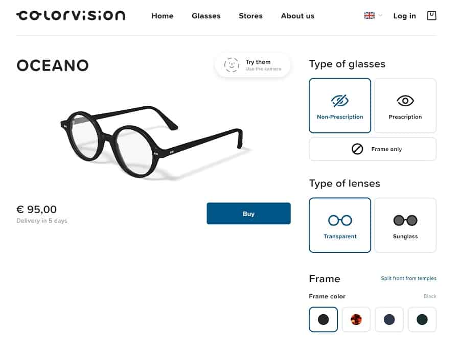
Colorvision uses a deep blue color scheme for their call to action (CTA) button and around some words and images they want to draw the user’s attention to. Selecting a shade between navy and royal gives the site an air of authority.
2. Peugeot
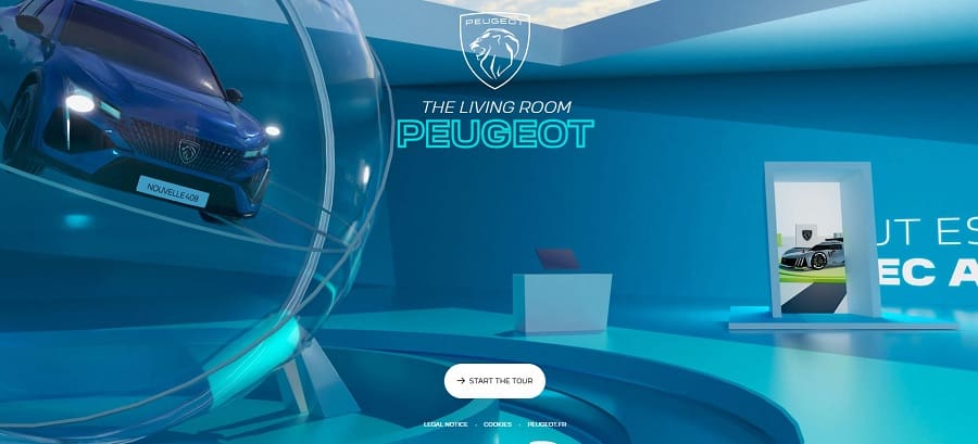
Peugeot takes the idea of blue color schemes and adds in varying hues to create a modern look that showcases their blue car. Note the neon blue headline that grabs attention and solidifies the branding. A clear bubble showcases the car but lets the blue color scheme shine through.
The human eye naturally goes from left to right and then zig-zags down to the CTA button. The white button contrasts sharply with the blues on the landing page.
3. Yuko Higuchi
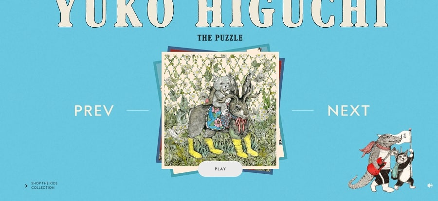
Yuko Higuchi uses a soft, baby-blue to give their page a retro look. A saturated blue like this fades into the background and puts the images as the focal point of the page. Rather than using a start white for the text, the designer chose a soft, off-white that pairs perfectly with the images and adds to the vintage look of the design. You could also use vintage typography to enhance the look.
4. Media Innovation Campus (MICA)

MICA uses a vivid blue that matches their brand color palette for their landing page. Since the site is aimed at capturing the attention of young people, blue color schemes in these more vibrant hues make sense.
The designer sensed that the use of such a brilliant color might overtake the page and limited other shades to neutrals such as gray, black and white.
5. Spiagge
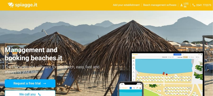
Italian-based Spiagge offers software for resorts on the beach to help them with booking and reservation management. The blue color scheme is contrasted with bright splashes of yellow. The user thinks of beaches and sunny days, setting just the right tone for the customer base.
The colors mesh well with the different hero images on the site. The CTA button is a bright blue and makes one think of a cloudless sky or bright, clear waters. Blue color schemes work well to build trust with the user, too.
6. Canva
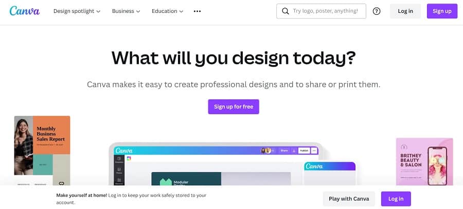
It makes sense that Canva would be on the cutting edge of design with blue color schemes. Look at their logo and how it morphs from blue to purple. Blue and purple are somewhat analogous colors, sitting close to one another on the color wheel and mixing between blue and red.
The purple Canva uses has a lot more blue in it than red, but it still creates a nice shift between hues and adds interest to the design.
Are Blue Color Schemes on Trend?
Blue is a color that never truly goes out of style. Other shades may bump into first place occasionally, but people almost always turn back to blue as a color they enjoy. The emotions a blue color scheme evokes are calmness, steadiness and trust.
You’ll find blues that aren’t calming, though, and shades that jar the viewer. Think about the impression you want to make on your site visitors and choose one that matches your goals and personality as a brand. You really can’t go wrong with blue, because there are so many variations of the color.


Leave a Comment