Best Flyer Design Inspirations

Posted on November 22, 2023 | Updated on November 22, 2023
Putting a printout into the hands of a potential client shows them what you’re capable of as a designer and gives you a chance to market your business and showcase your best work or offer. The best flyer design inspirations are snapshots of a brand’s story. They might cover the unique value proposition (UVP) or a special sale.
Coming up with a flyer that grabs attention can be challenging. You have to figure out how to convince someone to buy from you with just a few short paragraphs and images. Where should you place headings, photos and contact information? For a flyer, you probably want to hone in on a single goal and not throw too much at people at one time.
Since many customers might connect digitally through social media or a website, it’s crucial whatever flyer you design has a digital counterpart or translates well online. The ideal scenario is to reach people in both print and digital simultaneously.
Director of Marketing at Canon Solutions and contributor for AdWeek dug into some of the research behind what makes consumer brains tick. She found studies showing 75% of people retain information seen in a print ad compared to only 44% for digital.
Designerly spent time pouring over some of our favorite flyer design inspirations and came up with a few we think you’ll find beneficial. What makes a great flyer design? Sometimes you have to see it to fully understand why it works. We’ll talk about why we like them and how you can repeat their success in your designs.
1. Use Bright Colors
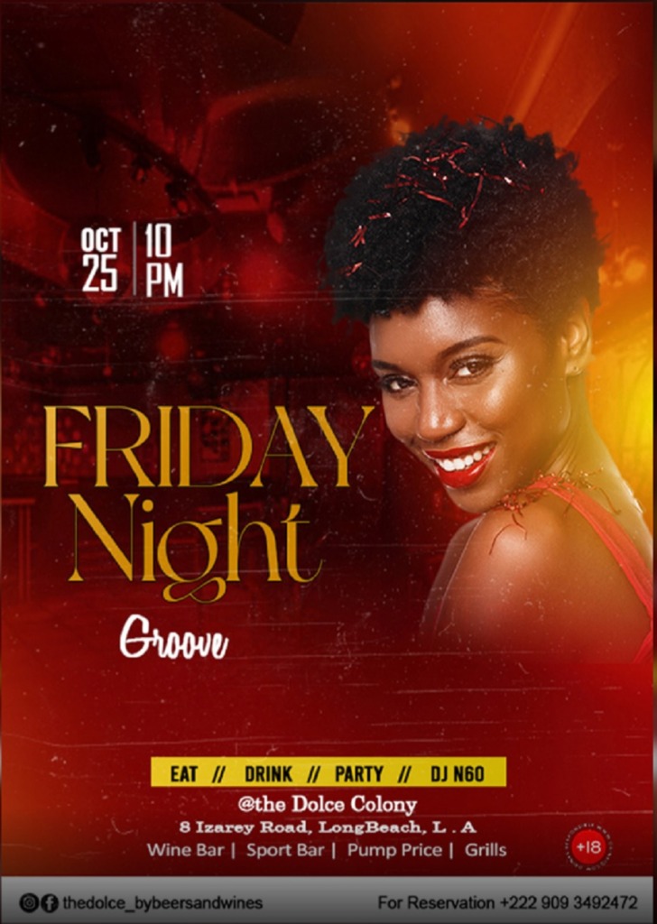
The Dolce Colony uses a bright red background to grab user attention and let potential customers know about an upcoming event. Notice the pops of yellow to hone in on what the place has to offer.
The very bottom of the flyer has a strip of white with info on how to call and make reservations or where to visit them on social media. The combination of red with yellow accent grabs attention and holds it.
Most flyers are black and white or lighter colors, so investing in something a bit more vivid can help you stand out from the crowd. Pull in a bit of color psychology and you’ll have an even greater impact. Everything the user might need is listed, including the address and phone number.
2. Create a Sense of Urgency
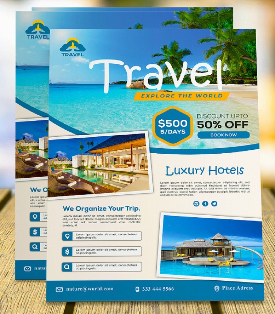
Sadekul Sayad shares his concept for a flyer to create urgency to take a brand up on an offer or special price. If you run seasonal sales or just want people to act now, you can use something similar to draw potential clients.
Note how the offer is in the top third of the flyer. The design also uses bold to set off how much people can expect to save. Although this is a print design, there is a clear call to action with the capsule with the words “Book Now.” Easily convert this type of flyer design inspiration for digital usage. The bottom includes contact information in the location most consumers expect.
3. Get Creative
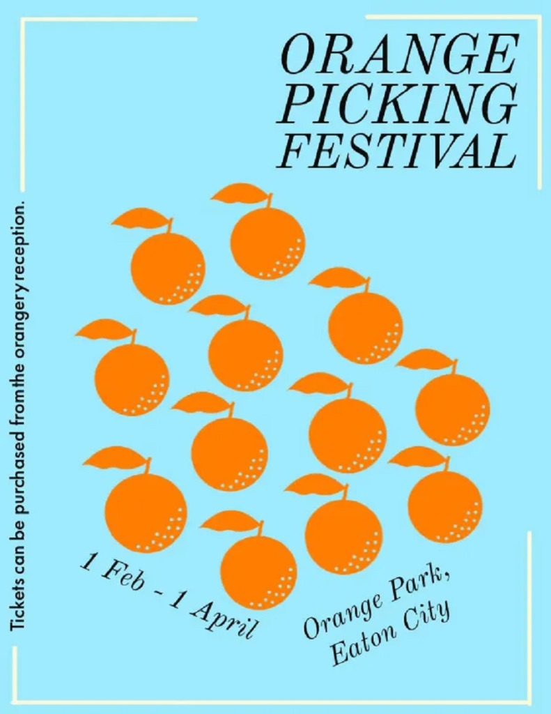
A lot of graphic artists use Adobe tools to create their desktop publishing projects. The flyer above is for an orange picking festival. Note how they went with an unexpected blue to grab attention. The oranges aren’t on a tree but lined up almost geometrically.
The designer then slants the text so it goes with the flow of the pattern of oranges. The flyer also has only the basic information one needs to attend the festival. Instead of filling it from top to bottom with details, the creator hones in on the event, when it is, where it is and what it is.
Sometimes, taking a minimalistic approach and giving it an unusual spin can help your ad stand out from all the other flyers people receive or see hanging at various locations around town.
4. Go Vintage
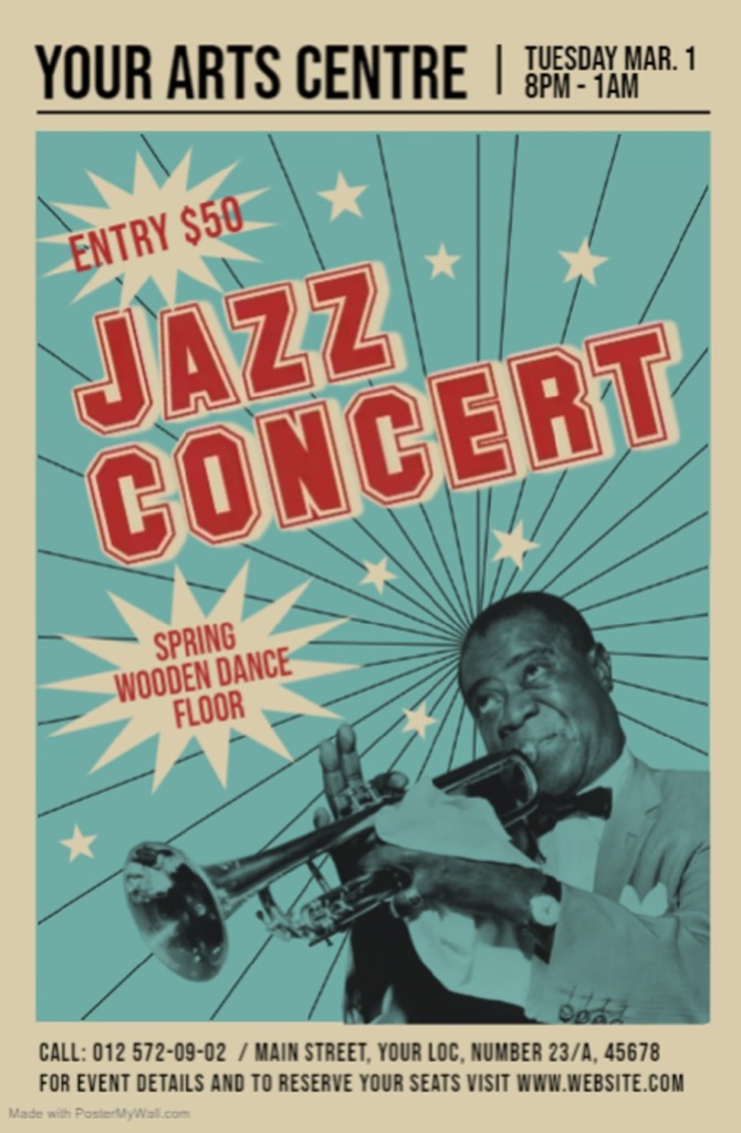
PosterMyWall offers a vintage template for a flyer for almost any type of event. Vintage looks are quite trendy right now but for events that bring back the thought of yesteryear, they are the perfect mix between traditional and modern.
Whether you use their template or just take it as an example of best flyer design inspirations, you can learn a lot from the layout. The color choices are reminiscent of decades gone by. The flyer uses an image but then overlays a transparent color on top to give it an aged look.
The font puts one in mind of a sock hop announcement from the 1960s. Keep the design simple and aligned on a grid for the best results.
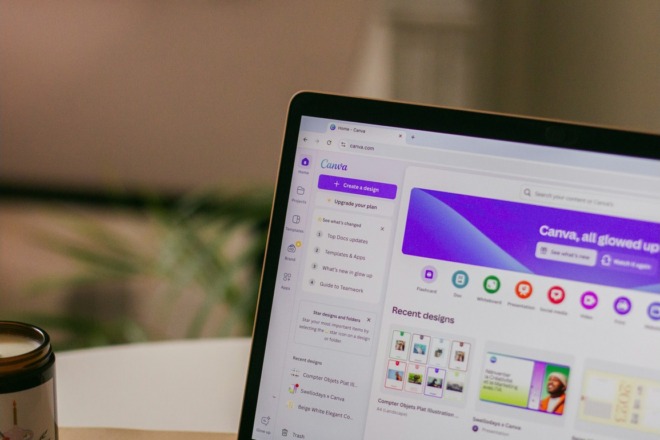
5. Choose Headlines Wisely
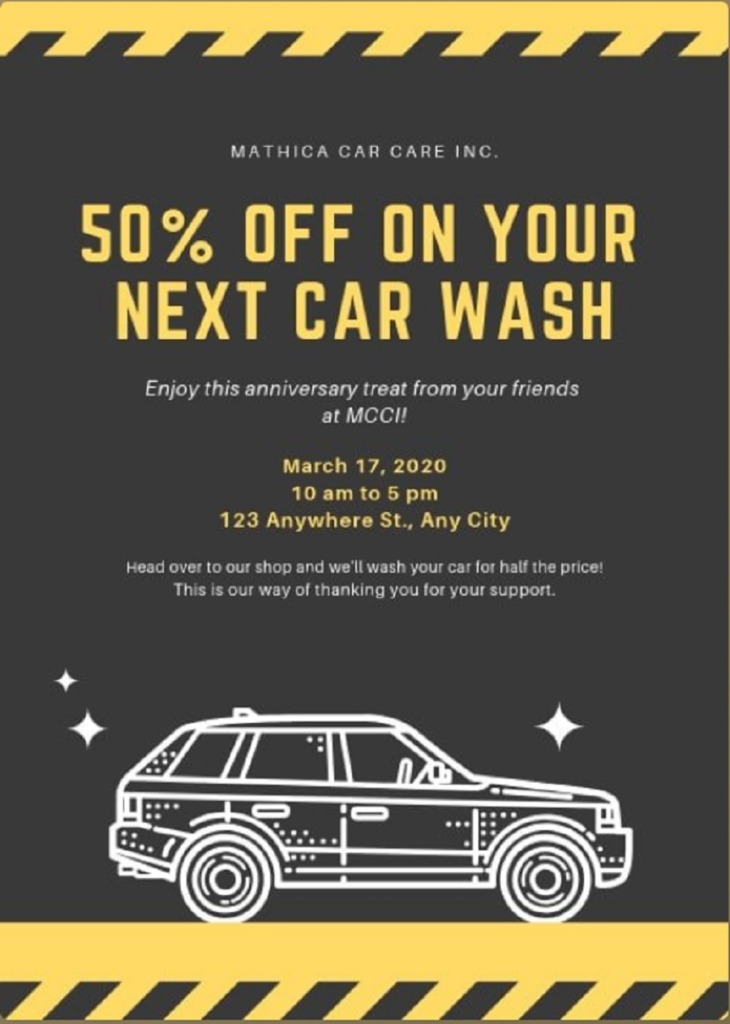
Canva offers some tips for excellent flyer design and some examples of their templates you can use to get started. One thing we loved about the flyer above is how the headline becomes the selling point.
The name of the company is in smaller letters but then the 50% discount offer is in bold, heading font and an accent color. The first thing the reader’s eye goes to is the headline. The company’s UVP is the sale, so it’s smart to make it stand out with a better visual hierarchy and bold, bright text.
Learn from Best Flyer Design Inspirations
Flyer design inspirations help get the ball rolling on design ideas. You should choose a theme and look that matches your brand personality. With a bit of effort, you’ll find your flyers make an impact on your target audience and bring you the exposure you want.