When it comes to design, inspiration is half the battle in coming up with new ideas and learning trends. Logos can be a bit of a challenge, even for experienced designers, because you have to summarize what the company stands for, what industry they’re in and give them a unique but at the same time recognizable look. Airline logos are a good thing to study for this purpose.
One thing we like to do here at Designerly is study the work of other people and see what we can learn from it. In the past, we’ve looked at sports team logos, Olympic logos and even beer logos. Today, we’re going to dig into some of the beautiful airline logos and break them down.
Which Are the Best Airline Logos?
There are thousands of airlines around the world, although not all are commercial airlines. Statista tracks the number of airlines in the United States annually and currently lists 18 major airlines and 43 other carriers.
Sorting through not only all the US carriers as well as worldwide companies is quite an undertaking. For the purposes of studying the best airline logos, we limited our selections to well-known carriers people have likely heard of.
1. Air Canada

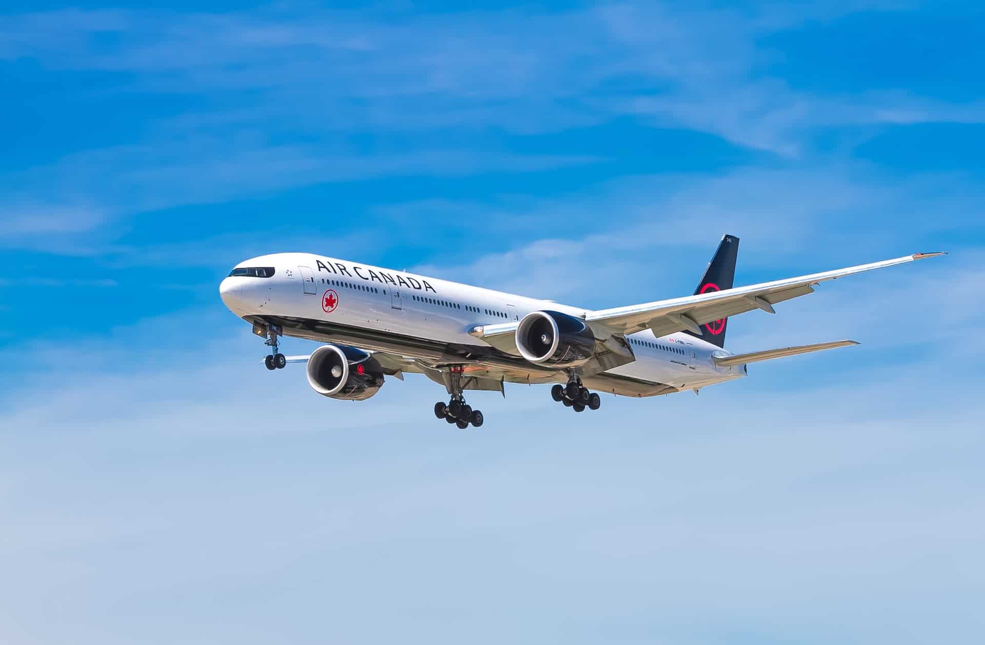
Air Canada has a pretty simple logo, but the red maple leaf speaks to everything people know about the country and its image. The iconic use of the maple leaf is something we’ve seen before, but when placed inside a circle and then with the word logo added next to it, it becomes distinctive to the airline.
When sorting through different airline logos, we kept coming back to this one because we felt it proves simplicity is sometimes the best option for a recognizable brand image. Putting the pop of red on a white background is also a smart move as it pulls the user’s attention toward the leaf.
2. American Airlines

American Airlines has utilized their initials, name and an eagle for quite some time. They are also known for using red, white and blue–the colors of the country’s flag. There are versions of the logo with just the two capital letters “A” and an eagle resting on top of them. Either way the logo appears to work equally well.
One thing about choosing a symbol, such as the eagle, is the ability to upgrade your design to keep up with modern trends. Their logo a few years ago had the look of an eagle profile and is now more abstract with some gradients.
3. Air Asia

Choosing a distinctive font can help your logo stand out from your competitors. Air Asia uses a red circle with white letters inside. Most airlines use standard letters, but they turn to a pretty script looking font.
They do have several versions of their logo, however. The drawback to a circular airline logo is that it won’t fit in every media instance. It’s a good idea to think through the different occasions you might have to use a logo and come up with different versions. Think about how it will look on a dark background, light background and in smaller spaces.
You can learn a lot about versions by studying simple logos with strong design strategy and seeing what other designers did.
4. Hawaiian Airlines

Hawaiian Airlines has a logo with a ton of meaning behind it–from the iconic hibiscus flower in the woman’s hair to the color purple. Purple is used to symbolize safety. In the latest version of the logo, there is a gradient effect that encompasses several hues of the shade.
The woman in the logo is Pualani, who was once Miss Hawaii and serves as an iconic Hawaiian girl. When one sees the image, it brings to mind all you expect when you visit the islands.
What can you learn from the logo? Try to think of iconic images for your industry or business that people expect to see and create something that has meaning. Airline logos are sometimes a bit generic, and that’s okay in some instances. However, Hawaiian Airlines’ logo stands out from the competition.
5. Lufthansa

Lufthansa has used a crane in their logo for 100 years. The crane taking to flight is a good image for an airline. The most recent version of the logo is a bit more abstract with the crane being an outline inside a circle.
In the world of airline logos, a circle enclosing an image stands for protection. The word mark part of the logo contains a simple sans-serif font. The kerning is consolidated and the letters pushed close together to make the longer name fit within the constraints of a logo design.
6. Qantas

The Australian airline Qantas nails their image with an updated kangaroo that fits as well on their website as the tail of their airplanes. When it comes to airline logos, it is one of the few that is quite noticeable from a distance.
If you want contrast for your logo but don’t want traditional black and white, consider white on a deep red or dark blue. Combine some contrasting colors with purple and yellow. Blue and orange can add some interest. Look at the different possibilities and see what pops.
Look at Other Airline Logos
The ones above are some of our favorites and show variety from all around the globe. There are thousands of airlines, though, so finding a logo you can gain inspiration from only requires doing a bit of research.
Whether you’re designing a logo for an airline, or you want to get ideas for a business design, airline logos are a great place to start and find fresh ideas.


Leave a Comment