It’s been a while since we featured a destination website, so we thought we’d revisit this category and look at the government tourism website for Visit Britain. With warmer weather arriving soon in most parts of the world, why not turn to summer travel destinations for a bit of whimsy and to study their web design skills?
We used the same criteria we typically use to narrow down our options and select a site for this award. First, we knew we wanted it to be a travel destination site with details about an area. We then decided to focus on bigger slices of tourism, rather than a city or landmark. Finally, we decided to go with government-sponsored sites, which took our options down quite a bit.
Next, we went with a European destination to further narrow our choices. We will likely revisit this category in the near future and select a different continent from which to choose.
Winner: Visit Britain
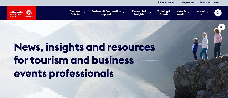
Visit Britain is the official website for United Kingdom tourism. After looking at dozens of websites in Europe, we settled on the design of this one because of several factors. The simple grid layout with a nice hero image at the top pulled us in. The site also offered a lot of detailed content to help anyone wanting to visit the country plan their trip.
They link to their family of websites in the footer on additional topics such as British holidays and England holidays. You might wonder what the difference is between Britain and England. Britain is essentially the island that includes Wales, Scotland and England. England is a country located on the island of Great Britain.
You’ll gather information on several different countries when you visit the website.
Why We Chose Visit Britain as Our Winner
We discovered many worthy tourist websites in our search for a winner. Narrowing down the options took a lot of time. We looked at a variety of factors and finally decided Visit Britain hit all the right notes we were looking for.
First Impressions
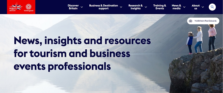
One thing we kept coming back to was the first impression we had when we visited the Visit Britain site. The hero image grabs your attention. It’s a beautiful scene that shows people taking in an awe-inspiring view. Just above their heads is a little camera icon. If you click on it, it credits the photographer. The dark blue heading over the lighter background pops.
The area above the fold on this page is one of the main reasons we kept coming back to it as a semi-finalist, finalist and winner. The pop of red highlighting the flag also grabs attention.
Navigation
As you can see from the screenshot of the website, the navigational hierarchy boils down to six options. Under each of those, the menu expands in a drop-down, expanding user options. Researchers at Nielsen Norman Group determined vertical menus allowing for expansion perform better when there are multiple categories. Combining many options into several main selections and then adding submenu items is good design practice.
About Us
The About Us page lends authority to the site, explaining it is created by the tourism authority for Great Britain and outlining what the department does. When users understand who you are and why you started a site, they’ll be more likely to trust what you have to say on the topic at hand.
Curated Information
Another favorite feature of this website design is the curated information about traveling to Great Britain and a list of destination partners. They have sections for students, families and business travelers.
The layout of the curated information section is neatly put together and easy to skim over to find what you seek. The rounded images are a bit different than the more square and rectangular shapes most travel websites use, giving the design a bit of an edge.
You can repeat this look by highlighting your featured content in a similar way. Consider straying from squares and boxes to add interest.
The mobile version of the site stacks the curated content in single slider format. You see one rounded image and the description and then arrows along the bottom left of the content pane to move to the next selection or backward.
Informational Footer
The Visit Britain footer serves as a reminder not to forget about this valuable digital real estate. They include links to their social media pages and details so you can quickly navigate to various areas of the site and partner sites.
While you don’t want your footer to overtake the rest of your design, you can use it as a sort of homing beacon to showcase details users might need to access repeatedly as they browse through your site.
What We Would Do Different
We chose Visit Britain as our winner this month for the reasons listed above. The hero image and first impression gave the site a huge edge over others. However, something we would do a lot differently is the mobile version of the website.
We found the site wasn’t nearly as user-friendly on an iPhone 16 Pro. The text wasn’t consistent in size and the menu shrank to a hamburger one, which is fine, but the logo then sat in the center of the header on a stark white background. It was a bit jarring and looked like graphic design in the early 90s, where things were just plopped together without much layering or transparency.
The hero image also shrank to only part of the view and lost the most enticing aspect of the people browsing out at the view. We’d rather they’d cropped it differently or used something else. The rest of the mobile version was fine, but those two elements were a bit off-putting, especially the photo and header being at the top of the page.
Tourism sites can be a lot of fun to study. The designers tend to pack massive amounts of information into a single site, so seeing how they handle navigation and what they highlight is a good study for any web designer. Congrats to Visit Britain on their award win. Keep up the good work!