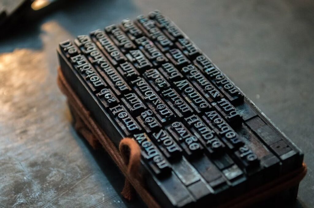
Times New Roman is a font that is familiar to most people and has a rich and varied history. Most people have used Times New Room, also affectionately abbreviated TNR, at one time or another. For many, it is a default font in their word processing or email program. College professors and publications often require submissions to be in Times New Roman. One reason for this is that the font is on almost every computer, making it extremely compatible across systems.
Origin
Times New Roman came to be because The Times (the British version) asked for the serif typeface to be created for them for use in their publications. Stanley Morison — with the help of artist Victor Lardent —designed the font and officially put it into print in 1932. Morison was already quite well known in British typography circles when he was commissioned to create Times New Roman. He was also the artistic advisor to the typesetting and font design company Monotype at the time.
Some of his other infamous typefaces include Gill Sans, Perpetua, Bembo, Baskerville, and Bell — with some of those being revamps of older typefaces. The Times used Didone before changing to TNR, which people viewed as dated since it came out in the 1800s. Didone was also not as bold or as heavy as TNR. Some speculate Morison based the design on the typeface Plantin but then revised it to utilize the space as efficiently as possible.
Remember that its original purpose was for newsprint, which tends to see space as premium real estate. People received the design so well that the creators later offered it for commercial sale to other publishers. The Times used the font for the next 40 years.
The Modern Difficulties of Font Creation
Monotype owns Times New Roman, along with other popular fonts, such as Helvetica and Arial. Monotype is also the owner of the MyFonts marketplace, where several thousand independent artists sell their designs. However, those creators have a tough mountain to climb to make fonts that become as widespread as Times New Roman.
Monotype has a stronghold on the font design industry, and portions of the profits font designers make by selling on MyFonts must go to that company. Consider the case of one MyFonts creator whose work attracted the attention of someone associated with the 2013 adaptation of “The Great Gatsby,” starring Leonardo DiCaprio. They wanted to use the designer’s creation in the film, which sounds like a big, lucrative break. Although people worldwide ultimately saw the font while watching the movie, the creator only made $12 from the achievement.
Mechanics of Times New Roman
Because it was specifically created to be used in a newspaper, Times New Roman is naturally narrower than many other fonts used in body text. Even the bold style of TNR is fairly narrow for bold. This allows newspapers to fit in more text per line and save space for more advertising, or income.
Times New Roman has tall lower-case letters. It is seen as an older style serif font and has often been compared to the older typefaces, such as Baskerville, because it has a variety of both thick and thin strokes, creating some contrast and definition. Because it is a serif typeface, you will find serifs in some of the letters in TNR, such as “H,” “X,” and “I.”
However, the fact that TNR is a serif typeface put it under scrutiny by people providing feedback and guidance to the United States Department of State. In February 2023, that agency stopped using Times New Roman in all its formal communications.
It now uses Calibri. That change reportedly occurred because representatives decided the sans-serif Calibri better-supported accessibility needs. More specifically, they believed it would be easier for people with visual or learning disabilities to read due to its cleaner look.

What Does the Font Imply?
The font is familiar and versatile, so it creates a comfortable feel for most people. One study places it as the most trustworthy font — however, that same study had Comic Sans in second place, so take the results as you will, depending on your views of Comic Sans.
Most people will instinctively recognize the font, even if they aren’t aware specifically that it is Times New Roman. They’ve likely seen this font in newspapers, magazines, books, and online for years. It is like putting on an old, warm winter coat on a crisp day — it is comforting, somehow. TNR is also the default font when you create a new document in Microsoft Word and start typing.
However, legal professionals have particularly polarized views about the font. Some go as far as to associate it with apathy. Others point out that TNR’s traditional look minimizes distractions for readers of the complex paragraphs typically found in legal agreements. Since some judges and courts have rules about which fonts acceptable documents must include, you should always check for such specifics before settling on Times New Roman or any other option.
Even though some critics will say that people overuse TNR and should try to find a different font, many circles still widely accept Times New Roman. If the font works well for what you are designing, why throw it out just because it is common?
Where It’s Commonly Found/Used
As we mentioned before, Times New Roman is often located in publications such as magazines, newspapers, and books. It is quite popular in academia, with many professors requiring students to submit papers in TNR 12-point font. There is a reason for this. It is a standard size, and students can’t simply use a wider or bolder font to pad a paper when there is a specific page count requirement.
That’s the same reason why some publications require people to submit their material in TNR 12-point font. At a glance, the editor knows whether the article or story will fit within the space they have allotted for the piece. The writer can’t overwrite or underwrite, or it will be immediately apparent. The Encyclopedia Britannica used this font as well — which makes sense since printed books use the font so widely used in printed books.
People also choose Times New Roman when creating or updating their resumes, probably because it’s so easy to read. However, the font’s popularity among those looking for work is one reason to consider using something different. After all, a resume should help you stand out, and its design is one characteristic that makes it easier for employers to notice you over other candidates.
What Should It Be Used As?
Times New Roman works across just about any type of industry. It is a bit plain, but that is why it works so well for business papers and reports. Many signs feature it, too. It’s easy to read and translates well both in print and on-screen. It can be a bit faded-looking on screen as it is naturally a narrower and less weighted font. However, you can fix that by increasing the font size or bolding.
Today, there are many additional versions of the typeface, including extra bold, condensed, Seven, and Times New Roman World. There are also specific design versions — Linotype variants — that people use for very specific purposes. For example, Times Ten came about for small text that is under 12 points or so. This version is just a touch wider to make it better to view on-screen.
Alternatives for More Modern Choices
For many, Times New Roman may seem outdated or plain. Fortunately, there are many other options that you could choose from to make your work seem more impactful in conveying the message.
Calibri is an excellent option if you want to keep the same style of Times New Roman but with a more casual twist. Calibri was the default font of Word, Excel and PowerPoint until recently, when Aptos succeeded it. Times is another option if you want to compete with Times New Roman. This font is thicker, improving legibility. It also looks friendlier and more approachable than Times New Roman.
If you’ve decided to part ways with Times New Roman, consider Helvetica. Its spacing promotes visibility and therefore allows better accessibility. This font is also popular among resume writers because of its clean and sharp features. You could also opt for Georgia, another go-to font for many, particularly website builders. This font is legible across Mac and Windows and easily read in different resolutions.
Aptos is also a good choice for ease of reading and printing and to give your work a modern feel. Originally named Bierstadt, this font was released in 2023 and is part of grotesque sans fonts (block-style alphabets) like Helvetica. Block-letter fonts like Aptos generally stand out because they look formal, have thicker strokes and retain a decent amount of white space for better visual presentation.
An underrated font perfect for editorial use is Tiempos. With a sleek and elegant touch, this serif is clear and legible, making it great for optimized typesetting. The headline fonts are designed large, allowing titles to capture attention. If you’re looking for a sans-serif alternative, check out Montserrat. This font is largely used on websites, but its legibility also makes it suitable for printed materials. Some governments also use this font as their official font, and Fiverr declared Montserrat the Font of The Year this year.
Times New Roman, A History
The typeface you choose can impact everything from conversions to the overall branding of your company. Times New Roman offers a familiar and trustworthy look that can work well for almost any industry. Although there are certainly many other alternatives out there, it is doubtful that any are as well known or respected as Times New Roman.
Before selecting it for your next project, take the time to speak to your client about their expectations and needs. Get the details of whether TNR would fit the company’s brand image if used in future materials, too. Although the font choice can seem relatively minor, it makes a big difference in factors including readability and style.
The Font Series Guide: Introduction
Chapter 1: 15 Google Fonts You Should Be Using
Chapter 2: Times New Roman
Chapter 3: Roboto
Chapter 4: Georgia
Chapter 5: Verdana
Chapter 6: Helvetica
Chapter 7: Comic Sans
Chapter 8: Didot
Chapter 9: Arial
Chapter 10: Tahoma
Chapter 11: Garamond
Chapter 12: Century Gothic
Chapter 13: Brody
Chapter 14: Bromello
Chapter 15: Savoy
Chapter 16: Athene
Chapter 17: Calibri
Chapter 18: Proxima Nova
Chapter 19: Anders
Chapter 20: Monthoers
Chapter 21: Gotham
About The Author
Eleanor Hecks is the Editor-in-Chief of Designerly Magazine, an online publication dedicated to providing in-depth content from the design and marketing industries. When she's not designing or writing code, you can find her exploring the outdoors with her husband and dog in their RV, burning calories at a local Zumba class, or curled up with a good book with her cats Gem and Cali.
You can find more of Eleanor's work at www.eleanorhecks.com.


