


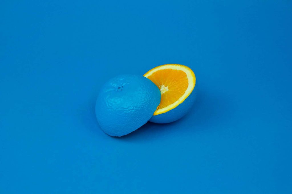
Each color scheme has its own appeal, but split complementary colors are somewhat unique. They’re essentially an enhanced version of regular complementary colors that give you much more customization potential. However, while the shades pair well together as swatches, their cohesion doesn’t automatically translate into design. You must know how to use them purposefully to take full advantage of them.
Designers have an eye for what works and what doesn’t. Sometimes your best tool is taking a step back from the computer screen and looking at what you’ve combined to see how it works.
What Are Split Complementary Colors?
Regular complementary colors involve one color and its complement. Split complementary colors take the single complement and split it into two symmetrical colors. You get three shades to work with instead of two.
On top of that, the resulting shades are much more varied because it’s customizable to an extent. Each color has one set complement, but split complements aren’t limited to the same extent. As long as the split shades are an equal distance from the original complement, they can be any color.
You can combine a light blue with a medium green and the colors still complement one another and create a beautiful design.
Why Use Split Complements in Graphic Design?
Color is an incredibly significant part of graphic design. In fact, up to 90% of first impressions on products or environments are based purely on color. Because most viewers define a brand by their colors, it’s essential to choose those that interact well with each other.
Many people enjoy using split complements because the colors are particularly harmonious. The balance between temperature, contrast, and shade range is naturally visually appealing and striking. It provides a simple and fast way to create an effective color palette.
Finding just the right hues takes a bit more time but it also stands out amongst competitor websites. You may want to run some split tests to see how your users respond to different shades and their combinations.
How to Find Split Complementary Colors
Color wheels are great tools for finding split complementary colors because they’re incredibly simple. You can use them to establish the three base shades you want to use before fine-tuning the tone, tint, and shade.
Shades on the opposite side of the color wheel are complements. For example, purple and yellow are complements because they’re located directly opposite each other. Choose the color you want to primarily use, find its complement, and then select two evenly-spaced shades.
Purple, for instance, could have yellow-green and yellow-orange as the additional shades. Any two will work as long as they’re spaced symmetrically along either side of the complement. It’s important for them to be equally distanced because it creates balance.
You can find a wheel with more detail for split complementary design. Rather than red, green, blue, yellow etc., you’ll have a wheel with all the combined shades, including lilac, hot pink, peach and so on.
It’s also relatively easy to find split complementary colors without using the color wheel. Decreasing or increasing the hue value of a color by 150 points results in two complementary colors. Altering the hue value can be a useful method for organizations looking to find colors matching their logo or palette. Play around with the settings and see what you can create in your design tool of choice.
That being said, there are limits to the range of shades you can choose from. Although you can technically choose any two accents on the color wheel as long as they’re symmetrical, they can’t touch the base color. Three shades directly next to each other count as analogous, which is a separate color scheme with different benefits and uses. Finding just the right mix requires experimentation.

The Benefits of Split Complementary Colors
Each color scheme has its own benefits, and split complementary colors are no different. Unlike a randomly selected palette, each shade has a relationship with the other. Such a connection translates well to graphic design because each colored design element influences the flow and definition in a specific way.
A lot of color schemes are somewhat limited. For example, analogous colors must be next to each other on the color wheel. Split complements, on the other hand, have much more potential. They allow for many variations, so you can come up with all sorts of interesting color combinations. Their flexibility and cohesion make them appealing.
Beyond its visual appeal and ability to direct attention, split complements can also benefit brand awareness. People easily remember images with complementary colors because they contrast strongly and stand out. The simple choice to include such colors can create subconscious connections in people’s minds about your design.
How to Purposefully Use Split Complementary Colors
There aren’t strict rules on how to use split complements in graphic design, but the colors can function better if they’re organized. Beyond that, focusing on balance can enhance the positive impact of the color combination.
1. Draw Attention
Split complementary colors allow graphic designers to create cohesive color palettes with natural appeal. The three shades contrast nicely, meaning they can create attractive visual distinctions in a design. Layering or using various amounts of each can help draw attention to specific parts of the design.
Each shade is different enough from the other that they stand out, so they can be really effective at drawing the eye. The split complements work well as accents. Strategically placed accents can draw attention and encourage certain reactions.
2. Balance Each Color
Although split complementary colors can look amazing because each hue works well with the other, they can be overpowering. Instead of using each shade equally, it’s best to balance them. Going by the 60-30-10 rule, the main color used to select the split complements should take up 60% of the space in the design. The two remaining shades are accents, so one should occupy 30% and the other 10% to keep things balanced.
A balanced color palette organizes things and helps viewers know where to look. It also prevents the design from being overwhelming. Even though split complementary colors are harmonious, they can still look chaotic without balance.
3. Focus on Temperature
Split complementary colors will always have a mixture of warm and cool shades. Two out of the three shades will be either cool or warm, so you’ll have to choose which gets the majority. Temperature dominance can invoke certain moods, so it’s important to pick colors accordingly.
Complementary colors create visually enticing contrasts when paired with warm shades, meaning they can easily grab attention. Temperature accents can be advantageous if you want to direct the viewer’s eyes. If a design is full of blue and green, for example, small amounts of red-orange will be very striking.
4. Inspire Emotion
Every color invokes an emotional reaction to some degree. Split complementary colors are typically located far away from each other, but they can still inspire similar emotions because they’re related.
The two symmetrical shades are often combinations of colors, meaning they can inspire very specific reactions since each color ties to a particular feeling. For example, blue is associated with calm and sophistication, while green is tied to nature and peace. Combined, it can take on a new meaning of natural tranquility.
The two additional colors can add even more layers. You can encourage viewers to feel a certain way by carefully choosing and mixing certain split complements.
5. Ensure Readability
Although high-contrast colors might seem like they’ll read well, too much contrast is painful to look at and can make for poor readability. There should be an 80% difference in contrast between the background and the graphics to ensure everything is legible and looks nice. It can be tempting to use split complementary colors in every aspect of a project because they pair so nicely, but it’s easier on the eyes to limit them.
6. Start With a Base Color
When using split complementary colors, picking a base color is the easiest way to get started. This is the main color you’ll focus on, so consider choosing a color that fits your project’s theme. Then, you’ll use the color wheel to see how the colors relate.
Remember to be careful in choosing your base color, as this is the starting point for your visual project. This is important to make sure of because the other colors you’ll choose will depend on it. Another thing to keep in mind is that the base color should be the one you want to highlight the most in your design. This first step sets the stage for the rest of your color choices.
7. Consider Color Values
Color value refers to the lightness or darkness of a color. To ensure your design is appealing, you’ll want to mix different values. For example, if your base color is dark, choose lighter shades for the split complementary colors. This contrast makes your design stand out more.
Yet, remember that darker colors always add depth and seriousness. On the other hand, light colors can make a design feel airy and cheerful. Adjusting the lightness or darkness of your colors can greatly change the look and feel of your project. Therefore, it’s essential to consider the mood you want to create when experimenting with lightness and darkness.
8. Experiment With Tints, Shades and Tones
Playing with different tints, shades and tones is key in using split complementary colors effectively. Tints are made by incorporating white into a color, making it lighter. Tones are created by using gray, changing the intensity. Next, shades include black, making colors look darker.
By playing with these variations, you can create a more interesting and dynamic design. For instance, if your base color is blue, try a lighter blue tint or a darker shade for contrast. This approach adds depth and variety to your color scheme. Plus, you can ensure your colors work well together and suit the overall style you aim to achieve.
9. Use Color Tools
Using color tools is a great way to help you find your split complementary colors. Tools — like Adobe Color CC or Coolers — enable you to pick and visualize your color schemes. They show you how your base color interacts with other colors, helping you find the right scheme for your design.
They also let you play with tints, shades and tones, so you can see different variations before deciding. Some tools even suggest color schemes based on the latest trends or classic combinations. It’s a much simpler way to create appealing color combinations. Plus, you can ensure more color accuracy for your projects.
10. Test Your Colors in Context
Testing your colors in real life is essential to see how they look in the actual environment where they’ll be used. This is important because colors can look different depending on the lighting, surrounding colors and materials. For example, a color may look great on a computer screen but different on paper.
As a graphic designer, you’ll want to ensure you preview your colors in the actual layout. This testing will help your colors work together in real life and convey the intended effect. As such, you ensure your choices look as good in practice as in theory.
11. Adjust Based on Feedback
After testing your split complementary colors, get opinions from others. Whether it be your co-workers or your target audience, they will be able to see colors differently and may provide insights you hadn’t considered before. Ensure you listen carefully to whether the colors work well together or suit the purpose of your project. This feedback can ensure changes that lead to better outcomes. Sometimes, a slight adjustment in hue or saturation can make a big difference. This process helps refine your color choices, ensuring they appeal to others.
Examples of Split Complementary Color Schemes
The best way to learn how to use split complementary colors is by looking at what other designers have done.
Some color combinations include:
- Red, Blue and Yellow
- Red, Green and Blue
- Yellow, Purple and Orange
- Blue, Yellow and Orange
- Purple, Orange and Green
You get the idea. The colors should be somewhat evenly spaced around the color wheel with a color between each one.
We scoured the internet and found a few examples to help you learn how to implement this cutting edge design tactic in your own creations.
Nature’s Table
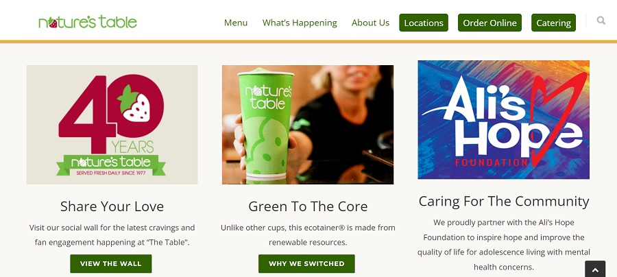
Nature’s Table uses a split complementary color scheme with plenty of white space to offset the bold pops via the photos and typography. Note how they incorporate just a bit of red into their logo and repeat it in one of their headline images. There is also blue and green throughout. Because they can easily swap out any box, it’s easy for them to shift and focus on one color more than another.
The World of Museums
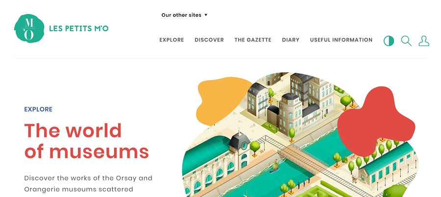
Source: https://www.petitsmo.fr/
The French-based website titled The World of Museums has a green, yellow and red color-scheme that grabs the user’s attention and holds it. They use the colors sparingly and mute them down a bit to keep them from taking over the design. The entire effect is modern, youthful and fun.
DConstruct
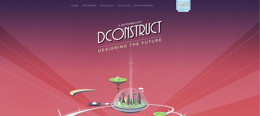
DConstruct is actually an older event website but the design is so unique we wanted to include it as an example anyway. It has a Jetson’s retro futuristic feel that grabs the user and makes them want to read more.
In this example, the designer filled the background with a soft red. They then worked in the complementary colors of green and purple, using it subtly near the top of the page and then for accents.
Mail Bakery

Mail Bakery pulls in a gorgeous split complementary color scheme by adding a block of green behind the hero image and then weaving in red and yellow throughout. You’ll also see pops of orange, such as in the top navigation bar.
The designer used the 60-30-10 rules and eyeballed how well each hue balanced the other. The effect is bright and engaging.
The examples above show how flexible split complementary color combinations can be. You can go with any saturation or hue, consult the color wheel for options and make the design uniquely your own by testing what works best with your audience.
Many designs limit themselves to a couple of color choices. When you add in a third shade, you take your design to a new level. Users may not know why they’re draw to your site over a competitors but they will have a sense of an aesthetically pleasing design.
Split Complementary Colors
The split complements and base color can look a lot more appealing and have a more specific impact with balance. There aren’t firm rules about properly incorporating them into a design, but following a structure can bring out their strengths. Purposeful uses of split complementary colors can help you inspire positive emotions and reactions.


Leave a Comment